The BRAWL² Tournament Challenge has been announced!
It starts May 12, and ends Oct 17. Let's see what you got!
https://polycount.com/discussion/237047/the-brawl²-tournament
It starts May 12, and ends Oct 17. Let's see what you got!
https://polycount.com/discussion/237047/the-brawl²-tournament
[UE4] Environment Neon Murder WIP
LATEST update at the bottom.
Hello Polycount,
I have been working on this scene mostly after work and I am at a stage where any feedback and critique would greatly help. I wanted to have bolder color choices and focus on something simple. Basically, somebody got assassinated while he was peAing, I know, it sucks.
b. Lighting tweaks and overall color balance.
c. better story telling.
d. add a bit more interest on the ledt side of the scene. probably with a wooden wall shelf with some cups and cocktail glass or something.
e. work on the sign/ chnage the font. Any ideas?
This is my primary shot

This is the second one:

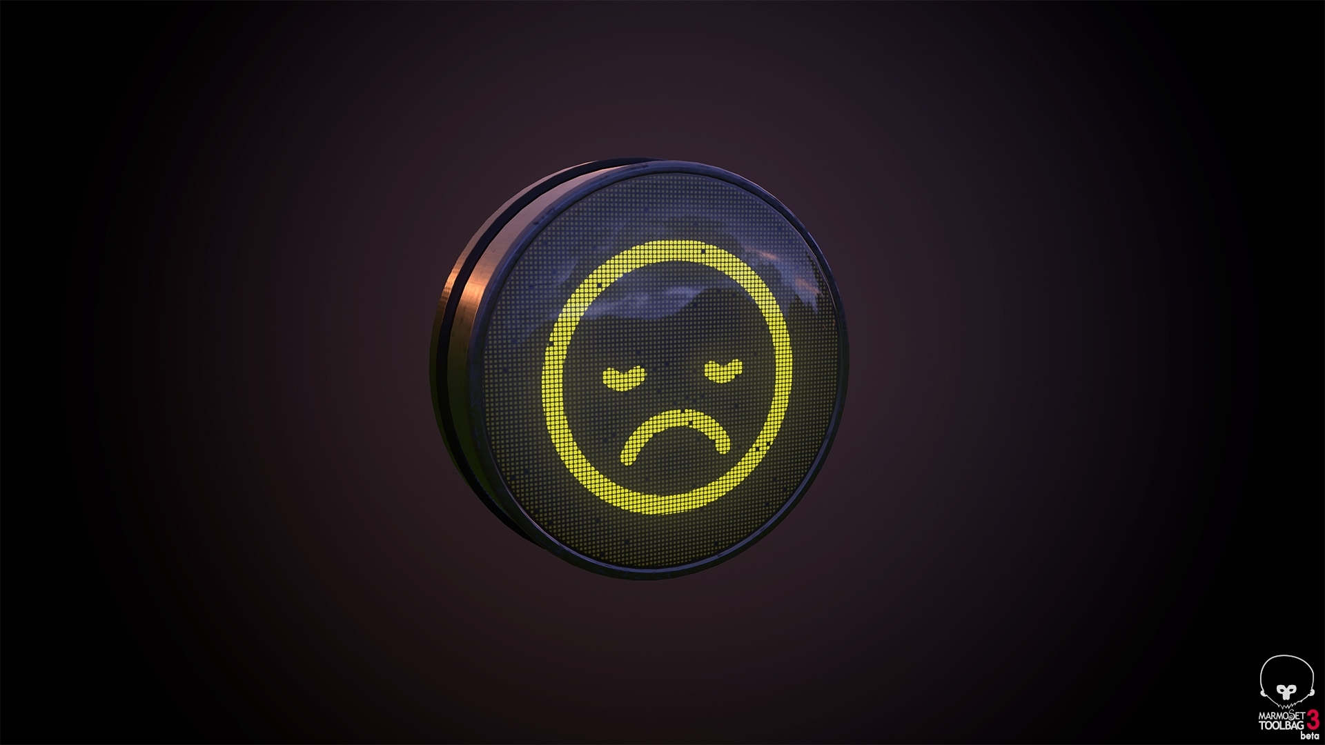
Some prop renders:


Thanks!
Hello Polycount,
I have been working on this scene mostly after work and I am at a stage where any feedback and critique would greatly help. I wanted to have bolder color choices and focus on something simple. Basically, somebody got assassinated while he was peAing, I know, it sucks.
Currently, on my to do list:
a. working on some detail props to fill up the scene with bits like paper, cups, bottles and stuff.b. Lighting tweaks and overall color balance.
c. better story telling.
d. add a bit more interest on the ledt side of the scene. probably with a wooden wall shelf with some cups and cocktail glass or something.
e. work on the sign/ chnage the font. Any ideas?
This is my primary shot

This is the second one:

Some prop renders:


Thanks!

Replies
Love that lighting u got going on there. Keep it up
My first thought was the camera angle. Your screenshots are to balanced, If you choose an angle near the ground you get a more dramatic or thrilled result.
example:
https://delaneylewis.files.wordpress.com/2013/03/room.jpg
Keep it up!
True. Agree. I thought so too and that's why I have a second shot because of that lol. I guess I will try brightening that area a bit more to make the blood a bit more visible. Also planning to add a bit more smear there too. Thanks!
Ahh. I was playing around at first with something more dramatic but that was in the early blockout stage. I guess I will give it another go. My thought process of having a camera super balanced was to contradict with the chaos on the left. I do think having a lower camera could be pretty cool.
Thanks for the great feedback. I am gonna post an update soon. Cheers.