Survivor type character
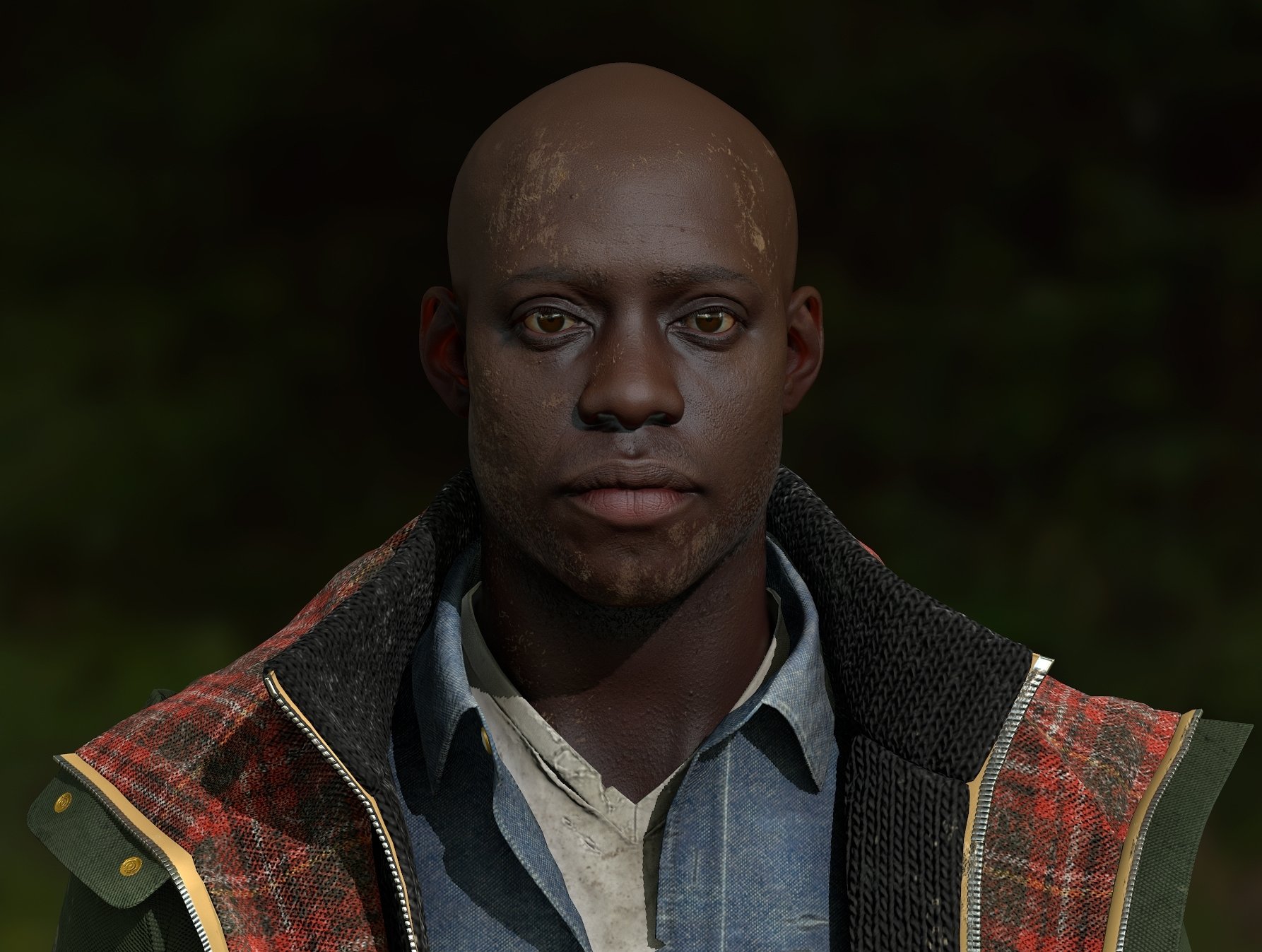
Supposed to be a survivor type character that would fit into a Last Of Us or Walking Dead type universe.
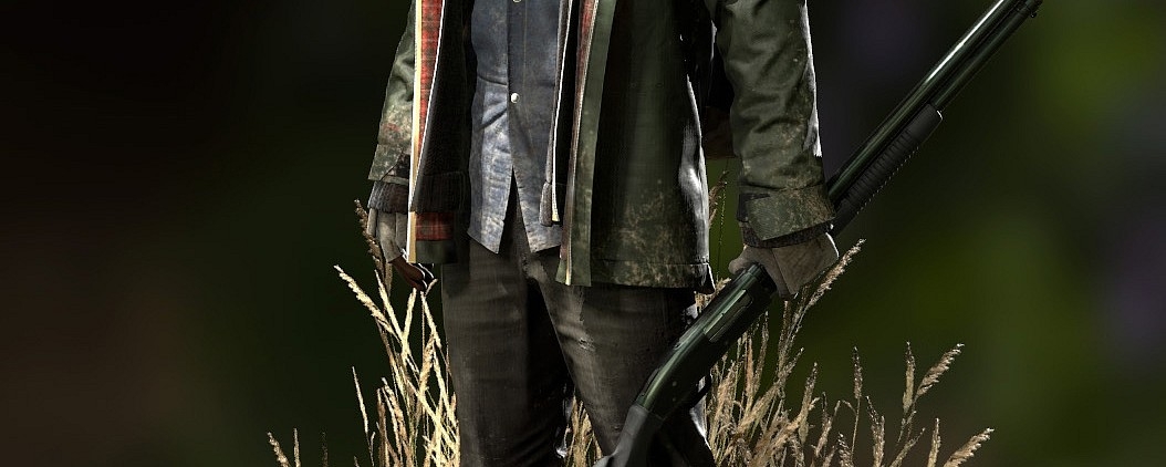
Right now the highpoly is finished except for a gun and some minor pieces, I'm thinking a shotgun but haven't decided yet, the gun will be the last thing I do.
The highpoly render:

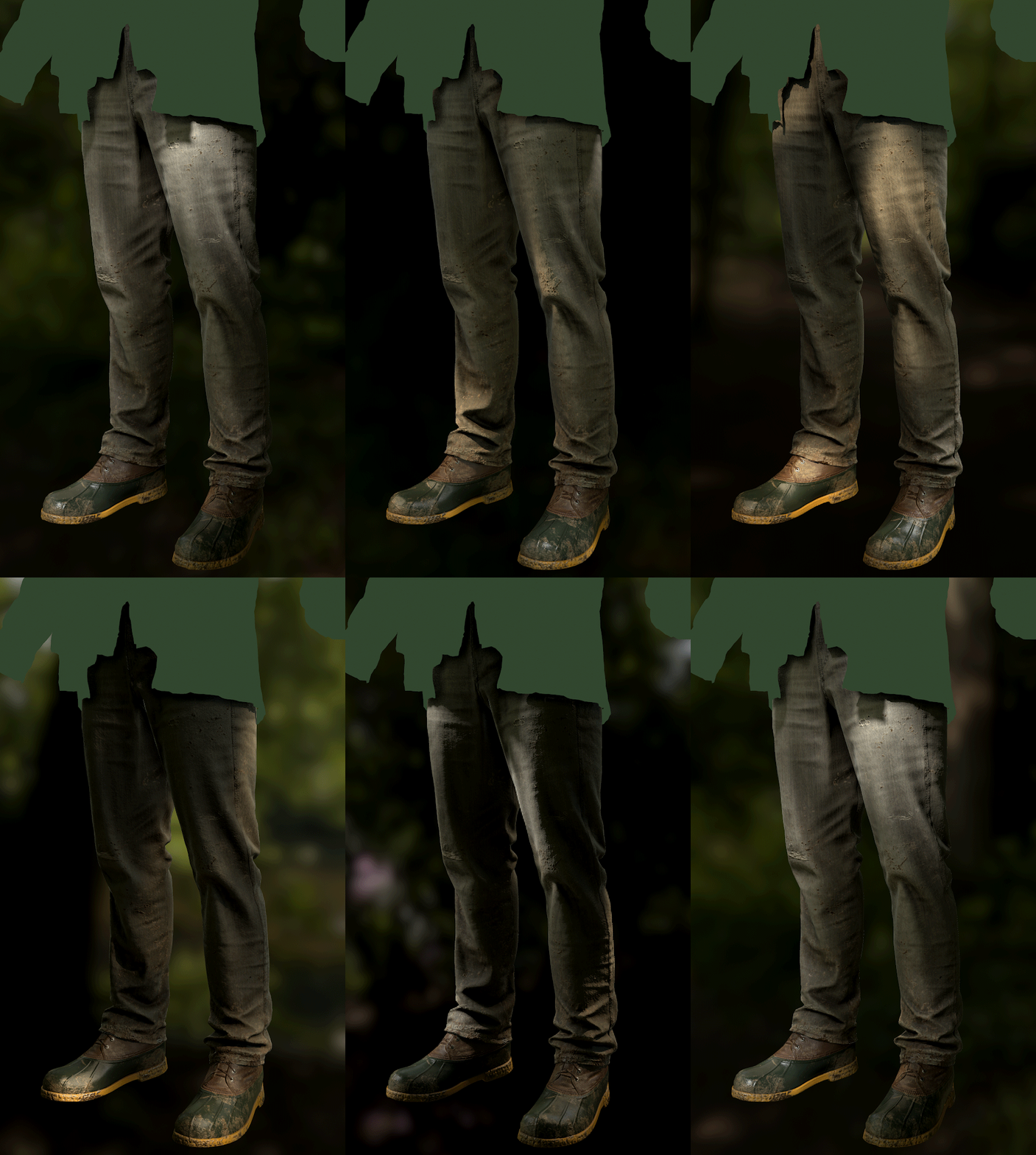
And here is the low-poly so far. This is most things, but I need to finish the hands and get them done as a low-poly (just a sketch right now), and I also need to do a low-poly for the backpack and get that in there. Right now I am doing a damage pass on the backpack to add more wear and some duct-tape details. "
Shots in marmoset toolbag 2:



And a GIF, you might have to right click and open in a new tab to see it, not sure why
Right now the highpoly is finished except for a gun and some minor pieces, I'm thinking a shotgun but haven't decided yet, the gun will be the last thing I do.
The highpoly render:

And here is the low-poly so far. This is most things, but I need to finish the hands and get them done as a low-poly (just a sketch right now), and I also need to do a low-poly for the backpack and get that in there. Right now I am doing a damage pass on the backpack to add more wear and some duct-tape details. "
Shots in marmoset toolbag 2:


And a GIF, you might have to right click and open in a new tab to see it, not sure why


Replies
Makes me think he's either an immigrant and the shit hit the fan or living in an African country that's dealing with its own outbreak.
Process wise were you pulling reference from any particular faces?
The mud tends to "cake" to the face, as far as I could tell. I made some mud in the backyard and drizzled it onto garbage bags to check color and material and maybe make some alphas.
i couldn't get the mud to mix quite right, so I mixed in some protein powder and vegetable powder mix.
unfortunately when I went out with the camera to capture everything, I caught my dog eating the last of my "mud".
As some has pointed out the model could be abit more interesting (in a storytelling point of view), you say he is a survivor but i can´t really see it, But as i said, the model itself looks amazing!
It's a really good looking model and well made, don't get me wrong, but it kinda looks like he just fell into some mud on a walk in the forest rather than that he survived anything. In the end however its up to you to decide what hardship he survived but right now it is hard to understand just based on how he looks.
Unfortunately I made more changes to the coat/torso than seen here texture wise, but my texture document got corrupted in a crash, and all I had left was an older .jpg that I thankfully saved out. Oh well.
I thought more about the 'story' aspect, and ultimately although I appreciate the input, I've decided to go with what I had in my mind when I started. I had originally decided I wanted to do something in the vein of the TLOU and TWD, and I think this is accomplishing that, although I respect those that disagree. I wanted to keep the design more grounded, I don't feel it necessary to spell anything out story wise. Just my opinion.
Anyways, here are the marmoset screenshots. He's running fine in Marmoset, although I think I will compress him down a bit at the end. Right now he is running mostly 4096 maps but he looks fine at 2048, so thats where I'll go. He's 80K polygons, which I'm fine with.
Also adding that someone PM'd me to ask what he's textured in, its just photoshop, still my preferred tool.
I think he would fit very well in a TLOU
Can't wait to see him posed (and with hands!)
I really like the hat!
I want one pose that is more basic, of the character standing, and will use these for the closeups and the turnarounds. This is the A-B one, I kind of like the attitude in A, I dont really like his legs in either, I might shift back to a more symmetrical leg stance.
The second pose would be more actionable. Not firing gun or with the gun full up, just a little movement. First try is with the second pic.
pose A works great for a complete turn around.
Just as a matter of curiosity - how do you split up your maps? Does every garment have its own?
Forgive the UI elements and stuff. These screenshots are from inside the editor, and I haven't built the lighting either. I built some of my vegetation incorrectly for lightmaps, so I have to fix their UVS before I can build the lighting correctly, unless anyone knows a workaround, I would love to hear it.
Everything in the scene is mine, most of the vegetation is made from pictures I took in my backyard, everything except the ground texture, which I bought at surface mimic.
Loving the enviro progress too, gj. It looks just like typical british countryside, exactly like the fields behind my house
Great stuff man
Also, good choice on the pose. It captures movement, it's not to symmetrical and has a decent line of action, but at least in the top picture, he looks a little bit out of balance. A bit to straight. Maybe a slight weight shift towards his right would help, so that he's got a bit more of a curve to him, favoring the leg that supports the weight of the body. Also, I agree that he's possibly looking a bit to relaxed. I guess it depends on what situation he's supposed to be in.
I modeled using a combination of Maya, Zbrush, & Marvelous. Everything baked in xnormal, all texture work done in Photoshop.
For the face details, I used maps from TexturingXYZ, which sped up that part of the workflow a lot, otherwise the face is all sculpted by hand as well.
Here is the album with higher quality images:
Amazing work! I just love it!