Home 3D Art Showcase & Critiques

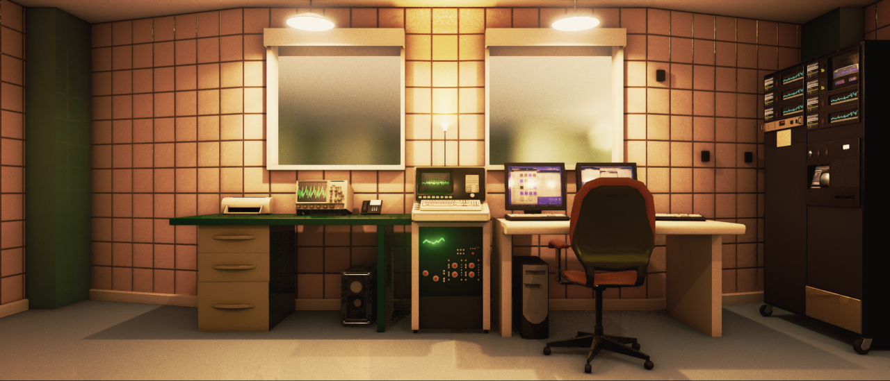
80s-style Engine Analysis Room (UE4)

Scene I put together for an art test for Camshaft Software (Camshaft gave me permission to post this)
I had a lot of fun making this, any crits welcome :)

Scene I put together for an art test for Camshaft SoftwareI had a lot of fun making thisMORECamshaft gave me permission to post thisHere you can see how the fresnel effect is used to dull-out the displays the oscilloscopes fade out the table LCD has a low field of view and the CRT displays have a subtle colour fade effectDOF was used to blur objects that were either too far away or too close to the screen Grain was also added to give the objects a lsquowornrsquo lookI took screenshots of my desktop to use for the monitors here The oscilloscope graphs were generated in Adobe Illustrator A mask texture was used vertically and horizontally for the graphs to give them their refresh rate The CRT displays use a 29x multiplier for the panning mask to give them that flickering look why 29 half of their actual refresh rate because 60 was too much minus 1 to give it an uneven lookThe table was given a detail noise texture to make the reflections look a bit more realistic for this type of materialMost of the graphs displayed on these monitors are from WolframAlpha Irsquod really like to go back and improve some of these interfaces they seem a bit blocky to meTherersquos something beautiful about just looking at the lighting in UE4 too I wasnt a fan of lightmaps and baked lighting before I was a CryEngine fanboy for a while but UE4 really changed that for meYoursquod never thought that flat colours and low-res geometry could look so good in the end yet here we are Totaled about 24000 triangles and 10MB of meshestextureslightingTook about 35 weeksThe first two weeks were a bit sketchy but after I got my internet sorted out and therefore didnrsquot ragequit when google images wouldnrsquot load when trying to look for reference material because holy smokes does that get old quickly things started to go smoother Clocked in at about 40 actual work hours total though a lot of that I think was spent on baking lightmaps Jeeze the issues I ran in to with that Never have I had to go in and snap each UV for a modular floor to stop lightmass from making weirdly stupid errors with the bounce lighting Still eventually had to just replace the whole walls and floor with a single meshFinal post-processed image hereHad a lot of fun using static colouring instead of textures for a lot of this I was using Alien Isolation as a lot of reference for the props I loved the way they hit that aesthetic right on but it did bug me that everything looked too clean There wasnrsquot enough noisersquo in the materials for me in the texturesThe image Camshaft gave me was a good challengeThe low resolution meant I had to think a fair deal about how light bounces around in the smaller areas what some of the smaller details might be I didnrsquot even see the slight curve in the wall until a few days in and it wasnrsquot until just last week I think that I saw the wall behind the far rack system lead out into another area The lighting was a good brain teaser too I wasnrsquot sure how much of that was light bleed into the lens how much was actual albedo or how much was from the lights I think I got a good balance between post-processing albedo and lighting colouration in the final productThings Irsquod like to continue on would be improving the UVs for everything since I basically said screw itrsquo for everything that didnrsquot need a texture adding some grunge by way of decals to areas like the front of the tables to demarkate where peoplesrsquo arms would polish the surfaces water marks and light-wash under some of the things that lean against the walls and really increasing the resolution of that chair because I didnrsquot remember I wanted to do that until after I took all the pretty screenshots and I really shouldnrsquot just keep iterating on this one thing everything has to be finished eventually Irsquod really like to have another go at a lot of the interfaces too Especially that central one on the large oscilloscope machine I think I got a nice minimalist finish but nothing beats a good high-resolution detailed interfaceIf I can find out why when I package the project the camera is stuck at 000 and I cant move or do anything then Ill post up the download link for people to have a walk around

Here you can see how the fresnel effect is used to dull-out the displays.  the oscilloscopes fade out, the table LCD has a low field of view, and the CRT displays have a subtle colour fade effect:

image

DOF was used to blur objects that were either too far away or too close to the screen.  Grain was also added to give the objects a ‘worn’ look:

image

I took screenshots of my desktop to use for the monitors here.  The oscilloscope graphs were generated in Adobe Illustrator.  A mask texture was used vertically and horizontally for the graphs to give them their refresh rate.  The CRT displays use a 29x multiplier for the panning mask to give them that flickering look.  (why 29?  half of their actual refresh rate, because 60 was too much, minus 1 to give it an uneven look):

image

The table was given a detail noise texture to make the reflections look a bit more realistic for this type of material:

image


Most of the graphs displayed on these monitors are from Wolfram|Alpha.   I’d really like to go back and improve some of these interfaces, they seem a bit blocky to me:

image


There’s something beautiful about just looking at the lighting in UE4 too.  I wasn’t a fan of lightmaps and baked lighting before (I was a CryEngine fanboy for a while), but UE4 really changed that for me:

image

You’d never thought that flat colours and low-res geometry could look so good in the end, yet here we are.  Totaled about 24,000 triangles and 10MB of meshes/textures/lighting:

image

Took about 3.5 weeks. 
The first two weeks were a bit sketchy, but after I got my internet sorted out (and therefore didn’t ragequit when google images wouldn’t load when trying to look for reference material, because holy smokes does that get old quickly) things started to go smoother.  Clocked in at about 40 actual work hours total, though a lot of that I think was spent on baking lightmaps.  Jeeze, the issues I ran in to with that.. Never have I had to go in and snap each UV for a modular floor to stop lightmass from making weirdly stupid errors with the bounce lighting.  Still eventually had to just replace the whole walls and floor with a single mesh.

image

Final post-processed image here:

Had a lot of fun using static colouring instead of textures for a lot of this, I was using Alien: Isolation as a lot of reference for the props.  I loved the way they hit that aesthetic right on, but it did bug me that everything looked too clean: There wasn’t enough 'noise’ in the materials for me in the textures..

The image Camshaft gave me was a good challenge:

image

 The low resolution meant I had to think a fair deal about how light bounces around in the smaller areas, what some of the smaller details might be..  I didn’t even see the slight curve in the wall until a few days in, and it wasn’t until just last week I think that I saw the wall behind the far rack system lead out into another area.  The lighting was a good brain teaser too, I wasn’t sure how much of that was light bleed into the lens, how much was actual albedo, or how much was from the lights.  I think I got a good balance between post-processing, albedo, and lighting colouration in the final product.

image

Things I’d like to continue on would be improving the UVs for everything, since I basically said 'screw it’ for everything that didn’t need a texture, adding some grunge by way of decals to areas like the front of the tables to demarkate where peoples’ arms would polish the surfaces, water marks and light-wash under some of the things that lean against the walls, and really increasing the resolution of that chair because I didn’t remember I wanted to do that until after I took all the pretty screenshots and I really shouldn’t just keep iterating on this one thing, everything has to be finished eventually.  I’d really like to have another go at a lot of the interfaces, too.  Especially that central one on the large oscilloscope machine.  I think I got a nice minimalist finish, but nothing beats a good high-resolution detailed interface.

If I can find out why when I package the project the camera is stuck at 0,0,0 and I can’t move or do anything then I’ll post up the download link for people to have a walk around.

Sign In or Register to comment.