SmilingMountain's Character Art Practice Thread
Hello Polycount,
Thought I'd finally post some of my character work here. The goal of this thread is to improve my character art, and work towards creating a decent entry level portfolio.
Since I was a little rusty, I started out with some lower poly stuff, I also wanted to improve my hand painted textures. I looked at the work of artists like Ben Mathis, Pior Orbeson and Jonathan Rush for inspiration. Any comments and critique on how I can improve my textures (colour, value, edge control etc.) would be greatly appreciated.
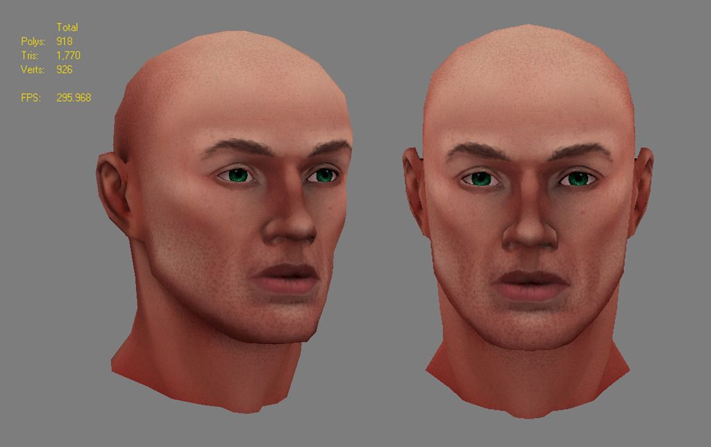
Male face practice based on Andrew Loomis' ideal proportions, textures in Photoshop:
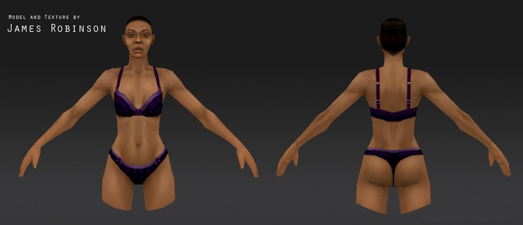
Female Anatomy Study to test out 3dCoat:
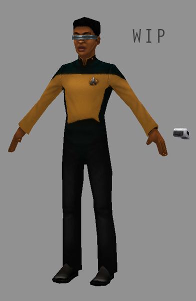
Low Poly Star Trek, also done in 3d Coat:
Thanks for checking out my work! If you'd like to see any additional images UV's, wires etc. please ask.
Thought I'd finally post some of my character work here. The goal of this thread is to improve my character art, and work towards creating a decent entry level portfolio.
Since I was a little rusty, I started out with some lower poly stuff, I also wanted to improve my hand painted textures. I looked at the work of artists like Ben Mathis, Pior Orbeson and Jonathan Rush for inspiration. Any comments and critique on how I can improve my textures (colour, value, edge control etc.) would be greatly appreciated.
Male face practice based on Andrew Loomis' ideal proportions, textures in Photoshop:

Female Anatomy Study to test out 3dCoat:

Low Poly Star Trek, also done in 3d Coat:

Thanks for checking out my work! If you'd like to see any additional images UV's, wires etc. please ask.
Replies
-Does the silhouette read well?
-Does the joint topology look like it will deform OK, could the topology in other areas be better?
-Could I make better use of the UV space
-Would this be interesting as a folio piece, is it boring?
- Is the tri count to high/low for the intended platform
model
Here is a screenshot from max and the UV's.
Thanks!