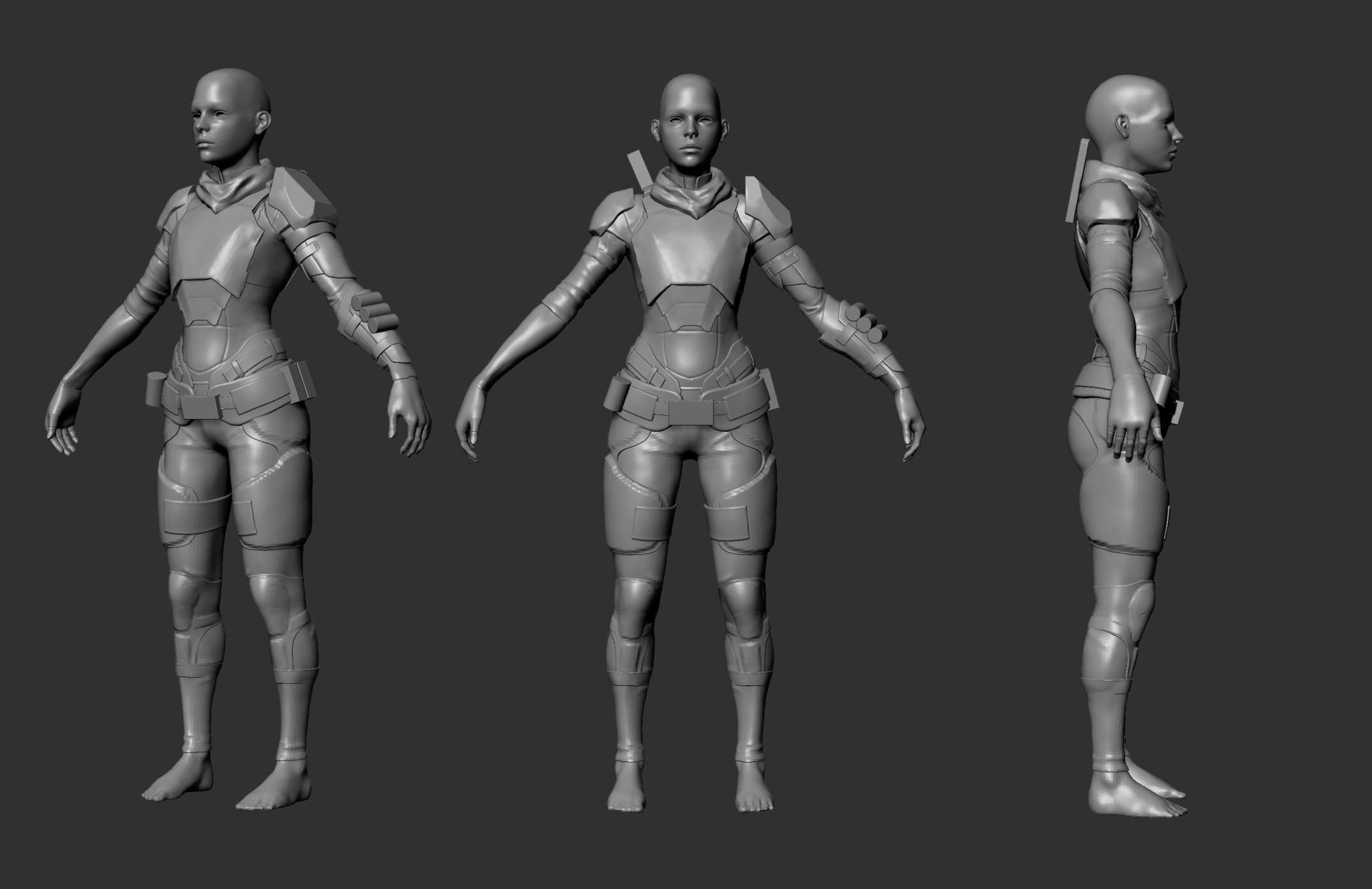
Futuristic Police Character
Hello!
This is the first time I've posted on polycount though I've been reading the forums for many years
I'm studying my senior year as a game artist and I'm starting to compose a character portfolio.
I will mostly work on this piece alongside my other courses, so apologies if updates become rare at times
The setting for the character is the dystopian near-future, where all major cities have formed into mega clusters and the crime rate is high.
The personality of the character is of someone that started with good intentions though has now been hardened and desensitized by the harsh reality and dangers of the job.
In the final piece I intend for her to jump through the air, kicking a bank-robber in the face while firing her pistol.
So it's quite extreme
I've just started on the sculpt so it's still missing things from the concept, though I though it would be good to get critiques early so that I can easily make large changes.
The concept is quite stylized, though that is just so that I could match values and colors more easily. The finished character is intended to be more gritty and realistic.
Please give critique on both the concept and the sculpt.
Cheers!


Replies
Great work so far
I had similar thoughts as the guy above, the silhouette from the side would use some love, and chunky is definitely the word!
I think the chestplate (and backplate) could be much more thick and clear, at least that's how I usually perceive armor. It could also have a shape which would allow bigger chest to fit under it (even if the girl doesn't have), right now if the girl had even slightly bigger chest, the sides of the chestplate would make it really uncomfortable to wear.
I would suggest making the hard shapes in Maya and not zBrush after you've figured out what shapes you're going for, will create much more crisp and clear surface. It's much easier at least to get a good result in Maya.
Things like thighrigs, holsters and kneepads could also pop the silhouette slightly.
In general I feel her torso looks really long in the side view, I'd lift the butt a tiiiiny bit.
Another thing is the arms being slightly bent in front view, and looking fairly straight in side view. I would personally add a bit of a bend in side view too, since it would be a bit unnatural to not bend arms sideways while having hands palm down. Not without taking shoulders out of t-post at least.
I made a little paint over of the things I mentioned, in case anything was unclear, hope it helps! And of course it's a shitty rushed paint over so don't read too much into it haha.
Looking forward to see your progress!
I will be going away for two weeks now though as soon as I get back I will post updates of my edits
Happy holidays!
Hello again!
I increased the size of the knee pad a bit though will probably exaggerate it more or change the design a bit.
I'm not sure if the pants are supposed to be tight, based on concept I guess not, so you should definitely play with the silhouette on them (i pulled them out everywhere). Also don't make all folds on the pants start from the crotch as a sun, it attracts all the attention, and I'm guessing you don't want her crotch to be the focal point of the character.
If you're going for realistic character, it's not so common for girls to have such a wide thighgap, I'd give her a little more meat on the thighs.
I'd also suggest adjust the scull shape, make the forehead form kinda from where highpoints of eyebrows are. Not the best explanation but I hope you get what I mean.
And of course keep working at the other things, make sure to make hardsurface clean and smooth later. It's a bit of a mess now.
Keep working with silhouette from the side with pants too
I've made changes thanks to the feedback, though I have not gotten to the pants or any other cloth yet
Note that the hair something I'm testing temporarily
I shortened the under arms slightly. Unsure if it needs more?
I redesigned the arm-guard and straightened it out a bit.
I tried to fix the head shape. Unsure if I succeeded. I'm planning fix up the whole head soon so I will try it again then.
I made the thigh gap a bit less wide, and pulled some areas of the pants out a bit, though as I start sculpting the folds I will review it.
I've started to clean up a few of the hard-surface objects, though the shoulder armor design is not final yet so it has not been polished.
Cheers!
Now I've gotten close to the end of the highpoly and my project time limit. I will soon start on the lowpoly.
Please mention if anything sticks out as weird!
Cheers!
Only thing that's bugging me is the back of the calves seem quite bulged between the kneepad straps.
Thanks for the comments! =D
I adjusted the calves and hopefully they look better now
I'm basically done with the high-poly aside from adding a scarf around the neck and finalizing the head.
I've already started on the low-poly and will post updates with it soon
Cheers!
I thought it was time for an update.
I have inserted the model into Unreal Engine 4 for presentation.
There are a bunch of things left; I need to go over the texturing again, pose her, make that hair better and create a good light setup.
Though here is how it looks so far
Cheers!
I've been very busy lately with finalizing my portfolio getting it ready for internship applications. Though here are the 'final-ish' renders. I still appreciate feedback for what I can improve the next time I decide to make another polish sweep of this piece.
Since last time I :
- Went over all the textures again
- Posed the character
- Added working cube map reflections
- Re-made the hair
- Added enemies
- Added post process effects
- Set up a more interesting lighting situation
Here is a link to a turnaround video as well:
Cheers!