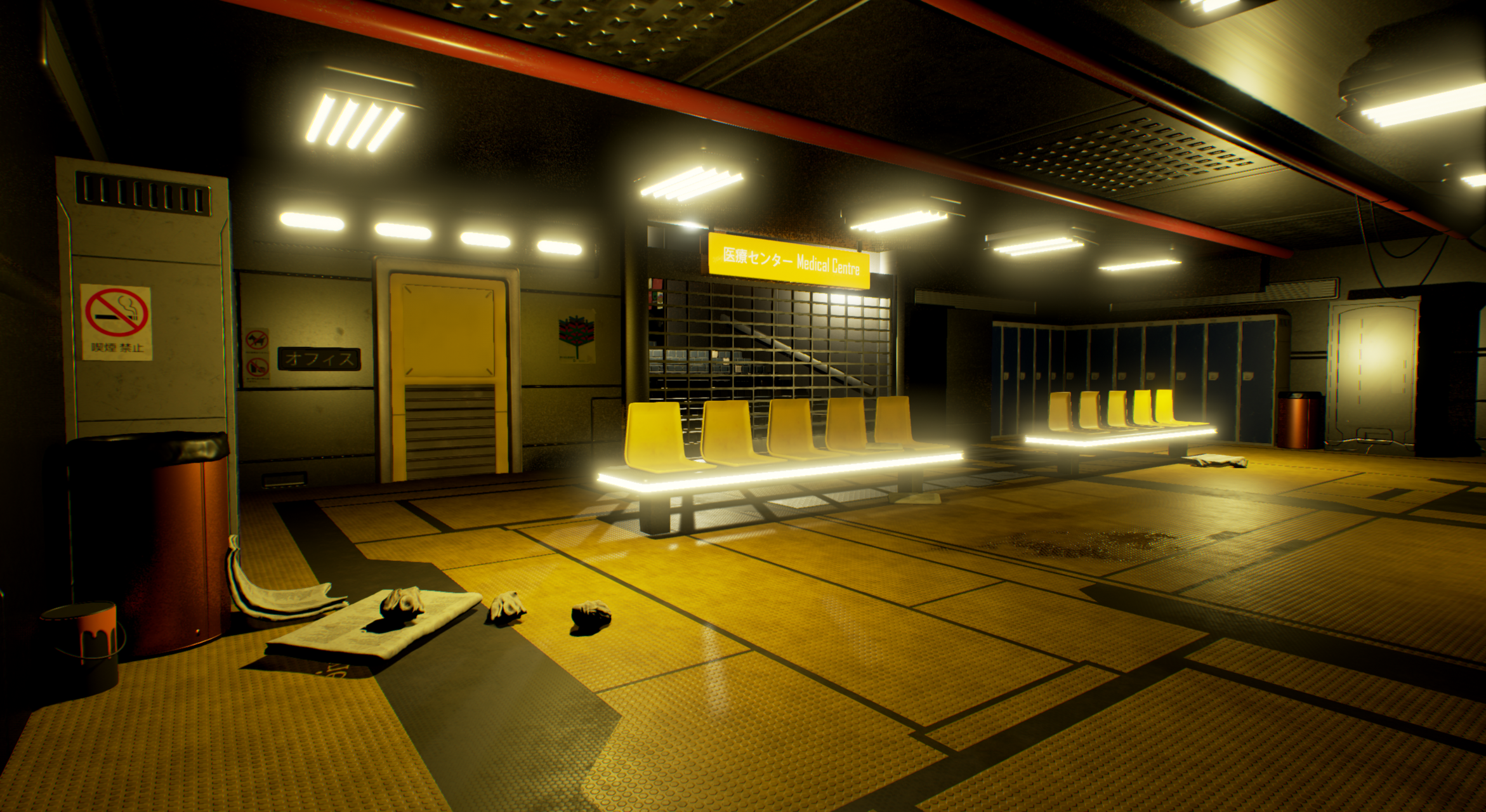
Hey guys I have been working on this scene for a few weeks and I am just looking to get some nit picking for areas of improvement. I have a few place holders for example the yellow door, and I am hoping to get a bit more garbage in spots on the floor.
Any feedback or comments are appreciated
here is a screenshot of the scene!
Replies
Please see the thread http://polycount.com/discussion/161965/why-is-everyone-using-massive-png-files-for-their-shots .
Bloom is too strong for my taste. But this piece is coming along well. I'd love too see some variation in lighting color, it's very yellow at present.
As Eric said: Try some softer lighting.
Color:
Also you could try to change the red beams on the ceiling. I think the contrast is a bit to harsh?
Lighting:
I assume you used this concept. I did a really really quick overpaint of your scene. Lighting can really change the look of your scene. There are a lot of different light sources in this scene, but in order to make it interesting the concept artist used a contrast between the bright spots and the shadows.
I also noticed that you haven't build your lighting yet.
As you can see in this comparison ref: (I just blurred out all the details, so you can see the lighting. )
Overpaint:
You could also minor tweak some objects in your scene. (For example the door and the garbage bin.)
Also the ceilingpanels could be smaller, this way the roof looks more interesting.
It can be tricky to get this working in Unreal. If you need any help just ask.
My tips:
- Really tune down the emissive material on all the lights.
- Try to change the look of your scene with only a few spotlights. (Improve your lighting in steps)
- In the concept they used a really reflective floor, maybe you can try that as well?
- Make sure the shadows are not too dark/black.
- Bake your scene. / Lightmapping
Best of luck! Keep going!
I really hope this feedback/critique is helping.
vonBerg