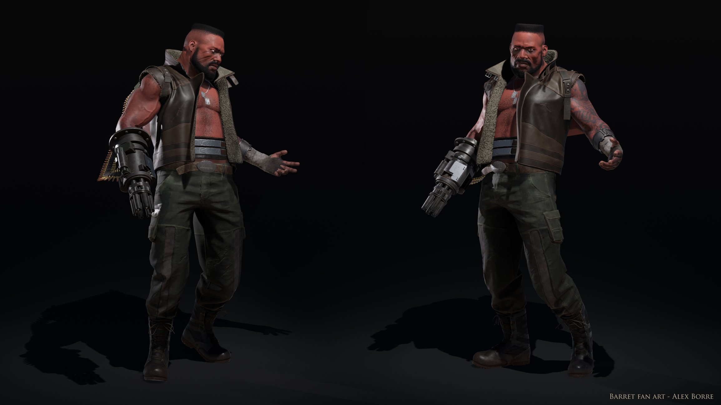
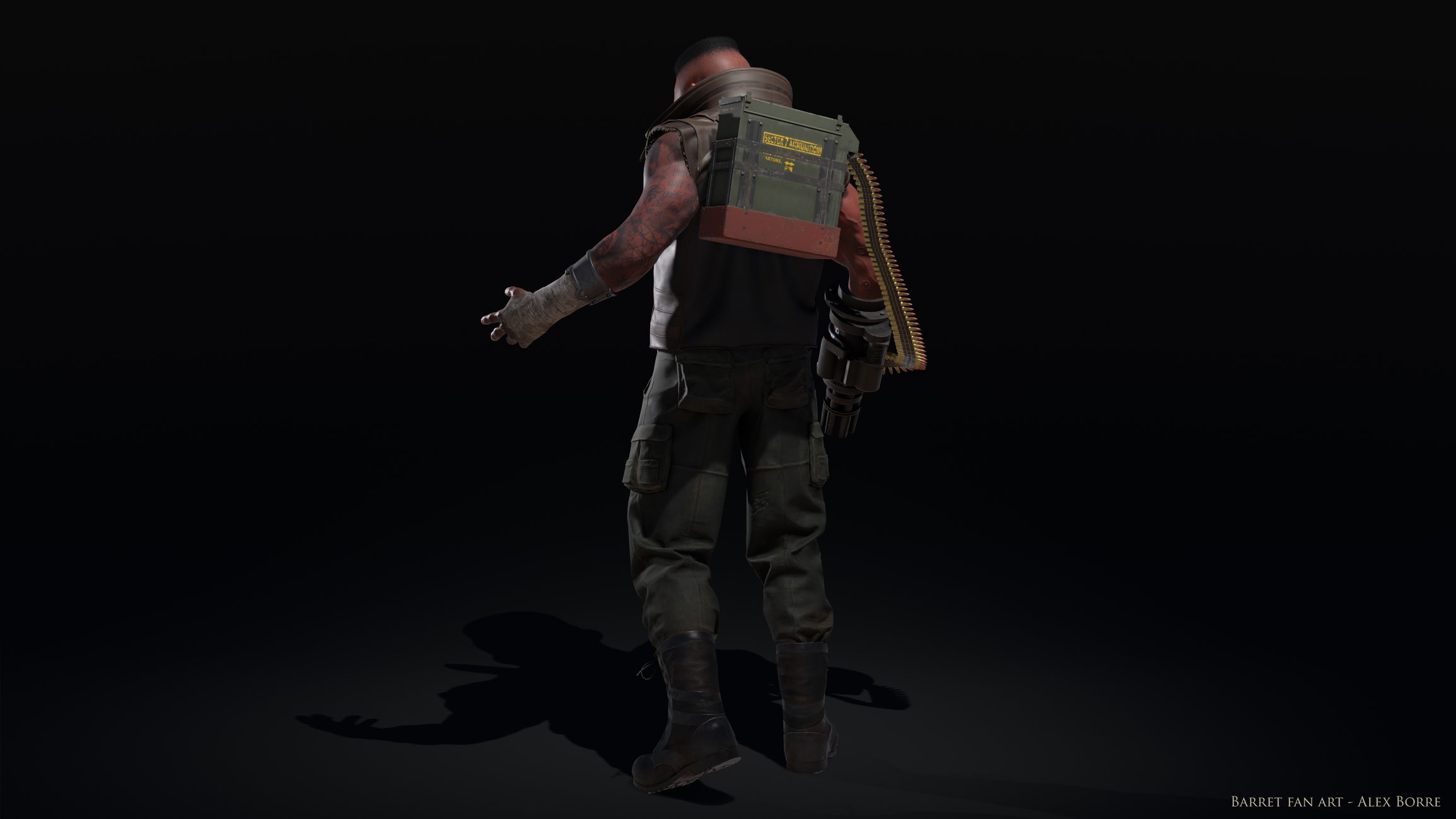
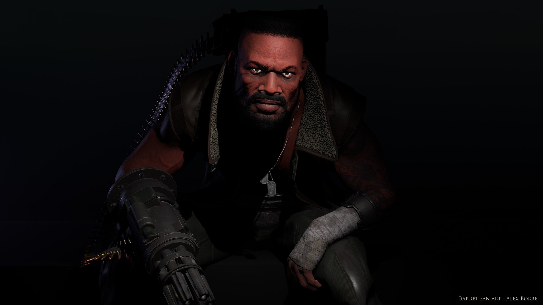
Barret (FFVII) Fan Art Character Model
Finally completed this fan art piece of Barret from FFVII! The goal was to create a high resolution but efficient game model of one the most memorable Final Fantasy characters from my childhood. I wanted to capture the character as I imagined him when I played the game as a kid, loosely using the artwork from the original game as concept.
The project has been a great learning experience, I'm excited to use the knowledge on future projects!
Software:
ZBrush for sculpting
Maya for hard surface work, low res creation
Marvelous Designer for cloth simulation
iPackThat/Maya for UVs
Substance Painter/Photoshop for textures
Maya for rigging, posing
Rendered in Unreal Engine 4.
51858 tris
2x4096 texture maps


Turntable:

Replies
It looks amazing!
I do, however, agree with slosh in that better material definition and work overall (mainly the organics) would make a significant difference. Some spec/gloss on the eye, lips and other materials would help alot IMO.
1. Barret's frame is supposed to be incredibly squat, from the concept art through to his world model in the original game, and even his battle model, he's always shown as being this ridiculously broad, almost hulking figure. It's practically a parody of (at the time) american action heroisms from the point of view of the Japanese. It's something that could really be pushed here to better effect. Shortening the legs a little, broadening the shoulders, pumping up his pecs and biceps.
2. Character preferences aside (i actually like the way you've translated the outfit and made the machine gun arm quite believable as a form of working tech with the ammo pack), the lighting really leaves a lot to be desired here. It very much looks like this is rendered in something offline with some point or spot lights, and no form of ambient reflections or IBL going on, i think that's why a lot of the surfaces aren't coming across believably. So i'd be curious to know what you're rendering with to achieve such a poor result from what is otherwise looking like good source art.
As far as proportions go, I intentionally went with a more realistic/achievable physique. I know this strays from the original character, but for me it was part of making him more believable.
I have much to learn about lighting! This is my first time messing with it in UE, as I've never had to light in a professional setting. I'm starting to see it's necessary for personal growth. If anyone has any good resources for UE4 lighting I'd greatly appreciate it.
I really appreciate the critiques. It's the best and worst feeling knowing there is still so much to learn
New (hopefully nicer) renders coming soon..