Home 3D Art Showcase & Critiques

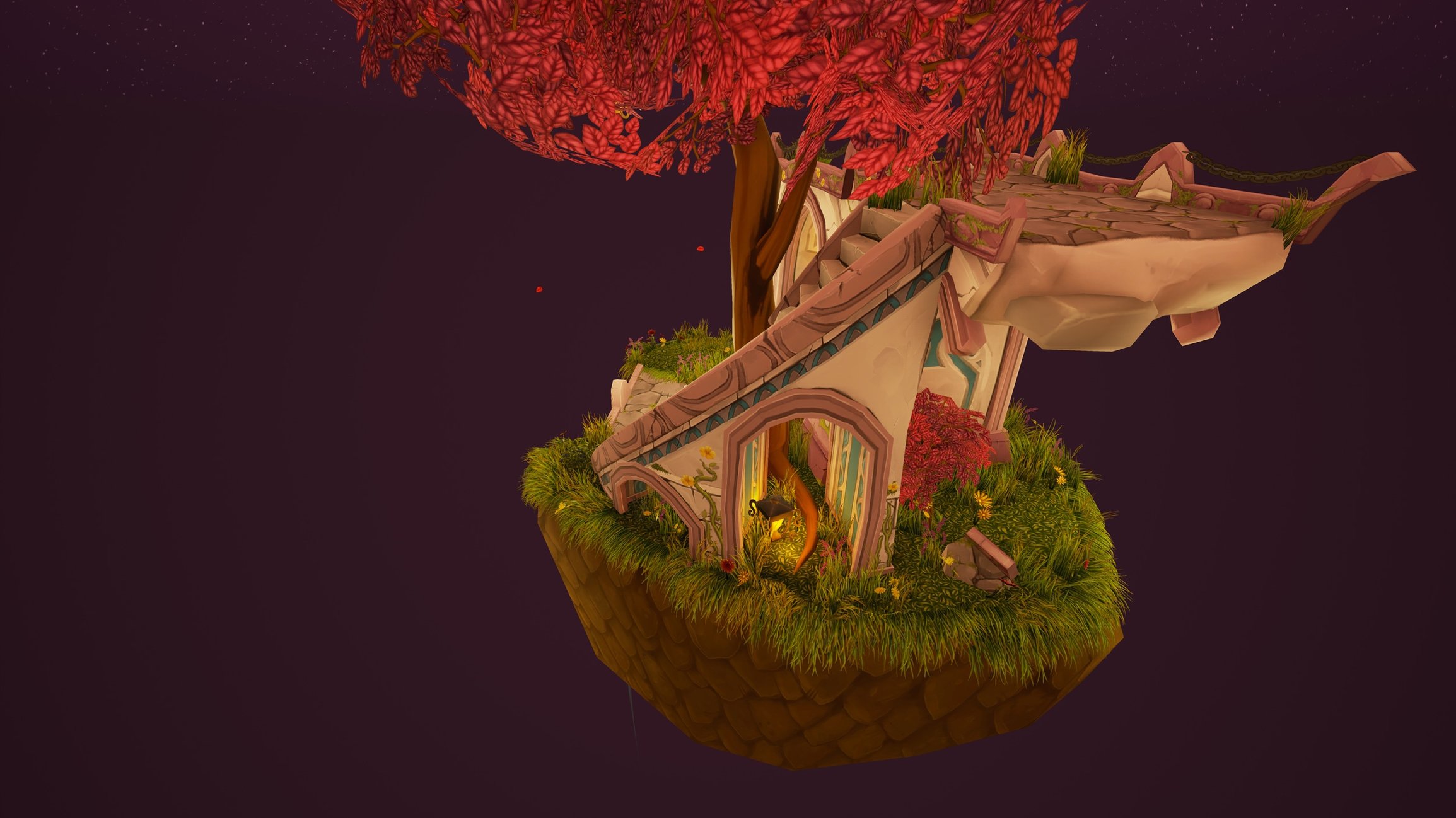
WoW-style handpainted diorama

interpolator
Offline / Send Message
Pinned
AnyaElvidge interpolator
For university I was given 3 weeks to create a WoW-style diorama (I've played WoW for like an hour lol)... basically the brief for the Blizzard student environment art contest, except we can't enter because we're in the UK!

3 weeks wasn't a great amount of time for something that I'd have liked to spend ages on and make super lovely, but it was a good period of time to really get into hand-painting textures (I didn't use Zbrush though) and realise what I suck at.

As a result of the time-constraints, there are a few bits and bobs that are unfinished (such as the grass tile, dirt tile, moss, foliage bits and bobs), a few seams and weirdly intersecting meshes currently unfixed, and I wanted to put a camp-fire on the empty patch of grass in the foreground to make it more interesting and lived-in. Basically the initial idea was someone had set up camp in the shelter of some ruins. This piece is rendered in UE4.

Please give me feedback! I have my university final major project coming up soon, for which I'll be creating a series of environment dioramas based on Robin Hobb's Fitz/Fool books (she has given me permission yay!). I'd like to know what you guys think I can improve and do differently, and I'll carry this advice over into my FMP dioramas. Thanks!




Replies

  • PyrZern
    Offline / Send Message
    PyrZern polycounter lvl 12
    It's weird that someone would hang the lantern off of cut off branch, when it's safer to tie it across the trunk.

    I like the texture work though, a lot.
  • Dethling
    Offline / Send Message
    Dethling polycounter lvl 11
    Very nice work.
    The textures are nice and also the geo is WoWish (no straight lines etc.)
  • CarlK3D
    Offline / Send Message
    CarlK3D polycounter lvl 7
    Looks great! Cant really fault anything personally 
  • AnyaElvidge
    Offline / Send Message
    AnyaElvidge interpolator
    Thanks guys! Nice to know that you all approve! I wish I had more time to fix the stuff I never got round to doing. I feel so burnt out though. :disappointed: 

    PyrZern said:
    It's weird that someone would hang the lantern off of cut off branch, when it's safer to tie it across the trunk.

    I like the texture work though, a lot.
    Yeah I get what you mean. My initial concept actually had it around the trunk... but I don't know. I guess I thought it looked more interesting where it is now. :tongue: 
  • Doomathon
    Offline / Send Message
    Doomathon polycounter lvl 4
    Very nice work. It really reminds me of the Blood Elf area. Could you explain why you made the dirt like that? I understand you were hard pressed for time, but I am just curious as to the design approach. It looks interesting in any case.
  • Bedrock
    Offline / Send Message
    Bedrock polycounter lvl 11
    I would push the tri count a little more around the focal point, particularly for the tree trunk and the round bit in the bridge where the bottom lantern is. It's a little too jaggy at the moment, even for a WoW diorama.
    The river is a little too faint and the riverbed fooled me for a stone road at first glance. For a riverbed texture I would probably go for something that's more like 25% rock 75% muddy blurry soil. Or you can try your hand at hand painted water, which I've seen people use to great effect.
    The tree leaves could use a little bit of color variety as well. Maybe just vary up the individual leaves by a small amounts whilst staying in the red/orange range.

    Overall, great work. Good composition and colorful pieces are always welcome. Keep posting more!
  • AnyaElvidge
    Offline / Send Message
    AnyaElvidge interpolator
    Doomathon said:
    Very nice work. It really reminds me of the Blood Elf area. Could you explain why you made the dirt like that? I understand you were hard pressed for time, but I am just curious as to the design approach. It looks interesting in any case.
    I've had people say it reminds them of all sorts of areas, which is awesome as a non-WoW-er!!

    In answer to your question, I guess it's because I shied away from trying to paint 'normal' looking dirt, because I feel like I'd suck at painting something that doesn't have more form to it... So I made it... scaley... to detract from my currently sub-par texturing abilities, it that makes sense. My tutor picked up on that as well- he didn't like it. But deadline is tomorrow and I'm fixing a different project, so I won't have time to deal with it. :( I'll hopefully go in and tweak stuff for my portfolio later though.

    Bedrock said:
    I would push the tri count a little more around the focal point, particularly for the tree trunk and the round bit in the bridge where the bottom lantern is. It's a little too jaggy at the moment, even for a WoW diorama.
    The river is a little too faint and the riverbed fooled me for a stone road at first glance. For a riverbed texture I would probably go for something that's more like 25% rock 75% muddy blurry soil. Or you can try your hand at hand painted water, which I've seen people use to great effect.
    The tree leaves could use a little bit of color variety as well. Maybe just vary up the individual leaves by a small amounts whilst staying in the red/orange range.

    Overall, great work. Good composition and colorful pieces are always welcome. Keep posting more!
    Ok, thanks for that! I was actually well under the tri budget for this as well, so yeah I can fix that. :smile: The river was a temporary mesh that I meant to swap out and -again- ran out of time. I wanted to put some sort of watery-foamy texture on there and make it look less faint. The riverbed I hadn't considered fixing but now you mention it... what was I thinking ha! Agree with you on the leaves too.... better add that to the fix list.

    Actually, Bedrock, I've always been interested to know how you made the water in your hand-painted diorama? And all the splashy bits? I was following your thread at the time, and the diorama is in my inspiration board for environment art, I love it! Got a little excited when I took a look at your portfolio and saw it. :blush: 
  • Bedrock
    Offline / Send Message
    Bedrock polycounter lvl 11
    The water is just a super simple shader I've put together in U4, nothing special just one or two scrolling normal maps, the distortion thingie, color by depth thingie (I haven't touched u4 in a while as you can tell) and such, nothing is "hand painted" per se. The splashy particles are just transparent planes with some splash like texture on it that I drew in photoshop. It works as long as you don't want anything to move/animate.
  • AnyaElvidge
    Offline / Send Message
    AnyaElvidge interpolator
    Bedrock said:
    The water is just a super simple shader I've put together in U4, nothing special just one or two scrolling normal maps, the distortion thingie, color by depth thingie (I haven't touched u4 in a while as you can tell) and such, nothing is "hand painted" per se. The splashy particles are just transparent planes with some splash like texture on it that I drew in photoshop. It works as long as you don't want anything to move/animate.
    I suck at shaders. :tongue: Thanks!
  • AnyaElvidge
  • theblueturtle_
    Offline / Send Message
    theblueturtle_ polycounter lvl 3
    cool project! the grassy areas look like they don't belong to the same environment. the tiling grass on the main surfaces is pretty neutral with very little implied lighting but the grass on your alpha planes has much darker value. those darker greens and oranges are not carries through in your tiling texture either.

    If you unified your color palette and adjusted the lighting across your textures I think that would tie those areas together a lot nicer. the hard clipping lines where the alpha planes pass through the ground are really harsh also. you might try reshaping your grass planes to break that up a little combined with some slight opacity shifting on the base of the texture to help it fade as it meets the ground. my two cents :)
  • AnyaElvidge
    Offline / Send Message
    AnyaElvidge interpolator
    cool project! the grassy areas look like they don't belong to the same environment. the tiling grass on the main surfaces is pretty neutral with very little implied lighting but the grass on your alpha planes has much darker value. those darker greens and oranges are not carries through in your tiling texture either.

    If you unified your color palette and adjusted the lighting across your textures I think that would tie those areas together a lot nicer. the hard clipping lines where the alpha planes pass through the ground are really harsh also. you might try reshaping your grass planes to break that up a little combined with some slight opacity shifting on the base of the texture to help it fade as it meets the ground. my two cents :)
    Thanks for your critique! Couldn't agree with you more, it's my biggest beef with the entire piece. The grass tilable is an unfinished texture. I HATE it! Good idea to try playing about with opacity... not sure how flexible that is in UE4 (pretty sure I can only do black or white masks, not faded?), but I'll take a look. :smile: 
Sign In or Register to comment.