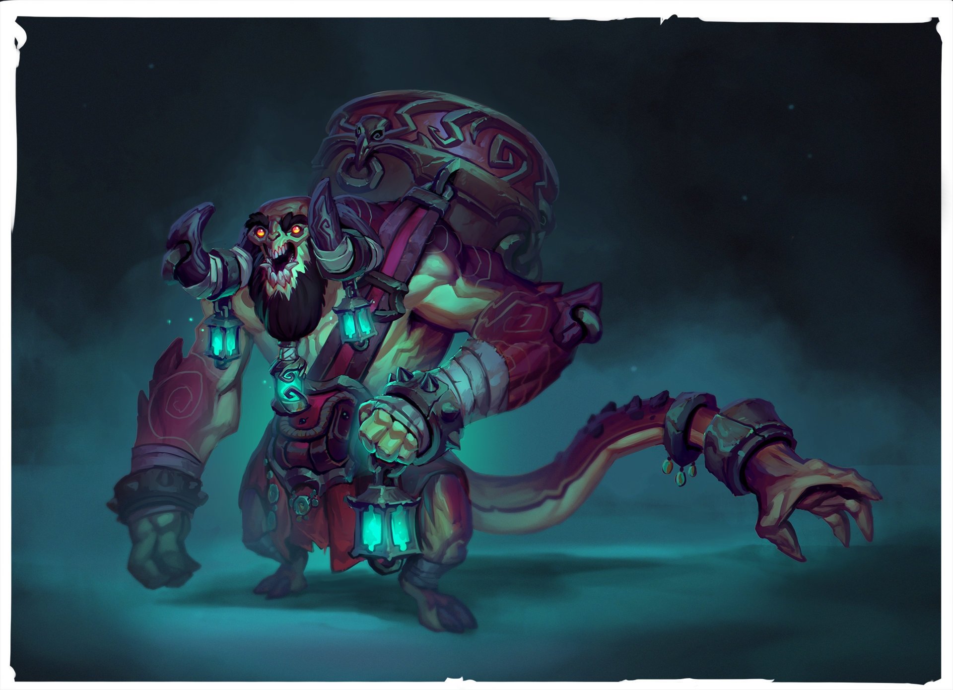
Thanks mr.Moose, made the changes based on your comment. Although I didn't go all the way to how thin the arms are in the concept, I will revisit! Added a bunch more stuff, and started on his drum thingy.
Alright, one more update, did some details all around still a lot left though. Also scaled down the hands a bit more. Any feedback is welcome as always
this looks awesome! Only thing i noticed is his upper arm and back has some wonky anatomy, ill try to do a paintover later if youd like. Mainly the triceps and his rear deltoid.
@Tits ,@Ritualsynergy ,@Optinium: Thanks, I'm glad you like! @Sabotage: I knew there were things wrong there but wasn't very sure what, so thank you for that very helpful paintover!
So here is my latest update, main addition is the tail and the new back anatomy(hope it works a bit better now), but worked on details all around.
Also some rough concepts for alternative "drum" prop, not sure if any can feel like they belong to him, if I don't start leaning towards anything specific, I'll leave it as it is now.
Looks great. One criticism, when I looked at the latest images, at a snap having the 3 lanterns around his head confused my eye a bit, which then had trouble settling anywhere else on the design. Part of me wants me to have his tail holding one lantern (at a glance it's hard to see it's a hand, but with it holding something I think that might help) and maybe another hanging off one of the tail braces whilst ditching the ones from the horns and beard (turning them into solid ornaments instead maybe?)
It turned out great, I really like the new placements of the lanterns. In my opinion though I think the rock on the ground is a bit too shiny, and the grass is not at the quality as the rest of the character. But that is just minor nitpicking, great job!
So good! I love everything about this piece. Maybe the tail could hold the lamp and it feels like he needs larger knuckles but whatever, this piece is amazing! great work.
Thank you Nuclear Angel, definitely the ground was just a quick put together because I didn't want him floating on air. Thanks littleclaude, I see your point Optinium suggested the lamp to be on his tail-hand as well, but the shift of focus didn't sit right with me for some reason. Knuckles went back and forth a bit, I made them bigger than the concept at the start and then scaled them down, in the end I left them smaller to not draw so much attention 'cause there is a lot of stuff going on and it felt a little too busy.
At the moment my eyes are drawn to the lanterns and I feel as if I should be paying attention to his face. His face however just is not as interesting, so I think either making the eyes brighter or the lanterns darker may compensate. Adding detail to his facial region such as glowing runes that he could breath/exhale out (he is a scribe) would be thematic and add another focal Que. He has red eyes but blue glowing lanterns, possibly making them the same color will help stop the focus from being split.
I would say the sculpt is my favorite part of the piece, balanced hard edges and soft, believable anatomy and not to busy with micro details.
Thank you guys @polygonmonster , @manilamerc ! Great crit @-DN- , that's very helpful, as you can see I cut down on the lanterns compared to the concept as @Optinium suggested I should probably have done some of the stuff you mentioned as well, busy designs like this read well in concept since you can tone in and out the details completely at will, but on 3d every detail is more solid and it may need to be left out.
How are you getting the blueish light in your sketchfab model? I have been playing with the emission maps but I'm not getting the light to work like that
I think you mean the bloom, from the post effects.
@GED, thanks man, I love this style as well, probably my favorite model so far. Baldi has a lot of stuff like this one, some awesome concepts if you like this style!
Replies
Only things that jump out at me is that his arms are a lot thinner than your current design, & The mouth needs to be smaller
Keep up the great work!
Although I didn't go all the way to how thin the arms are in the concept, I will revisit!
Added a bunch more stuff, and started on his drum thingy.
Also scaled down the hands a bit more.
Any feedback is welcome as always
Looking forward to see how this turns out!
@Sabotage: I knew there were things wrong there but wasn't very sure what, so thank you for that very helpful paintover!
So here is my latest update,
main addition is the tail and the new back anatomy(hope it works a bit better now), but worked on details all around.
Also some rough concepts for alternative "drum" prop, not sure if any can feel like they belong to him,
if I don't start leaning towards anything specific, I'll leave it as it is now.
Any input is appreciated
Also small update:
Also sketchfab.
See ArtStation for 3D and more shots!
definitely the ground was just a quick put together because I didn't want him floating on air.
Thanks littleclaude,
I see your point Optinium suggested the lamp to be on his tail-hand as well, but the shift of focus didn't sit right with me for some reason. Knuckles went back and forth a bit, I made them bigger than the concept at the start and then scaled them down, in the end I left them smaller to not draw so much attention 'cause there is a lot of stuff going on and it felt a little too busy.
At the moment my eyes are drawn to the lanterns and I feel as if I should be paying attention to his face. His face however just is not as interesting, so I think either making the eyes brighter or the lanterns darker may compensate. Adding detail to his facial region such as glowing runes that he could breath/exhale out (he is a scribe) would be thematic and add another focal Que. He has red eyes but blue glowing lanterns, possibly making them the same color will help stop the focus from being split.
I would say the sculpt is my favorite part of the piece, balanced hard edges and soft, believable anatomy and not to busy with micro details.
Well done.
Great crit @-DN- , that's very helpful, as you can see I cut down on the lanterns compared to the concept as @Optinium suggested I should probably have done some of the stuff you mentioned as well, busy designs like this read well in concept since you can tone in and out the details completely at will, but on 3d every detail is more solid and it may need to be left out.
@GED, thanks man, I love this style as well, probably my favorite model so far.
Baldi has a lot of stuff like this one, some awesome concepts if you like this style!