Previous monthly challenge
Hello there, as I'm currently studying 3D Art, I searched for previous art tests to improve myself.
This concept was given in the monthly noob challenge in february.
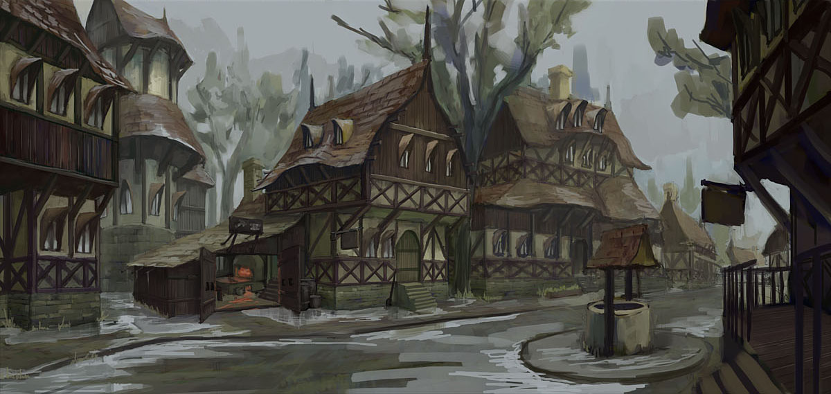
(Artist - Yuriy Georgiev / http://windmakerart.blogspot.com )
I decided keep it quite simple (concerning trianglecount and texturing).
This is what I got so far:
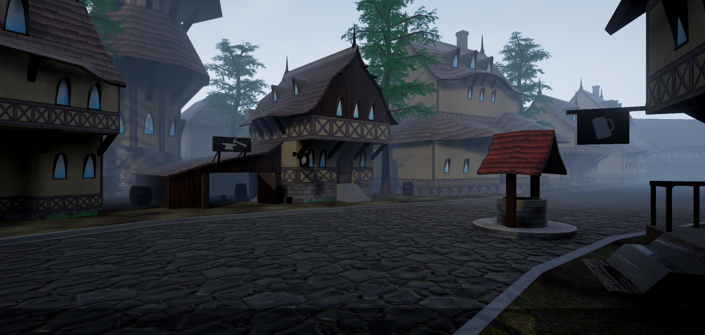
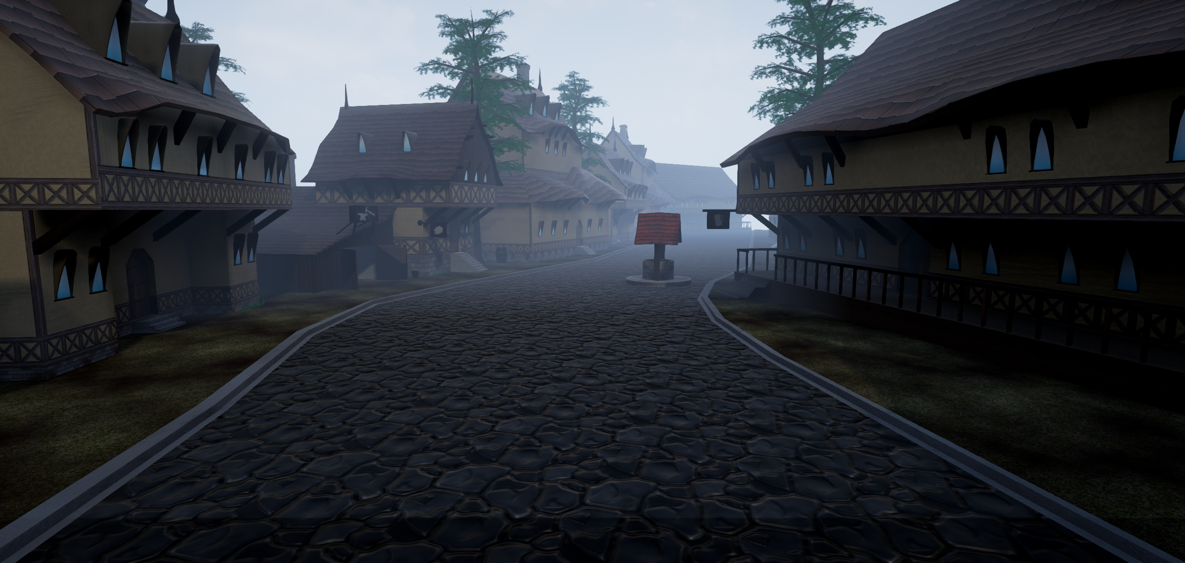
Most of the used textures are handpainted by myself, trying to achieve a semi-realistic-stylized art style.
Any critique is welcome, especially how to create the wet look.
This concept was given in the monthly noob challenge in february.

(Artist - Yuriy Georgiev / http://windmakerart.blogspot.com )
I decided keep it quite simple (concerning trianglecount and texturing).
This is what I got so far:


Most of the used textures are handpainted by myself, trying to achieve a semi-realistic-stylized art style.
Any critique is welcome, especially how to create the wet look.

Replies
I'm not sure if it's intentional to the style, but the well roof area is a little larger than the concept. Some of the buildings in the background also seem a little off scale, but maybe it's the camera's focal length? It's definitely coming along though!
For the wet look, have you tried playing around with any specular / metalness maps, or reflectivity? Do you use Photoshop for your textures, or is there another program you like to use?
I actually didn't try to copy it exactly as it is, then I would have made it a highpoly scene (but it is true nontheless, I didn't give too much attention to the exact measures).
Initially complete tileable textures were planned (using a greyscale map) on all models. I cancelled that due to complexity (more time-consuming) but it would have created better texture quality.
The camera's focal length is definitely an issue!
I tried to add a completely white specular map and metal values which didn't give the desired effect. Somehow the reflections are a bit off in general (e.g. the windows). I probably try some other changes tomorrow.
For the textures I actually like to use Mudbox besides Photoshop as I find the brushes easier to use. (Sometimes still some "posteffects" in PS)
I recreated the UVs (instead of unwrapping everything, I used the tiling of the box-UV-mapping). Saved a lot of time (as opposed to the other texturing) and texturesizes.
Something like clutter and a forge is still missing in the main building.
Criticism still welcome!
Textures are all handpainted. Fire made using a tutorial. The skybox is the standard asset of the Unreal Engine!
Do a barrel (cliche yes). A low poly barrel that is stylized, try to define your material, dont be afraid of using blue colors in where your indents are (never use pure black or white).. and most important, try to have fun with it!
As you said it was not finished (apart from the fact that such things are rarely "finished") and I could not stop working on it.
The most crucial part has been the wood of the houses. Added puddles to the street, rain and some other texture and model changes.
Lighting still not perfect and some minor foliage would probably add a lot to the scene.
The reflection in the puddles are sometimes a bit off.
And is rain in a rendering acceptable this way?
Edit: Forgot to post the "final" rendering: