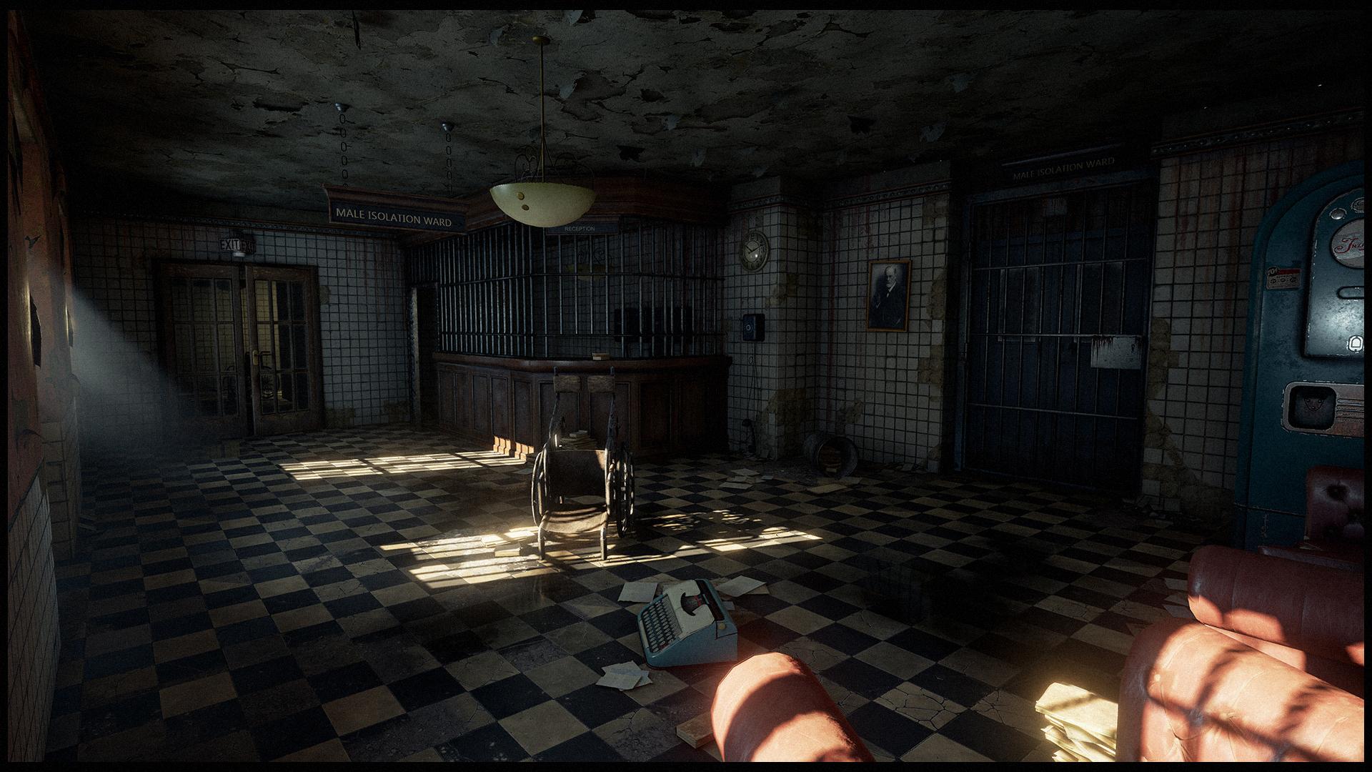
[UE4] Asylum Environment - Feedback plz
Last Update
========

=====================
I've been working on this asylum scene for a while now.
The original shot is based on a matte background from the game Abandoned: Chestnut Lodge Asylum. (Karpin)
Well I don't really know the original game, so I just went in and assumed what the rest of the room could look like.
Now I'm slowly losing my sanity and I could really use some feedback and tips on what could be done to take it further in pretty much every aspect

I also tried a daytime version.


========

=====================
I've been working on this asylum scene for a while now.
The original shot is based on a matte background from the game Abandoned: Chestnut Lodge Asylum. (Karpin)
Well I don't really know the original game, so I just went in and assumed what the rest of the room could look like.
Now I'm slowly losing my sanity and I could really use some feedback and tips on what could be done to take it further in pretty much every aspect

I also tried a daytime version.


Replies
If I had to say what you could do to improve it, I'd say push matching the inspiration as much as possible. Really get that dirt, rust and general damage popping. One thing I noticed is that room in the original is so dirty and damaged that there's hardly a spot that's unaffected or clean enough to reflect anything (apart from the puddles), while your version has much more shiny surfaces. Things to focus on would be the dirt on the floor and the rust on the metal bars. Getting the cool rust trails on the wall on the right side of the original image would be nice too. Get that variation in roughness going.
Out of the two lighting types, I'd say I prefer the daytime version as the bloom from light hitting the various surfaces looks great!
The problem here is that it pushes a lot of your lovely room into darkness and you lose a lot of that great detail.
Maybe a lot more clutter and broken bits of tiles swept up against the walls would help bring some more of the interest back here.
In terms of lighting, it'd be worth looking through different interior concept art images to see how other artists have been able to give the impression of a bright daylight outside while still maintaining detail inside, as it's very easy for a scene to become too dark.
It's looking good so far, keep up the awesome work!
Regarding the rust and all.. yeah in the concept he has that painted metal / rust texture that's on top but I felt it didn't work so well so I relied on localized rust mostly. (ambient occlusion/curvature mask) His version is also painted, while mine is bare.. but that was more of a choice. I'll play around with it some more.
There's a lot of dirt on the ground.. cigarette stumps and what not.. I'll try to get some more of that in and improve the wall-decals.
And I'll see what I can do with lighting and composition.
May i ask you something about your floor texture ? The small hanging parts of stucco, are these meshes, a simple normal effect or even a parralx mapping effect ?
Those are just a few tiny planes with the same texture placed there.. they don't even line up so well atm.
As for ways to improve it, I think I would probably recommend a little more focused environmental storytelling. What I mean is that some of the details don't have a very clear cause and effect and you could capitalize on that. For example, where is the water coming from? If it is welling up from the floor there could be more buckling of the linoleum. Dripping from the ceiling? Maybe a moldy patch and a bit of a sag. Maybe leaking from the radiator or refrigerator?
You have such a solid environment going, even little things like disconnecting one of the chains on the "Male Isolation Ward" sign to leave it dangling would help. Call it icing on an already delicious cake
Nice! - CJ
The wet mark on the floor looks more like a fresh spraypaint rather than a puddle
There's still a lot of stuff that could be done better, but I guess I'd rather start fresh and do things better with the next one.
But please point out anything that's on your mind and I'll still go and fix it during the holidays. (really need to change those lazy ceiling pieces.. like.. now)
It's all pretty much standard I think.
There's a static directional light with almost standard settings.. apart from the indirect intensity of 2.0.
Then there's a skylight and a point light (without shadows) to set the black level.
I included the current World Settings for Lightmass below.
Here's a look at the setup for the windows.
The sunlight is mainly cast by the directional light, but that's hardly enough to light the room.
So there's a (sky-colored) spotlight, that casts against a white plane to get all the bounces starting with the 2nd. (Koola's Archviz & Clinton Crumpler used that)
This one uses the inverse-squared falloff, so there's another, weaker spotlight to light up the entire room.
And then there's another point light just to get some warm color to the immediate window area.
The bloom is mostly due to post processing (exposure), so the other lights had to be "weaker" than the sunlight.
I didn't really do too much optimization on lighting since I was mostly going for the end result -> picture, but I understand what you guys are pointing out here. I can't really tell you the build time on max.. but I think it's somewhere between 15 and 30 minutes.
@FreneticPonies thanks for the advice! I do have the bounces at 100 currently
One question how did you do the floating dust particles near the windows?
Then there's a simple particle system for the smaller floating particles. I even used one of the standard assets as a texture (T_Dust_Particle). Oh and there's another cloudy dust particle system.
https://forums.unrealengine.com/showthread.php?88952-Lets-make-Lightmass-EPIC-(and-understandable)&p=410965&viewfull=1#post410965
DanielW is working on something called light portals:
Especially when looking at the render times he mentioned.