Formula Future - WIP
I'm currently in my last year of university and for my final year assignment I will be creating a concept model of how a Formula One car may look in 10 – 20 years time. Using reference images of current and past Formula One Cars as well as any images of future concepts. Part of this assignment requires me to have critique from industry forums, so any and all critique you may have will be appreciated!
I have already established an Imgur album full of reference images I have gathered, this will be updated as I find new content that is suitable for the project. In the album there are included images of current spec Formula one cars, screen shots and vehicle designs from Wipe out, birds, planes and different aerodynamic shapes.

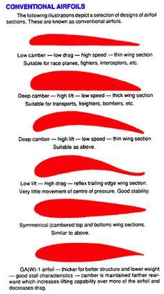
I have been looking into aero-foil designs as a formula one car is basically an upside down aeroplane in terms of aerodynamics, everything is just flipped to provide down-force instead of lift. The above image demonstrates what wing designs provide the most lift and speed, so I will be incorporating this into my car designs. Using the references I have already designed the front and rear wing of the car.

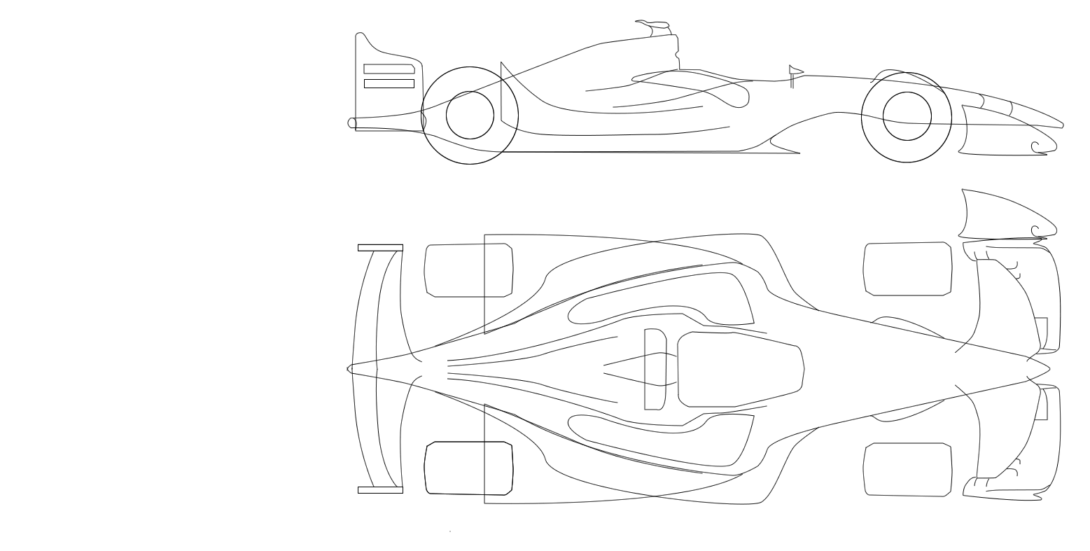
Using these I produced the first of my blueprint concept drawings.
My Lecturer and Project Supervisor suggested that the section where the body of the car blends into the nose was to wide and needed to be skinnier for aero-dynamics. He also pointed out that "Curves doesn't make it futuristic" when referring to the rear wing, so that was made slightly bigger and squared off.
As well as this the FIA are currently planning on introducing closed cockpits to their future car designs. So I have incorporated this into my design, I feel that the canopy will have a small grove running through the centre of it. This (in theory) would help to channel air into the intake that is located just above the drivers head.

Taking that feed back I went on to finalising the blueprint designs.
However these Blueprints don't show what I plan to do with the tires, also I have gathered a couple of images that also show of the suspension. The following images are taking from Drive - by Scott Robertson, Daniel Gardener, and Annis Naeem


I really like the way the suspension makes up the wheel rim and would like to implement this into the design.
Next I decided to have a look at wheel designs.


I think for my wheel design they will have a closed front, which would help with the cars aero-dynamics. I especially like the second image which has a heavy curve to it with a small rim profile, however the blue accent is to "Tron" so that won't be included.
Almost done I promise.
Next I started to think about what livery I should do. The livery will be based on the current top teams in formula one as there are the teams most likely to still be competing in 10 to 20 years time. Those teams are Ferrari, Mercedes, Williams, Red Bull, Toro Rosso, Force India and Suber. After looking at current designs I decided to go with a livery design for Ferrari as I find their use of red and white to be very visually striking and it is also the most identifiable livery. I then produced 5 of my own designs, and decided upon this design.
This design has the most contrast and is the best looking one, so this is the design that I will be using to texture the model.
And Finally
I have modelled some of the wheel designs that I like in order to get a feel for them. Yet to decide on which one I like the most. I think I may incorporate the two together and see how that works out.


Right I'm finally done. Sorry about this super long first post as I have already been working on the project for about a month now, so I already had a bit of content to show. Once again any and all critique will be appreciated and I hope that you will enjoy my future posts.
I have already established an Imgur album full of reference images I have gathered, this will be updated as I find new content that is suitable for the project. In the album there are included images of current spec Formula one cars, screen shots and vehicle designs from Wipe out, birds, planes and different aerodynamic shapes.

I have been looking into aero-foil designs as a formula one car is basically an upside down aeroplane in terms of aerodynamics, everything is just flipped to provide down-force instead of lift. The above image demonstrates what wing designs provide the most lift and speed, so I will be incorporating this into my car designs. Using the references I have already designed the front and rear wing of the car.


Using these I produced the first of my blueprint concept drawings.

My Lecturer and Project Supervisor suggested that the section where the body of the car blends into the nose was to wide and needed to be skinnier for aero-dynamics. He also pointed out that "Curves doesn't make it futuristic" when referring to the rear wing, so that was made slightly bigger and squared off.
As well as this the FIA are currently planning on introducing closed cockpits to their future car designs. So I have incorporated this into my design, I feel that the canopy will have a small grove running through the centre of it. This (in theory) would help to channel air into the intake that is located just above the drivers head.

Taking that feed back I went on to finalising the blueprint designs.

However these Blueprints don't show what I plan to do with the tires, also I have gathered a couple of images that also show of the suspension. The following images are taking from Drive - by Scott Robertson, Daniel Gardener, and Annis Naeem


I really like the way the suspension makes up the wheel rim and would like to implement this into the design.
Next I decided to have a look at wheel designs.


I think for my wheel design they will have a closed front, which would help with the cars aero-dynamics. I especially like the second image which has a heavy curve to it with a small rim profile, however the blue accent is to "Tron" so that won't be included.
Almost done I promise.
Next I started to think about what livery I should do. The livery will be based on the current top teams in formula one as there are the teams most likely to still be competing in 10 to 20 years time. Those teams are Ferrari, Mercedes, Williams, Red Bull, Toro Rosso, Force India and Suber. After looking at current designs I decided to go with a livery design for Ferrari as I find their use of red and white to be very visually striking and it is also the most identifiable livery. I then produced 5 of my own designs, and decided upon this design.

This design has the most contrast and is the best looking one, so this is the design that I will be using to texture the model.
And Finally
I have modelled some of the wheel designs that I like in order to get a feel for them. Yet to decide on which one I like the most. I think I may incorporate the two together and see how that works out.


Right I'm finally done. Sorry about this super long first post as I have already been working on the project for about a month now, so I already had a bit of content to show. Once again any and all critique will be appreciated and I hope that you will enjoy my future posts.

Replies
I love the idea and concept of a futuristic F1 car that is really cool!
I feel that your design is playing a bit safe, i feel you could push it a bit more. The wheels are very interesting, I'm curious to see how you will pull this off and make it feel and look real. I think your rear tire in your concept are to narrow i feel a wider set of tires would make more sense especially if you increasing torque and horse power you will want that extra rubber to grab the pavement.
For you model its really hard to see what is going on.
The wheel on the right does not look mechanical at all....i dont see how this is a mechanical system it all looks too "soft". These shapes don't mimic the concept images very well, those shapes feel narrower and less flowing and more angular. I don't know how hard core you want to stick to the prototype vehicles but thier suspension sticks more to the outer edges and don't really venture into the center of the wheel like yours do.
The wheel on the left i think you could push it in more and you need to add the second lip to distinguish between the wheel and the axel
Your lighting and material set up needs work so that we can see the detail on mesh, as it stands now its really hard to see any of the mesh detail that you have included on these models.
If you are working in max open your material editor
and just up the spec to 80 and i prefer to darken the color
throw a spot light in there and an angle
in your render window click on the render mode it should say (shaded or realistic) should be to the right of your camera angle (perspective or camera 1...etc)
if its not already change it to realistic
then scroll down the list to lighting and shadows and make sure that illuminate with scene lights, shadows and ambient occlusion are checked
click back into your render window and let the AO settle and then take a screen shot
I hope this helps man! Keep up the good work i can not wait to see more of this project!
The wheel concepts were always subject to change, but you're right the suspension wouldn't be as centred as they are now but that is something I will address when it comes to fitting them onto the full model.
When following you're materials and lighting this is what my view port decided to produce.
So I did a quick render and it looks a lot better!
For the high poly I am using the double turbo smooth method: one modifier smoothing by smoothing groups and the other just using 2 iterations.
and about the lighting it looks like you have some weird things going on in that scene, your light looks like its at a very sharp angle which is why your getting those hard shadows
If your going to use the back drop here is what i use, don't worry i've included images this time
make sure your realistic settings match these
change your material settings to these and add a skylight
itll look like this but dont worry let it rest for a few seconds and....
voila it'll turn into this
I hope this helps man, keep up the good work!
Also I had the same set up
What other lights do you have in the scene?
it looks like you have some form of directional light in the scene judging by the shadows
And there's only a spot light in there like you said...
I've also rendered out a couple of other views for critique.
I do like the sharp edge down the centre, its striking. Although I do need to sort out the smoothing groups that are in the yellow circle, also the section in the square is meant to look like that as it would be a support for the out side of the wing.
if you could get some more ao into your renders it would help to see some of the mesh detail.
I agree that they plug into the support structure in the wing, but what does not look right is the fact that it just mashed in there, it just looks odd.
I am interested to see where you do with the body
Also when I show off wire frames would you prefer to see it with or with out the turbo-smooth modifiers?
I feel like th upper fin of your front arrow feels "floppy" I think it needs some hard edges to define its shape. I also feel the inner corner of the front arrow needs a hard edge right now it sorta Blends into the bottom. I think it's a good start on the front nose area (the 2nd image you posted) although on both of these I'd almost expect like screw holes or like panel lines just to give the pieces more character.
Forgot to post this last night. I have already started to implement seams between the body and the nose of the car. I will be going through adding screws and other joins when the bulk of the model is done
He also agreed with you about the turbosmoothing and suggested only using it as a "This is what my base geometry should look like".
So I decided to make them smaller and they look a lot better.
However I wasn't happy with the shape so decided to flip them to see how that looks.
Still unsure if I like this, I might end up just removing them or changing there placement.
As an artist I would make aero parts translucent to demonstrate that flexing effect. There could be structure on the inside. Looks pretty cool in my head.
Pretty please with these and currently the nose makes up 1,606 polys of my 60,000 poly limit.
The current Lowpoly count is 11,442
I could possibly cut down some more polys but as current gen car games have poly counts of 60,000 polys per car for ps4, and xbox one and over 200,000 for PC, there wouldn't be much point.