It starts May 12, and ends Oct 17. Let's see what you got!
https://polycount.com/discussion/237047/the-brawl²-tournament
The Environment Art of Halo 4

Do we ever have a treat for you. Some members of the amazingly talented environment art team over at 343 Industries have put together an article on creating the environment art for one of the largest releases in video game history - Halo 4. This article was written by the artists at 343 Industries - not us - specifically for Polycount. So, without further ado, may you have your inspiration folders open and your minds ready as Halo 4 Senior Art Director Kenneth Scott takes it away on this multi-page article, 'The Environment Art of Halo 4'.
THE ENVIRONMENT ART OF HALO 4
What you’re about to read is a very generous peek into the work of some of the Game Industry's strongest Environment Creators doing what they do best: Dropping Jaws and Melting Faces. Some protective gear is recommended. Please observe all emergency exits. We cannot be responsible for any messes that occur, or any injuries sustained through wild head turns and furious image saving.
We had some enormous challenges; Building a new team from nothing, charging through the growing pains of a new studio, wrestling with unfamiliar and unsupported technology, learning to work together for the first time, and taking over a beloved universe and all the world wide scrutiny that came with it. Any one of these things would have crippled a normal studio. Not us. We took our share of bruises, but we stepped over the finish line 'better, faster, stronger' than a decade of normal development would have awarded us.
The environment team, on top of simply making great imagery, also took on the role of storytellers. It doesn't just show, it feels. Engaging the goopy, sloppiest part of the players parietal lobes and making the universe a reality, immersing the player in a deep felt experience. The art is emotional, it resonates with story and imagination, it silently speaks to you.
This is art focused, but salutes need to be thrown at the talented teams who fought dragons and the laws of physics to squeeze out more polygons and pixels, who gave us every technical advantage possible, who held our hair back when it was too much. The Xbox didn't know what hit it.
This team is not made of Steel. It's made of the crazy strong shit you hire to hunt Steel when Steel messes up and needs to be returned to Steel Justice.
You can probably tell - I'm very proud of this team.
Kenneth Scott, Senior Art Director
UNSC - A FUNCTIONAL AESTHETIC
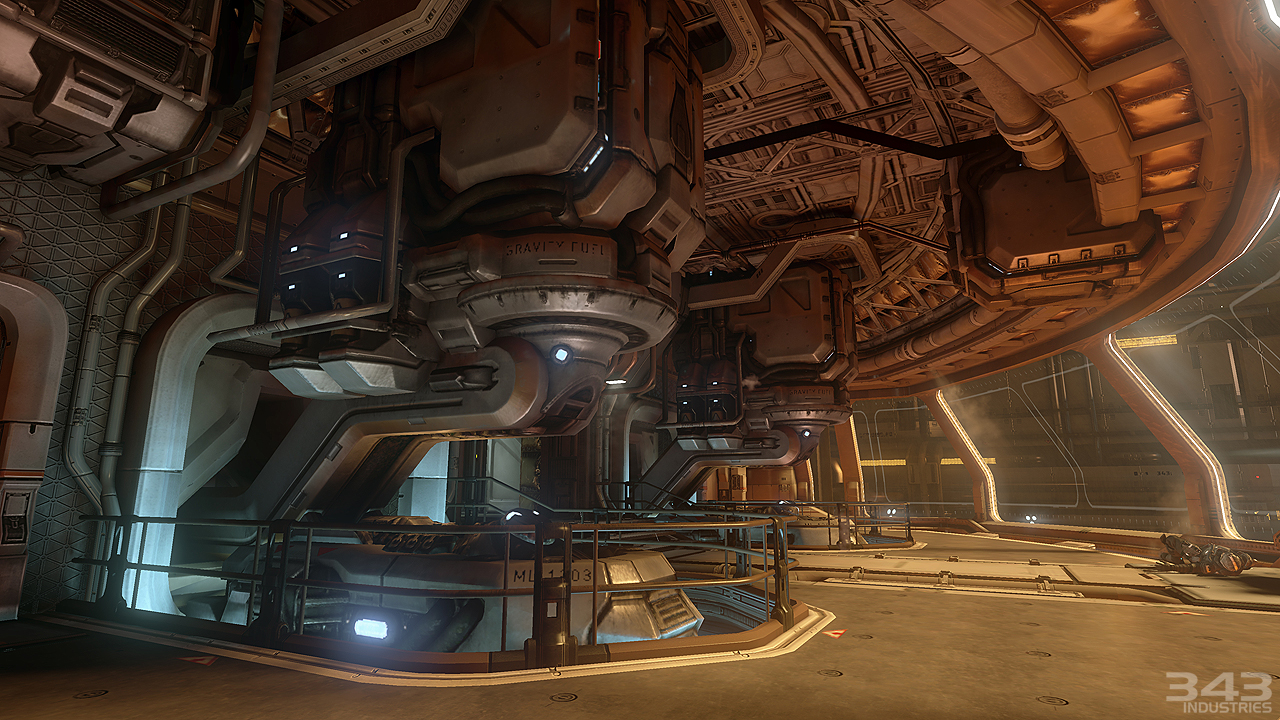
 For the first mission of the game the general theme of the industrial design was “space submarine.” We wanted to achieve a functional aesthetic for the UNSC environments. After the catastrophic damage sustained to the Forward Unto Dawn at the end of Halo 3, and after floating in outer space for over three years, the majority of the remains of the ship were left a frozen, shattered hulk. For the mission itself we wanted it to be cold and claustrophobic; piles of frost have accumulated in the cryogenics section of the ship; ceilings have caved in and some areas of the ship have lost atmospheric pressure. The environments would also get progressively more damaged as the ship was sucked into the forerunner planet Requiem. The cool color palette would give way to warmer tones as the events of the mission increased in intensity, culminating in an exciting start to the rest of the campaign.
Paul Pepera, Lead Mission Artist
We put a big emphasis on a high poly workflow for the hard surface assets. Artists would model or sculpt out the high resolution meshes and rip the normal map and ambient occlusion information from them. The normal tangent space of the engine was synced to that of Maya which allowed the environment team to construct less expensive game res models while preserving a clean normal map bake in the final result.
Paul Pepera, Lead Mission Artist
The majority of the game was lit statically using a baked-in lightmap method. This static lighting solution allowed us to achieve very realistic lighting results with full global illumination and ambient occlusion. A specular term extracted from baked spherical harmonics helped bring out the forms in the modeling work and added a great deal of depth of the lighting. A final color grading pass allowed the art director great control in determining the final look and feel of the game.
Paul Pepera, Lead Mission Artist
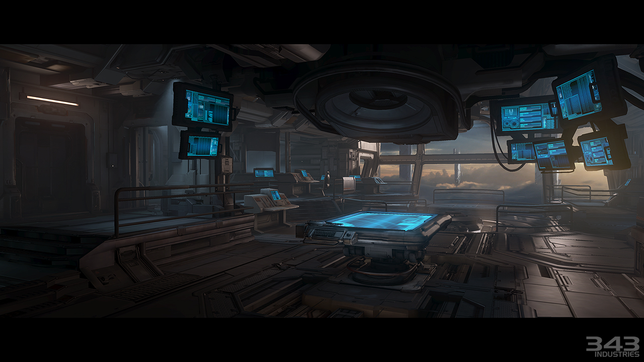
 Composer, the seventh mission in Halo 4, revels in classic science fiction with a space station built into a giant asteroid from a ruined planet. Sparth brought a fresh visual design to our structures while grounding his concepts in the disciplined functionality seen on NASA spacecraft. The surrounding rock influences the manmade structures by being both a benefit and a hindrance. A delicate foil lined hall may have a rock jutting into the play space because it would be too difficult to excavate but in another section the asteroid provides structural support.
Adam Peterson, Lead Mission Artist

 The lighting in Halo 4 needed to be very diverse – it needed to be epic and also guide the player in such a way that the player never got lost. We used light in many ways, mainly to portray feelings and to serve the needs of game play. Halo has a very distinct look that we could not stray from too much. The most difficult thing lighting-wise was to make the environment feel immense and vast; in one mission you might be flying around in a space ship and in another you might be running around in the lush jungle. The rendering system needed to be flexible enough to accommodate a wide variety of situations. We also used a lot of image based lighting to make everything fit better together and also to ground scenes. In multiplayer, the lighting is very different than that of the campaign because the lighting needs to balance in such a way that no side gets an advantage. One challenging part of lighting multiplayer is that most of the maps are mirrored but still needed to look very different. The character lighting is also very important throughout the whole game. We used every trick in the book for the cinematic lighting in this game - basically every shot is a hero shot.
Kenny Magnusson, Lead Lighting Artist
 Complex is one of the War Games maps. In order to run the game smoothly, War Games maps are restricted by limited memory and performance budgets – a single 1024×1024 lightmap was used for the entire map; no dynamic lights could be used. Therefore, lightmap optimization was an important process needed to retain good lighting quality. Some meshes were set to a higher lightmap resolution priority to allow for better shadow quality while others were flagged as per-vertex lighting. Another challenge lighting PVP maps was to ensure good visibility of the environment and characters for game play reasons, while at the same time create contrast and atmosphere for a good visual presentation. We used proper camera exposure settings to have fine balance between dark and light, and independent character lighting controls to maintain the visibilities of your teammates or enemies.
Rae Chen, Senior Environment Artist
Knowing what the cameras are is a great advantage to the cinematics environment artist, who can set-dress accordingly. Objects in the foreground can have more polygon density, and the artist is able to concentrate the polish on defined areas. Most importantly, an artist is able to better shape the overall composition per shot.
However, there’s a catch-- a good cinematics environment needs to fade into the background, serving as a platform for the characters to shine. It is important for the environment artist to realize this, and allow the focus of the cinematic to remain on the story, the characters, and their actions. This downplaying of the environment is usually accomplished by being careful with the amount and location of geometric details, shot composition, screen post process, and most importantly, lighting. Cinematics environments are often lit dimmer than their gameplay counterparts, allowing the audience’s focus to remain locked on the characters.
Gustavo Rasche, Lead Cinematic Environment Artist
Next Page: Forerunner - Math in the Madness
FORERUNNER - MATH IN THE MADNESS
 The forerunner aesthetic was both ambiguous and epic in scale. Ambiguity was used to communicate how advanced and ancient the forerunner civilization was. This also allowed the environment team to play with scale. Small rooms give way to huge atriums and huge pits fall seemingly without end into the planet. Such variety in scale helped create a sense of wonder and mystery for the player while also creating a compelling visual pace to the imagery. It also served a technical requirement of allowing the engine to stream in large portions of the mission while unloading previous areas out of memory. These smaller transition spaces allowed us to create a relatively seamless experience across a mission as the map would be loaded behind the scenes without the player noticing.
Paul Pepera, Lead Mission Artist
 Cauldron is one of a few maps specifically made for the Halo 4 Spartan Ops story branch. The challenge behind making these Spartan Ops maps was that we needed to create a single multiplayer map, with no streaming support, to encompass numerous missions without the player feeling like they were always in the exact same map. The best way we found to combat this potential repetitive feel was to create different visual sections of the map. All the sections shared many of the same assets, but each one had its own “vibe” which was accomplished by changing the lighting, FX, and scale of the area. In Cauldron we had three distinct, yet similar, areas. First, the upper plateau area that was greener and reveals a wide open picturesque vista shot. Second, the largest section in the middle of the map contains the large lava river and forerunner bridge. This area was broken into even more smaller visually unique sections or “call outs.” And finally we had the claustrophobic lava rock ravine, where we really played up the dangerous feel of lava with dramatic lighting and FX.
Justin Dinges, Senior Environment Artist
 One thing we included in our forerunner aesthetic was the concept of gravity defying architecture. Huge pillars and platforms levitate in the air suspended by mysterious forerunner technology. This concept of floating architecture allowed us to construct environments that would otherwise be impossible with a more traditional set of physical rules. Interesting gameplay encounters were also crafted to take advantage of floating set pieces resulting in some of the more memorable parts of the game.
Paul Pepera, Lead Mission Artist
 For Midnight, the final level in Halo 4, there were two big beats. The first beat was a race across the surface of the Didact’s giant ship. For reasons which are probably obvious, this area got nicknamed “The Trench.” The Trench ended up being over 30 real world miles long so the big challenge was figuring out how we were going to be able to build such a huge space while still creating visual interest and maintaining a high fun factor. We ended up creating a modular system which had the dual benefits of cutting down production time while also giving the mission designer a “lego” set that he could use when creating the layout of the level. The second and probably most important big beat for Midnight is the final confrontation with the Didact and his doomsday weapon, the Composer. A lot of things needed to happen in this area-- we needed to convey the emotional climax of the game; we needed a gameplay experience that felt like a satisfying final fight; and finally we needed an appropriately epic spectacle with which to finish the campaign. The area was an exercise in extreme collaboration-- just about every possible discipline worked simultaneously on the area to create a suitably memorable conclusion to the Halo 4 campaign.
Wade Mulhern , Lead Mission Artist
The Forerunner exterior in Shutdown is the largest playable space in the game, but has one of the smallest environment memory and performance budgets. The reason for this was to afford resources required for non-linear progression. With the exception of the terrain, the entire environment is built from low-res geometry with ~10 tileable textures (two or three per spire, one for the ground structures, one for the lights, one for the ceiling, and a couple for the landing areas). The spires needed to strike a balance between distinct, bold shapes and smaller, busier details. The scale of the space was achieved by the details on the spires (such as the points of light) as well as the atmosphere and terrain painted by the Skybox team.
Chris Emond, Environment Artist
Next Page: Requiem - An Alien Terra
REQUIEM - AN ALIEN TERRA
Forerunner – The third level in Halo 4-- takes place at the center Haven, an artificially constructed planet. On a big scale, the most important part of the visual identity of this level was the feel of being in an “inverted” world. A world without a sky where everywhere the player looks he sees evidence of the Forerunner’s technological prowess. On a smaller scale, we were going for a mix of subterranean and Forerunner high tech or a “high tech cave”.
Wade Mulhern, Lead Mission Artist
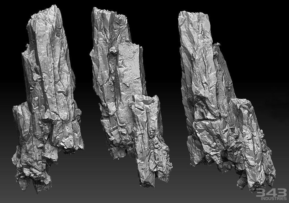
 Beyond the Forerunner elements, the vast majority of visual elements in the third level, Forerunner, consisted of rocks. We therefore created a large number of rock meshes, with varying shapes and sizes, in order to maximize flexibility in creating the landscape. In addition to developing variance in shapes, the metallic elements worked out in the materials introduced more diversity in the surface quality of the rocks.
Maintaining a consistent level of visual fidelity across all surfaces in the environment was one of the highest priorities we set for ourselves. In order to capture the large shapes Kenneth was looking for while being able to maintain sharp details on close inspection, we worked with one of our technical directors, Howard Coulby, to create new shaders for the level. In effect, his shaders allowed us to make materials that utilized a macro normal, accented by an edge/AO map, for the overall large form of the rocks, while tiling surface textures over the entire surface to maintain texel density
Ryan Peterson, Senior Environment Artist
For the Requiem, Reclaimer, and Ragnarok levels we went in knowing we’d have a very tight budget for environment art because of all the vehicles and characters. We had the Mammoth vehicle actually count as part of our landscape numbers in Reclaimer because it was just so massive. We had to plan accordingly and eke out a methodology that would allow these particular levels to stay on par visually with the others. We decided to rely heavily on a smallish set of elements (such as rocks and boulders), and prototyped this set with reusability and repetition in mind, knowing we’d be building up all these elements into larger shapes and silhouettes. The pieces themselves had to be ambiguous enough to allow for less-noticeable repetition, and that was a challenge. The other main challenge was the terrain and how vast and expansive it was going to need to be for these levels, especially when the Mammoth came in. The challenge here was similar- how do we make high-res terrain without blowing our budgets? Because of the multiple high vantage points the player would be viewing things (either on foot, from the third-person view of the Warthog and Ghost, from jetpacking, or riding on top of the Mammoth) we needed to have more visible detail and fidelity. The solution we chose involved using macro-normal maps which we sculpted manually from Mudbox, or procedurally from World Machine.
Vic DeLeon, Lead Mission Artist
The fourth mission of the game held the challenge of creating four different themes (Jungle, Caves, Wreckage, Infinity) within the budget and time constraints of a single campaign while maintaining the game’s high level of fidelity. We also did this with one of the smallest teams on Halo 4.
For the jungle portion we wanted as many unique elements as possible. This was achieved with a sculpted tiling normal map for the tree roots that was wrapped over the various low poly models created in Zbrush and wrapped around the terrain and set pieces. For better or worse, very little of the root system within the Jungle was instanced. This allowed us to give the area a truly hand crafted and unique feel. Most of our plants were contained on one texture sheet with several leaves that were paired together to create new plants quickly and efficiently.
Donnie Taylor, Senior Environment Artist
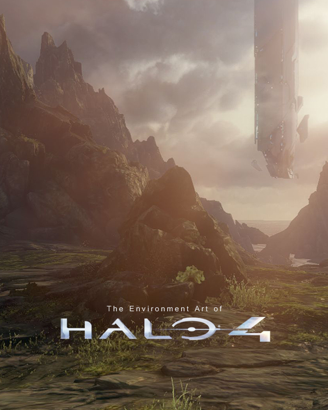
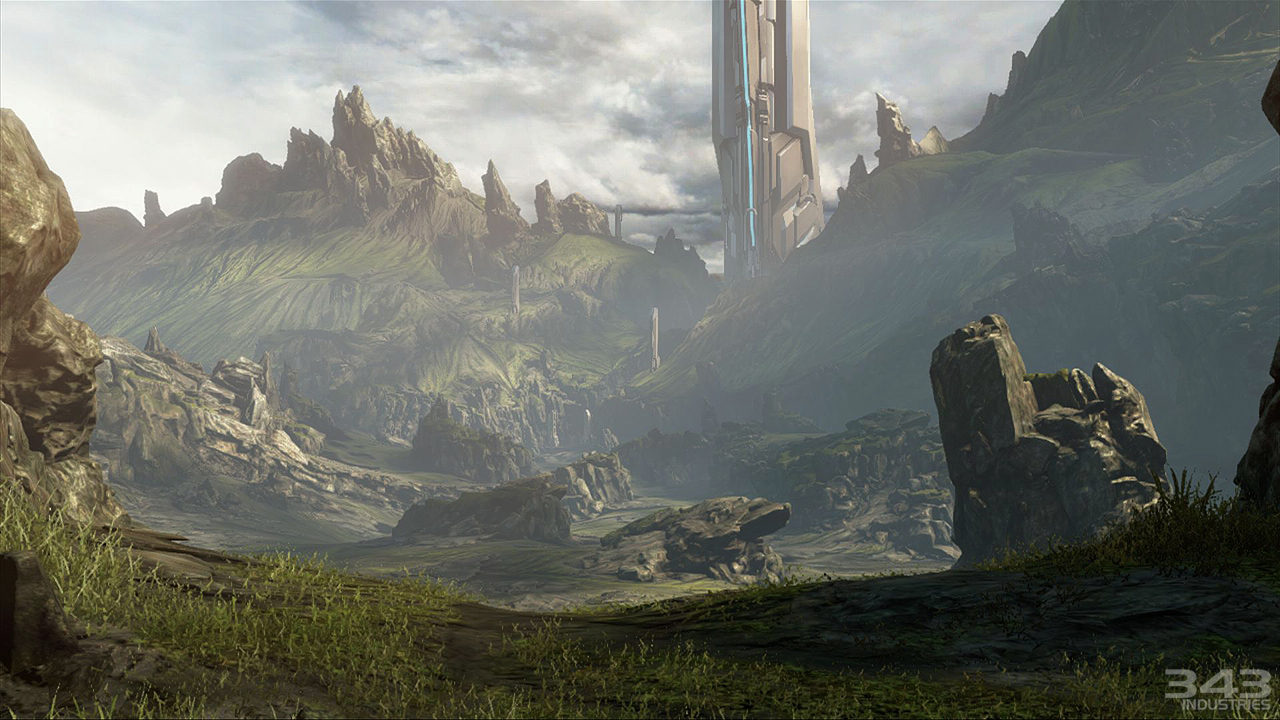
 Requiem, the second mission in Halo 4, is a kind of love letter to fans of previous Halo games giving them something familiar but at the same time exposing them to 343’s intense artistic focus that immerses like never before. Chief awakens amongst charred wreckage and is encouraged to explore this new world. Particular effort went into the Forerunner towers that Chief encounters early in the mission. It was vital to not only awe the player, but to also hint at the world’s still living nature with animated towers, light, and flowing water.
Adam Peterson, Lead Mission Artist





Replies
This is awesome !
would anyone be able to sum up how by using maya to construct models would be less expensive? would that be in comparison to max for example and to what extent would it be less expensive? if you guys could help me understand that a bit better I would very much appreciate it.
Thank you Polycount and 343!
Now I wish I had an x360!
@matt luxton: just taking a wild guess, I'd say they could keep their models with 1 smooth group and have the UVs less subdivided, because with the Normals matrix synced to the engine, there would be no chance of weird shadowing artifacts. In hard surface models and generally more extreme angles in the meshes, if you don't break the smooth groups and UVs you can have weird shadowing on the Normal Map.
Epic Games did the same thing between their engine and xNormal (or nDo, sorry I don't recall correctly), and was posted here recently.
I believe the "less expensive" part comes from less vertex calculations being done (each time you have an UV break or different smooth group, the vertex gets "duplicated"), and also less need to do Chamfers in the geometry to avoid those more extreme angles, thus saving on polycounts as well.
I'm sure someone who knows this stuff better than me will end up explaining it better. There was an entire thread on the forum about this as well.
343 Industries have really pushed game art on the Xbox to where it should be going.
Well done!
Also, thanks for the Blind skull mode... perfect for wallowing in all that visual goodness!
This a great article. This game is truly stunning. I am curious about this "specular term extracted from baked spherical harmonics." I looked up spherical harmonics, and I am not a math wiz (to put it kindly), so I am curious what this means? Are you saying you used spherical harmonics to bake out a geo based specular? I'd just like to know more about it. Thanks!