Doing More with Less Textures
Andrew 'dr1ver' Maximov has a great thread going about how to do more with procedural materials
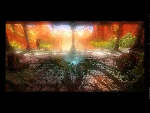
In his thread "The Desert" he covers some interesting ideas on how to blend materials together procedurally. These aren't your fathers procedural materials that stand out as a hallmark of the early days of 3D. Andrew is floating around some really good ideas that are actively practiced in popular games. Hopefully you understand this isn't some crazy "unlimited detail" kind of nonsense he is talking about but practical things that studios are doing that you should be paying attention to.
 https://www.youtube.com/watch?v=QtSbrIupviQ
In addition to the musings in the thread, you also need to check out his thoughts in "Ditching the Diffuse" . Which is about getting more mileage out of as few textures as possible. This is something that every studio wants to do without impacting the aesthetics of the game. If used correctly with a balanced approach it can drive some great aesthetics and great performance.
This topic wrestles with some of the core concerns that I see a lot of artists struggling with. How do you balance art and technology? They often get caught up in minute technical details and become blind to the larger aesthetics. The people who can walk this line are the ones worth keeping around.
Even if you are not into the technical details, he offers some good advice to all artists.
"The visual world around us is infinitely complex. All visual representative art is merely an approximation, comprised with the limited resources we have at our disposal. We can never have enough resources to recreate every single process that shapes the world around us, so trying to distill it to what makes reality feel real and feel beautiful is key in balancing the quality of your art with the amount time required to produce it. Another amazing example would be Robh Ruppel with the way he breaks down images to simple shapes and gradients to eventually come out with an almost photo-realistic image that actually reeks with “simplicity” when you just take a closer look."
Painting by Robh Ruppel.
Not only from a visual and technical stand point should you be thinking about just how much detail needs to be there, but it will also help to evaluate the workload. Which is another thing I think artists struggle with when they start working on on full scale projects and scenes. A large scale project can be a daunting task but I think that mostly comes from not being able to find the hand holds. It's hard to pick up heavy objects, but that task becomes a lot easier when you figure out how to grab it, which is why its important to keep the core visual themes in focus most of the time, it helps reveal those areas where you can best get a grip.
"... from an artistic standpoint, good lighting, fog and post processing greatly influence colors usually creating the broadest and most important strokes. You scene hardly ever is supposed to be about every little piece screaming for attention with a different color. Uniformity is good in a lot of ways and it is definitely not something to be fighting with a lot of the time."
As you obsess about pixels on a micro level, make the time to realize that you are painting with broad strokes and sweeping visual themes. Step back and realize the scope of the project and evaluate how much clutter you should be adding to the view. Make sure that whatever you add, is enforcing the core fundamental visual principles of the scene. The broad visuals deserve just as much attention if not more than the obsession with micro details.
As you look to do more with less keep some of these ideas in mind and try out some of the things d1ver talks about, they should help quite a bit.
It is also worth noting that Autodesk has started to incorporate this approach to 3dsmax as "Substance Materials".
You should also check out allegorithmic.com (which we have talked about before) for more tools to not only work with existing substance materials but also author your own. They have apps that help you tile bitmaps and turn them into substance materials. They also have a good explanation of what substance materials are and how you can use them, so check it out.
An interesting technique that I haven't seen too many people do is to create some high poly geometry, bake out some maps and turn them into substance materials and blend them together in various ways. This way you are not relying on texture sites or whatever else you can scavenge but you are creating some truly unique pieces that work well for you.
Related Links:


Replies
I just wanted to add that the materials used in the environment are up for grabs absolutely for free in the thread, so if you feel like giving it a spin yourself - feel free to do so.
I have only recently started realizing just how amazing a scene can look with very simplified assets, thanks to the magic of good lighting, post processing and smart design choices.
Anyways thanks for highlighting this article, I'm off to read now!