BRINK

Splash Damage, previously known for their Enemy Territory flavour of games, is set to release BRINK in the Spring of 2011. Splash Damage is promising a seamless single-player, co-op and multi-player experience with this title that allows the player to develop their character regardless of how and where they are playing. If you're familiar with Splash Damage's previous titles then this quick look at their method for allowing the player to choose their combat role should show you that they're taking that Enemy Territory style of multi-player and maturing it to a whole new level. And with the new freedom of movement system they've developed, BRINK, so far, is looking to be an experience all on its own.
But that's not with we're going to look at today. Today, we're going to take a brief look at the art and style of BRINK and what we know about it so far. And what we know about it so far is that Splash Damage looks to be cooking up a game whose art style, when compared to everything out there in this era of videogames, is understated when it's called 'refreshing'.
Kicking It With Art Direction
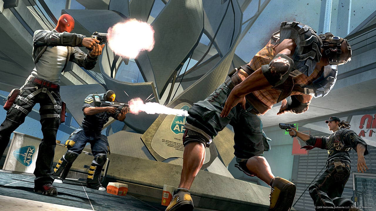
Exaggerated reality. This was what BRINK's Art Director, Olivier Leonardi, originally used to describe Brink's visual style. The game's take on reality is apparent. This is not a 'cartoony' game, and yet there are exaggerated proportions, bright colours and whimsical movement. So how does a developer take those 3 elements of style - which are normally mentioned along side a game of a cartoon style - and make it feel real?
Attention to detail.
And not just attention to detail, but polished details. It's this contrast that creates something that feels real all while being described using words saved for games like Ratchet & Clank or Team Fortress 2.
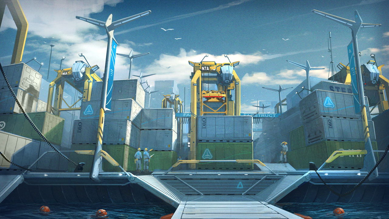
New or untouched environments are kept clean, simple, bright and overall 'positive' in feeling. Abused, ravaged, destroyed or desolate environments have scattered items, fractured materials and a colour palette that is borrowed from other games, yet saturated to fit the rest of the scene and the overall feeling of the world.
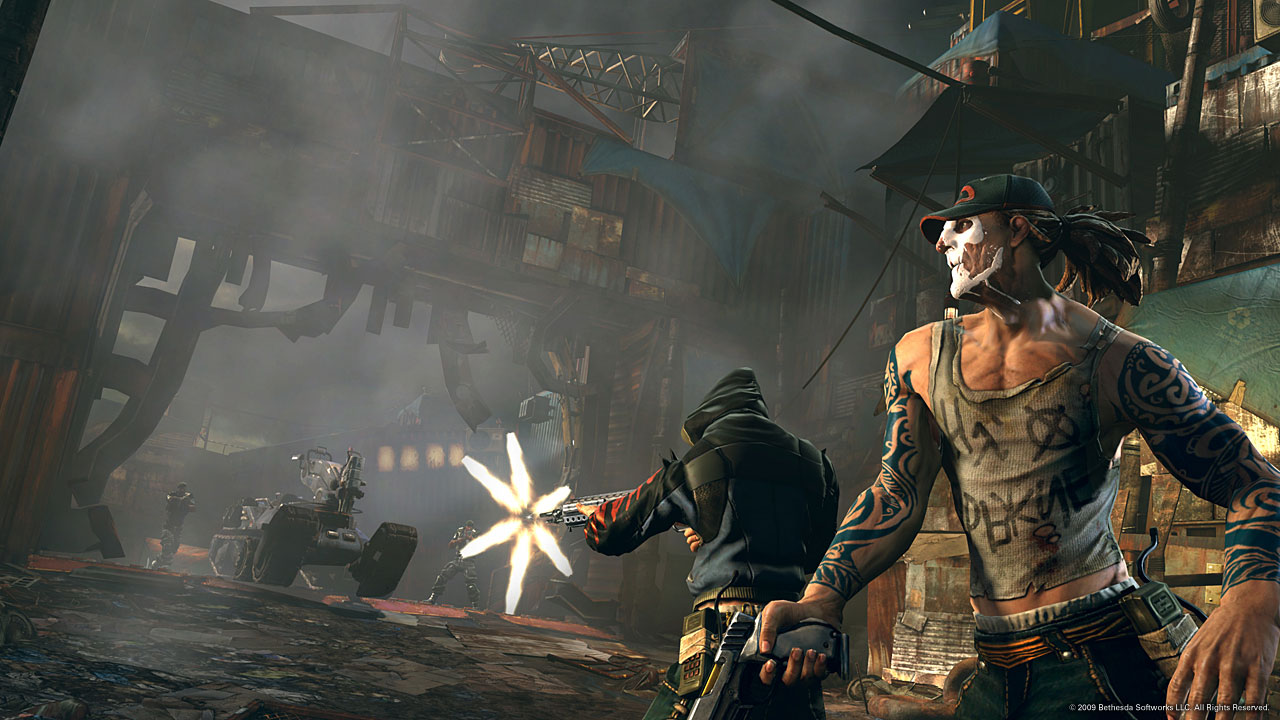
The characters, with their exaggerated proportions and godly feats of strength and manoeuvrability, still retain a familiar sense of realism to their design. The attention to detail found in the environment is applied to the characters; if anything, even more so. For such cartoony characters by definition, we still see veins in their arms, beads of sweat on their face, tears in their clothing, logos on their shirts, blood, cuts and bruises on their skin.
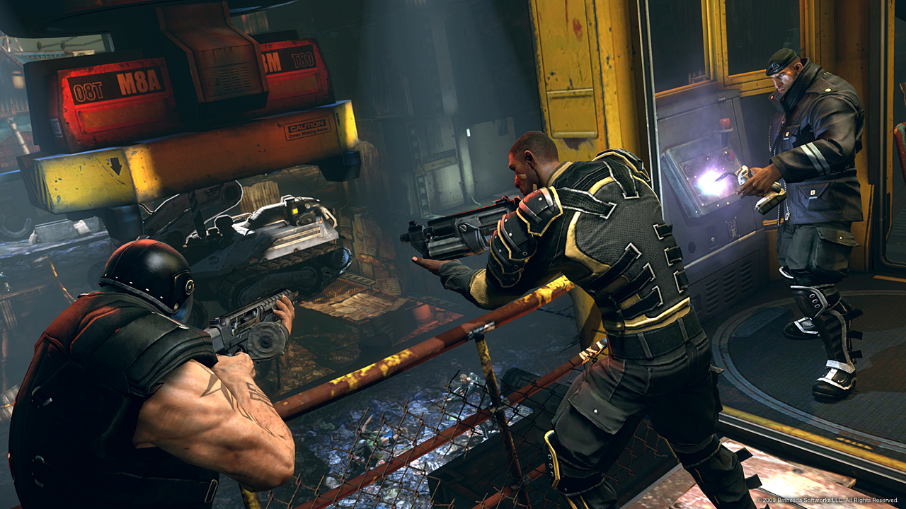
The anatomy itself isn't the only element that is exaggerated in proportion yet detailed like a realistic environment. The team looks to clothing items to exaggerate to unify this design choice all while selling the element of movement in the game. Cargo pockets, clothing stitches, creases in pants and shirts, zippers all find themselves at a scale larger than what we're use to in the real world, but somehow feel right when seen on the Ark, BRINK's world.
Setting The Tone
BRINK deliberately uses the colours found on the Ark to set the tone of the story or interaction that the player is experiencing. Creating these colours are the lighting, atmosphere and overall palette found in each environment. Since BRINK is about warring factions, each environment type pertaining to those factions must be created by distinctive sets of these elements all while being cohesive to the the game itself.
From what we can see of the world in BRINK so far, the Security faction has environments that feel structured, well kept, perhaps maintained over time and certainly intact. From what we can see in the game, these tend to be the 'positive' feeling environments mentioned before. Contrasting this are the Resistance environments which feel to be made from lesser parts, jury-rigged, dirty and overall unsafe in feeling. If the goal is to have the environment for these factions feel separate from one another, than polar opposites will certain do this. However, knowing Splash Damage's yearning to make BRINK a medley of approaches to creating distinct feelings we're sure the end result won't be so black and white.
Bring It On
As a gamer, BRINK had me at hurdling while shooting, tattoos everywhere, and badass-looking weapons. As an artist, BRINK has me extremely excited to see what this does to this industry when it drops. At this point, my only concern is that the game is as fun to play as it is to look at.
And as an editor for Polycount, BRINK makes me give a small smile to know that a large number of artists on BRINK are long-time members of Polycount: spacemonkey, Tully, MoP, osman_, katzeimsack, Wahlgren (and I'm sure a few others, too)! Inspiring work from you and the rest of the art team.
Related Links


Replies
Ok, I googled it and found out that they want to focus on the male characters first. Perhaps there will be a patch, DLC or expansion with female characters though