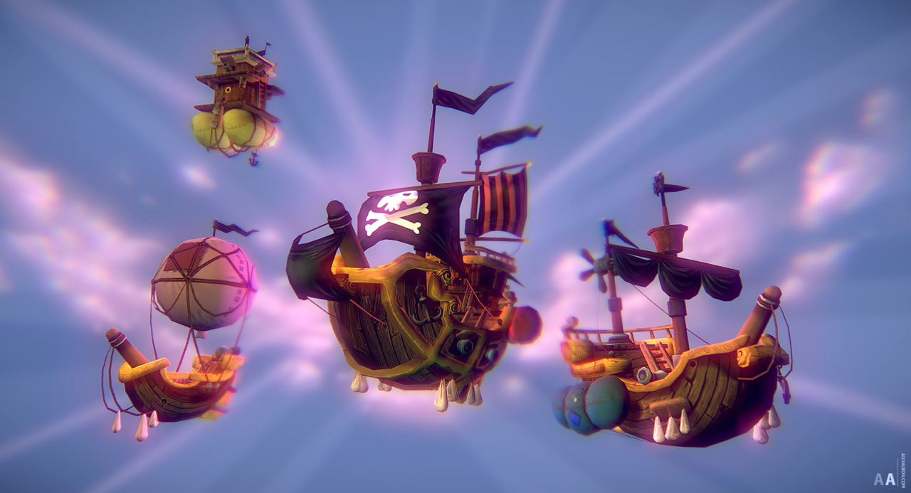
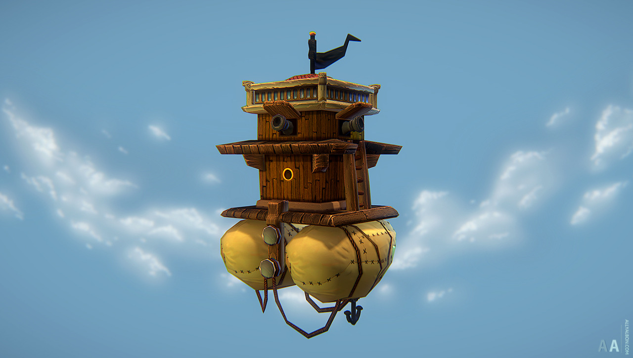
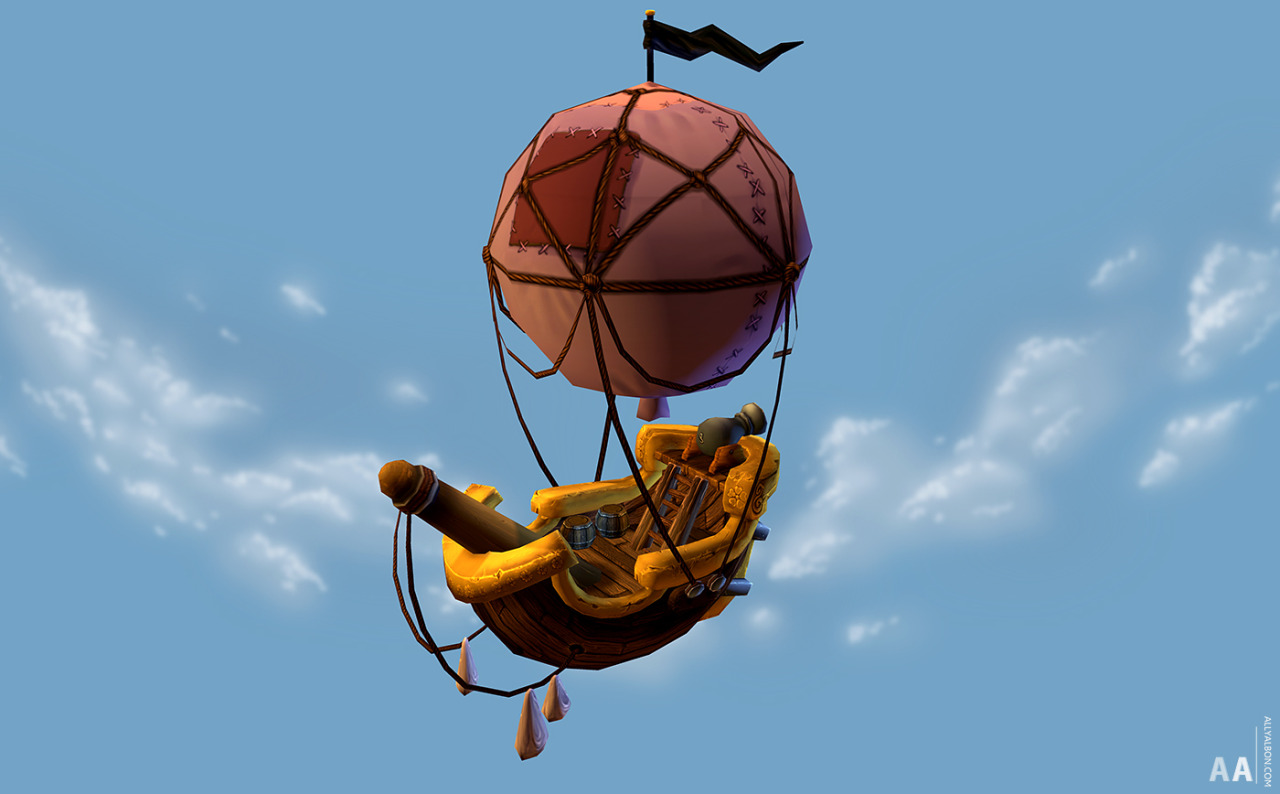
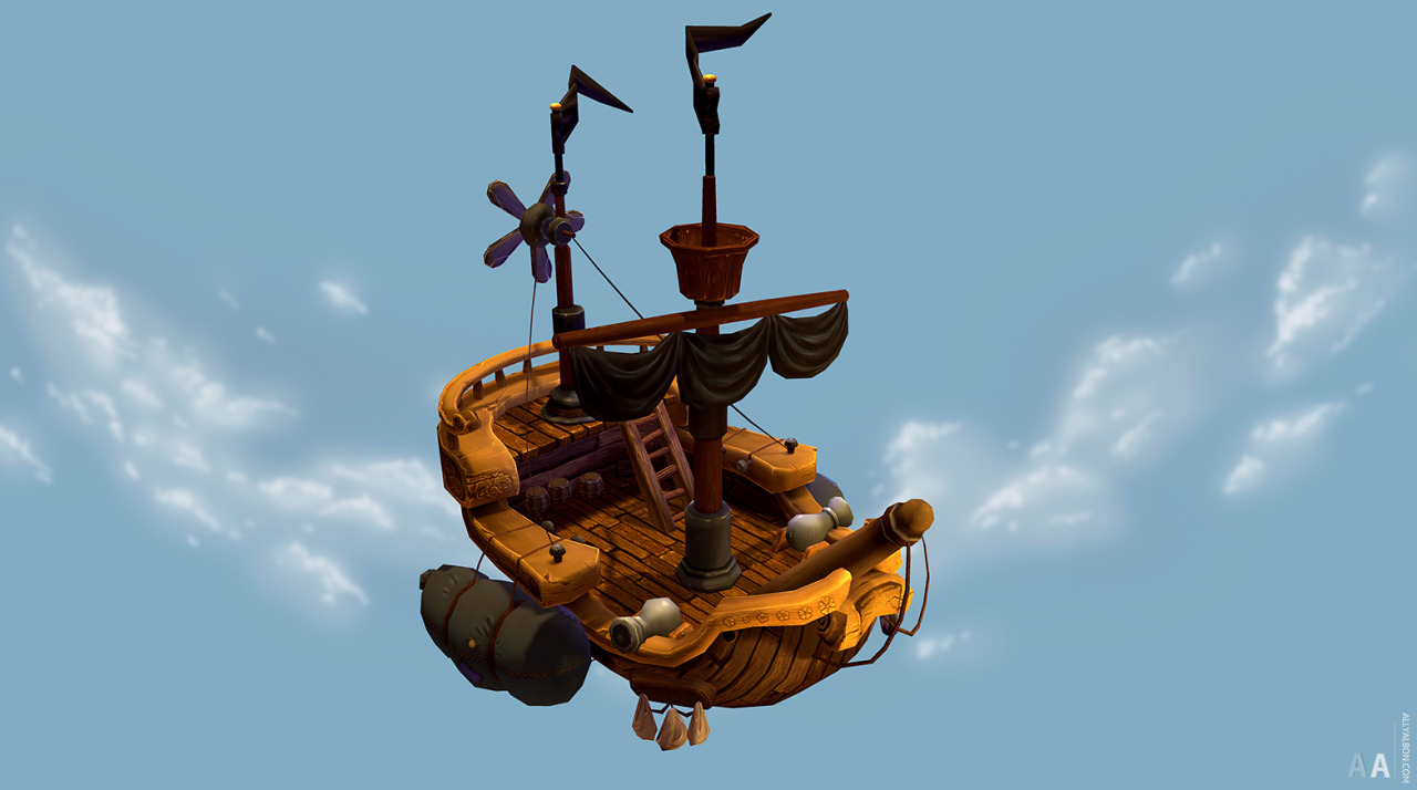
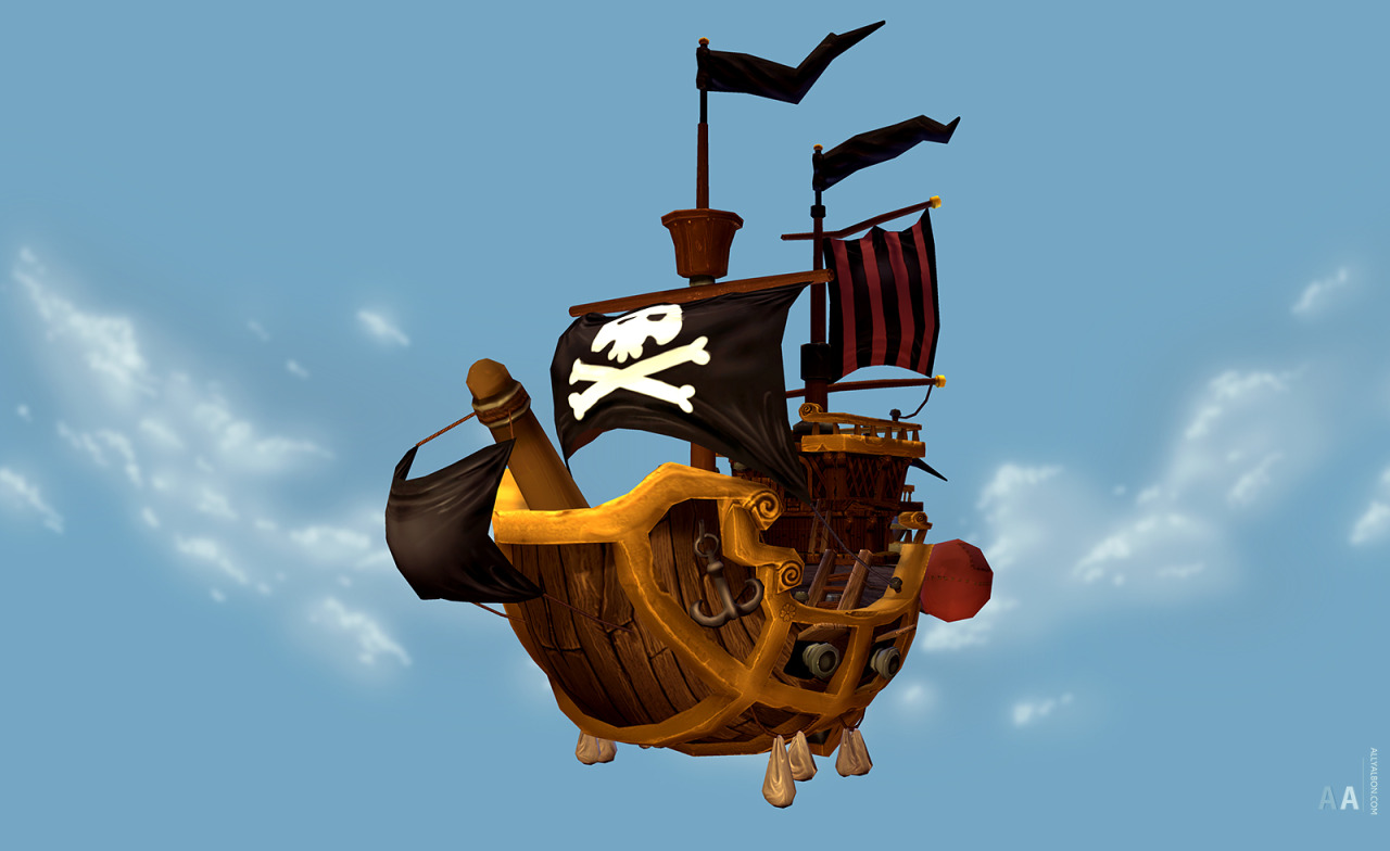
Pirateships!
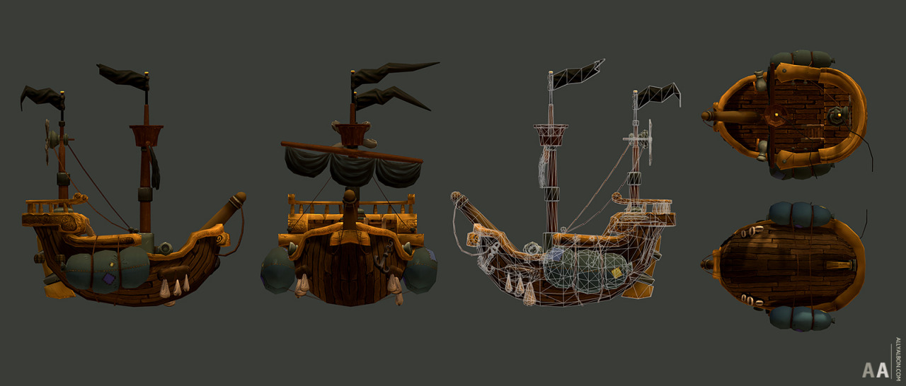
Saw a lovely concept online and wanted to give it a shot. (artist unknown).
Also tried out a new technique - high poly in Zbrush and using renders to create a diffuse map. Was a little bit time consuming due to learning a new workflow combined with a dying computer that crashed every 5 minutes when in zbrush, but am pretty happy with the outcome!
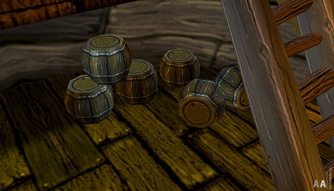
(I especially enjoyed painting the barrels!)


Replies
I have some texturing suggestions, I think you should remove both the noise and contrast from your textures. The wood grain for example makes your surfaces look more realistic but I think a cartoon treatment would not only fit the forms better but work better for this texture resolution. The barrels have almost white highlights and black shadows. I'd replace all the black lines with a darker mid-ranged color. My thinking is it should help make forms and details easier to read and give the asset an overall cleaner appearance.
I don't think it'd hurt to add a few more polys here and there to smooth out some of the contours.
These are so damn cute!