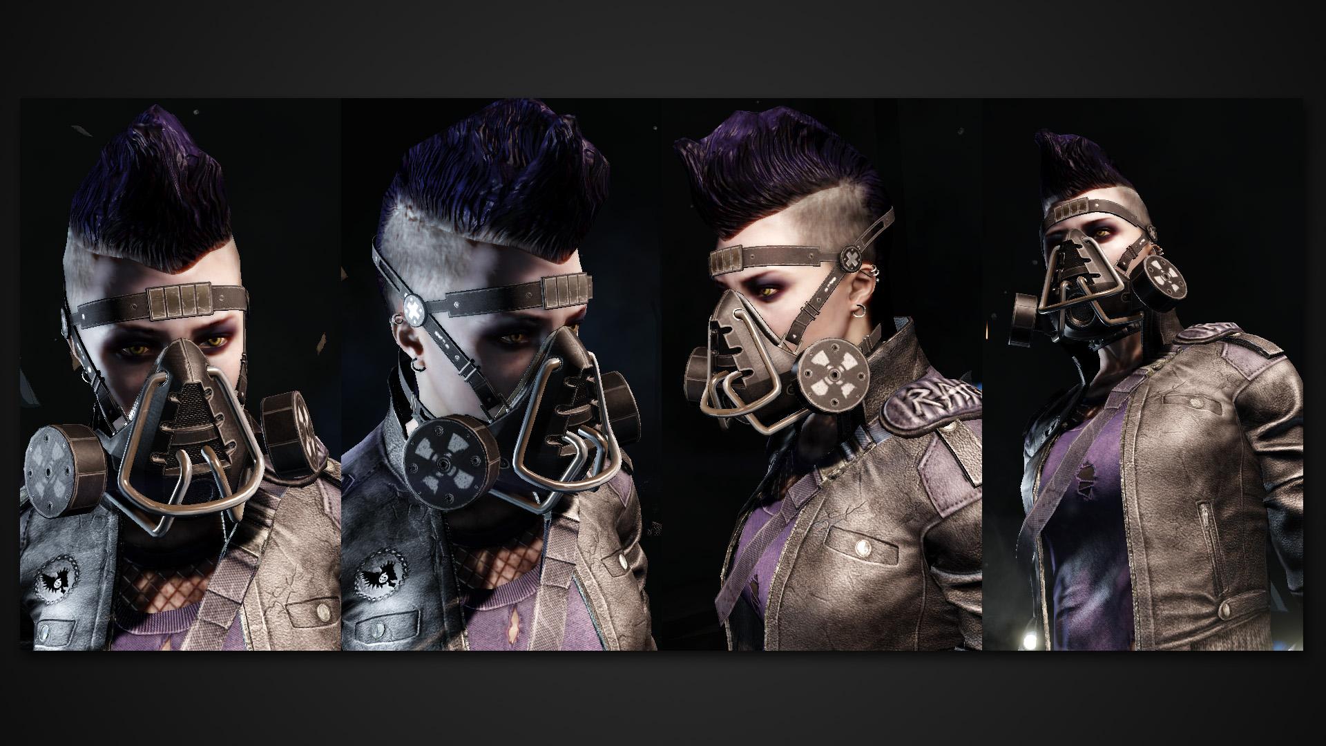
[KF2] Item - Criminally Insane Chemical Mask
Hello everyone!
I decided to do a some sort of chemical mask with a little bit of insanity. Not sure if I'm going to do a whole set or just the mask.
The original idea was to make a mask that could be used in toxic areas, underwater or high altitude places. And design it that way, it'd have some defining characteristics.
I'll try to update the thread daily, so it'd be easier to follow the progress.
Feedback and critique is always welcome, I hope you enjoy.
Cheers,
Sami
Image for the showcase banner

Mask Concept - Day 1

Pleminary idea and quick doodles. - Day 1

I usually start by doing a rough version first, so I can see whether the design works or not. - Day 2

Currently working on a detailed version, posting pics later today - Day 3
I decided to do a some sort of chemical mask with a little bit of insanity. Not sure if I'm going to do a whole set or just the mask.
The original idea was to make a mask that could be used in toxic areas, underwater or high altitude places. And design it that way, it'd have some defining characteristics.
I'll try to update the thread daily, so it'd be easier to follow the progress.
Feedback and critique is always welcome, I hope you enjoy.
Cheers,
Sami
Image for the showcase banner

Mask Concept - Day 1

Pleminary idea and quick doodles. - Day 1

I usually start by doing a rough version first, so I can see whether the design works or not. - Day 2

Currently working on a detailed version, posting pics later today - Day 3
Replies
Can't wait to see it fully textured, normals are looking really good right now.
May add some more detail later on, but for now I'm going to leave it like that.
Do you plan to make it available for other characters than classic briar or alberts I can't see on your day 4 pic ?
Yes.
Right now I'm using classic Briar, Alberts and Ana's models as a base for the mask. The mask seems to fit well for those characters. Ana's head is a bit thinner, so the straps need a little adjustment.
Here's what the mask looks like in UE. Texture size 2048px2048px ( Diffuse, normal, specular)
Here's a couple of in-game screenshots, pretty happy with the way it looks.
I still need to make it available for other characters and I'm thinking of making two different skin variations. One would be a military / camo style and the other one would be a more colorful.
You're right, the pipes need a little bit of work. There is some wear on the pipes but it's barely visible at this distance.
IMO, I'd leave it as is. I think the lack of rust, or anything extra on the pipes. Gives it a nice look and readability.
I'm at a point where changing things makes it worse and not better, so I decided to move on and started working on additional skins.
I personally prefer this color palette over the army green, but I may change the camo's color, so it'd match with the outfits in the game. I may be wrong, but I don't recall there being a 'desert storm' type of outfit.
The other one is still a mess. I like the color, so that's good. As for the material I was thinking of plastic. Add some dents and scratches here and there, and I think it would look pretty alright. As for the decals, I've some sort of 'femme fatale' / Harley Quinn / edgy rebellious theme on my mind. And it seems to stay there.
Here's a WIP screenshot.
And that took a lot of work. Every character needed their own model of the mask, because of the different head proportions. So that meant adjusting three straps per model and one character uses three different models. ( Base, LOD0 and LOD1). I used curves to control the straps and it made things a little bit easier. But still, it was very tedious and time consuming.
Some final words. I had a lot of fun making this and I'm very happy with the outcome. I think it looks great and fits the game's atmosphere very well. But that's a matter of taste. Unfortunately I wasn't able to finish the additional skins, but those were never in the original design. Tools I used for this project were Blender and Photoshop. But without further ado, here it is.
Steam workshop
http://steamcommunity.com/sharedfiles/filedetails/?id=536856727
[IMG][/img]