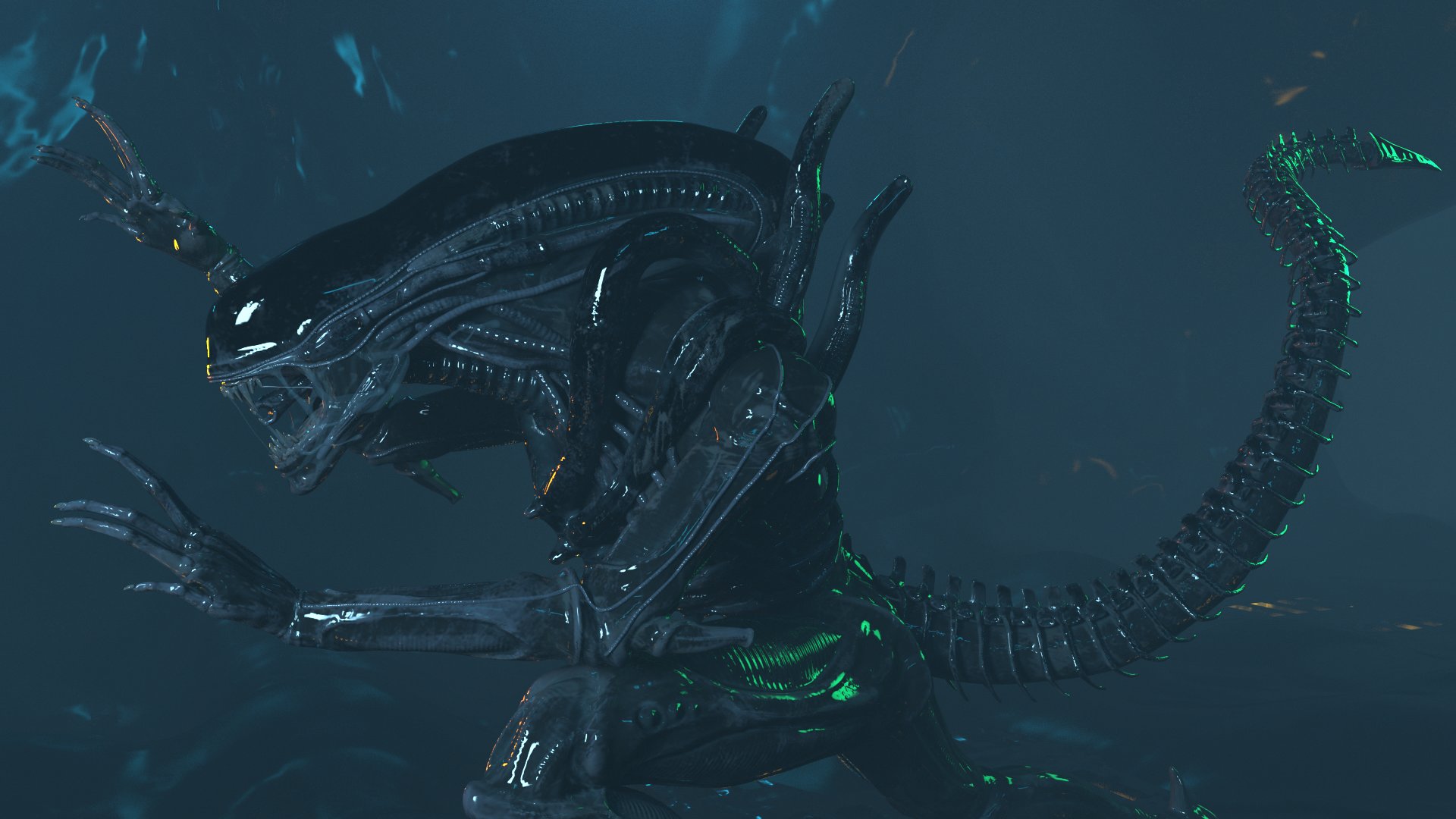
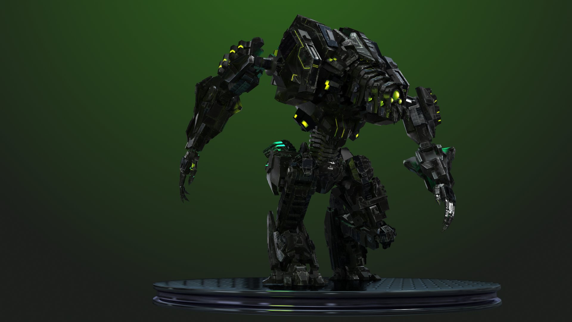
Xenomorph / Robot Modeling Reel
Hey folks, I've lurked here for some time but haven't felt very confident showing anything off... until now!
I recently finished a reel of some of my work this year, specifically two of my favorite models. Here's a link to my video on YouTube.
A few pics from the video:


And lastly, a link to both my alien and robot marmoset viewer files over on my Artstation site. Hope you guys like em, because they're inspired by all of you amazing artists on this site!
Oh and of course, critique is very welcome
I recently finished a reel of some of my work this year, specifically two of my favorite models. Here's a link to my video on YouTube.
A few pics from the video:


And lastly, a link to both my alien and robot marmoset viewer files over on my Artstation site. Hope you guys like em, because they're inspired by all of you amazing artists on this site!
Oh and of course, critique is very welcome
Replies
The robot needs work. Mainly the textures, I see uv distortion, smearing, and a lack of detail. The geo looks rather simple as well, a bit too low res, needs more bevels and detail.
Again, your alien looks quite good, nice material definition.
Definitely use 4k texture sets for all your characters if not multiple maps.
Cool thanks for the feedback! I'll see what I can do about the tail, the vertebrae definitely aren't correct. I was using this reference where the vertebrae kinda 'hug' this central tail thing. Think I need to find a better way to nail that look.
As for the robot yeah I definitely need to work with UV's more, I haven't really taken the time to sit down and learn how to properly unwrap them in Maya yet (just been using UVMaster in ZBrush mainly).
I'll go in and give him some more bevels and then see what I can do about the textures.