The BRAWL² Tournament Challenge has been announced!
It starts May 12, and ends Oct 17. Let's see what you got!
https://polycount.com/discussion/237047/the-brawl²-tournament
It starts May 12, and ends Oct 17. Let's see what you got!
https://polycount.com/discussion/237047/the-brawl²-tournament
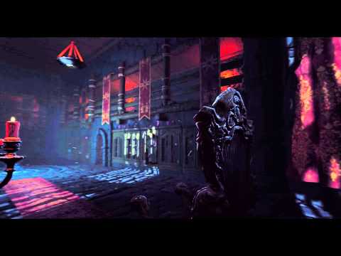
Witch's Den - Environment - Unreal 4
New personal piece
[ame] https://www.youtube.com/watch?v=o09IZ_FKSR8[/ame]

Engine: Unreal 4
Software: Maya, Zbrush, Photoshop, Xnormal
Music: Gem Club - Polly http://www.last.fm/music/Gem+Club
Ref: I used Atomhawk Harry Potter Wonderbook concept as a quide to start with:
http://atomhawk.com/case-study/book-of-spells
Used one of the flames from this FXpack and heavily modified it -> Seen in the middle. Everything else is self-made.
Will post wires if anyone like to see, but low polys are quite basic. All modular pieces are basically flat planes with slight tesselation applied.
Some Hi-poly and process shots


I am currently looking for a new job if anyone is interested in hiring. Other than that love all the feedback, thank you for your time!
[ame]
 https://www.youtube.com/watch?v=o09IZ_FKSR8[/ame]
Engine: Unreal 4
Software: Maya, Zbrush, Photoshop, Xnormal
Music: Gem Club - Polly http://www.last.fm/music/Gem+Club
Ref: I used Atomhawk Harry Potter Wonderbook concept as a quide to start with:
http://atomhawk.com/case-study/book-of-spells
Used one of the flames from this FXpack and heavily modified it -> Seen in the middle. Everything else is self-made.
Will post wires if anyone like to see, but low polys are quite basic. All modular pieces are basically flat planes with slight tesselation applied.
Some Hi-poly and process shots


I am currently looking for a new job if anyone is interested in hiring. Other than that love all the feedback, thank you for your time!
Replies
The one thing I'd might focus on is bringing in a little bit more varation or passes on the materials for some of the objects, especially the stone walls and floor. Currently it kind of looks like a matcap versus a fully textured material, so I'd probably try and introduce some more color varation in the textures themselves.
I'd also either very very subtly brighten the sky a tiny tiny bit, or slightly darken the intensity of the light coming from the sky, as right now it kind of looks to me like the sunlight hitting the floor is too bright/high contrast to be coming from that foggy sky. I could be crazy though, as lighting can be tweaked until the end of time, just something to think about.
Keep it up!
Thx for the feedback, much appreciated! Color variation sounds great, did not really cross my mind when working on this. Will definitely try it out. Thx!
there are a few things thought that i think would hep the scene immensely
-you need to push your materials alot of them seem flat and lack definition, for example the rocks could be soo much better! i love the detail done on the inner ring by the fire,but where is the color variation, the dirt the grim? right now they feel like clay.
look at these rocks...i know they are out side but look at all the color variations that adds detail and character to the rocks. Also your grout is like a mirror? I would do something similar to the pic above, your going to have tons of dirt and debris in that grout which would give this scene soo much character and detail!
-i feel you need to push the lighting, i feel upping the bounce lighting would help the scene alot, for example you focus on the chair and it is poorly lit i cant see any detail in it at all, all that hard work you did...not shown off
-i the fire needs some work, its to transparent for most of the shot....unless that is what your going for
-one last thing, if your going to do 1 continuous camera move smooth it out it is very chopping and jarring in its current state, i would recommend multiple shorter cuts to show off the piece
Previously I had the focal point pointed at the chair and later moved it to the middle. When I tried to light up the chair, it immediately ruined the focal point in the middle. Also naturally there is not anything to light it, so would have to add a light source. But I definitely get what you mean, I did put some effort to make that chair but now I am sacrificing some of that detail for the greater good. Of course I could play with the lighting to make the scene slightly brighter so that the detail would show. Will look into that.
The middle ground have some water/magic whatever in the cracks and hence the mirror like look, kinda pushed it to make it more apparent. Tried to bring some story in the scene.
Could tweak the wet material, will look into that.
Thx for the feedback
But this is looking awesome, keep up the good work! =}
Haha yeah you are absolutely right! Did some vertex painting in the middle section with the wet material, just did not think to apply it on the floor, maybe thought it did not need any variation at that time. Will do that, cheers!