Next Gen Megaman Volnutt
Hey guys, Megaman Legends is one of my favorite old games and I've been wanting to do a modern version for awhile.
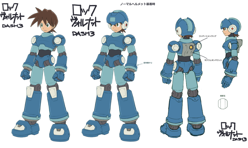
I'll be using the concept created for the cancelled megaman legends 3 as a guide, but adding more detail as I go.

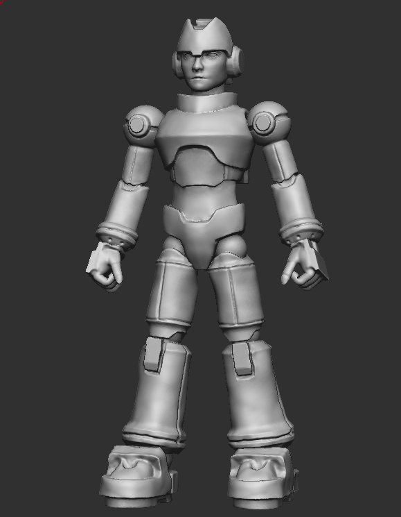
I started a sculpt in zbrush to lock down my proportions and I'd love some feedback on that.

The next step will be making the more detailed version using one of the many hard surface techniques Zbrush has right now. Or even building some of the pieces in Maya and bringing them in.
Thanks for all your thoughts!!
I'll be using the concept created for the cancelled megaman legends 3 as a guide, but adding more detail as I go.

I started a sculpt in zbrush to lock down my proportions and I'd love some feedback on that.

The next step will be making the more detailed version using one of the many hard surface techniques Zbrush has right now. Or even building some of the pieces in Maya and bringing them in.
Thanks for all your thoughts!!

Replies
Good progress so far
I think the helmet should be bigger and more round
The face should be more like Animation Feature Films style , u know < big eyes >
I did a quick modification to show you what i mean, i hope it will help.
GUYPHILL - I'm kinda leaving the face alone right now, but I do think bigger eyes will be the way to go in the future.
Kamezis - I think your modification looks sweet, I thought it would be weird if his head were bigger than his torso, but it definitely looks cooler and more streamlined.
There was alot of discussion about the roundness of the helmet, and I think the image I posted wasn't great. I went ahead and made it a bit more rounded, but I also wanted to include a sideview so you guys could see a better angle. Based on the design I don't think the main helmet part should stick out past the front plate from the front view, but I would still love some thoughts on that.
Thanks again!
I have made some progress on taking this thing to the next level so let me know how its going.