Home 3D Art Showcase & Critiques

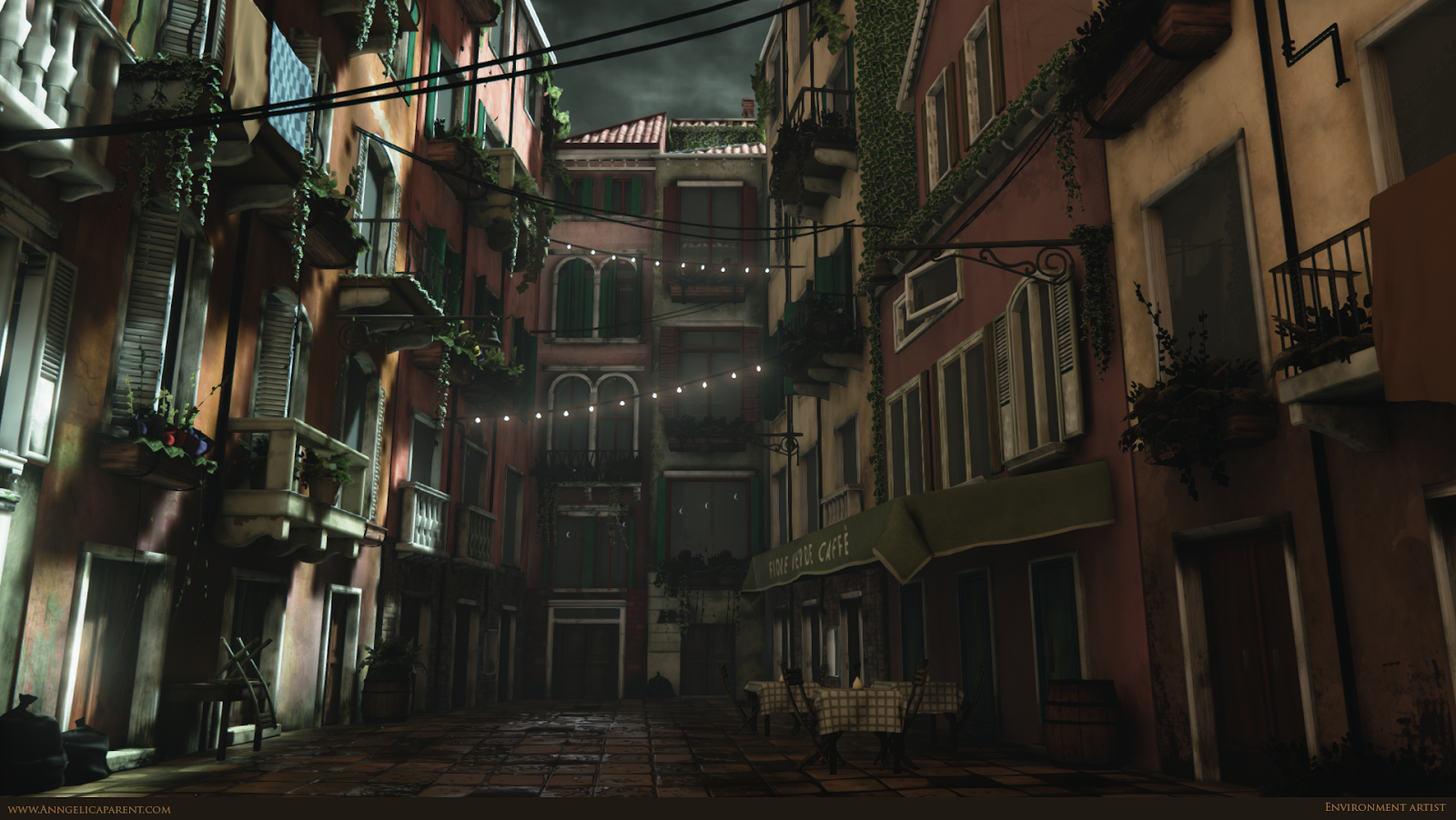
[UE4] Venice Street

Anngelica
polycounter lvl 10
Offline / Send Message
Anngelica polycounter lvl 10
Final Update:

Venezia_Dark_Update01.png

It seems like there've been a lot of awesome Italy-themed projects here lately so I was a little nervous to post this. This is a final project for an independent study that I've been working on. I've still got a lot of placeholder textures to replace and a lot of asset placement/tweaking sort of stuff to do, especially the foliage.

I wanted to finish it a little more before putting it up but I need the critique and advice now before it's too late to fix for my class deadline.

So, if anyone has any pointers or suggestions or crit or advice or whatever, I'm more than happy to take it - I know I need it. :)

Thanks!

Edit: Reference Image
zbnBrzh.jpg

wiZToc8.jpg

Replies

  • Bek
    Offline / Send Message
    Bek interpolator
    Just some quick notes; the ground tiles seem quite large (compare them to the size of the door for example — perhaps the doors seem a bit short as well?), and the bricks on the right are stacked one above another, rather than interlocking. The barrel on the left is quite close to the camera as well and is obviously unfinished, so I guess that's one of the placeholder assets you mentioned.
  • A-N-P
    Offline / Send Message
    A-N-P polycounter lvl 6
    Overall the scene is over saturated in terms of colour and there's no real balance.

    I think with the addition of some interesting lighting with nice shadows falling this could be made into a nice scene :)
  • Anngelica
    Offline / Send Message
    Anngelica polycounter lvl 10
    Awesome, thank you both for the feedback! I definitely need to add in more shadows and the bricks need work.

    As for the scale of the doors - ABSOLUTELY. This has been my biggest fight. I based the buildings mostly from this concept. The doors look the same size (if not slightly smaller) than the windows but that looked so wrong in 3D. I exaggerated their size a little but it just hasn't been enough. I can exaggerate them more or maybe it's my camera angle that's creating that effect.

    Either way, I'm glad you pointed it out because I've felt like that too. I'll see what I can do to fix it.

    Thanks again!
  • Anngelica
    Offline / Send Message
    Anngelica polycounter lvl 10
    Okay, so here's the latest update. I've tried to implement most of the suggestions and the rest are on their way. Hopefully this has helped the scale issue, and I also pulled down the saturation. I'm still working on finding a focus.


    bHI51NM.jpg
  • Anngelica
    Offline / Send Message
    Anngelica polycounter lvl 10
    Okay, so the deadline has technically come and gone for this project but I'm still tweaking stuff here and there. This is the night version that I've come up with:

    EVz4n5q.jpg?1

    I'm gonna start working on a daylight soon. Thanks again to Bek and A-N-P for the advice!
  • JustGarry
    Offline / Send Message
    JustGarry polycounter lvl 4
    The lighting and buildings look great! I think your foliage is letting the scene down at the moment though (the Ivy mostly), it's too flat and the leaves look too large, looks almost cartoony, hope this helps :D
  • mhofever
    Offline / Send Message
    mhofever polycounter lvl 9
    The lighting looks great, especially the night one! I also like how the texture colours go well together, you've definitely captured that Italian feel.

    I agree with the foliage thing, mostly the ones that are hanging, they need to be more complex (smaller leaves maybe to define the alpha better?).

    Your reference shows lights hanging from the walls, for the night scene, you should add spotlights to them and make it look like a bit of fog coming from them, it will definitely enhance the mood.

    For laughs, there could be a hooded man seen on top of the roof :P
  • Gazu
    Offline / Send Message
    Gazu polycounter lvl 12
    This is awesome. Do you have an Portfolio?
    Can you give us a Breakdown for this Scene?
  • Anngelica
    Offline / Send Message
    Anngelica polycounter lvl 10
    Hey! Thanks for pointing out the ivy - I will definitely try to fix it and make it fit more with the rest of the scene. Smaller leaves is a great suggestion. This was my first real attempt at anything with foliage (aside from grass) so it's been a learning experience. :D

    Since I'll be editing that, I'll look into fixing the lamps too. I originally made this for day so I didn't include any sort of lightable light fixtures. I'll change that.

    Once I get everything and a daylight scene worked out, I'll try to get some wireframes and texture flats up.

    Thanks for all the feedback, guys!
  • reckzilla
    Offline / Send Message
    reckzilla polycounter lvl 11
    I like the scene, I'll comment on textures since that's my love but aside from what's already been mentioned the surface of most of the buildings are really smooth I see in some areas you tried to get that cool drip effect that the ref has I would say don't be afraid to add more of that chracteristic with decals. Also look at some reference of just plaster building walls you'll see some awesome detail that can really add to your scene. That's all I can think of at the moment I hope it helps keep up the great work.
  • nastobi123
    Offline / Send Message
    nastobi123 polycounter lvl 8
    wow, really nice work. Is it gonna be one view only ? looks really nice tho. Agree with others, foliage can do some work.
  • .nL
    Offline / Send Message
    .nL polycounter lvl 3
    Really awesome. The door nearest the camera, on the left hand side feels very flat and blurry, though. But other than that, I can't add anything that hasn't been said already.

    The scene looks really good in the night lighting
  • currve
    Offline / Send Message
    currve polycounter lvl 3
    good job here! I like the architecture a lot. Here and there some improvements on the materials and you're done :) Looking forward for updates.
Sign In or Register to comment.