The BRAWL² Tournament Challenge has been announced!
It starts May 12, and ends Oct 17. Let's see what you got!
https://polycount.com/discussion/237047/the-brawl²-tournament
It starts May 12, and ends Oct 17. Let's see what you got!
https://polycount.com/discussion/237047/the-brawl²-tournament
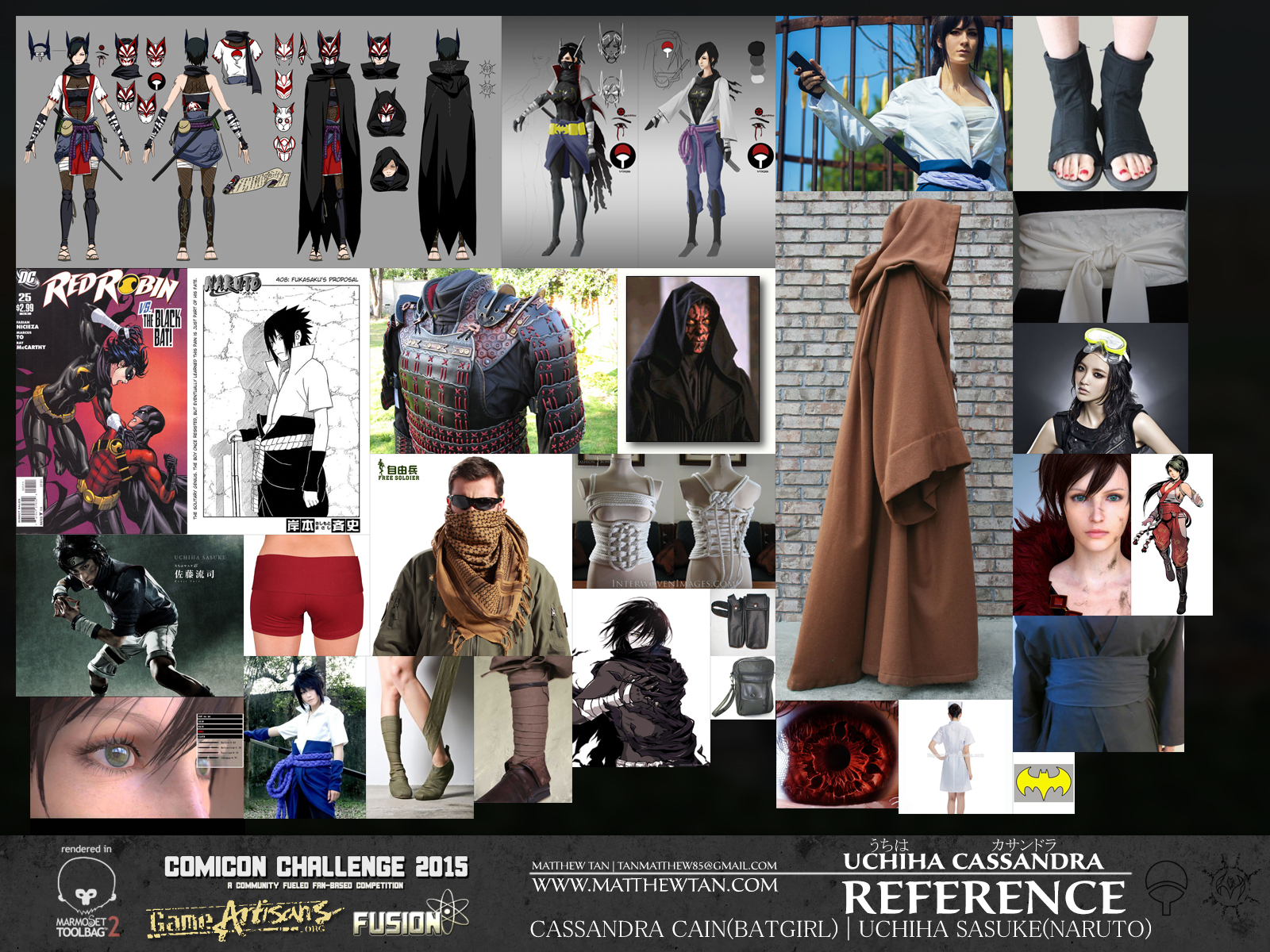
Uchiha Cassandra - Comicon 2015
Hey ya guys/gal
I thought I made a thread for my comicon piece this year but maybe I got it confused with last years one.
Anyway I'm glad I finished it although I had to rush parts of it. In the process of doing a turntable render. In the meantime I'll post up some images.
sorry if some of the images are really big.

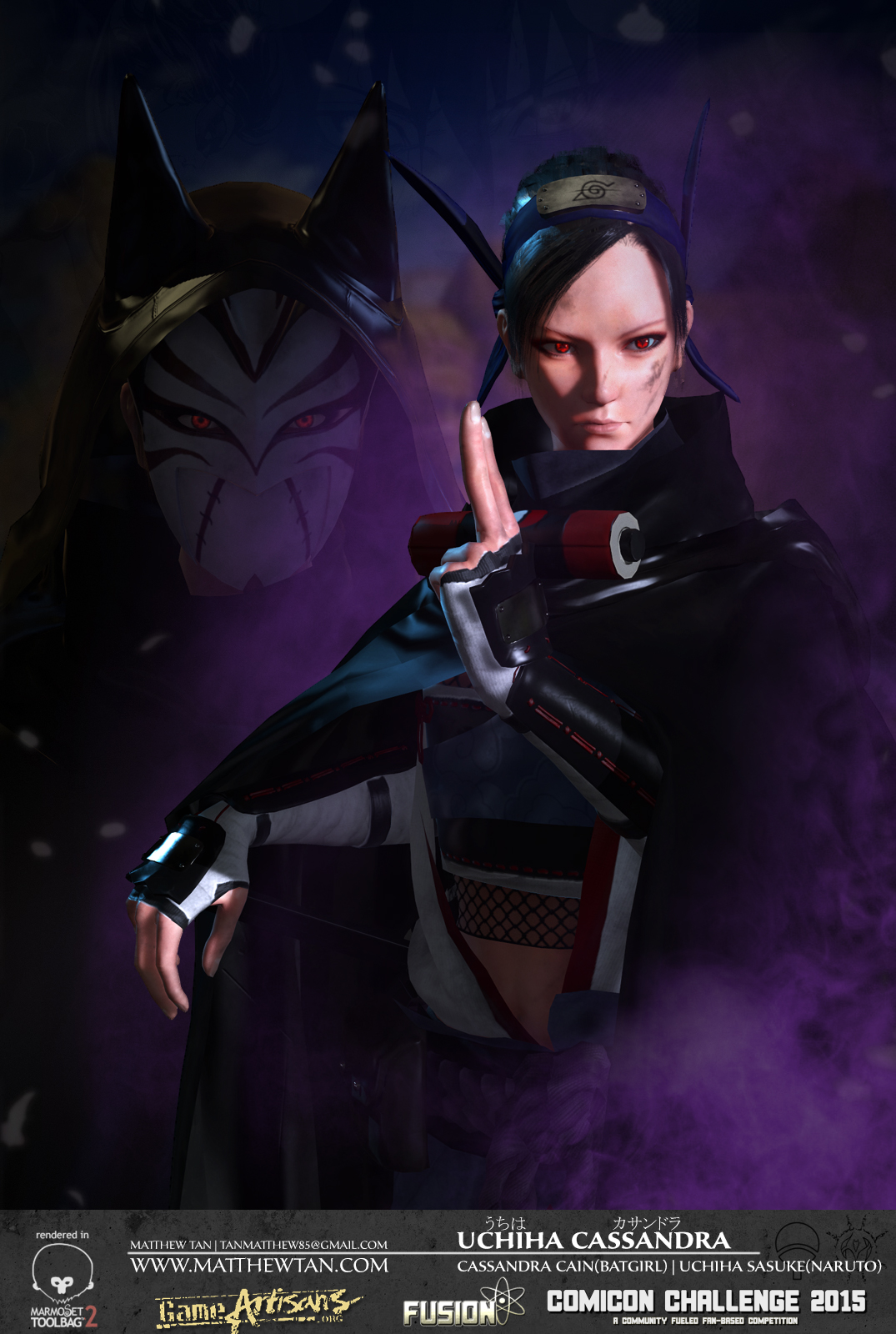
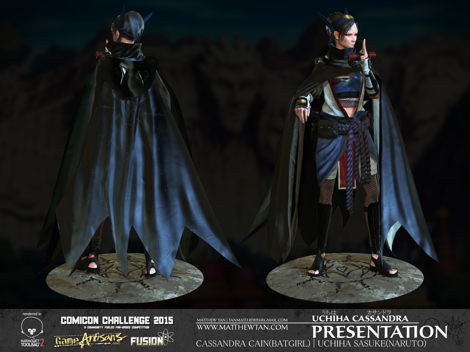
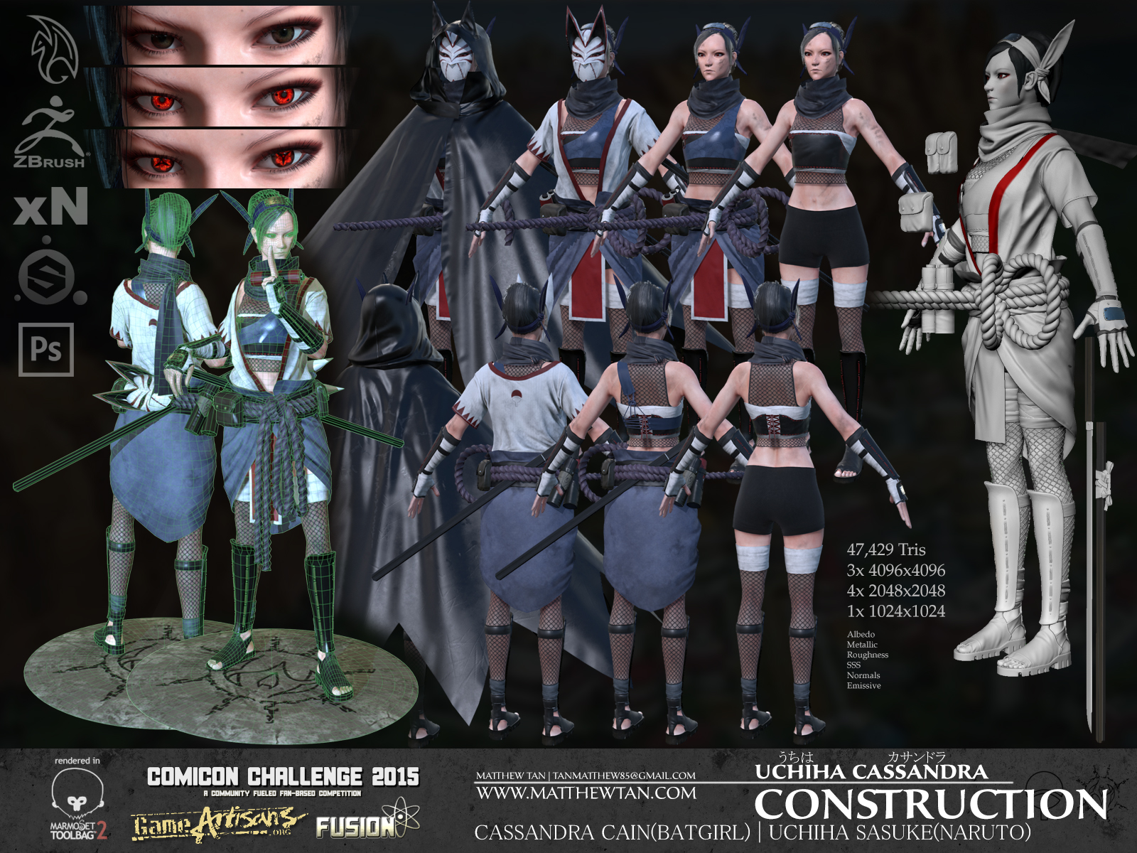
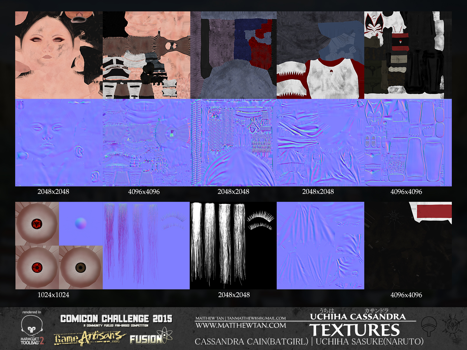
Only have the Albedo and Normals showing here I used the Metallic Roughness work flow. Probably could've used half the amount of textures but I wanted the extra detail for when the cloak, and gi etc come off.

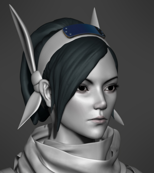
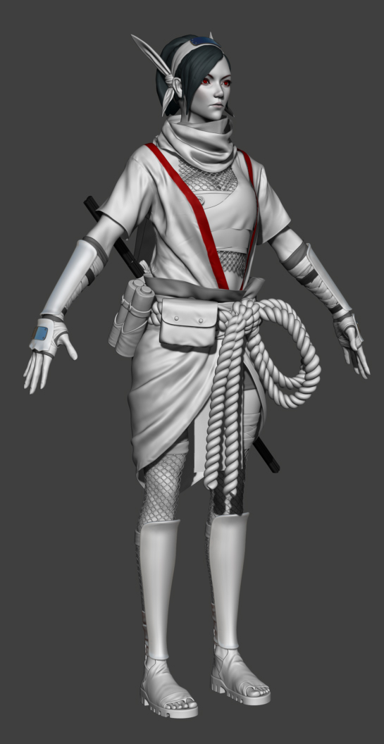
sorry for all the images
I thought I made a thread for my comicon piece this year but maybe I got it confused with last years one.
Anyway I'm glad I finished it although I had to rush parts of it. In the process of doing a turntable render. In the meantime I'll post up some images.
sorry if some of the images are really big.


Only have the Albedo and Normals showing here I used the Metallic Roughness work flow. Probably could've used half the amount of textures but I wanted the extra detail for when the cloak, and gi etc come off.


sorry for all the images
Replies
[ame]
Maybe it was a matter of personal taste, but her eyebrow could use a lot more thickness IMO.
On the highpoy sculpt she looks fine, but the final one looks a bit too thin tbh, almost couldn't see it in the presentation shot.
thanks again appreciate the feedback
When making portfolio pieces, I'm not sure if I should just use loads of texture sheets (4 x 4k sheets or something) to make it look good or not.
If you are making your folio for games... so long as your UV sheets are efficient I suppose 4k is fine. Keep in mind 4k is still a rarity in games these days (to my knowledge) you need the object being displayed to take up the full screen of a 4k monitor to even see that texture size, mipmapping will munge it down much smaller than that in 99% of cases.
@X³²Lapis - Great work, your topology is lovely. Makes me feel lazy as hell for never finishing :P
jstyles3d: Thanks, looking bad I really could've taken a lot of excess polys out, but I was getting close to the deadline. Still planning to animate her, but I've been saying that for a while now.