Home 3D Art Showcase & Critiques

Pirate Tower WIP

polycounter lvl 3
Offline / Send Message
MasterJV polycounter lvl 3
Hey all,

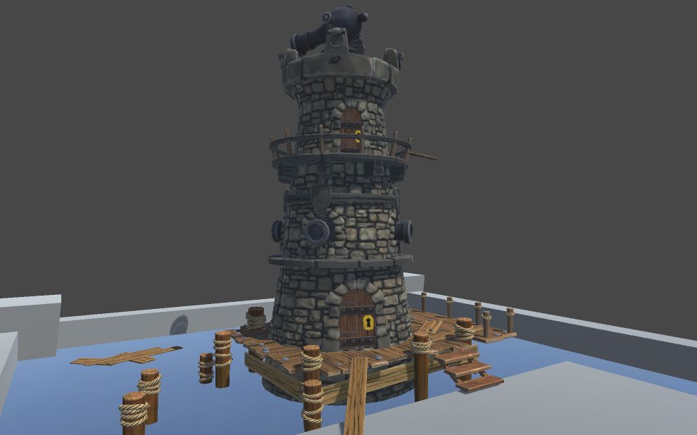
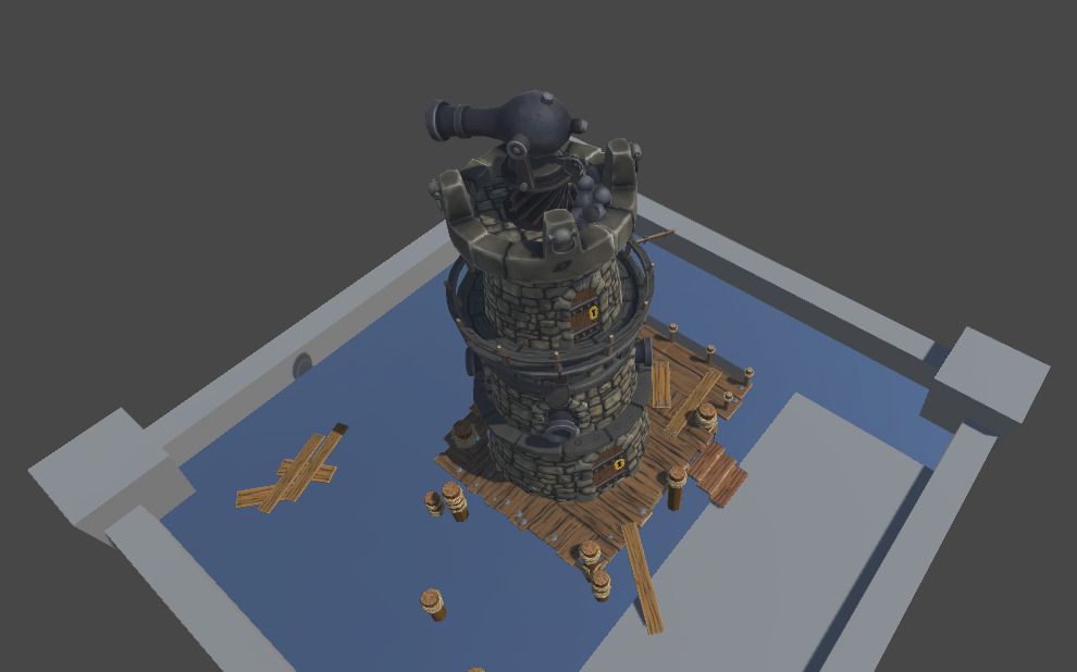
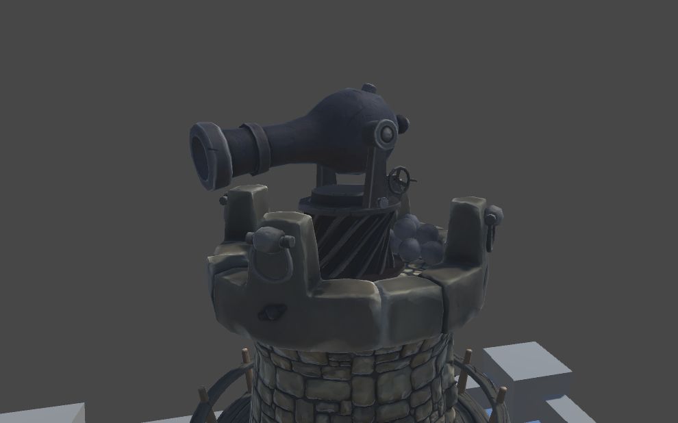
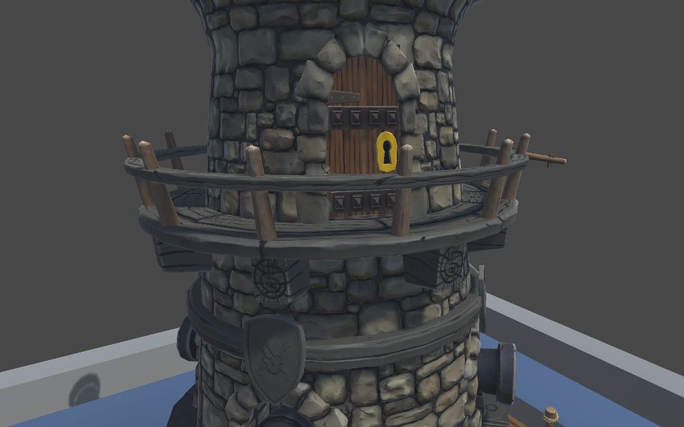
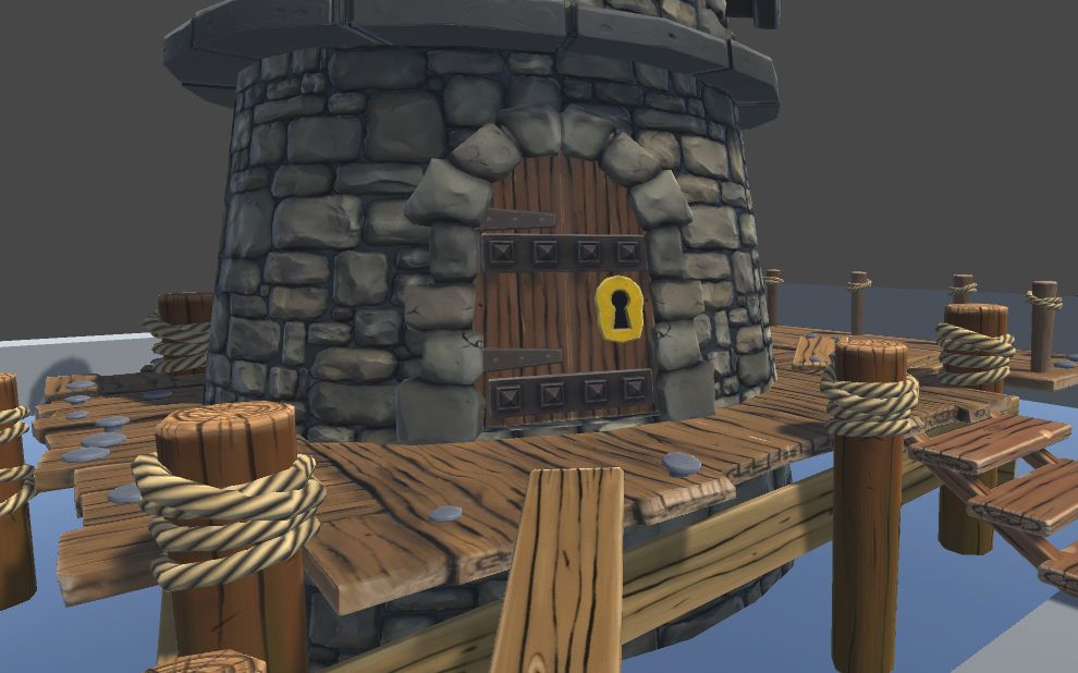
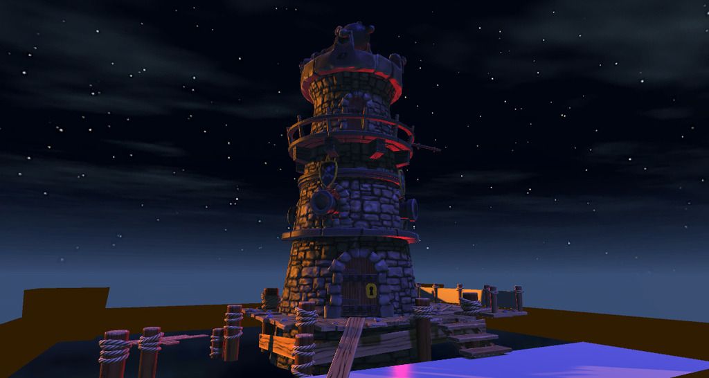
I started this project a while back, but then had other things to do so put it aside. Recently I got back on it and have gotten as far as getting it textured and lit in Unity, there's still more texturing to be done on the tower, still a WIP.

I've been working from a concept, it was in the beginning to just be the tower but figured it would be better to add some other props in. Have made it into a small diorama.

I thought I'd share my progress so far and maybe get some feedback, criticism, even suggestions on the work.

I've attached some images below, hope you like it.

Concept art done by: distritopapillon
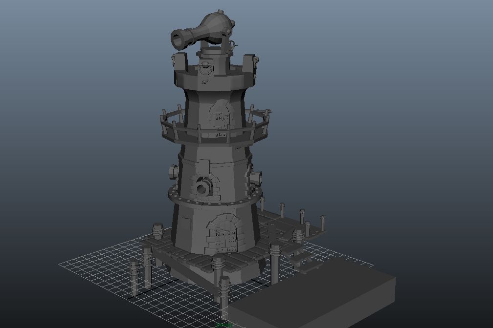
tower_zpsrglr5t7g.jpg

tower_unity02_zpsldfdhwaf.jpg

tower_unity01_zpsotabhckj.jpg

tower_unity03_zpscmpvhsor.jpg

tower_unity04_zpsjljl8a3r.jpg

tower_unity05_zpscwlplsgn.jpg

tower_unity07_zpsexbwckfk.jpg

Replies

  • zOffTy
    Offline / Send Message
    zOffTy polycounter lvl 18
    Nice work
    I think you should add more color variation in your stones ?
    Looking forward to see your texturing work :thumbup:
  • Dragonar
    Offline / Send Message
    Dragonar polycounter lvl 10
    hey cool work :) zOffTy have right try to put more color variation on your texture stone and for me the space between stones is to mutch ^^
  • MasterJV
    Offline / Send Message
    MasterJV polycounter lvl 3
    Thanks guys, glad you like it and thanks for the feedback. I could add some more color variation to the stones.

    As for the spacing, I was thinking that maybe I should put them more closer together but wasn't too sure, hence why I'm on polycount :)
    could do with some cracks now that I think about it. Will do more work on the stones, but will first get the rest of the model textured.

    Will keep you guys updated.
  • MasterJV
    Offline / Send Message
    MasterJV polycounter lvl 3
    Update: I changed the spacing between the stones with some additional cracks and gave it some more color.

    I've also added a pirate flag and a fence net. Done all the texturing on the tower, so far it's looking good but not finished yet.

    Think I'll now focus on adding some more assets to the scene.

    tower_unity10_zpsaxzbddvk.jpg

    tower_unity11_zps9refbc3z.jpg

    tower_unity09_zps2nqyvl5y.jpg

    tower_unity08_zpsihhgmwot.jpg
  • Nate Broach
    Offline / Send Message
    Nate Broach polycounter lvl 17
    This looks great! But that lighting is not doing you any favors. You've got a night sky, with a bright orange directional and red under lighting? It looks very strange. Please get rid of that red.. I'd try a more natural lighting setup, I think it will improve the overall look and feel a lot. Check out some reference of castles or lighthouses at night. Get it to look natural then exaggerate from there. Just my two cents!

    Overall though, this tower looks really nice, great work.
  • MasterJV
    Offline / Send Message
    MasterJV polycounter lvl 3
    Thanks Nate, the lighting isn't final and I do tend to get carried away when it comes to quickly lighting up the scene haha. I do appreciate your feedback and will check out some references once I've gotten my final assets in the scene :)
  • theblueturtle_
    Offline / Send Message
    theblueturtle_ polycounter lvl 3
    The stone texture is really sweet man! i do agree with zOffTy about the variation though. Maybe if you tinted some areas with a few different hues (subtly) then it might break up the repetition a bit better. I also agree with the Nate's sentiments about the lighting. What do you plan to do with the "pedestal"? I'd also suggest you push the wood grain on your floor planks. They seem a bit flat compared to the nicer detail in the stone work. Awesome stuff so far!
  • MasterJV
    Offline / Send Message
    MasterJV polycounter lvl 3
    Thanks theblueturtle, glad you like it. With the pedestal I'm thinking of doing a wooden type pedestal, the ones in the scene are just a placeholder, will work on the water too but want to leave that for last. The white cube in the corner will be a stone floor.
  • le0tard
    Offline / Send Message
    le0tard polycounter lvl 10
    Really like the concept! That red light looks way wierd though.
    Otherwise a really nice job, 9/10, would hide my treasure in.
  • MasterJV
    Offline / Send Message
    MasterJV polycounter lvl 3
    Another Update: Added some assets to the scene, basically a crate, a barrel and a lamp post.

    I removed the red and yellow light and just dimmed the key light a bit, I added lights to the lamp posts. Lighting is still not final.

    Going to now focus on the stone dock, the white cube is becoming irritating haha. And will finish off the pedestal, that will then be pretty much all the texturing done.

    Overall, it's coming along nicely!

    @le0tard: Thanks for the rating :) :thumbup:

    tower_assets_zps2qexya1g.jpg

    tower_unity13_zpsoljdifqx.jpg

    tower_unity12_zps6n9dny6z.jpg

    tower_unity15_zps1ixqytnw.jpg

    tower_unity14_zps8k1ysj4o.jpg
  • MasterJV
    Offline / Send Message
    MasterJV polycounter lvl 3
    Update: I finished texturing the dock. I'd say that's all my texturing done.

    Still need to change the water, not liking it.

    Overall, I'm pretty much close to done, just need to do some tweaking.

    tower_unity16_zpssfmwa8df.jpg

    tower_unity17_zpspicela1e.jpg

    tower_unity18_zpsl41fuior.jpg

    tower_unity19_zpsrv0ohvel.jpg
  • Nate Broach
    Offline / Send Message
    Nate Broach polycounter lvl 17
    Getting there! The lighting still needs work. Currently the orange lanterns are the focal point and its drawing my eye to them instead of the tower. You want the tower (and especially the cannon) to be the focal point. Even at night you can still have a stronger/brighter directional light. You may also want to consider getting some lanterns actually on the tower to bring some of that orange to the tower. Lighting can really make or break a model, really spend some time on it. That cannon is the hero! make it so!

    Good stuff man, getting close.
  • MasterJV
    Offline / Send Message
    MasterJV polycounter lvl 3
    Hey Nate, thanks for the feedback. I can add some lanterns close to the doors and maybe get the windows to light up more as well.
  • MasterJV
    Offline / Send Message
    MasterJV polycounter lvl 3
    I've now added some lanterns on the tower itself, also added some lighting at the top where the cannon is.

    tower_lighting02_zpshzgyl7aq.jpg

    tower_lighting04_zpsiya2dkrf.jpg

    tower_lighting03_zps5e0xfbhd.jpg

    With this image above I removed the middle lamp post just to see what it looks like
  • GrungyStudios
    Offline / Send Message
    GrungyStudios polycounter lvl 8
    Great texturing, especially the castle. Displacement on the bricks? they look good. I love how everything looks so smooth its quite satisfying
  • MasterJV
    Offline / Send Message
    MasterJV polycounter lvl 3
    Thanks Grungy, glad you like it :) I used a normal map on the bricks. Figured it would look just as good without displacement.
Sign In or Register to comment.