The BRAWL² Tournament Challenge has been announced!
It starts May 12, and ends Oct 17. Let's see what you got!
https://polycount.com/discussion/237047/the-brawl²-tournament
It starts May 12, and ends Oct 17. Let's see what you got!
https://polycount.com/discussion/237047/the-brawl²-tournament

Replies
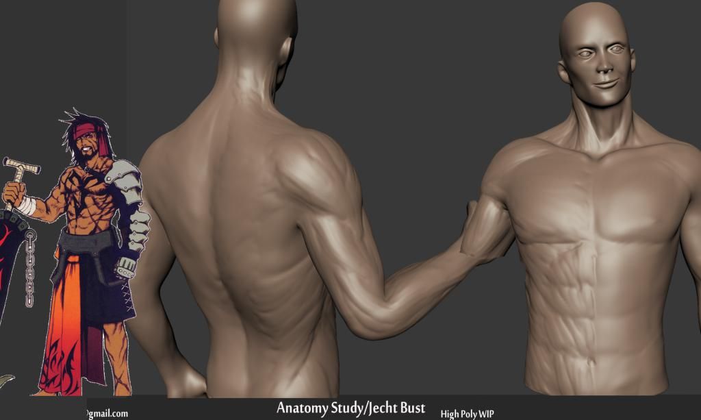
Also you shouldn't see the bone here
The clavicle on this area is more visible on woman and really skinny guy because the pec musle goes on top
For the torso, your placement is alright but your forms lack depth. Your abs, external obliques and sartorius all kind of blend together. You have the lines for these forms, but not any depth. Also, use reference for the muscles. For example, the sartorius muscles have 5 "fingers" that show on the surface, and they link with the ribcage.
For the head, the biggest thing that sticks out to me is the smile. When you smile, the corners of the mouth are mostly what goes up. Also, smiling causes a lot of folding under the cheeks and generally creates a different contour. In general, I'd push the depth of the forms on the face as well.
Keep it up.
The top pair of a six pack is actually located above the costal arch, and is on some people hidden under the pecs. You should also look for the insertion of the sternocleidomastoid, which should create a V between the clavicles.
Also, if you want to have the arm bend like that, you should look at some more references and sculpt it specifically for that pose, as a lot of muscles change shape and volume, especially the bicep and the ridge muscles(Brachioradialis) of the lower arm.
As for the face, as Chaos already pointed out, the smile needs quite a bit more work and I would say the wings of the nose are too big if it's supposed to be an anime style nose, otherwise the nose in general is too small.
This is a very good excersise though, keep at it