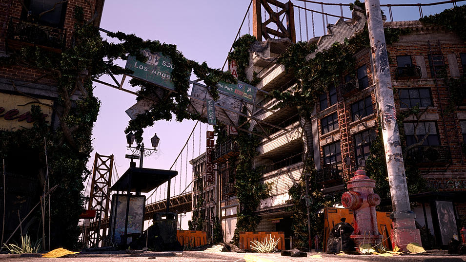
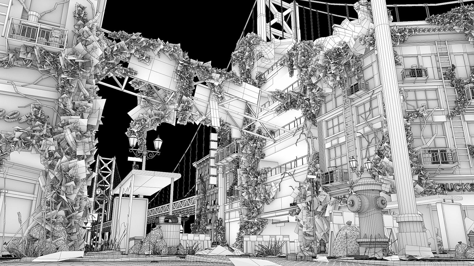
Really cool work man. The only thing i'd say is the definition in those plants looks off (for a second i couldn't figure out if it was moss or some type of vine). They kinda looks too blocky/jaggy. Could be just me though.
That is nice work. The rest of the work on your website is fantastic. I agree with TheWalkerGod, the plants are a bit bushy. Perhaps have them appear as thinner vines branching out onto the environment.
Nice stuff, I'm digging the dynamism of the angles formed by the architecture in your main composition, definitely draws my eye in and around.
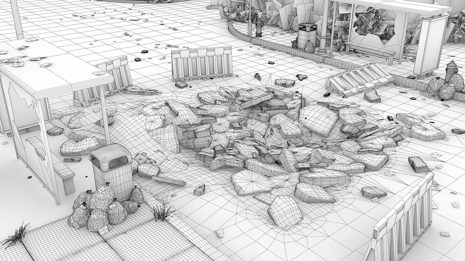
I'm wondering why the polycount seems pretty high/a lot of unused edges that are doing nothing in some of the models. The only way I could maybe see something like that being used is if you're doing a lot of vertex painting on the models. The sidewalk trim/curb is a prime example of having way too many polys for what it's doing. IE it kind of looks like you used turbosmooth or something similar and then forgot to remove the needless edgeloops.
It would be great if you could post some high-res (something like 1920x1080 or 1400x900 depending on your monitor's ratio) screenshots so it's a little bit easier to critique the texture work and individual assets themselves.
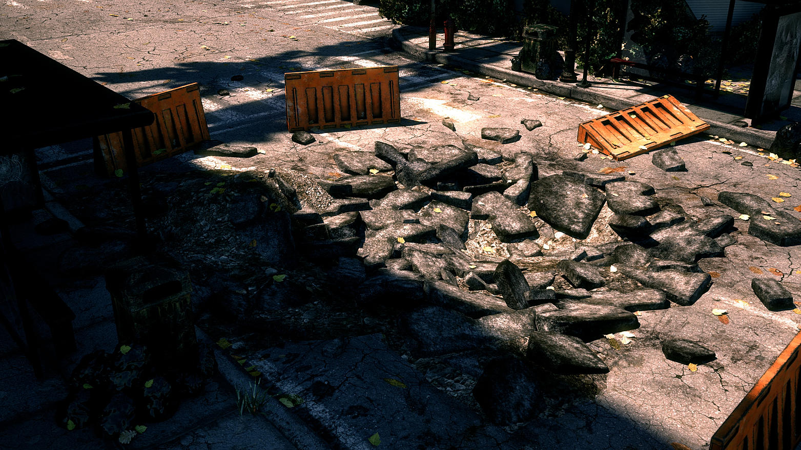
Cool destruction on the environment, but the fire hydrant in the first picture looks MAAAASSSIIIVVVEEEE.
Yes I agree with this, but actually it is not tooooooooooooooo big.
it's little big :poly121:
I think this my render camera is close with fire hydrant so it looks bigger.
Really cool work man. The only thing i'd say is the definition in those plants looks off (for a second i couldn't figure out if it was moss or some type of vine). They kinda looks too blocky/jaggy. Could be just me though.
In my case, the most difficult thing was to make plants stuff. When I have time to modify this work, I will fix them first.
I'm appreciate giving me nice critiques, thank you.
That is nice work. The rest of the work on your website is fantastic. I agree with TheWalkerGod, the plants are a bit bushy. Perhaps have them appear as thinner vines branching out onto the environment.
Good stuff!
Yes, l also agree with his opinion. I hope I can make better plants next time XD
Thank you.
Nice stuff, I'm digging the dynamism of the angles formed by the architecture in your main composition, definitely draws my eye in and around.
I'm wondering why the polycount seems pretty high/a lot of unused edges that are doing nothing in some of the models. The only way I could maybe see something like that being used is if you're doing a lot of vertex painting on the models. The sidewalk trim/curb is a prime example of having way too many polys for what it's doing. IE it kind of looks like you used turbosmooth or something similar and then forgot to remove the needless edgeloops.
It would be great if you could post some high-res (something like 1920x1080 or 1400x900 depending on your monitor's ratio) screenshots so it's a little bit easier to critique the texture work and individual assets themselves.
First of all, thank you for very detailed critiques.
I also think I spent too many poly for some of models. I always create high and low res models both and using high model for close shot. When I start this project, sidewalks and trash boxes are supposed to locate in front of camera. But... as you know, plan always change and change everyday.... haha. Now, my render shot composition said I spent too much polycount...lol....
I'm saying again thank you so much for giving me great critiques.
Replies
what tools is maya or 3d max?
Good stuff!
I'm wondering why the polycount seems pretty high/a lot of unused edges that are doing nothing in some of the models. The only way I could maybe see something like that being used is if you're doing a lot of vertex painting on the models. The sidewalk trim/curb is a prime example of having way too many polys for what it's doing. IE it kind of looks like you used turbosmooth or something similar and then forgot to remove the needless edgeloops.
It would be great if you could post some high-res (something like 1920x1080 or 1400x900 depending on your monitor's ratio) screenshots so it's a little bit easier to critique the texture work and individual assets themselves.
I used lots of modular pieces for building and other stuff, and I made 6 different debris and duplicate them
Thank you
Yes~ I also think the first pic is a reference pic. Thank you man~!!
Yes I agree with this, but actually it is not tooooooooooooooo big.
it's little big :poly121:
I think this my render camera is close with fire hydrant so it looks bigger.
Thank you so much for your critiques.
In my case, the most difficult thing was to make plants stuff. When I have time to modify this work, I will fix them first.
I'm appreciate giving me nice critiques, thank you.
Yes, l also agree with his opinion. I hope I can make better plants next time XD
Thank you.
First of all, thank you for very detailed critiques.
I also think I spent too many poly for some of models. I always create high and low res models both and using high model for close shot. When I start this project, sidewalks and trash boxes are supposed to locate in front of camera. But... as you know, plan always change and change everyday.... haha. Now, my render shot composition said I spent too much polycount...lol....
I'm saying again thank you so much for giving me great critiques.