The BRAWL² Tournament Challenge has been announced!
It starts May 12, and ends Oct 17. Let's see what you got!
https://polycount.com/discussion/237047/the-brawl²-tournament
It starts May 12, and ends Oct 17. Let's see what you got!
https://polycount.com/discussion/237047/the-brawl²-tournament
Luigi's Mansion Redesign Feedback
Hi guys,
Last semester at uni I took an advanced 3D modelling module where I had to redesign a fighting game stage. I chose Luigi's Mansion from Super Smash Bros and basically changed the mansion into a "gothic" castle, although I feel that it needs more gothic features. This semester I have to improve what I created last semester, I have been given feedback from lecturers and I have a list of things that I personally want to improve and add to the environment. It would be amazing if you guys could provide me with some feedback as well so that I can turn this piece of work into something that I actually like, because right now I don't like it at all.
So the environment is setup in UE4 and this semester we are learning more about shaders, so hopefully I can drastically improve my materials.
Below are the final renders of the scene and a video from last semester (I know the lighting needs a lot of work, that is on my list of things to do):
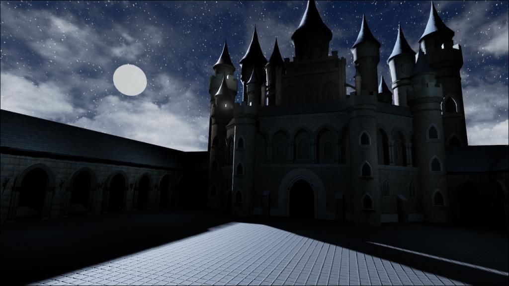
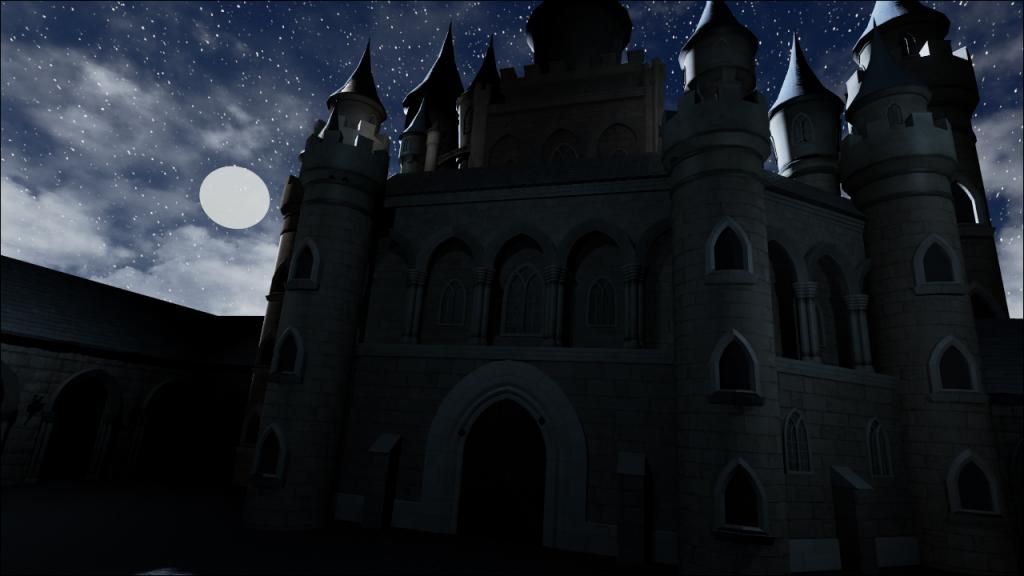
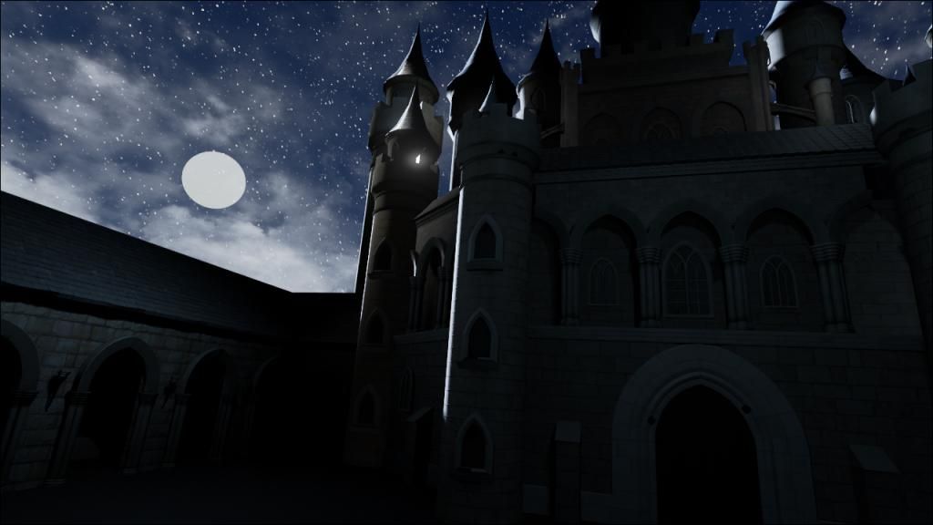
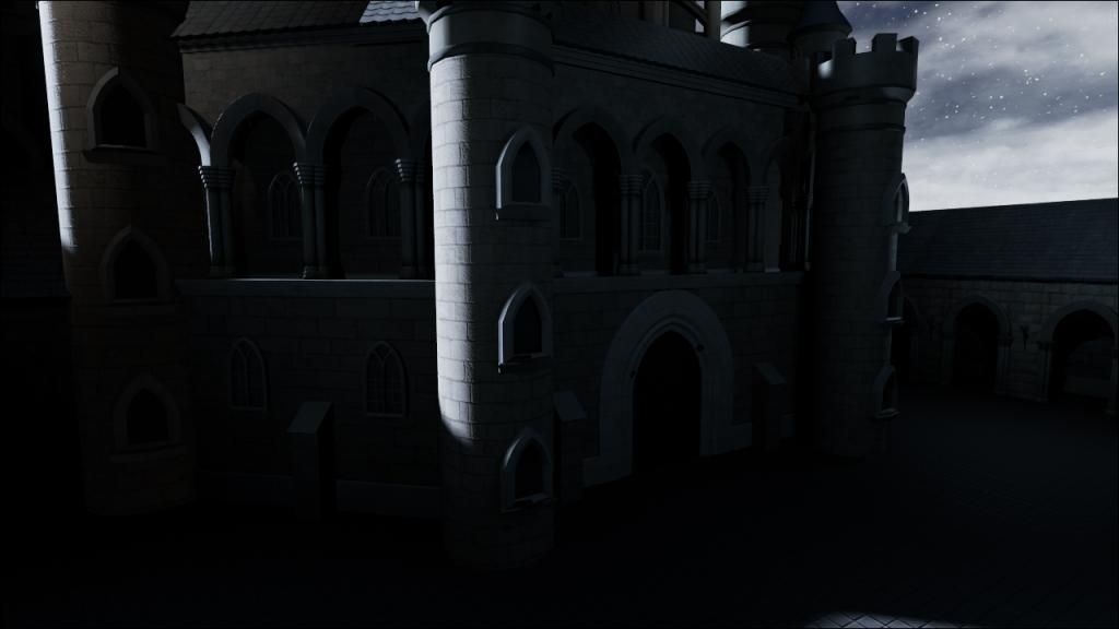
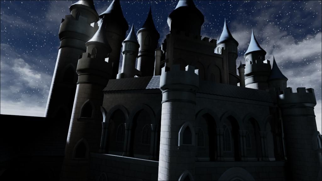
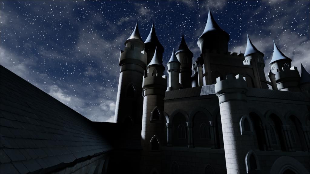
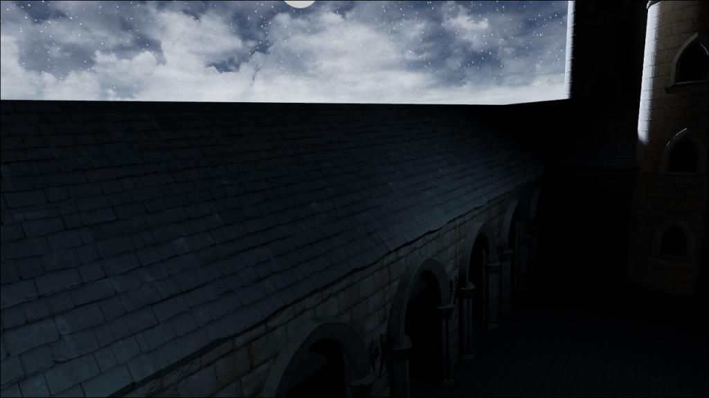
Video: [ame="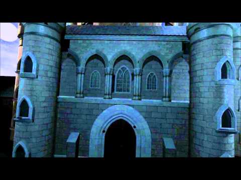 https://www.youtube.com/watch?v=eI1AYLs9PHY"]https://www.youtube.com/watch?v=eI1AYLs9PHY[/ame]
What I didn't include in the final deadline was a well in the middle of the courtyard, this was because I couldn't get my normals to bake properly. This is the low poly render in Maya with the well in the courtyard:
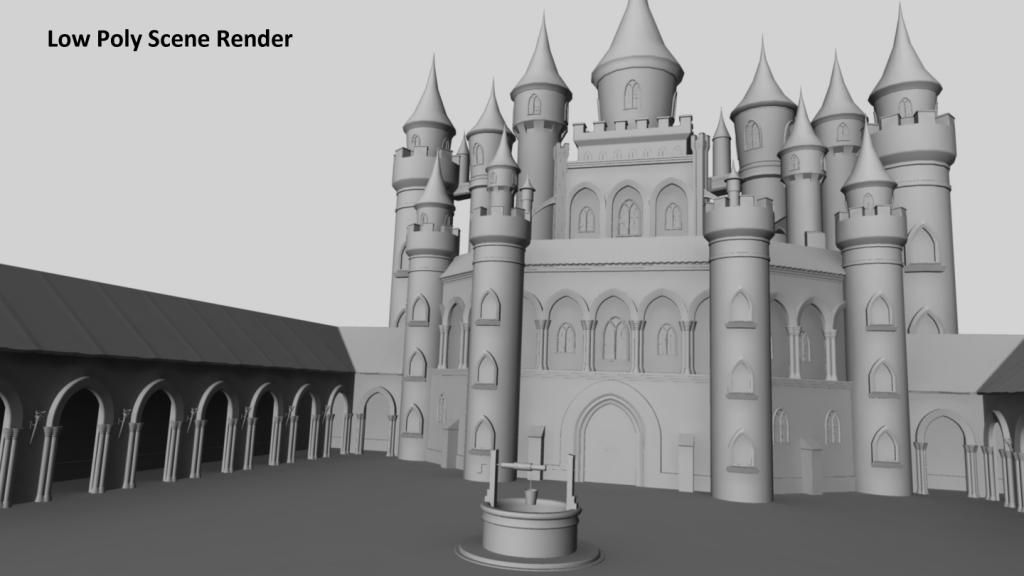
Here is the feedback from my lecturer:
From the feedback given I feel that this semester I need to improve the following aspects:
1. Try and have a concrete plan of what I intend to do.
2. Create and use UE4 shaders effectively adding dirt, moss, wet areas etc. As well as looking at adding cracks and recesses in brick work.
3. A more complex building style, similar to the style originally chosen in my first moodboards. I could try and incorporate extra assets to create this effect rather than start again with the assets I already have. For this I should try and have a clear idea and plan of what I want to do, deciding what I want to add to the piece and how that will affect the silhouette of the castle.
4. Lighting is a big part of this level that I want to change because it is not light enough to see the castle. My original idea was to have the moon in the background as part of the composition of the scene but this obviously affects the way the scene is lit and does not provide enough light. If I did have the moon shine on the castle from the front, as suggested in the feedback, so that it is lit clearly, I feel that I would have to adjust the composition of the piece because there would be a big gap where the moon was. I am not sure how I would change that at this moment in time because I would have to take into consideration the size of the castle and how that would fit into the scene without leaving masses of sky; this would also affect how I would add in more complex assets to the scene. I could move the camera closer to the castle so that it is more interesting but then that would cut off the top of the castle and destroy the silhouette against the night sky, which I actually like.
I would also like to work on some features that I discussed in my evaluation last semester, which were:
1. Create sculpts of stone textures for the castle walls and courtyard walls in ZBrush.
2. Create particle effects for the torches in the courtyard, which may also help with lighting.
3. Figure out how to create and use displacement maps effectively.
4. Finish the well that sits in the middle of the courtyard, by fixing the normal map and adding textures to it. As well as creating some assets that could populate the courtyard, such as weapons, a weapons rack and random objects including crates; whether I add in these assets depends on how I tackle the lighting of the scene and if I change the composition how they would integrate into it.
Thanks for reading and if you could provide any feedback that would be fantastic.
Last semester at uni I took an advanced 3D modelling module where I had to redesign a fighting game stage. I chose Luigi's Mansion from Super Smash Bros and basically changed the mansion into a "gothic" castle, although I feel that it needs more gothic features. This semester I have to improve what I created last semester, I have been given feedback from lecturers and I have a list of things that I personally want to improve and add to the environment. It would be amazing if you guys could provide me with some feedback as well so that I can turn this piece of work into something that I actually like, because right now I don't like it at all.
So the environment is setup in UE4 and this semester we are learning more about shaders, so hopefully I can drastically improve my materials.
Below are the final renders of the scene and a video from last semester (I know the lighting needs a lot of work, that is on my list of things to do):


Video: [ame="
 https://www.youtube.com/watch?v=eI1AYLs9PHY"]https://www.youtube.com/watch?v=eI1AYLs9PHY[/ame]
What I didn't include in the final deadline was a well in the middle of the courtyard, this was because I couldn't get my normals to bake properly. This is the low poly render in Maya with the well in the courtyard:

Here is the feedback from my lecturer:
Research and design
You have some useful visual reference but close ups would be useful to help with the production stage.
You've started thinking about the modular construction which is good but it would be good to see more of a concrete plan based on a clear source or set of sources.
What is somewhat neglected at this point is considrations for the implementation of the project in UE4. There's a lot to think about with shaders especially considering that most of the texturing is effectively one 'real world' material like sandstone etc. You need to think about adding other elements such as dirt, wet areas, moss, lichen etc.
Modelling
The modelling is competent but quite basic. The buildings style could be more complex and more in line with your earlier examples. Modularity should help if this was a attempted, assuming you can break things down to the minimum and using symmetry would be essential.
If you stick with the current level of complexity, much more needs to be done with material shaders to break up the brick work e.g. cracks, recesses in the mortar, different bricks from repairs.
Textures & shaders
You've produced quite a lot of textures but it's difficult to know how you may be intending on implementing them. There are several flat colour files that don't seem to have any purpose and this can't be deciphered from your naming convention.
Several of these textures have been treated like characters in terms of their unwrap rather than tiling textures, which might have cut down the work and been more appropriate e.g. rooftiles and much of the stone work could easily use a tiling texture.
Your UE4 files don't seem to have much in them. We'd be expecting the whole project rather than levels.
Some of the curved stone work could probably be straightened to allow for better packing and improved baking. The columns are a very good example of this.
Your normal maps could use more depth in elements such as the stone work. There are ways to do this by progressively blurring and layering the original map that you filter. Using bump offset in UE4 may also help in game.
As you've noted, the level could be lit better. Ideally, the mansion should be lit from the front by the moon to ensure that it is clearly visible otherwise the ambient light levels need to be increased.
Written
More interaction with your thread in the early stages of the semester would probably have helped. What you say is usually clear but you've missed out a lot of useful research at the beginning of the project and it's not clear froom your thread how you were going to tackle big issues such as textures and materials.
You make some useful points but from both an academic and professional point of view these need to be clearer. It would be useful for instance to find out how to implement displacement maps or discuss the process for sculpting brickwork. If you know something needs to change, discuss how it needs to change and how that change needs to come about. Research into different artists workflows and UE4 materials to understand the scale of the task. Be prepared for the new semester.
'Add more details intextures such as grime' - You need to look into lerping materials using vertex colour and RGB masks or blending between material expressions rather than adding this in photoshop.
From the feedback given I feel that this semester I need to improve the following aspects:
1. Try and have a concrete plan of what I intend to do.
2. Create and use UE4 shaders effectively adding dirt, moss, wet areas etc. As well as looking at adding cracks and recesses in brick work.
3. A more complex building style, similar to the style originally chosen in my first moodboards. I could try and incorporate extra assets to create this effect rather than start again with the assets I already have. For this I should try and have a clear idea and plan of what I want to do, deciding what I want to add to the piece and how that will affect the silhouette of the castle.
4. Lighting is a big part of this level that I want to change because it is not light enough to see the castle. My original idea was to have the moon in the background as part of the composition of the scene but this obviously affects the way the scene is lit and does not provide enough light. If I did have the moon shine on the castle from the front, as suggested in the feedback, so that it is lit clearly, I feel that I would have to adjust the composition of the piece because there would be a big gap where the moon was. I am not sure how I would change that at this moment in time because I would have to take into consideration the size of the castle and how that would fit into the scene without leaving masses of sky; this would also affect how I would add in more complex assets to the scene. I could move the camera closer to the castle so that it is more interesting but then that would cut off the top of the castle and destroy the silhouette against the night sky, which I actually like.
I would also like to work on some features that I discussed in my evaluation last semester, which were:
1. Create sculpts of stone textures for the castle walls and courtyard walls in ZBrush.
2. Create particle effects for the torches in the courtyard, which may also help with lighting.
3. Figure out how to create and use displacement maps effectively.
4. Finish the well that sits in the middle of the courtyard, by fixing the normal map and adding textures to it. As well as creating some assets that could populate the courtyard, such as weapons, a weapons rack and random objects including crates; whether I add in these assets depends on how I tackle the lighting of the scene and if I change the composition how they would integrate into it.
Thanks for reading and if you could provide any feedback that would be fantastic.
Replies
Maybe at some fog in there. and some cool lighting from the windows and what not.
He already mentioned the textures, but I feel it needs repeating. Please break those jokers up. Its far too uniform.
I really love this.
Thanks again.
Did you end up getting your baking issue figured out? You mentioned that you'd encountered some issues with that.