Home 3D Art Showcase & Critiques

Hand Painted Rocks

interpolator
Offline / Send Message
Zack Maxwell interpolator
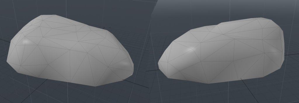
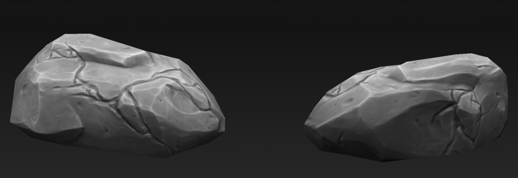
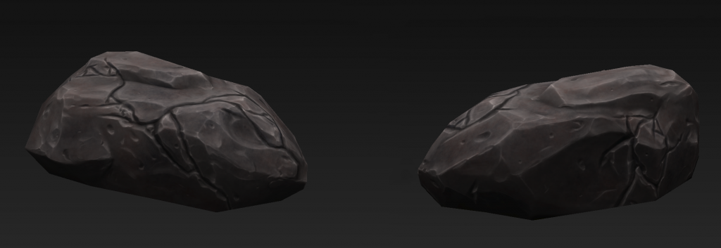
I've been working on creating some painted-style rocks. Something relatively simple that I could get some nice practice with. Basic Diffuse-only shading.
I'm not entirely happy with the result, though I've yet to pinpoint exactly why.
Any critiques and advice would be very welcome.
I'll be starting on the second rock soon and try to incorporate feedback.

ZBrush High Poly
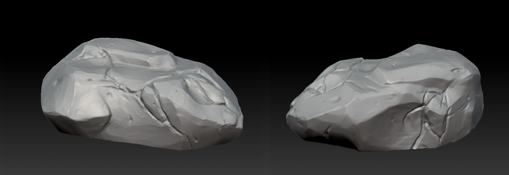
RockWIP1_zpsafc55d83.png

Modo Low Poly
RockWIP2_zpsd91f96e1.png

Substance Designer Base Diffuse
RockWIP3_zps81901f9b.png

Substance Painter Final Diffuse
RockWIP4_zps37a41707.png

Replies

  • TheWalkerGod
    The cracks on the rock don't seem really realistic to me. They seem to lack good edge definition and sharpness in places, and I don't know if cracks would really form on a rock like that. The cracks also lack depth but that's likely cause you didn't use a normal map. Just wondering, did you use reference, and if you did could you upload an image?

    I do like the overall color of the rock though. The spots where you used beveled edges also look nice.
  • Shurkuris
    Offline / Send Message
    Shurkuris polycounter lvl 3
    Is the darkness part of the Diffuse or is it lit with shading? It's harder to judge it since it's so dark.
  • Zack Maxwell
    Offline / Send Message
    Zack Maxwell interpolator
    It's flat shaded; everything you see is diffuse.

    I agree about the cracks. I spent a lot of time trying to figure out how to shape them, but just couldn't get it right.
    I used a large number of references, so it'd be difficult to show. Mostly though it was screenshots from Diablo 3 and Warcraft.
    I think this was probably the one I focused most on, though.
  • Snafubar7
    Offline / Send Message
    Snafubar7 polycounter lvl 8
    Not bad :)

    Can we see the texture?
  • Zack Maxwell
    Offline / Send Message
    Zack Maxwell interpolator
  • TheWalkerGod
    Grimwolf wrote: »
    It's flat shaded; everything you see is diffuse.

    I agree about the cracks. I spent a lot of time trying to figure out how to shape them, but just couldn't get it right.
    I used a large number of references, so it'd be difficult to show. Mostly though it was screenshots from Diablo 3 and Warcraft.
    I think this was probably the one I focused most on, though.

    Well looking at that image i can see why you modeled the cracks like that. But looking at the image, cracks like the one you made seem to appear on the much larger cliff faces. For the smaller rocks in the picture, like the one you modeled, the cracks are much smaller and nuanced, definitely not as intricate. Also i imagine such wavy cracks like the ones you made would be much wider and not as deep, which might explain why they appear on the larger cliffs in the photo.
  • Zack Maxwell
    Offline / Send Message
    Zack Maxwell interpolator
    I tried it without cracks, and it seemed too plain. At first they were a lot smaller and more subtle, but it still felt plain. Like there was a lot of unused space creating a kind of imbalance.
    In hindsight I think it may have been an issue with the structure itself, and the cracks may have ended up being a kind of ill-conceived band-aid.
    If such large cracks were unrealistic in the first place, that may help explain why I couldn't get them to look good.
    I definitely see what you mean about them being too narrow, as well. Creating wide, shallow cracks would probably look pretty good.
  • TheWalkerGod
    Well as for it looking too plain you don't always have to worry too much. Your diffuse texture, after all, will help it look cooler. Looking back at your diffuse texture actually i think you should play more with variations of color, might give your model that needed push (don't go overboard though, keep it subtle). Good luck with this project, I'll be keeping my eye on it.
  • Zack Maxwell
    Offline / Send Message
    Zack Maxwell interpolator
    Here's the high poly of the next rock. Really toned down the cracks.
    It also occurred to me; I have a Sketchfab Pro account, I really should use it :\
    [SKETCHFAB]af79cab61034494bb371a36d62ec6151[/SKETCHFAB]
  • TheWalkerGod
    I'm a little busy right now so i can't go too much in depth right now but from what i can see it is looking better. What i'm noticing though is some parts look like they're jutting out too far. Also i'm noticing that there are still some unrealistic details. Looking back on it i'm noticing the reference you showed me was of a gigantic scene. Are you using references of smaller rocks also? Also if you're not you might want to look at references of realistic rocks if you're only looking at hand painted ones.
  • Zack Maxwell
    Offline / Send Message
    Zack Maxwell interpolator
    Yeah, I should've gotten some better references, which I now have. I'm gonna try it over again.

    -Edit-
    Heheh... I finished the next one, but completely botched it. So time to start over on a new one. I was trying to make a super-basic little rock, but put way too much detail into the shape of the high poly again, so... it didn't bake well.
    The low poly ended up requiring a lot more geometry than I was willing to give it.
  • Zack Maxwell
    Offline / Send Message
    Zack Maxwell interpolator
    I seem to have hit a bit of a psychological impasse with the rocks, and I think I need to move over to something more structured. So, I'm going to work on some basic environmental props instead.
    First up, a crate!
  • Zack Maxwell
    Offline / Send Message
    Zack Maxwell interpolator
    My progress so far. Got tied up for a while there.
    Crate1_WIP1_zpsumf6fgku.png
    Just gotta sculpt details into those corner beams, then I can start painting.
  • Zack Maxwell
    Offline / Send Message
    Zack Maxwell interpolator
    Finished the sculpt and base texturing. Now I've just gotta paint it
    Crate1_WIP2_zpsoppzfhmb.png
  • Zack Maxwell
    Offline / Send Message
    Zack Maxwell interpolator
    Well, I've finished the crate. The problem is I must have botched the material or something, because I can't get it to work right in Sketchfab, so I'm still working that out. The color and the normals look all weird in it for some reason.
    Anyway, here's a screenshot from Marmoset instead, where it works fine.
    Crate1_zpshroritsc.png
Sign In or Register to comment.