Stylized Pirate - Sephez
Hey guys!
I'm pretty shy about posting some work in progresses and just art in general but I decided I'd start my own thread this time and see how it goes! I've started working on an old project that I never finished and I figured it was time to get it done It's inspired by Pirate Ninja Voodoo Witch from martyisnothere.
And I would love to recieve any feedback, harsh critique or anything else you have on your mind!
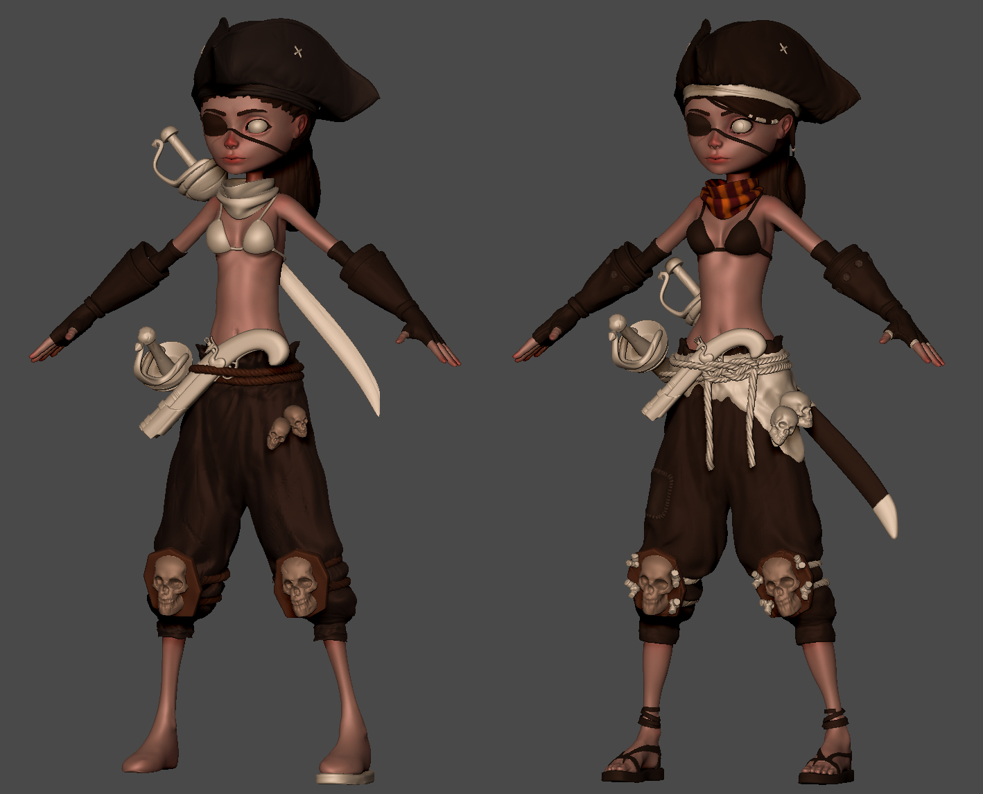
The left one is where I left off and the right one is a more recent version.

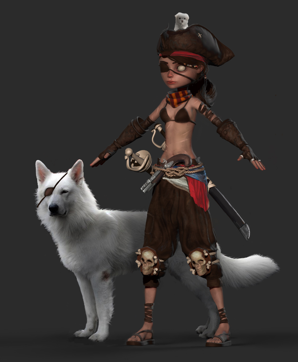
And this is currently the vision I have for where I'd like to take it! The plan is to replace both swords and make them both unique, their scabbards, shorten the sword in the back a bit, stylize the knee skulls a bit more and add some more details to her like a compass or something? Also dogs, perhaps with a corgi pup on top instead!

And a bonus concept I did for myself to help visualize the world she's in!

I'm pretty shy about posting some work in progresses and just art in general but I decided I'd start my own thread this time and see how it goes! I've started working on an old project that I never finished and I figured it was time to get it done
And I would love to recieve any feedback, harsh critique or anything else you have on your mind!
The left one is where I left off and the right one is a more recent version.

And this is currently the vision I have for where I'd like to take it! The plan is to replace both swords and make them both unique, their scabbards, shorten the sword in the back a bit, stylize the knee skulls a bit more and add some more details to her like a compass or something? Also dogs, perhaps with a corgi pup on top instead!

And a bonus concept I did for myself to help visualize the world she's in!

Replies
I think the pants need work. It kind of looks like melted wax. Check out some reference to help you out. Maybe even something a little more stylized would fit well with the character.
Great work, she has a lot of character.
Part of me is a bit bothered by how the gloves don't fit around her forearm. Since there is visible space that is not being filled it looks a bit uncomfortable. Perhaps stuffing something inside the gloves to fill the open space may help.
The main thing is the drapery, everything else that I've stated is more of a personal taste. Keep up the good work!
I went over her pants again and I feel it's looking better now, my main reference has been the girl in the bottom right and the brown pants next to her. I don't think it's quite there yet though so I'll have another pass once I can come back with some fresh eyes. Any thoughts on it?
Leinad: I went over the lips and defined them them a bit more and I think it's an improvement! There is some padding inside the gloves but it's a bit further down than what is shown in the renders, slightly below her elbow so I think it makes sense as it is!
Can't wait to see more and love the enviro
I've also done some early sculpting of the wolf, some tweaks to the pirate (have yet to decide a name for her) like the knee skulls and tried fibermesh for the first time, it seems really nice. I'm not entirely sure how stylized I want to make the wolf, I like how it's less stylized than the animals you'd see in a typical Disney or Pixar movie.