[Riot Art Contest] Malzahar
Hey all!
EDIT: Current state:

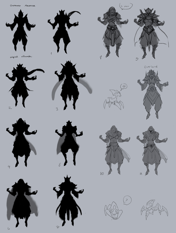
Since Malz is getting a bit outdated I decided to give him some love. Here are some WIP silhouettes and sketches of my attempt at redesigning his classic look (+ bonus minions):

As the classic Malzahar looks a bit boring, I tried to spice up a bit. Still haven't reached a design that feels like Malzahar, but I'm getting closer! Too many similarities to ninjas and other champions.. Please tell me what you think!
EDIT: Current state:

Since Malz is getting a bit outdated I decided to give him some love. Here are some WIP silhouettes and sketches of my attempt at redesigning his classic look (+ bonus minions):

As the classic Malzahar looks a bit boring, I tried to spice up a bit. Still haven't reached a design that feels like Malzahar, but I'm getting closer! Too many similarities to ninjas and other champions.. Please tell me what you think!
Replies
All of the sketches and silhouettes look rad.
I also like how you spiced it a bit although I do have to agree it does give a ninja-like feel.
Keep up the great work~
(those minions are so adorbs too)
Any comments and critique is welcome!
First, the used ref/inspiration pictures. I tried to dig up a lot of Shuriman/desert stuff.
I decided to stick with the 4th silhouette and continued from the sketches I made earlier. And since Malz has some glow-y runic writing on his robes, I tried how'd it look on these designs. The second from the left has identical runes to the classic Malzahar skin. The runes look kind of crude so they'll get discarded for now.
Then I combined the things I liked the most about each design and ended up with this:
The same with a slap of colour, tried to combine Shurima with Void. Ended up looking quite close to the Overlord skin, so I still have to work with this. Going to stick with a purple colour theme as it is supposed to be Malz.
Then the minions! Again, I started with really quick silhouettes. First silhouette as a reference to the original. I tried to keep the overall look somewhat recognisable.
Usually I draw more silhouettes before I stick to a design, but I liked the last one so I just picked it out. Tried a more insect-like look and more void-like. Probably going to stick with the void one. And then I slapped some colour on the minions as well. Left one's supposed to be recently summoned minion and right one once it grows/goes to frenzy.
Comments and critique are always welcome <:
Here's some progress:
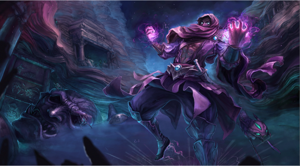
So the League wiki says the following about Icathia: "...alien geometry of a ruined city adorned with bizarre crumbling obelisks and the giant decaying idols of dark and horrific gods." Tried using weird rock formations instead of alien geometry, seemed more appropriate.
Flipped it to match the 'splashart standard' and fiddled a bit with his pose. Also adjusted the colours to match the theme (less Ionia wibe).
Pretty much all the basic shades on Malz are now done. Time to throw on more cast shadows and such, then comes wear and tear <: Soon minions!
Though, now that I look at Malz, his hand and pelvis are in dire need of fixing.. If you guys see something out of place please tell! o/
soon
Finished!