Deus Ex: Human Revolution Scene in (UE4)
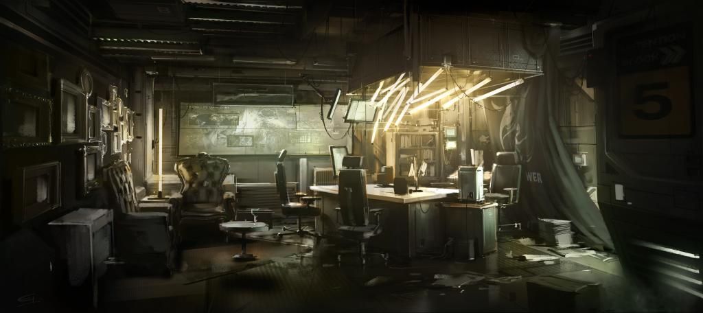
I am finally getting some time to start on a new portfolio piece after many failed attempts to see on through. -.- I will be doing this in UE4 and POSSIBLY crossing over the CE3 to do a comparison. My goal here is to attempt hyper-realism. Here is the scene concept.
I have started the first mesh already. Below are some quick renders of the high poly. I started with the chair to go ahead and get that out of the way. Plus it looked like a fun hard/organic surface challenge. I wanted to do it in sub-d for a little bit better control. Here it is so far:
It was fun to reference this one because the chair doesn't actually exist (it only represents a particular style present in the game... which I love!) I tried to fuse some modern simplicity with a Victorian sort of fine detail while following the shape language that was introduced in the concept. Obviously the chair was not the "Hero" piece in this shot so the detail in minimal in the concept which left a lot to be interpreted. I am pretty happy with the results so far. Next to re-topo and bake down. (assuming i decide to refrain from adding further details..also there are some minor overlapping issue I will resolve before moving on to the low poly.)
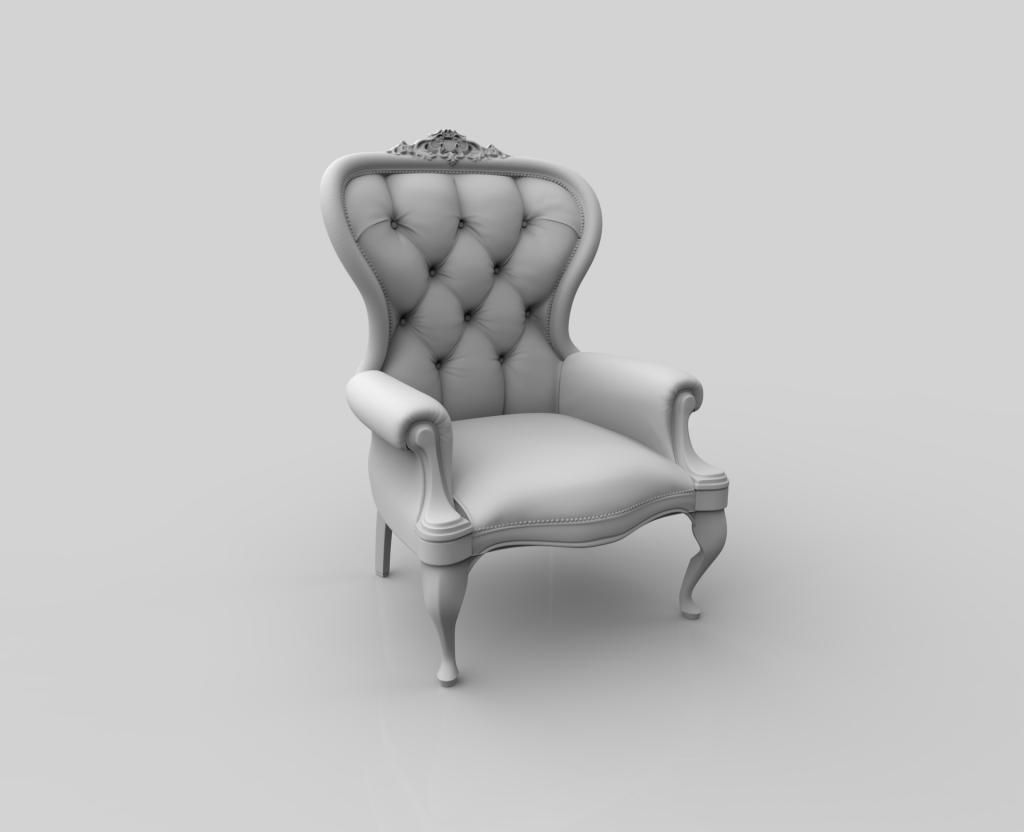
A quick clay pass:
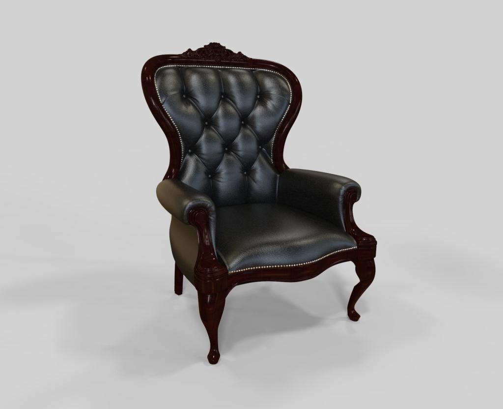
And a quick material pass just to see it with the proper mats on it. I am feeling pretty good about the leather at this point... and the shape looks good i think... I am considering going back to Zbrush for some more fine Victorian detail on the bottom trim though.
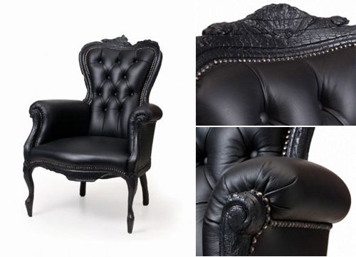
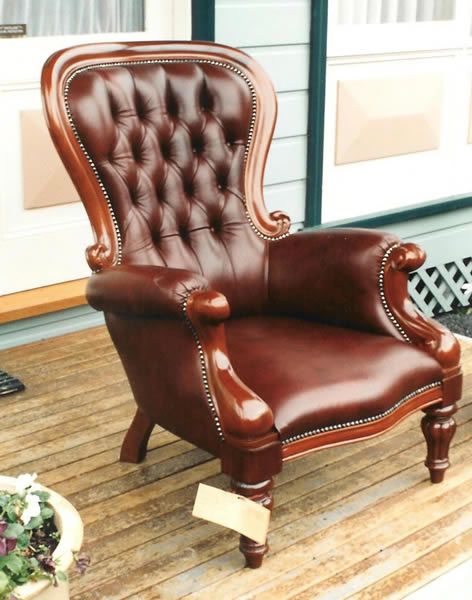
Here are some of the images I LOOSELY reference for this chair.

I have started the first mesh already. Below are some quick renders of the high poly. I started with the chair to go ahead and get that out of the way. Plus it looked like a fun hard/organic surface challenge. I wanted to do it in sub-d for a little bit better control. Here it is so far:
It was fun to reference this one because the chair doesn't actually exist (it only represents a particular style present in the game... which I love!) I tried to fuse some modern simplicity with a Victorian sort of fine detail while following the shape language that was introduced in the concept. Obviously the chair was not the "Hero" piece in this shot so the detail in minimal in the concept which left a lot to be interpreted. I am pretty happy with the results so far. Next to re-topo and bake down. (assuming i decide to refrain from adding further details..also there are some minor overlapping issue I will resolve before moving on to the low poly.)
A quick clay pass:

And a quick material pass just to see it with the proper mats on it. I am feeling pretty good about the leather at this point... and the shape looks good i think... I am considering going back to Zbrush for some more fine Victorian detail on the bottom trim though.

Here are some of the images I LOOSELY reference for this chair.


Replies
For the chair I'd go with the all black look, rather than the brown wood, the model looks cool though.
I was looking at this chair at work and the first thought I had was how much i want to model it. Moooi make some really intresting designs that I always get inspired over.
The model looks nice can't wait to see more on this project.
Edit: I also agree with frmdbl on the wood I think it would look better in black.