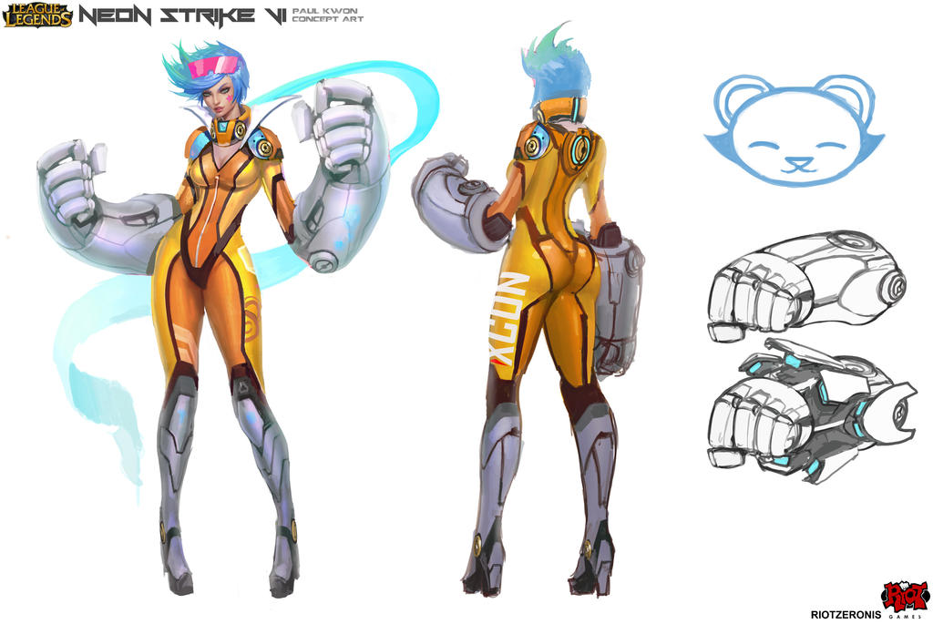
[Riot Art Contest] - Neon Strike Vi
wooo hoooooooo!!!!
I finally made it....I have to admit this was extremely difficult towards the end (oh man and handpainting!! I've never handpainted in my life..so this was...hard..to say the least.), and wasn't able to push it as far as I had hoped, especially with all the awesome paintovers! This is pretty much the first game model I've ever made correctly and seen it through to the finish, so it's been a bit tough.
I'm also AWFUL at graphic design, haha! aaaaaaaand learning what pose works and what doesn't for lowpoly models! This contest really put me through the ringer, and I'm so thankful. I've learned a lot about myself as a person and an artist. I understand my weaknesses and am so excited to push myself further in the future.
I've also met many awesome artists through this contest! Which is awesome! All you guys are so inspirational.
A special thank you to Hai Phan, Hellstern, DmitryGrebenkov, Michy, and polymator for your awesome paintovers!! Thank you everyone for your support and wonderful critiques.
Most of all..a very special thank you to Troy (hazardous) for putting up with all my questions, teaching me how to bake maps even better than before, sitting down with me and teaching me some tricks of the trade, lifting me up when I was down, and cooking all the meals the last week. I wouldn't have made it this far without you. Thank you, and I love you I hope with many more characters in the future I will be able to put your knowledge and teachings to good use! I wont let you down ;__;
LETS ALL GET SOME SLEEP NOW!


Hey guys!!
Super stoked for this contest!
I'll be doing Paul Kwon's Neon Strike Vi, possibly putting my own spin on it ! Good luck everyone!

I finally made it....I have to admit this was extremely difficult towards the end (oh man and handpainting!! I've never handpainted in my life..so this was...hard..to say the least.), and wasn't able to push it as far as I had hoped, especially with all the awesome paintovers! This is pretty much the first game model I've ever made correctly and seen it through to the finish, so it's been a bit tough.
I'm also AWFUL at graphic design, haha! aaaaaaaand learning what pose works and what doesn't for lowpoly models! This contest really put me through the ringer, and I'm so thankful. I've learned a lot about myself as a person and an artist. I understand my weaknesses and am so excited to push myself further in the future.
I've also met many awesome artists through this contest! Which is awesome!
A special thank you to Hai Phan, Hellstern, DmitryGrebenkov, Michy, and polymator for your awesome paintovers!! Thank you everyone for your support and wonderful critiques.
Most of all..a very special thank you to Troy (hazardous) for putting up with all my questions, teaching me how to bake maps even better than before, sitting down with me and teaching me some tricks of the trade, lifting me up when I was down, and cooking all the meals the last week. I wouldn't have made it this far without you. Thank you, and I love you
LETS ALL GET SOME SLEEP NOW!


Hey guys!!
Super stoked for this contest!
I'll be doing Paul Kwon's Neon Strike Vi, possibly putting my own spin on it


Replies
Goodluck!
Best of luck!
I took the basemesh I was working on last week and continued to push it towards exaggerated proportions.
I picked Paul Kwon's Neon Strike Vi but would like to pick a few pieces from his earlier workings of Neon Strike Vi, so we'll see where it goes!
This is the first time I have ever made my own base mesh and started from blobs, so please- critique is very welcome!
P.S She has cuts on her neck because I like to separate the body and head due to having different topology at the beginning ^-^
Possibly picking some things from this!
The colours in the original concept are amazing.
I look forward to seeing more.
"Quick question,
will I be disqualified if I use some stuff from Paul's earlier neon strike vi concepts? I'm not sure if that counts as fan art since it's not the official version.
Thank you!
Response:
You are fine. That is art made by a Rioter which is acceptable."
We're all good to go here! ^_^
Thank you all for your support and critiques! I'm stoked to keep going today!
So I've hit a bit of a road block. I really dig some pieces from the concept of Neon Vi that made it in game, and I dig some of the old ideas that were drawn up. I was trying to mix in a bit of both but quickly realized that was mooshing too many ideas into one. So I tried to do a quick block out of each concept.
Any ideas? I'm not sure how detailed or not to go into her arms either. The in game is pretty simple and readable while the splash and concepts are pretty in depth. Suggestions?
I was also having some trouble shaping out the legs properly so I spent some more time on the base body
Need to make her shoes look not so "heels crazy" and block them out a bit more to feel like the concept
crits and tips please!
And I would say go into as much detail as you want with your high poly sculpt but cut it back if you have to with your low poly model so that way you the best of both worlds.
For the gloves, I don't have much experience with game characters yet, but I feel like the detail is all going to depend on how you end up painting the diffuse. On the original neon strike model in game, the model is pretty simple, but the cut lines, both placement and frequency, and the color breakup give the sense of high detail. Again, I may be talking out of my butt here, but every step of my Kha design so far (which is almost finished, btw) has included thinking heavily about what the low-res is going to look like as well as what the diffuse texture is going to look like. So I think you should come up with a balanced plan as far as what to put on the gloves - basically anything that breaks silhouette - and what you can safely leave to the painting.
As far as the shoes, it's hard to see on the concept, but it looks like the heels are about as wide as her actual heels. If you just thicken them up, maybe reduce the tapering a little bit, I think that will help make them feel beefier and more stable.
Hm..Polypainting some ideas...I don't think it quite looks like the ingame Vi or even Pauls yet. I think it needs many many more hours to get it there. I'm considering changing her hair from blue to pink because Vi has pink hair. I also saw a really nice fanart of one of his designs and it flows together much better. I need to jot some ideas down in poly paint before I get to sculpting her suit. Hopefully that will make it a little more clear to the direction I need to go. Trying to find a happy medium between hardcore manly Vi and cute Paul kwon vi Lol! >.<;
I agree with slosh, jaw line is a bit strong. Other than that, everything looks good to me.
Awesome progress!!
I totally agree with slosh...The "Masseter" or "Angle of Jaw" should roughly sit in line with the side of the mouth.
I am keen to see some more please.
How does this look?
Still has a looooooooooong way to go! :P But I'm enjoying it so far!
Also..I think I dig the hair colors from before- a much lighter more neon pastel look. Gotta block it in tomorrow :> Thanks doods.
Crits very welcome!!
Looking at it now - on post #37 her proportions look great, at least to me. I don't know if you changed the proportions since then or is it just fov? or are you going for longer legs - if that is the case just ignore me.