Space Admiral and future Projects :)
Hello 
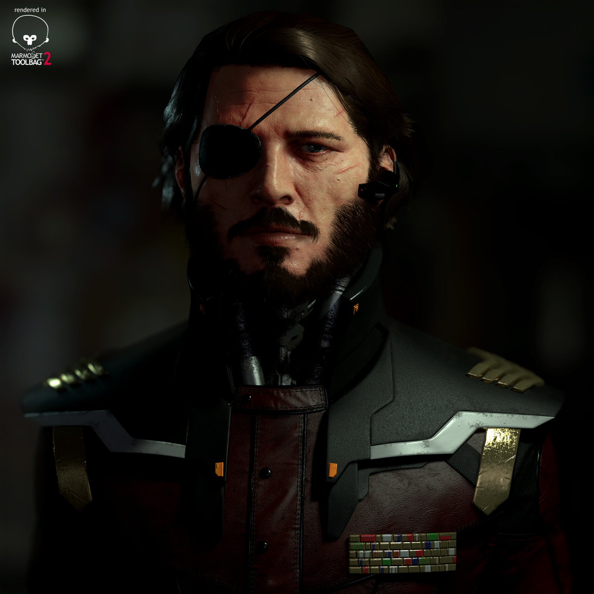
This is my latest personal project. He's not perfect and there's loads I wanna change but it's time to let him go now. Everything is rendered in marmosets toolbag 2, if you got any questions then please ask away
*updated renders*
Cheers

Turnaround

Construction

Wires

Sculpt

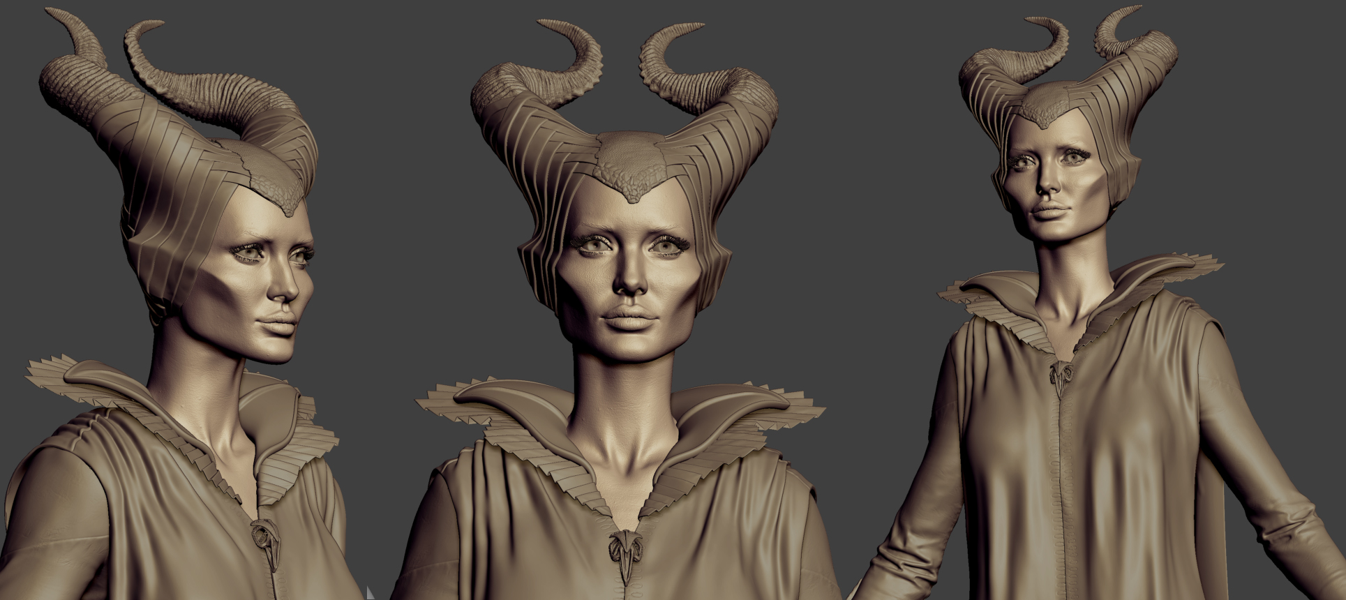
Also heres another project I have been working on More to come soon!!!!
[FONT="]

As some of you may have noticed in my signature, I'm not with 'Slide London' anymore which means I'm available 'now.' So please do get in touch if you like what I do and think I might be able to help you out my NDAs are very tight for the last 3 years due to the nature of what I have worked on but please visit slides website for a very small insight into some of the many clients I've had the pleasure of working with over the years[/FONT]
This is my latest personal project. He's not perfect and there's loads I wanna change but it's time to let him go now. Everything is rendered in marmosets toolbag 2, if you got any questions then please ask away
*updated renders*
Cheers

Turnaround

Construction

Wires

Sculpt

Also heres another project I have been working on
[FONT="]

As some of you may have noticed in my signature, I'm not with 'Slide London' anymore which means I'm available 'now.' So please do get in touch if you like what I do and think I might be able to help you out
Replies
Hope you land a job that takes advantage of those ridiculous skills.
good job with the hair, what was your process for that?
Great work Tom! Love the details on that guy.
- Agreed with Jackablade, it's really quite hard to see some things, especially since Polycount's background is just a shade brighter than the backgrounds of your renders.
- Personally I just dislike scarring in general, it's almost a rarity to see a grizzled man who hasn't had a blade scathe him either over the eye or by the upper lip just enough to show, but not enough to disfigure. But overlooking that, I feel you might have overdone the amount a bit, so that it becomes difficult to see the eye scar as iconic. Furthermore, a lot of them seem to have a different direction, which makes it look quite random.
- I don't think the insides of the nostrils work entirely well. While sculpting, we all have a bit of a habit of tapering them as they go in, whereas they should open up to a larger cavity inside. This means that you don't get the amount of occlusion you need. It should be more of a black hole.
- More nostrils: I think that the outside folds are modeled a bit too sharply and should derive their definition more from a slight darkening of the skin. At least, that's how it works on my face.
- The material wear seems a bit inconsistent to me. The gold bits have scars of their own and are very worn, the leather is dirty, but intact, and the plastic of the shoulder pads, as well as the straps, are in pristine condition.
- Lastly, the individual beard hairs look very thick and solid to me. It looks fine from a distance, but I wonder if they wouldn't look a bit better if they'd get a bit of transparancy at their ends to make them look somewhat less harsh.
Great Job.
Though I do agree to what Zwebbie said about the nostrils needing to be darker, and that the overall render would look better, a bit brighter.
Furthermore, I think that if the nose itself looks like it needs a bit bigger pores/deeper pores. As it doesn't seem to quite pop the same way the rest of The face does.
I'm gonna do a write up on the hair in the next few days as a lot of people have asked about it. I am using my IMM brush technique aswell, was surprisingly good fun in the end haha
Looking forward to seeing that hair write up
Hair write up is on the way aswell, got some awesome uv tips from Eric Askue aswell that just made my day haha. Uving entire hairstyles in seconds!!!!
Although the block color beard is odd like it's just unlit.
I'm not saying you need to make a Joel beard, but some edge highlights could help unflatten it.