My final school project WIP
Hey this thread will be about my final project for my bachelors in 3D animation and design at centre NAD in Montreal.
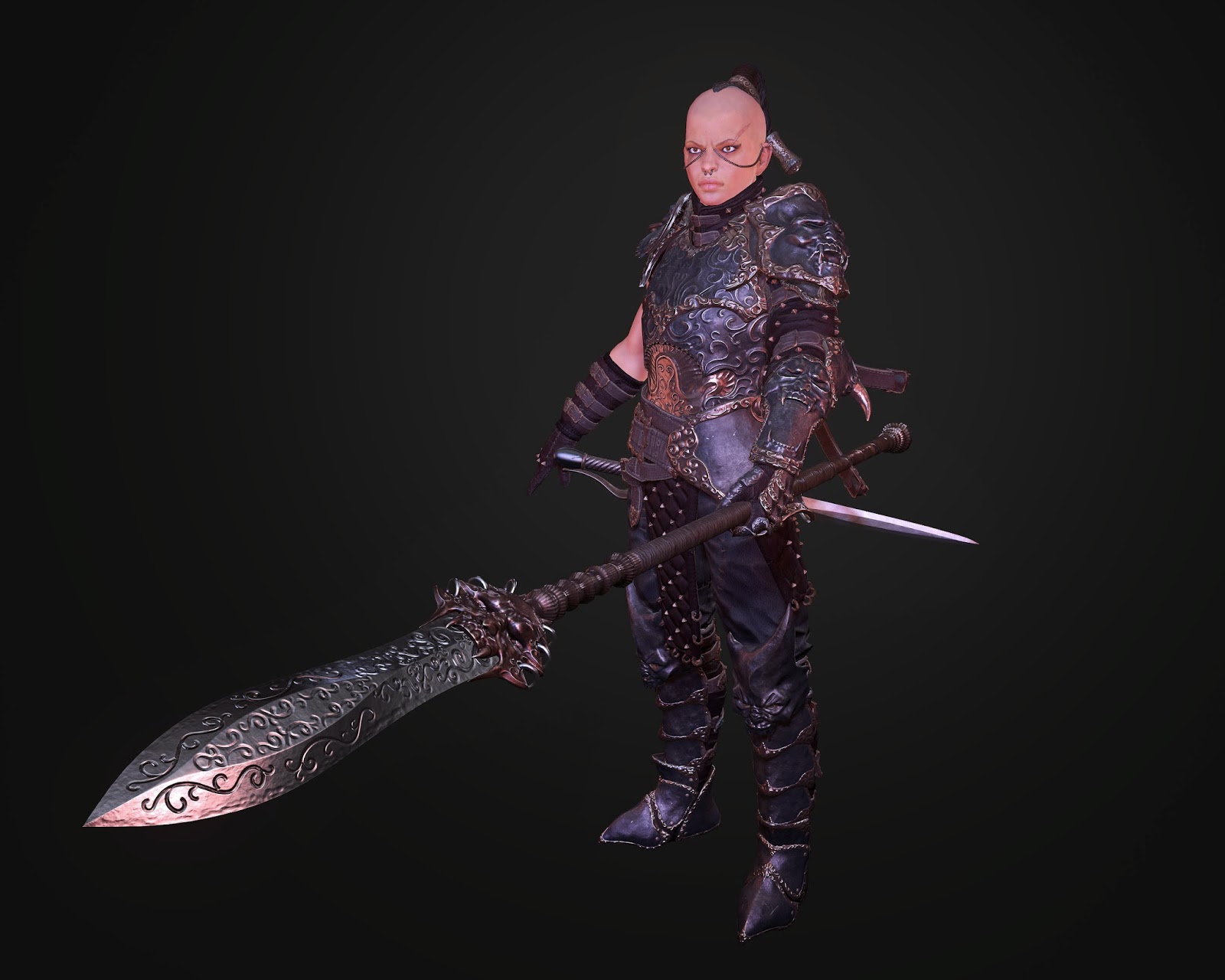
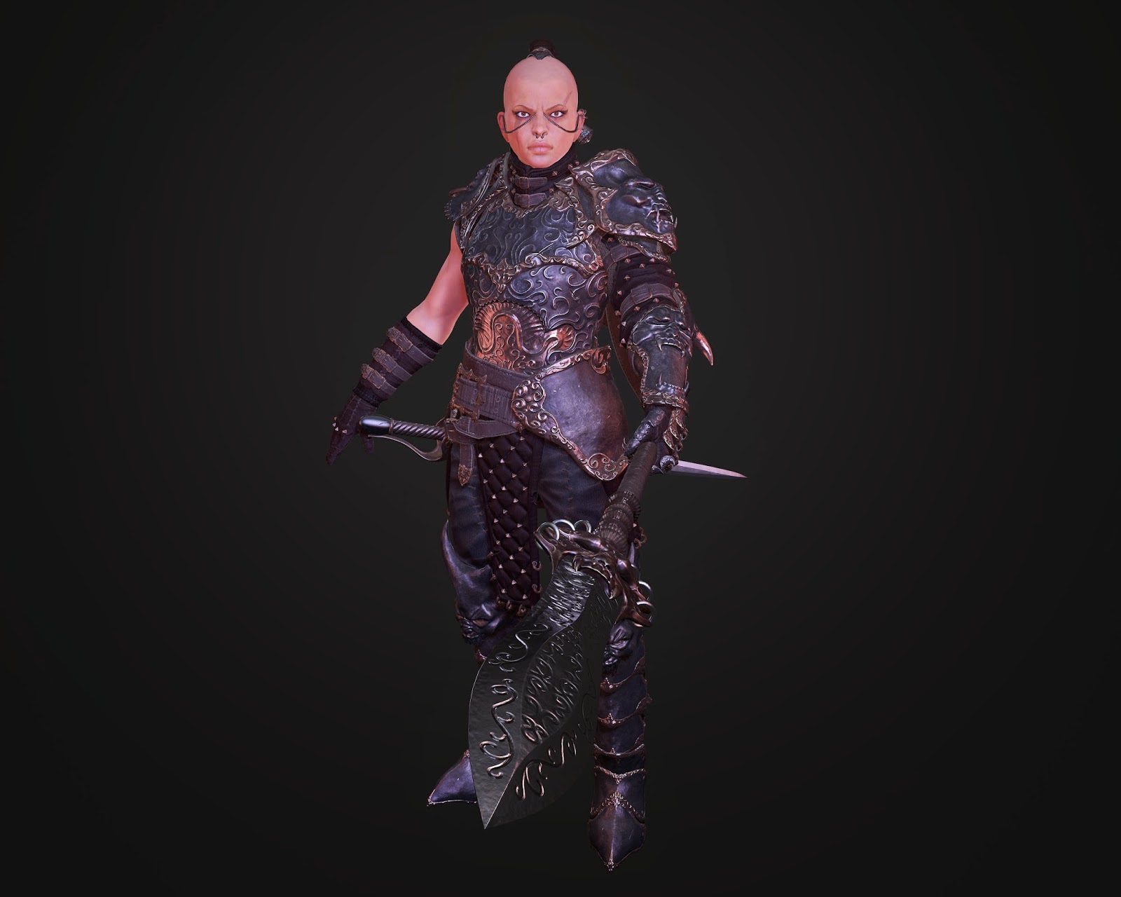
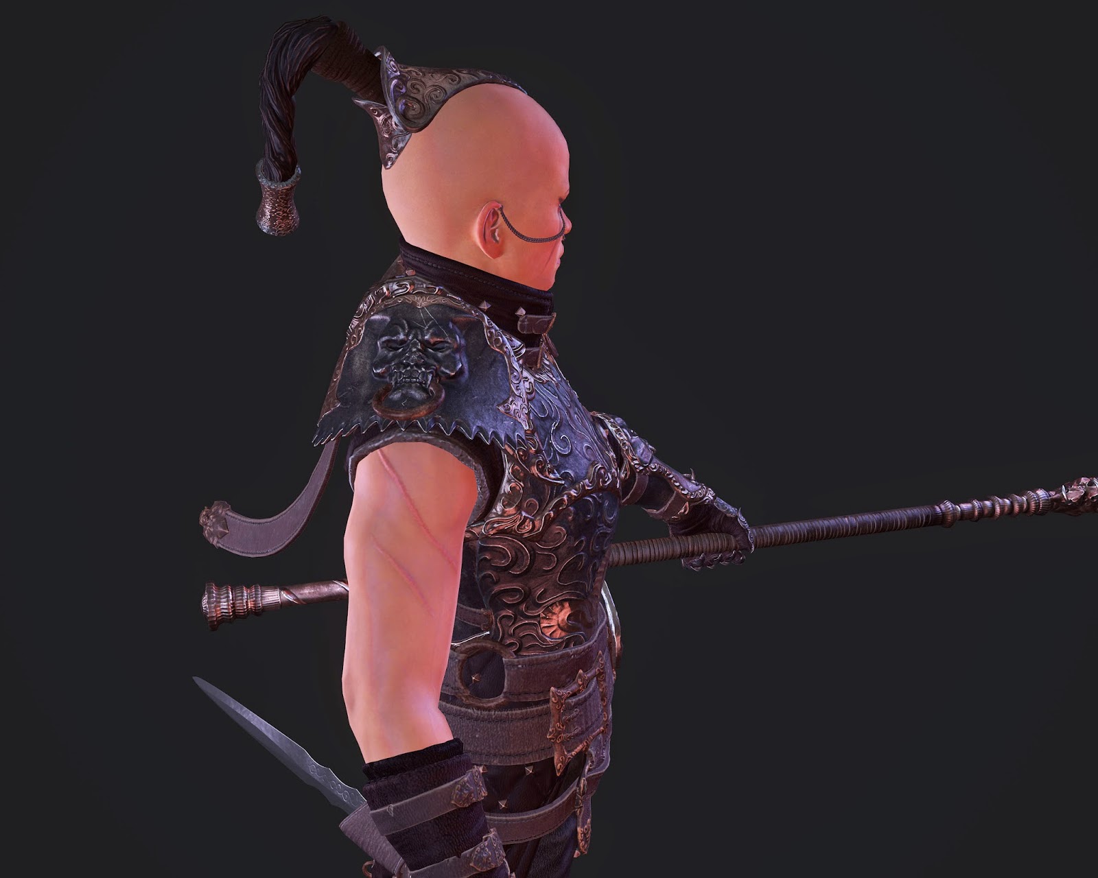
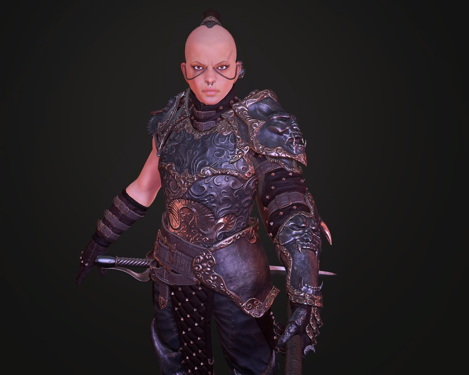
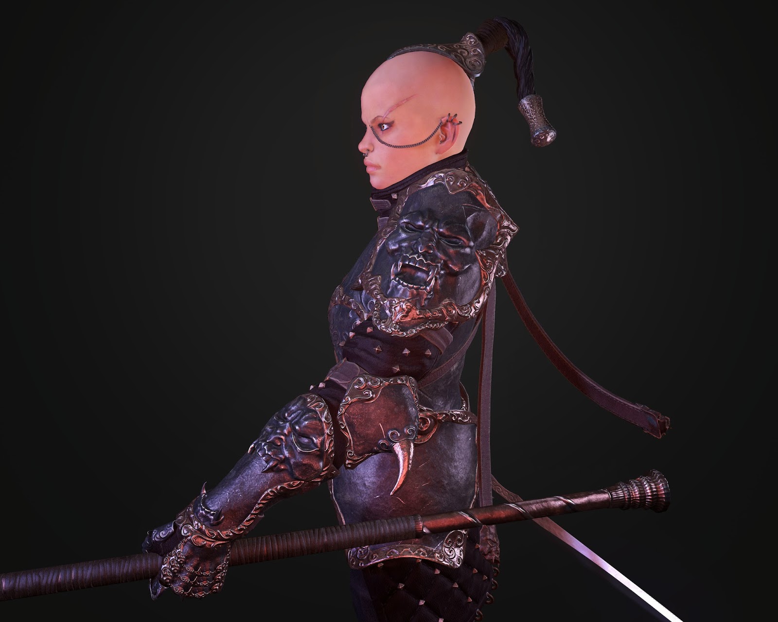
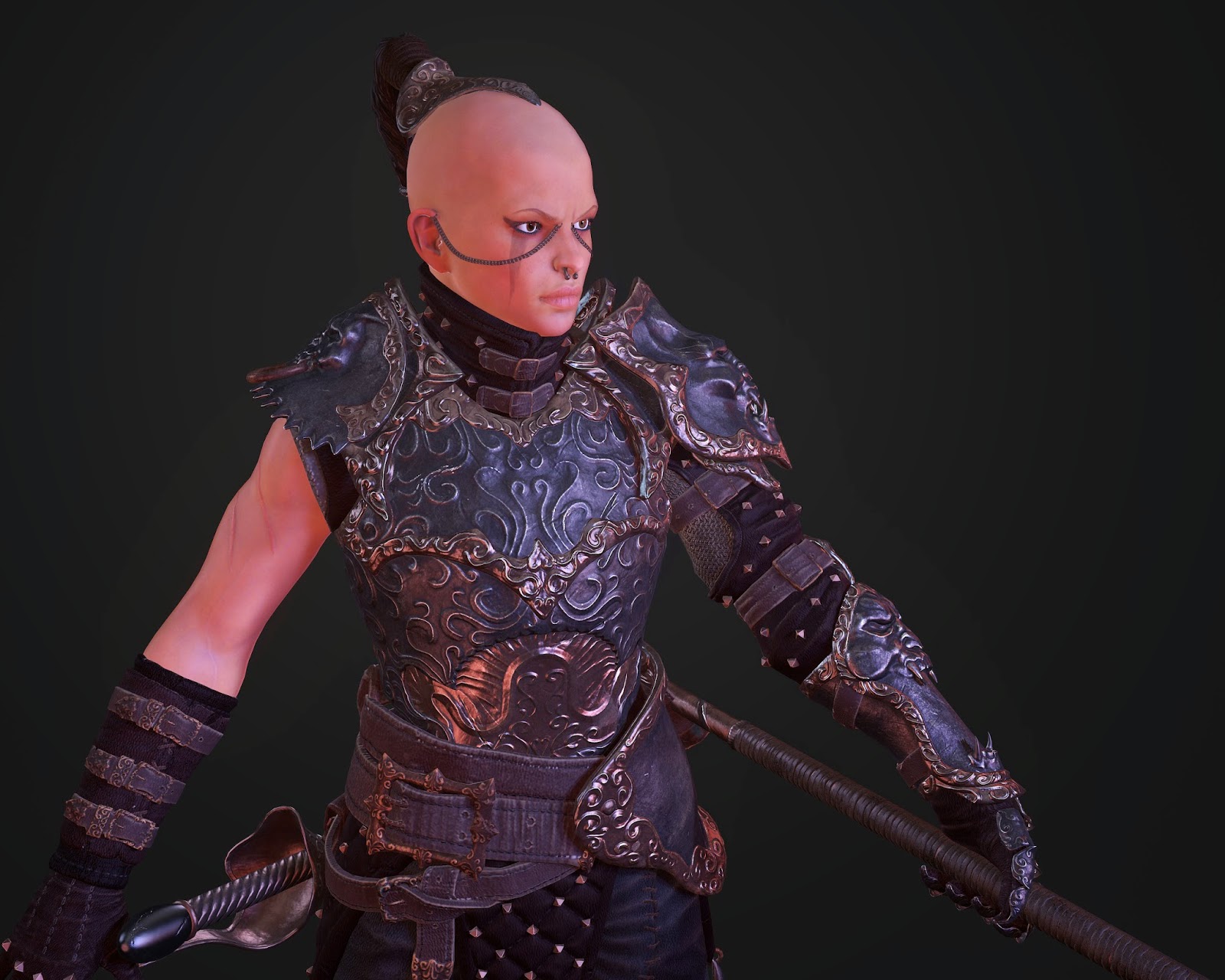
For my project I chose to create a female warrior. Im trying to stay away from the pin up female design.
And thanks for viewing
High rez almost completed will start retopo soon
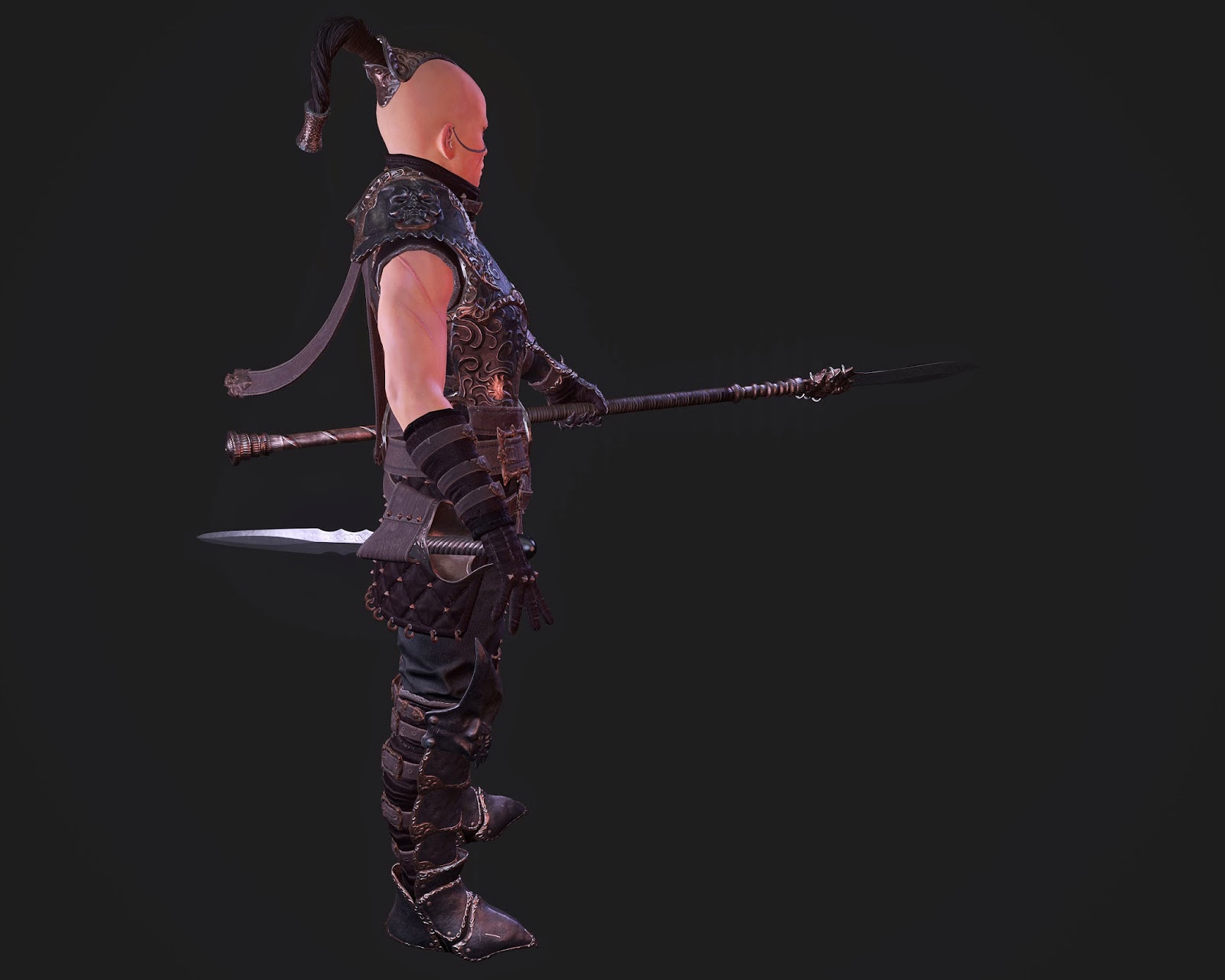
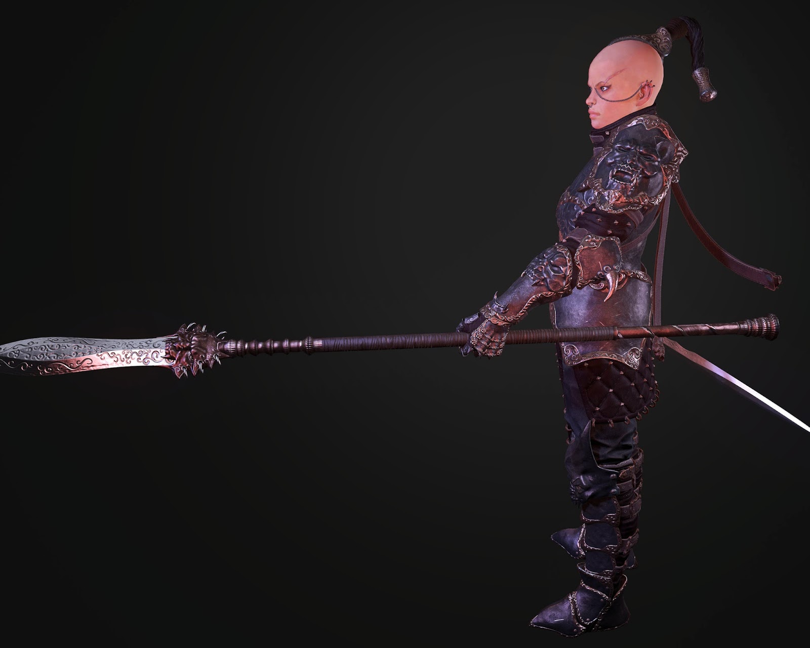
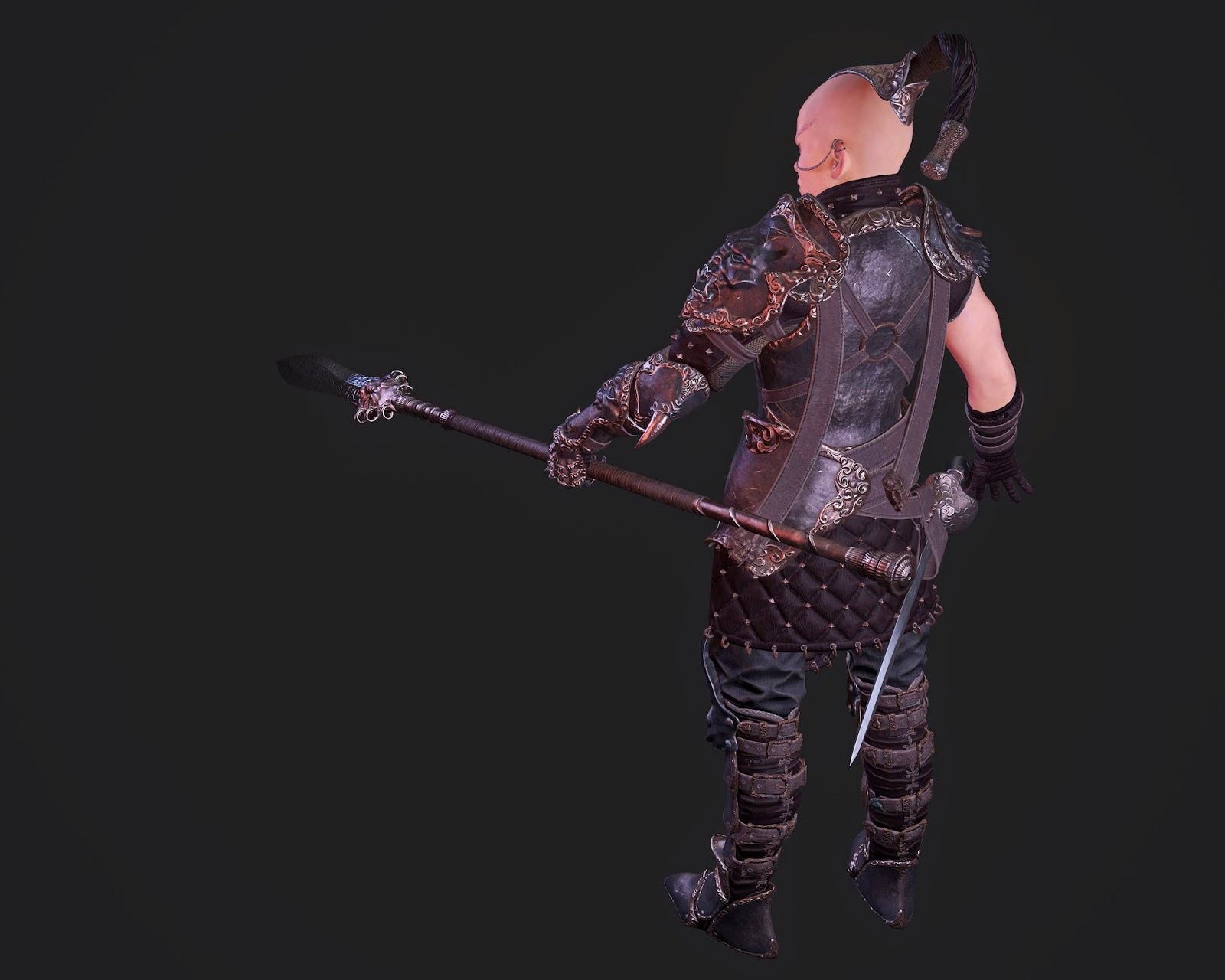
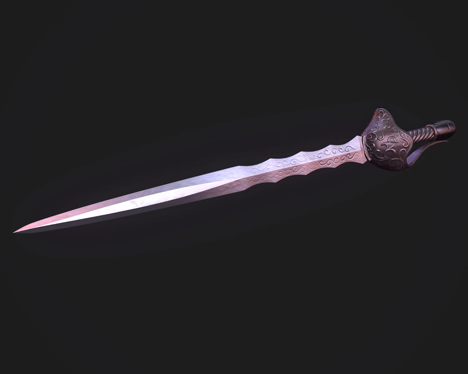
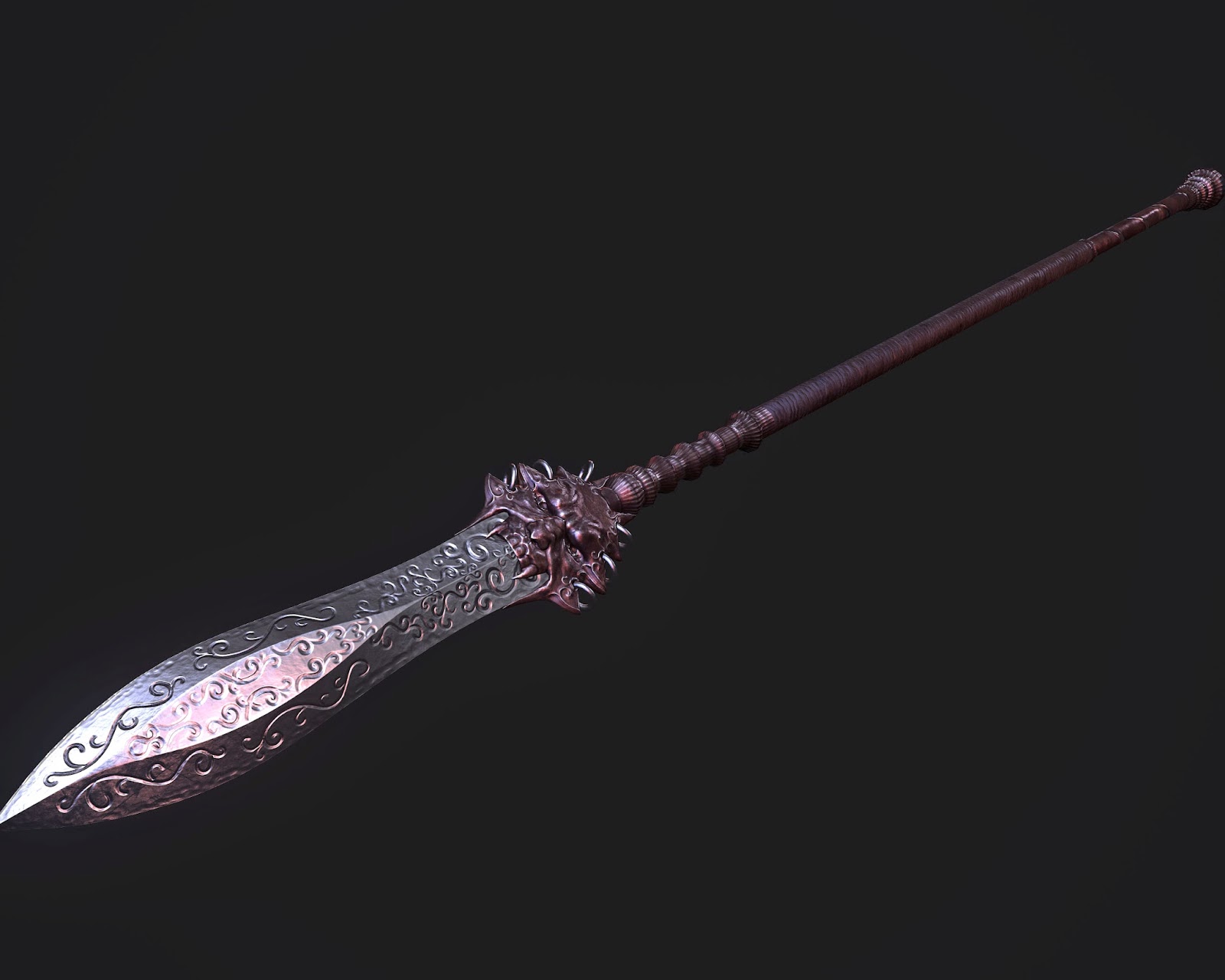
Update: Hey I need some tips for presentation, If anyone has good experience in Marmoset 2 I would love some tips. I notice the bloom is too strong and the background might be a bit dark
Should I put a pedestal or a floor maybe?
I have the field of view at 45 degrees, is that good for a character?
thanks!
crits always appreciated


Replies
But maybe you try to keep a few female atributes. When I look on your character I don't know this is a woman. Maybe you give her a softer shape for the face.
Helmet or no helmet? If i decide for no helmet i added some metal ornaments on face
How is the overall design of the armor?
I want to finish to base mesh so i can start adding details.
thanks
crits appreciated
Face will need some love soon
still missing a few things, will need to work on the head more.
crits welcome
Anybody got some presentation tips for showing my model better?
i dont know why some images are greenish lol
@holly: thanks
crits always welcome
love the detail :')
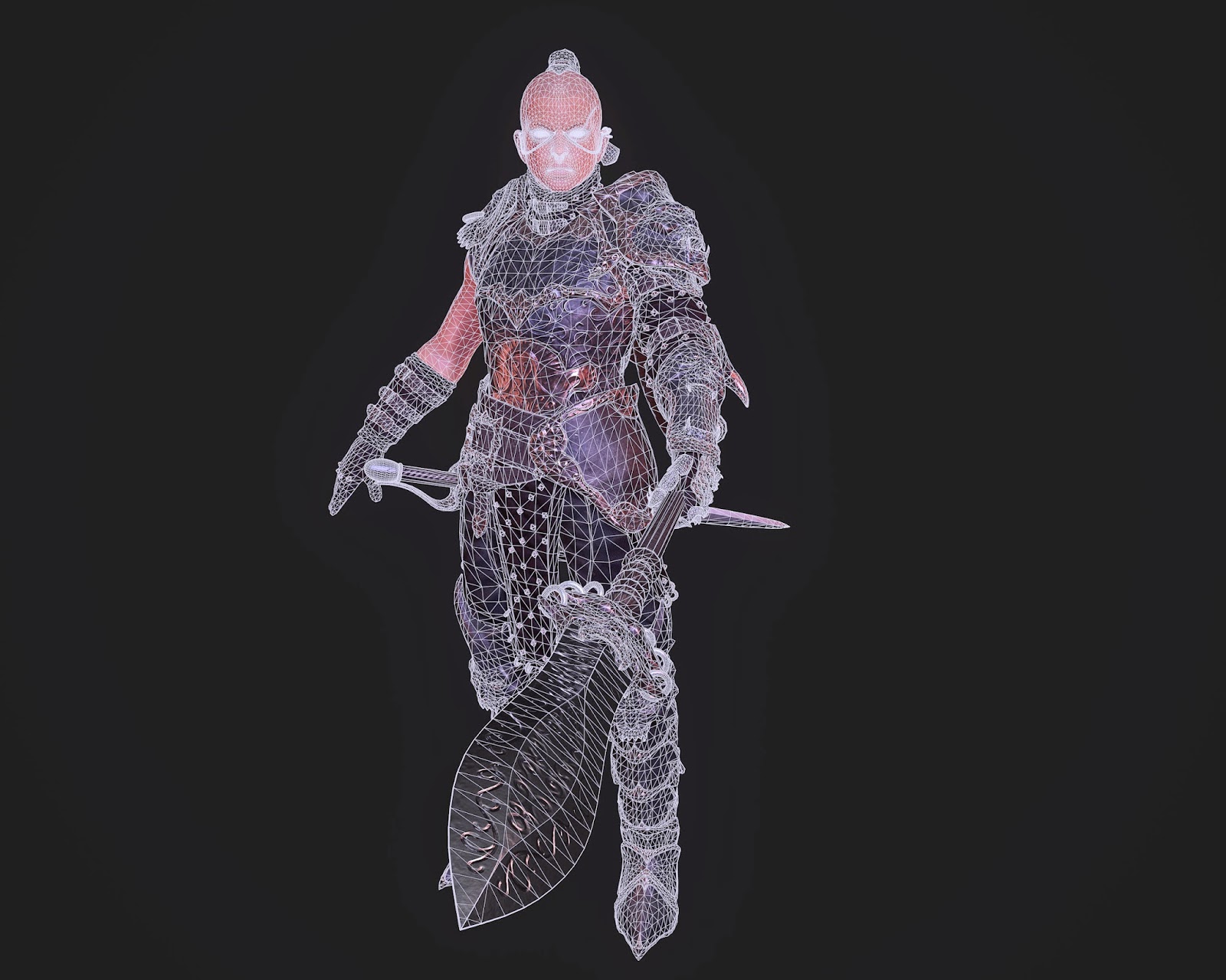
65k tris and three 2k maps
2 for body and 1 for head
Armor could use some "off-hues," like subtle greens, etc. in the albedo. Just to give it a tiny bit more body.
I don't know if you have a skin shader on the head yet, but right now it is sorta giving this strange "glow" feel overall. Feels a tad off, BUT could also be a style decision, your call.
I like the details of her armour, only crit point ... the dark parts looks a little bit like plastic, I would give the material a more defined gloss.
Added some gloss for the armor and messing around with some makeup/war paint stuff
Should I put a pedestal or a floor maybe?
I have the field of view at 45 degrees, is that good for a character?
thanks!
crits always appreciated
A standing pose looks boring and yeah use a pedestal, because every character needs a environment to look alive
right now I cant go back and add detail to the model but maybe after im finished
Il explore some different lighting conditions for the final render.
As for the pose I wanted a pose as if shes defending a king behind her
IL work up a pedestal real quick
thxs for the tips:)