Alien Larva Harvester Blaster - WIP
polycounter lvl 8
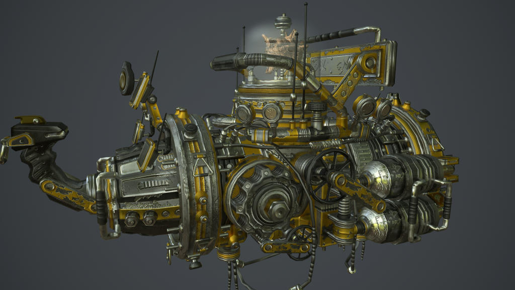
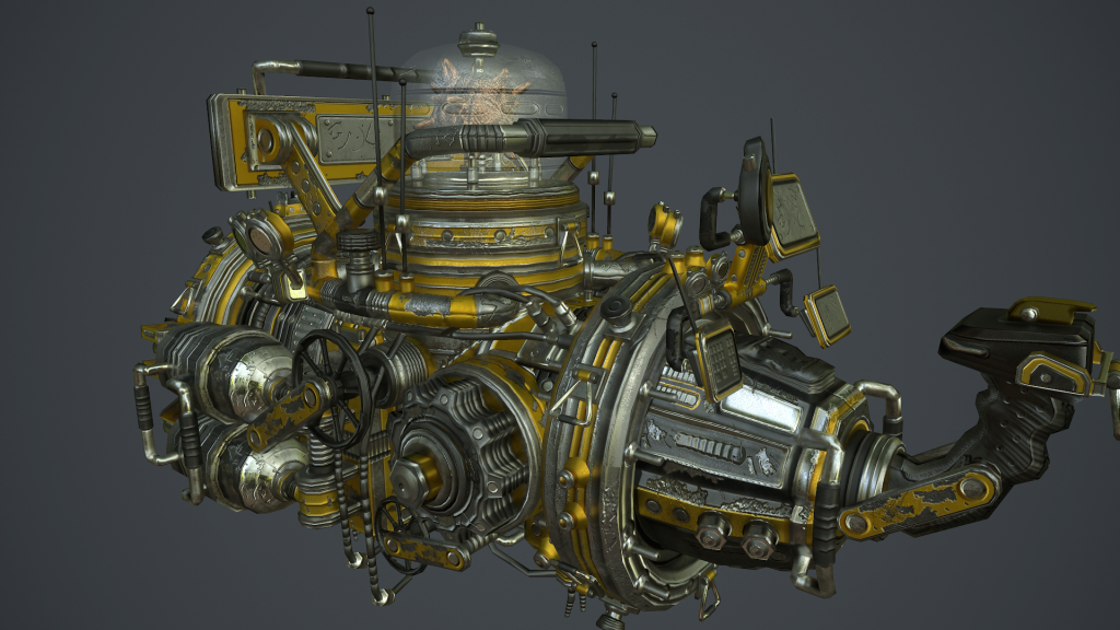
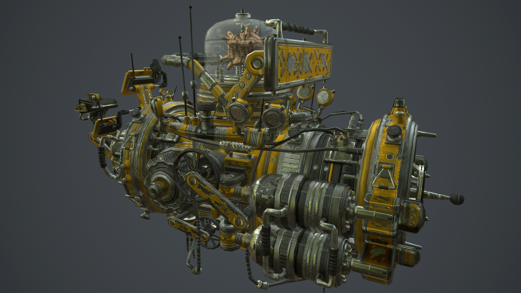
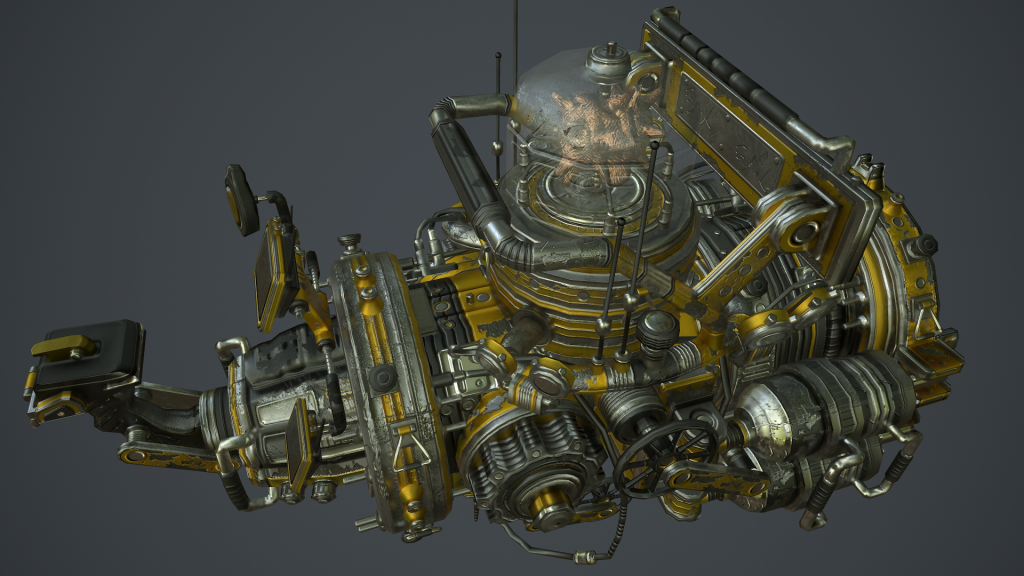
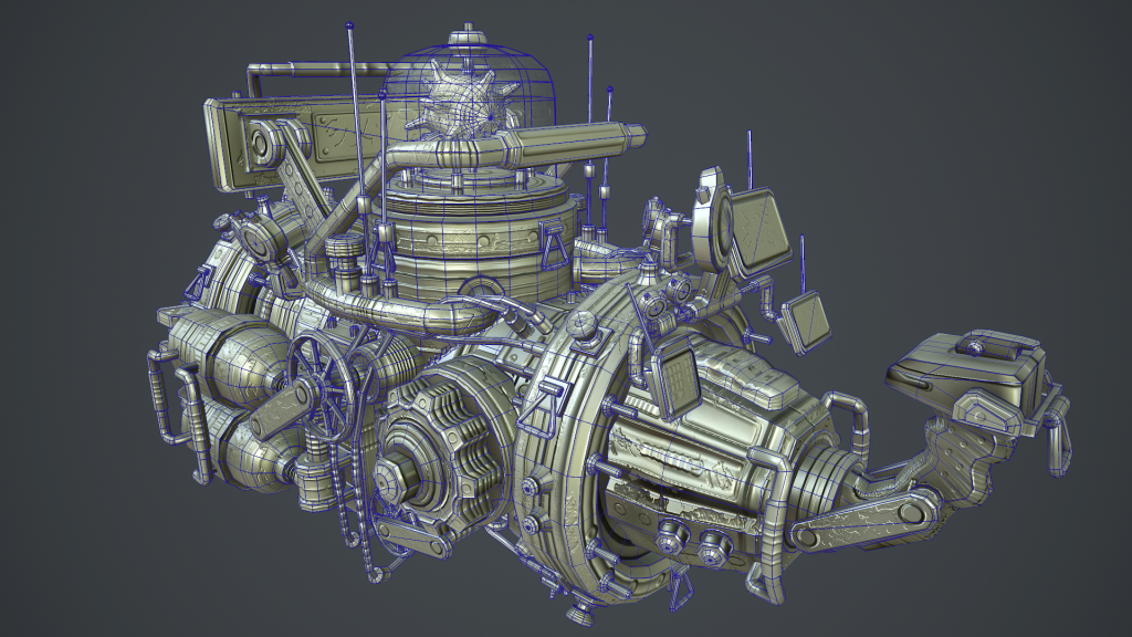
Heys guys. Been working on this for a school assignment. Loosely based off a concept i found on pintrest. Its a weapon that harvests alien larva energy and blasts it, incinerating anything in its path.
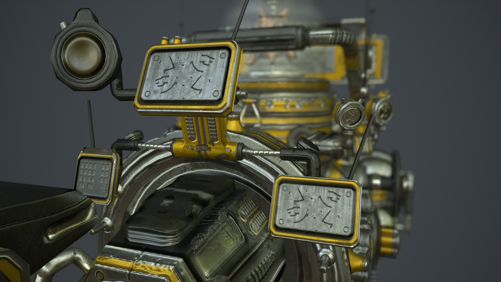
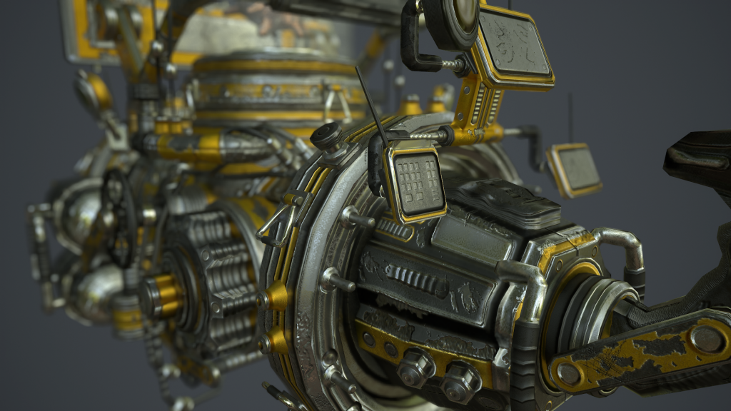
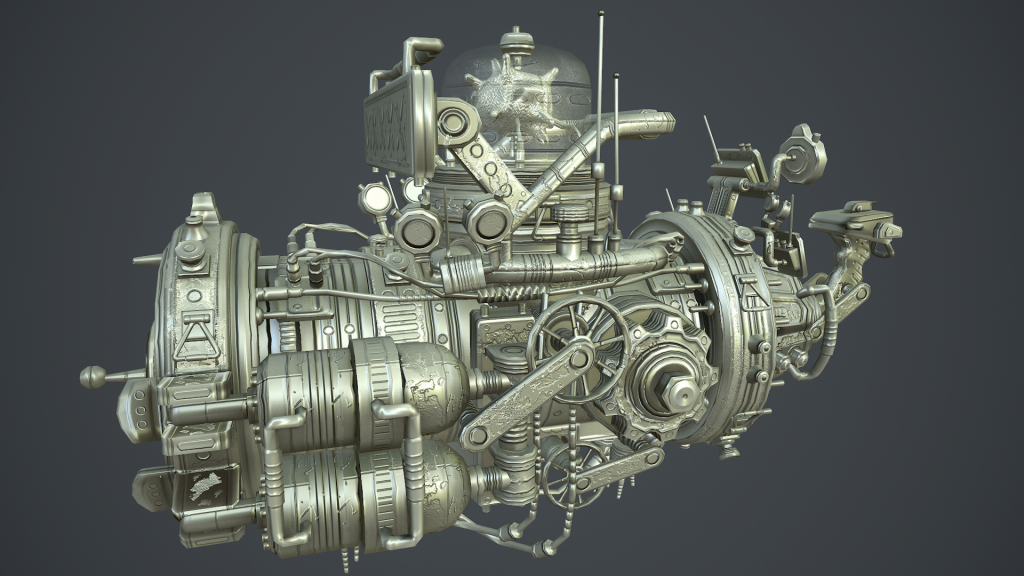
Right now its work in progress. Still have a week to complete it. Basically done all the modeling and baking, im just working on the textures now. Trying to get good material definition. I was going for a more grungy look. Because i like grungy looking stuff
Any feedback and critique would be awesome, trying to make this thing better so i can get a good mark. Thanks. Heres some pictures. (edit: for some reason when i share through photobucket it makes my images look like crap! anyone know how ti fix this?)
*So far things i am aware of and are on my fix list is waviness in the normal map.


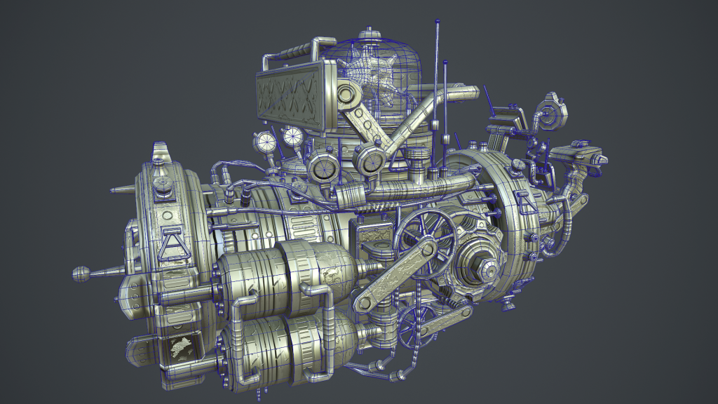
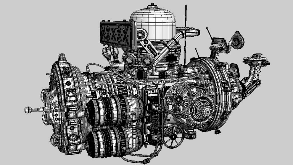
High poly wireframe. Lots of floating geo going on here.
Right now its work in progress. Still have a week to complete it. Basically done all the modeling and baking, im just working on the textures now. Trying to get good material definition. I was going for a more grungy look. Because i like grungy looking stuff
Any feedback and critique would be awesome, trying to make this thing better so i can get a good mark. Thanks. Heres some pictures. (edit: for some reason when i share through photobucket it makes my images look like crap! anyone know how ti fix this?)
*So far things i am aware of and are on my fix list is waviness in the normal map.


High poly wireframe. Lots of floating geo going on here.

Replies
But really good technique !
Proper 3 point lighting and some proper AO would probably fix the problem.
Time to get back into photoshop.