The BRAWL² Tournament Challenge has been announced!
It starts May 12, and ends Oct 17. Let's see what you got!
https://polycount.com/discussion/237047/the-brawl²-tournament
It starts May 12, and ends Oct 17. Let's see what you got!
https://polycount.com/discussion/237047/the-brawl²-tournament
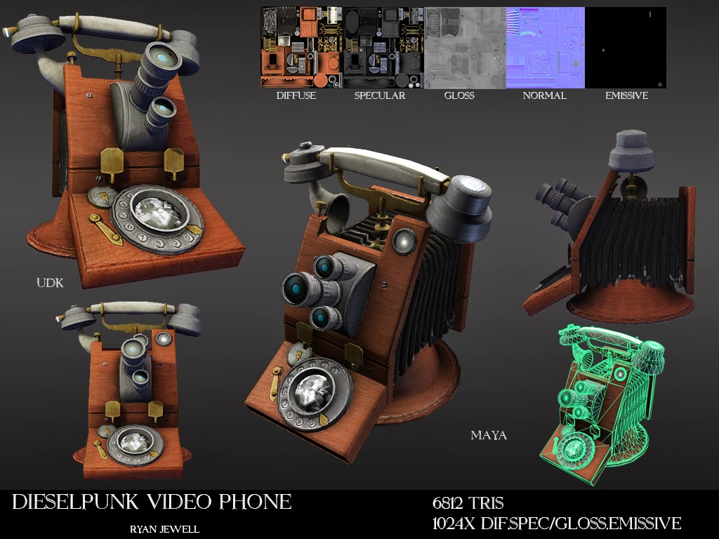
[UE3]Prop - Dieselpunk Video Phone
Hey guys. This is my first post to the community so I'll start off with saying that I'm glad to be finally be posting on here and no longer just a silent reader.
Here, I tried my hand at designing modeling and texturing a unique Dieselpunk Video phone. I was trying to make something that would fit in a world like Bioshock.
I welcome all types of feedback: design, technical or otherwise.

Here, I tried my hand at designing modeling and texturing a unique Dieselpunk Video phone. I was trying to make something that would fit in a world like Bioshock.
I welcome all types of feedback: design, technical or otherwise.

Replies
check out some of these examples to see what you can do with your materials
http://joerivromman.com/Props.html
http://www.polycount.com/forum/showpost.php?p=2073635&postcount=5356
http://www.polycount.com/forum/showpost.php?p=2020833&postcount=76
http://www.polycount.com/forum/showpost.php?p=1997463&postcount=1
Also, the who 3-lens set-up is rather anachronistic and unnecessary. It wasn't really used until the 50s for TV work, when they'd allow a single camera to make the three common shots - close, medium, and long. Anybody on the phone is going to be at a fixed, short distance from the camera.
The bellows is a nice effect that does scream "olde timey camera", but really doesn't make sense in your case, as the whole purpose is to move the lens relative to the focal plane. Once again, the camera's target is going to remain at a fixed, known distance. Furthermore, the lenses are at an oblique angle, so the focal plane couldn't be at the back of the bellows without adding some prisms.
The cord really should be visible at this distance; there would certainly be no concept of a wireless handset - the transmitter would be larger than the entire phone.
You might consider adding some bright light source; limelights would be interesting, but really any bright light from the 30s would work:
This also seems to be a 1-way device; at least, I didn't notice a display screen.
Perhaps I do obsess a bit too much about bringing realism to a fantasy setting, but I have often found that form follows function, and even high fantasy follows rules; very different rules, mind you, but rules nonetheless.