The BRAWL² Tournament Challenge has been announced!
It starts May 12, and ends Oct 17. Let's see what you got!
https://polycount.com/discussion/237047/the-brawl²-tournament
It starts May 12, and ends Oct 17. Let's see what you got!
https://polycount.com/discussion/237047/the-brawl²-tournament
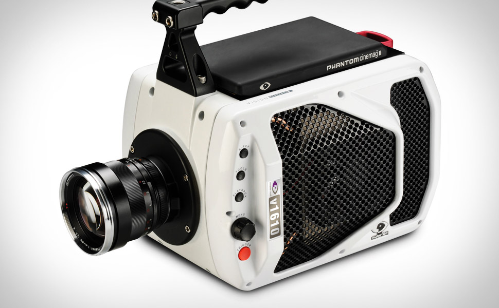
[TB2] V1610 High-Speed Camera
Hi everyone. After finishing my internship in 3D advertising, I think I may enjoy games more. I have a year left of college and am going to work on a game-ready portfolio for graduation. Here is my first asset.
Crits welcome. I will incorporate any into a environment I have planned. This model was kind of a warmup into the game asset PBR pipeline.
Tri count: 8159
Maps: 4K
Renderer: Toolbag 2


Ref:

Crits welcome. I will incorporate any into a environment I have planned. This model was kind of a warmup into the game asset PBR pipeline.
Tri count: 8159
Maps: 4K
Renderer: Toolbag 2


Ref:


Replies
Rubber came out great and materials in general look pretty authentic, although there is not much traditional wear
Some things;
The bottom of the grip is super spiky even tho you could easily round it off by just
moving those vertices up a bit
The material of that red grip thing at the back dosnt read well and looks odd from the back screenshot
Edit: Material is probably fine, you could illustrate the metal better with some wear however, and the green is doing part of the hard to read thing.
If youre coming from a advertising background, then you should know how to present your objects in canvas space : P Use the space you have.
Same for the UVWs, there a bunch of unused space left and a advanced 3d user, aka the guy reviewing you will notice in 0,03 seconds.
The background gradient is tasteful, but why do you go with the first best marmoset HDRI background that has strong green lighting while your background is blue ?
Its making it look out of place, especially at the reflective back side.
Ah, yea, good call. That'll be something to keep an eye out for in the environment. I was trying to keep true to the form though. Would it be bad to add more edges there to keep the silhouette?
I'll have to play around with the lighting some more. Do you think it reads well from any other angle or is it just the material itself? I'll play around with the lighting and see if I can make it look a bit better.
Yea, the UV space is definitely not as optimized as it should be. I forgot to mirror the handle as well but was decently far into texturing and decided to leave it alone. Definitely something to keep in mind when working on an environment.
Ah yea, I can see that green creeping in now. Pretty ugly. I'll update these renders soon!!
Thanks again.
I'm a total dumbass and was having a lot of problems syncing my materials from engine to engine. Mostly with Substance Designer but with GCX in Marmoset it's all fixed.
That Ethernet connection at the back needs to be cut in to give it some depth. Considering how far in those sockets go the normal on a flat box doesn't do it justice!
Ah yea, I was conflicted about whether to add more geo or just normal map it. In the future, I guess I'll go with more geo if it's not going to add much (that box probably would have added an extra 8-20 tris or something)..
Updated images again..
Other than that it looks awesome!
Yea, the front lens could definitely use additional geo. I think it's a 20 sided right now. Maybe 26-30?
Just a side thought: I tried to stay away from nDo for the project to learn more high-poly hard surface modeling and proper baking. For my next project I feel like I can add more geo in some areas and remove some in other areas if I use nDo2 in my workflow.
I guess my main dilemma right now is with graduation in May of 2015 (9 months), is it worth spending the extra time redoing this or moving on with more portfolio pieces/learning more about the game pipeline?
I feel like I have to have this insane portfolio put together to even be considered at AAA companies.
By the way: First project I've used with Toolbag 2, super easy to use and awesome program :thumbup:
Though if you want to be a game artist you'd better get used to re-doing things!
Yep, I'm super thankful I experienced the process of throwing away work @ internship. Redid stuff a loooooooot