Home 3D Art Showcase & Critiques

High School Art Project (Need Feedback)

polycounter lvl 12
Offline / Send Message
sziada polycounter lvl 12
Hey guys I need some critiques for this high school art project I am undertaking.

First I made this concept, I know it could be better, but I am not the best digital painter tbh
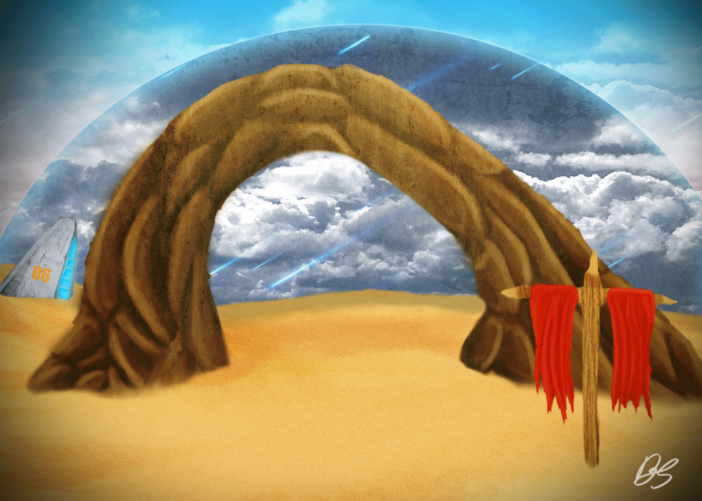
Web-Preview_zpsc3c0a5ea.png


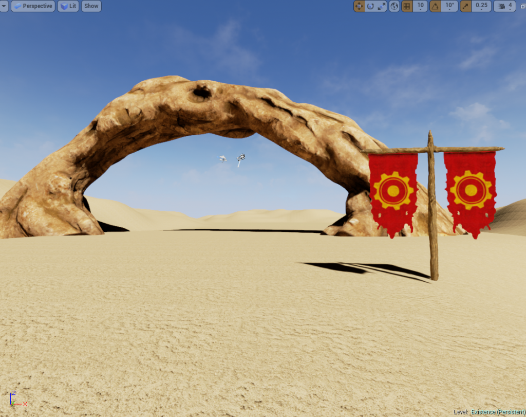
Current state of the scene:

Scene_02_zps23bdef98.png

My goal is to take this concept I made, to a full and finished scene. Please any feed back you could give would be great, I really want to blow my teacher out of the water with this project. :)

Replies

  • renanfab
    Offline / Send Message
    renanfab polycounter lvl 11
    The first thing u could do before start blocking ur painting is setting the perspective, its really off.

    From your paint, seems like its someone right in front of it taking a photo of a rock and a flag right in front of the rock.

    In the image reference, u can see the horizontal line is really bellow cause seems like was like if someone took it on his knees or even lay on the floor to take it.

    So 2 things : find the horizontal line before anything and also divide your ref imagem in 9 squares so u could visualise wheres where better. Hope it helps
  • AgelosAp
    Offline / Send Message
    AgelosAp polycounter
    It's on a good path, I mean at least you have no major flaws with the lighting or the rock formation.
    I 'd tell you to look at more compelling vista shots since you don't have any particular prop centered in your composition.
    Also you could blend the base of the rock ark with some smaller rocks to make it more natural.
    What is the purpose of the assignment?
  • AlexCatMasterSupreme
    Offline / Send Message
    AlexCatMasterSupreme interpolator
    Push the shapes and silhouette and stuff it looks kinda like a bent turd and make the scene more interesting it just feels like three random elements put together

    Lets g+ dis weekend m8
  • Stockwell
    I think your 3d skills heavily out weigh your concepting skills. My advice would be to ditch your own concept, i know you might be attatched, and choose a more interesting piece. This will allow you to skip the forethought of how to design a cool scene, and instead focus on your game art.

    I'd strongly consider that, UNLESS!!! Your assignment was to concept as well. In which case you should analyze as many professional, or student, concepts of say dessert scenes, and think about what makes those pieces interesting visually to the eye and a player. Just choose something you think is super awesome.

    For example, this piece is similar, but it's landscape is so much more dense and energetic. Silhouette, composition, color, etc. All things to consider.

    Ty4MLul.jpg

    You're modeling/sculpting could also use some work, but for highschool I see a great start. Here is a sculpted rock arch from that same concept that handsome guy above me busted out awhile back. Pick his brain and ask him about his approach, i'm sure he could help.

    O0XMuJt.jpg

    Good luck!
  • dazart
  • sziada
    Offline / Send Message
    sziada polycounter lvl 12
    Hey the theme of the Asignment is Existence, the concept isn't important, so I could ditch the concept
  • NegevPro
    Offline / Send Message
    NegevPro polycounter lvl 4
    I'd also agree that ditching the original concept might be a good idea. If you take the sky out of your orginal concept, you're really left with three random objects in a blank desert scene. I don't think that would translate very well into 3D.

    What kind of deadline do you have for this project? If you have the time then I think going for the concept posted above would be a great idea, and checking out the rock thread would probably also help.

    It's cool to see highschools actually acknowledging 3D art, I remember how awful art classes were when I went to highschool.
  • AlexCatMasterSupreme
    Offline / Send Message
    AlexCatMasterSupreme interpolator
    Stockwell wrote: »
    I think your 3d skills heavily out weigh your concepting skills. My advice would be to ditch your own concept, i know you might be attatched, and choose a more interesting piece. This will allow you to skip the forethought of how to design a cool scene, and instead focus on your game art.

    I'd strongly consider that, UNLESS!!! Your assignment was to concept as well. In which case you should analyze as many professional, or student, concepts of say dessert scenes, and think about what makes those pieces interesting visually to the eye and a player. Just choose something you think is super awesome.

    For example, this piece is similar, but it's landscape is so much more dense and energetic. Silhouette, composition, color, etc. All things to consider.

    Ty4MLul.jpg

    You're modeling/sculpting could also use some work, but for highschool I see a great start. Here is a sculpted rock arch from that same concept that handsome guy above me busted out awhile back. Pick his brain and ask him about his approach, i'm sure he could help.

    O0XMuJt.jpg

    Good luck!

    ;) That's where he got the idea i htink he told me. I swear if you dont add me on skype or somthing stockwell i'll run you over.
  • sziada
    Offline / Send Message
    sziada polycounter lvl 12
    test2_zps9b83c5de.png

    test3_zps6d9c6909.png

    made a few changes, feedback please :)
  • ClusterOne
    Offline / Send Message
    ClusterOne polycounter lvl 4
    If you compare it to Alex's work, yours look a bit lumpy and unconvincing. I'm not sure what brushes you use but I would strongly suggest using Trim Smooth Border (it can be found in the Trim section of lightbox--its not loaded in by default), Mallet Fast (which can be found in the mallet folder of lightbox--its not loaded in by default), Orb Cracks (which can be downloaded at orbart.free.fr/Orb_Cracks.ZBP), as well as the standard brushes like trim dynamic, clay tubes and clay build up.
  • sziada
    Offline / Send Message
    sziada polycounter lvl 12
    I used trim smooth border with a rock alpha to get the hard edges and the extra details, I really want to know what you guys think.

    Rock_02_zps68d27707.png
  • LaurentiuN
    Offline / Send Message
    LaurentiuN polycounter
    Looks better now mate
  • sziada
    Offline / Send Message
    sziada polycounter lvl 12
    I will post some more screens soon
  • slosh
    Offline / Send Message
    slosh hero character
    It still feels very unnatural to me. If you look at the concept, alexs version, and real reference, rock formations have MUCH more solid support than that for the most part. Yours looks like it would not be able to exist IRL because of the thin support. Broaden both sides considerably and add more rock formations that flow with the overall shape instead of just bumps.
  • sziada
    Offline / Send Message
    sziada polycounter lvl 12
    Alright I have made some more changes


    Rock_03_zps5702210d.png
  • sziada
    Offline / Send Message
    sziada polycounter lvl 12
    Current Scene at the moment, need some help with its needs a lot of improvement and there are probably a heap of things that I have overlooked as well

    Scene_04_zpsa854e189.png
Sign In or Register to comment.