Knight Portrait - I'm not sure if I'm finished?

polycounter lvl 9
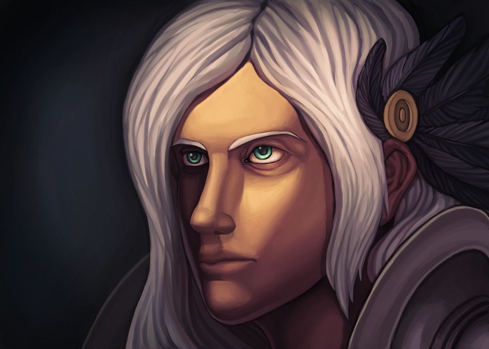
OK, this piece has already had allot of critiques allot on another site. I just want to make sure all the bases are covered and this piece is the best it can be. Because, I was hoping it would be a portfolio piece. Any help is certainly appreciated, more eyes the better right ?

Replies
As a stylized piece it's looking really pleasant, but there are some smaller "mistakes"
Forms/perspective/anatomy look a bit wonky, materials could be defined more. (Hair, metal, skin, feathers are shaded pretty much the same. )
The reflections/highlights in the eyes don't seem to react to shadows.
The eyebrows don't seem to sit naturally on the skin, but hang a bit over the eye socket.
The top right part if the image looks amazing (the hair and the feather thing).
you have a great style, but yeah, anatomy issues, he is kind of horse faced.
Nice painting though
It has an unusual style to it as a whole, but it sort of works. I'm mildly bothered by the slight black outlines around things like the eyes, as they don't really make sense and I think it detracts from the rendering of what may be the picture's most interesting aspect.
I also agree that parts of the facial shape/anatomy could use some work. I notice you have this image on your photobucket. Is it an older version? If so, I agree with the changes you made to the things like the jaw, but sort of preferred the older shape of the nose. It was more interesting than the soft, almost more cartoony seeming nose he has now. The old one (again, assuming it's an older version) could've used some work too, but adding some more of that shape in is something to consider. Sort of liked that hair wave, too.
A few other things stand out to me, the size of the philtrum (too wide), eyebrows seeming very solid and perhaps too low (or it might be that they end so harshly at the bottom, there's no evidence of skin/eye socket below them that's simply sunken in), that sort of thing.
Some things to consider.
While here's an updated version: I worked hard at adding more textures, like Noren had suggested.
(Depending on where your light source is exactly, it should be in the shadow, though.)
You haven't answered the question of what you want to achieve, exactly.
Is it supposed to be realistic? (Concerning proportions, anatomy, perspective, lighting etc. )
Like said I think it works pretty well as a stylized illustration, even though there are still some problems and I'd suggest to move on and maybe revisit this after some time.
(How long is up to you, the longer the time, the more you'll have improved. )
Of course you can also try to improve with this piece as much as you can, but you might get sick of it.
For a portfolio piece I'd take another look at the following aspects, listed by likelihood of standing out negative and least effort to fix:
The form of the ear.
The form and shading of the nose and philtrum.
the shading of the shoulder pieces.
You seem to have squeezed his right eye, eyebrow and contour towards the nose, so it isn't covered by the hair.
maybe the shading and form of the hair. (Though it can be tricky with white hair like we have here. )
The eyelids are missing thickness. (Especially on his right eye.)
Shadows and light direction are inconsistent right now, but in some cases like the shadowed right cheek it has a nice effect and the image as a whole is nicely balanced and overall beautiful. Actually the old version was better concerning the focus on the face. Things like the reflection on the shoulder pads are starting to draw the eye a bit, now.
P.S.: I don't like the detail you added to the eyes. It's too much compared to the rest of the image, and instead of setting a focus they are kind of irritating.
(They remind me of UI buttons
Version #1: This is the one my sister like of the two reversions. I haven't painted it up yet, because I didn't want to do work unnecessarily. So I just left the line work.
Version #2: This is the one I changed the most from the original. However my sister hates this one.
I cant take this destructive criticisms any longer, we are completely ignoring the elephant in the room.
The hair texture isnt flat, you dont need to ad photo textures or micro details. I honestly think your first version is the best one, before everyone started to intervene with trivial criticism.
as I mentioned in my earlier post, I do think you have some great things going on here, especially with the style and the rendering, wich I think was best in your first iteration. the problem with this image is the face, and the complete lack of structure and anatomy.
the perspective is of, the proportions are way of, the ear is god knows flying away somewhere in the back of his head, the eyes are not three dimensional, the nose is way to long, and the mouth to small and far down, he dosnt have a chin what so ever.
there are to options here (in my opinion). either repaint the entire face, or start a new piece of take what you learned from this into account.
your rendering and composition skills are far better then your structure and anatomy, do some studies to catch up with that part and I can assure you that you will be a better artist.
First thing that needs to be done, in my opinion, is to define a goal.
Are the proportions supposed to be realistic or not, the shading etc? (I like the general proportions, they make a big part of the appeal for me.)
I agree the anatomy and perspective should be fixed first, but that's easy to say for us and might be a long process for clearrose, as we are witnessing already.
Since she (or he) seems determined to soldier on I'd say an overpaint might be a good idea at this point, if wanted.
Thanks allot for all the help guys But I do agree with lotet, studies at this point seems to be the next step. I don't like quitting or giving up, but I'm getting tired of this place, and I feel like it's going in circles at this point. Nothing good can come from that. So I've decided to do the studies, lots of them and than redo this piece when it comes time.
Hugs and :)s for all who have given me their hand in critiques.