Skyline5gtr Journey to get a JOB !
Hello all, i'm starting this thread to post projects for feedback regularly as i strive to get a new job.
I have a BA in game art, just got laid off from a job so i want to redo my entire portfolio and really try to push myself and spend quality time on smaller assets to get a better fundamental as oppose to doing bigger scenes and objects. I have a hard time with material definition so that is my primary concern
Entire site will be wiped as i do not like my layout as many have told me, too many clicks to get to art, i think i will keep ferengi maurader and the robot turret, i may revisit robot turret to upgrade it.
www.nickbarone3d.weebly.com
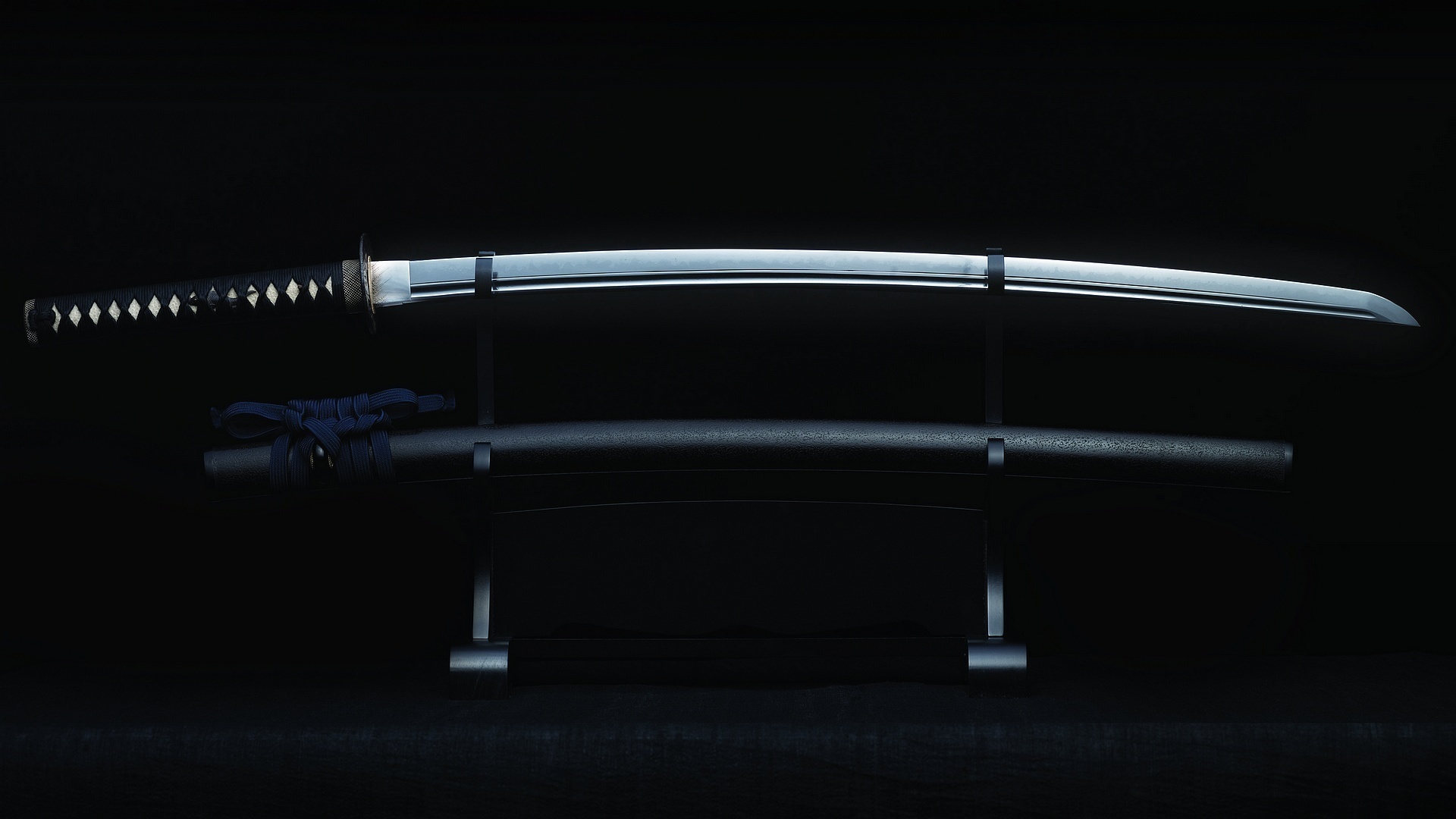
First project will be a Katana Samurai Sword and rack - I really want to concentrate on HP to LP workflow, material definition and presentation


Replies
I found this for marmoset, which i will use to display my assets
http://www.marmoset.co/toolbag/learn/pbr-practice
Wires
@ steve - you mean screen straight for viewport ?
I would suggest that this is less important than just doing something WELL and then doing it AGAIN.
If you use the same concept as 10 other people, sure, they've seen that before. but of the 10 people that made a katana, or a district 9 gun - is yours better than 8 or 9 of them?
Something gray with decent spec so you can see how light plays of the model.
The wraps on the handle need a lot more thickness. They are way to flat to give you depth from the bake. Also there is usually a detail piece under the wraps in the middle of the handle.
The edges all over need to be more rounded. The problem with sharp edges in the high poly is there is very little information to bake so it doesn't show up that well in the bake. More on that here.
I can't tell, but you want to be turbo smoothing your highpoly. If you aren't you need to. You want a decent amount of geometry to allow for smoothing. Done't collapse the turbosmooth though. You want a lower poly mesh to control the the turbo smoothing so that it's easier to make edits.
Hope this helps.
I would spend a good 2 weeks making this the first week for a really high quality high poly/ low poly and the second for textures. You don't want to burn through this stuff it's not going to get you anything but a mediocre portfolio.
Right off the bat I can tell you your wrap for the hilt is wrong, and it's probably the biggest detractor from the asset overall. You need to really, REALLY pay attention to how things are constructed. Those wrappings are done in a very specific way, and most notably, the strap twists in the middle, giving it that bowtie shape. Granted, it's probably the most difficult part of the entire piece to model, but aside from the crossguard (I don't know the actual names so I'm using European sword terms) it's arguably the most important part to get right. Without the thickness, and most certainly without the proper anatomy as it were, it looks completely off.
I would strongly recommend readdressing the hilt entirely, including actually holding one of those swords in your hands to really understand how it's built.
Do a lot of reading research, or even better, go down to a store that sells replica swords and ask if you can take pictures, sketches, and detailed notes about any katanas, wakazashis, or even any tantos they have. Doing in-depth research into real construction will pay HUGE dividends in terms of the quality of your projects.
I also added a very slight shell modifier to give the cloth some depth like recommended
The new machine model looks somewhat interesting but right now the panels look off. It almost looks like you've just extruded the panels from a single model without separating them properly. Not to toot my own horn too much but I'd expect a lot more defined separation between the panels, like on this model that I posted in the Noob Challenge (it's not finished or perfect so don't hate too much).
The metal on your katana felt off so I had a look at the flats at your site.
Unless I am overlooking something, you should really look at using a gloss map.
Even when not using pbr, that's such a important map.
And just diffuse+spec is getting outdated at this point if you want to do realistic assets.
UV's for the katana:
-The guard could have been overlaid, you will never see both sides at once
-same with the blade, there isn't enough unique detail to have both sides seperate.
-same with the grip (hard to see both sides + someone will hold it)and the circle behind the guard
-Don't be afraid to push yourself, this is a really basic katana, you could have done a lot more with it as chillydog mentioned, so for the next asset, don't try to rush it to much
Also pay more attention to the materials & construction.
-On the hilt, the inner part is actually coated with (mantis?, some fish atleast) skin, wich has these bumps on it, yours seem to be some sort of ivory
-The wrapping on the hilt, it almost looks like coloured teflon tape, not only because of material definition, but also because of how thin it was modelled in the highpoly.
Minor thing: watch out with banding on your backgrounds.
On the current one:
Overall proportions look off
Try to get some reference on seperate parts (for example instead of just extruding a line, have a look at how a built in monitor would or could look when it would be done more crudely/aimed towards a harsher environment.
And on the "push things further" instead of doing the (relatively simple) prop on it's own, maybe expand that, make a part of a wall where it would be, with some stuff next to it, a sort of mini-mini diorama.
And because of the current work in my portfolio I'm maybe not the best person to say this, but I'm gonna go ahead and say it anyway because of my own experience:
"for my next project i cant decide on doing a Panzer Tiger 1"
That is like doing a audi R8 or an AK (I'd even put the tiger a step higher), it's done so many times, you will have to blow people away with the first shot to even get them interested to look at it.
+there is so much cool stuff to make if you start digging deeper in a certain subject.
In my mind i think i need to start small, to really get details down.
Also for some hard-surface goodness you can always try. http://hardsurface.tumblr.com/
For example: Start off with something simple, and remember that there will be a theme here, military, mechanical stuffs, this way, whatever you make, no matter how simple can go right into your portfolio. remember SERIES. (this formula can be applied to anything or for anyone.)
Remember to always get good ref. and block out your subject matter before stepping into hi-poly... for now, but always get good hi-res ref if you can; for as long as you live.
Make this
Then make this.
Then this
Then this
[IMG][/img]
Then this!
Someone might hand you a job before the Hind, but for sure after the Hind. These things can also be made as the hero pieces and then you can build a hanger or some environment around them. So now you can have a Hind in a hanger surrounded by some cool military equipment and a convoy behind it... in some sort of winter setting?... that would be crazy awesome... I should have kept this to myself. Still you get the point, if you build around a theme there's a lot more you can do with it, even if it's 2-4 pieces. Also if you are making real world stuff, people can dig up ref. for you, make it easy to give crits and what not. Downside is that people will nitpick, but just get 85-90% there, if you feel like 100% go for it, but it will take you double the time to hit the 100% modeling in that bell curve. Last thing. you don't have to go super hard at first, build up, it's just a map. Hope that helps out.
http://www.eliottlillyart.com/
he has some cool guns and mechs on his site, just ask permission before making anything. This go for any concept art your modeling form; contact the artist and ask.
I think to start i may do the golf bag/clubs, especially since i can just model what i physically have and be able to look at them. Then maybe move onto the more difficult military stuff, does that sound like a good plan ?
Wish I saw those before. They look fun.
What does everyone use to insert images ?
This without the quotes... is that what you are asking?
Nice progress so far man, You're in good hands with ZombieWells!
i mean where does everyone usually host the pics , i usually used photobucket but they are small. Or can i just host it on polycount the img tag it