[UDK] Chinese Courtyard Environment

polycounter lvl 8
First off, Apologys for my spelling, Dyslexic, but I am using a spell checker J
Anyway straight to the point.
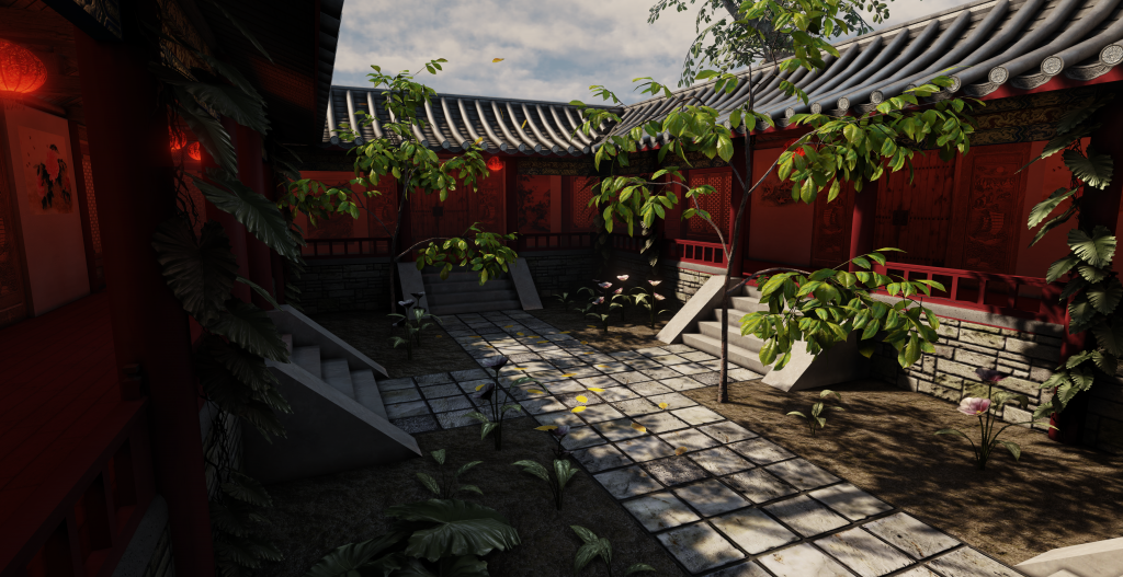
This is my final hand in Project of a Chinese inspired courtyard. It is also my first ever Environment.
Ive been shy putting up my work as I didnt think I rely had the skill level to match the giants out hear. Currently my dream job to be an Environmental Artist, but since I am just about to graduate I doubt Ill get to that position anytime soon (will stick with 3D artist for the time being).
All this is to blueprints of traditional Chinese architecture. My main inspiration for doing this was memories of my time living in Hong Kong and Singapore and I wanted to do something that would test my skills and improve them at the same time.
This was also my first time using UDK, my uni supports Unity mainly, but for the detail I wanted I did not like Unity so I switched a month ago to UDK. A lot of scaling issues when I did that but it all turned out well in the end.
The idea of the place is a well-kept Environment. A perfect balance between Architecture and Nature (Yin and Yan effect), as well as trying to make this extremely detailed. Currently running at an average of 105 FPS, I dont think I would probably use this for a game as such, but Im not 100% shore on that.
I used Maya, nDo, dDo, Photoshop and UDK. All of this was drawn out from a birds eye view and then I followed roofing blueprints and so on for the modelling. So this think at lest looks like it could stand on its own.
I had to adjust the light for the Uni monitors as they are extremely dark. So in order to make the aria brighter I just upped the Scale of the irradiance from 3 to 10
The next Environment I plan on doing will be a Si-Fi small room (working from small arias and then slowly getting bigger and bigger). The concept I have is from a student from FZD School of design.
Ill be changing the trees to my own ones (Cherry Blossom trees) but I think since the aria is rather small for them Ill stick them as background trees replacing the current background trees.
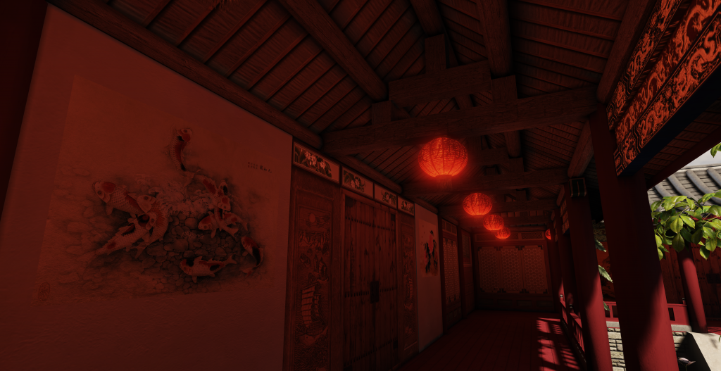
Also tried to make the Lanterns ever so slightly flicker but that didn't go down too well even though i was flowing a tutorial for that and also it would make the baked lighting look unnatural anyway so I left that out.
Tips and advice is openly welcome. I still have a lot to improve. Need to properly learn how to use Vertex painting tool in UDK and the Geometry Brush thing. If I can find another free Skybox ill use that and experiment with the lighting as this is still the default lighting.
I think I might also turn this into a night time scene and have the lanterns hung over the courtyard to give that tropical night-time feel.
any questions on how i did things feel free to ask. currently working for a portfolio and CV/Resume deadline at the moment so I might not respond to all or any time too soon (after Monday ill have this rigged to the Oculus Rift hopefully for the Graduation show)
Anyway, here they are.
Ill just put up 3 unless people want more angles, then ill just update the post with more.
Anyway straight to the point.
This is my final hand in Project of a Chinese inspired courtyard. It is also my first ever Environment.
Ive been shy putting up my work as I didnt think I rely had the skill level to match the giants out hear. Currently my dream job to be an Environmental Artist, but since I am just about to graduate I doubt Ill get to that position anytime soon (will stick with 3D artist for the time being).
All this is to blueprints of traditional Chinese architecture. My main inspiration for doing this was memories of my time living in Hong Kong and Singapore and I wanted to do something that would test my skills and improve them at the same time.
This was also my first time using UDK, my uni supports Unity mainly, but for the detail I wanted I did not like Unity so I switched a month ago to UDK. A lot of scaling issues when I did that but it all turned out well in the end.
The idea of the place is a well-kept Environment. A perfect balance between Architecture and Nature (Yin and Yan effect), as well as trying to make this extremely detailed. Currently running at an average of 105 FPS, I dont think I would probably use this for a game as such, but Im not 100% shore on that.
I used Maya, nDo, dDo, Photoshop and UDK. All of this was drawn out from a birds eye view and then I followed roofing blueprints and so on for the modelling. So this think at lest looks like it could stand on its own.
I had to adjust the light for the Uni monitors as they are extremely dark. So in order to make the aria brighter I just upped the Scale of the irradiance from 3 to 10
The next Environment I plan on doing will be a Si-Fi small room (working from small arias and then slowly getting bigger and bigger). The concept I have is from a student from FZD School of design.
Ill be changing the trees to my own ones (Cherry Blossom trees) but I think since the aria is rather small for them Ill stick them as background trees replacing the current background trees.
Also tried to make the Lanterns ever so slightly flicker but that didn't go down too well even though i was flowing a tutorial for that
Tips and advice is openly welcome. I still have a lot to improve. Need to properly learn how to use Vertex painting tool in UDK and the Geometry Brush thing. If I can find another free Skybox ill use that and experiment with the lighting as this is still the default lighting.
I think I might also turn this into a night time scene and have the lanterns hung over the courtyard to give that tropical night-time feel.
any questions on how i did things feel free to ask. currently working for a portfolio and CV/Resume deadline at the moment so I might not respond to all or any time too soon (after Monday ill have this rigged to the Oculus Rift hopefully for the Graduation show)
Anyway, here they are.
Ill just put up 3 unless people want more angles, then ill just update the post with more.
Replies
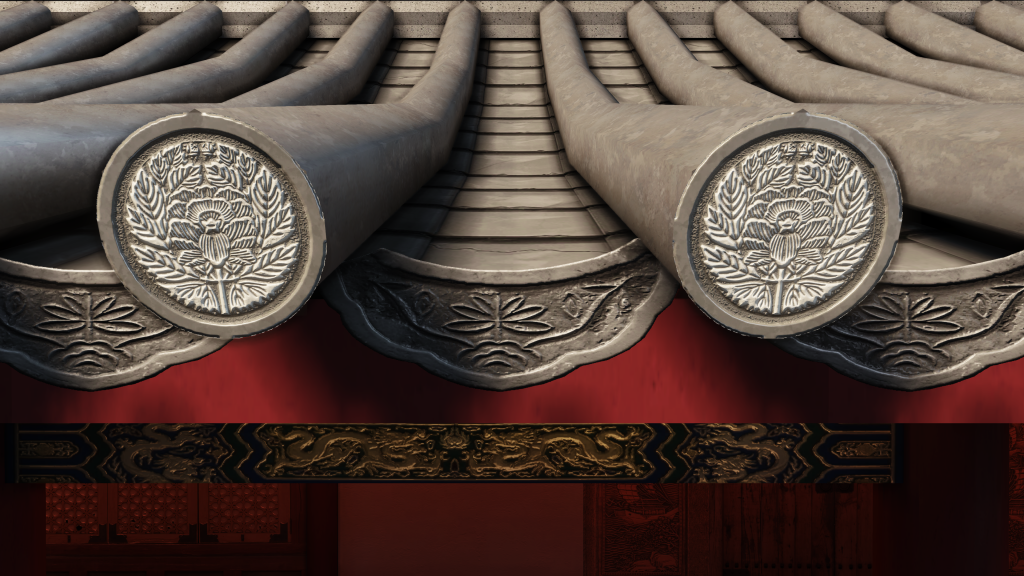
Keep it up! I really love the detailing on the ends of the roof!
Changed the environment colour to one more matching the skybox, made that darker and increased the intensity to 30.
Also changed the bounce from 10 to 50 on the environment too as well as increased the indirect scale from 10 to 40 too.
Also tried creating a post processing box to try and simulate eyesight but it didnt work with the scene at all so I abandoned that.
Changed the lanterns light colour to something brighter.
OK so Ill just upload the screenshots now. Still not shore about what I can do to make it more naturally light. Kinda frustrating but at least Im learning and developing through this.
Also thinking of starting a new project now (unis over but I still need to keep moving). Based on one of FZD School of Design students work; very Si-Fi so it should colour my portfolio with variety.
Also hear are my settings, anything I missed out or need to change?
Really starting to like how this looks btw!
UDK Lightmass is all about balance, there's no real "right" answers. You do have some peculiar parameters though. Firstly, your number of indirect bounces is at...50! That's probably increasing your build time and also having little to no effect. I've found that going much above 3 doesn't net much of a difference. Imagine your light trying to bounce around 50 times - it's probably dead by the 5th bounce.
Are you noticing much of a difference when you've brought the environment color up to 30 (as compared to the default of 1?). You could try to balance that out a bit more by brightening your environment color a little bit and turning the influence back down.
You have the right idea concerning your indirect lighting scale, if you're wanting to get more of that natural light travel, that's the control you'll want to push. You could balance that out by strengthening the intensity of the source, that way it has less work to do in the bounce. If you doubled your brightness, the light would have a greater effect as it moves throughout the scene.
As Kimon said, you could also try to supplement with a skylight. I'd warn that you should keep this very subtle as it washes across all surfaces and that amount of ambience could ultimately start washing things out. Right now, you have some nice contrast so try to keep that in check.
I wouldn't say you're far off, keep tweaking and you'll have something really cool!
Love,
-Jon
Thanks for the critiques and tips everyone! Spent some time going over your suggestions; tried the SkyLight Actor option, while it did make the shadows brighter it did create an unnatural feel to the environment as it was also brightening arias which should be extremely dark.
@Endfinity Jon: tried out your suggestions. Seems to work the best! Lowered the bounce to 4 instead of 40 XD. I noticed that the seams between models on the floor starting to appear when I increased the scale of the indirect lighting to 60, but I’m not too concerned with that as for next time I know how to go about modularity better (no real need for tillable squares for everything I am starting to believe). So in a nutshell this kind of problem is more if a “next time I’ll keep this in mind kind of thing”.
Ill post up my settings too so you can have a look at what I have done, and the new screenshots. Tomorrow I’ll be putting the Oculus Rift on this for the graduation show. Then it’s off to hopefully get a job somewhere in the games industry. So in a nutshell I’ll have to start finishing this up pretty soon.
On a side note, might not be the right place to ask, any advice could any of you give for a new graduate heading out into the world?
Oh, and your bricks look over-contrasted as well.
Once you get the lighting down, you may need to take another look at your material to avoid them getting blown out.
Edit: Some material and lighting reference; I took these photos earlier today - the architecture is Thai rather than Chinese, so obviously there are differences, but you should be able to see how different the lighting is compared to what you have in your scene. Note how the areas under the awnings are still well lit, and those outside are lit very uniformly and quite brightly. Also take note of the extreme specular reflection - a good example is that roof which has a very matte material, but an extremely strong specular reflection simply down to the intensity of the light source.