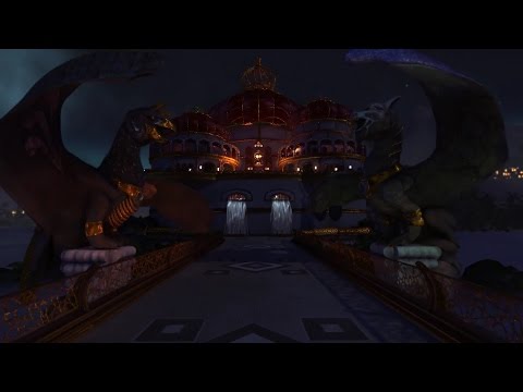
[UDK] Temple of Time (heavy images)
First post (WIP screens) moved downwards, should've reserved the first post 
Hello again,
So today can finaly show off the finished project.
Major changes are the environment (changed from a city to an island like idea) and the improved post-processing.
Hope you guys like it, and ofcourse credits to my teammembers once again: (alphabetical):
-Ilia Tonev (level design)
-Arthur Abeen, Nikhat Ali, Katharina Schütz, Eline Slingerland, Olaf van der Kuij and Timo van Hugten.
[ame=" https://www.youtube.com/watch?v=TWVe1Ukl_Vc"]https://www.youtube.com/watch?v=TWVe1Ukl_Vc[/ame]


Hello again,
So today can finaly show off the finished project.
Major changes are the environment (changed from a city to an island like idea) and the improved post-processing.
Hope you guys like it, and ofcourse credits to my teammembers once again: (alphabetical):
-Ilia Tonev (level design)
-Arthur Abeen, Nikhat Ali, Katharina Schütz, Eline Slingerland, Olaf van der Kuij and Timo van Hugten.
[ame="
 https://www.youtube.com/watch?v=TWVe1Ukl_Vc"]https://www.youtube.com/watch?v=TWVe1Ukl_Vc[/ame]


Replies
Also try to move to UE4
This! Would love to see all that metal with a proper brdf. Sticks out too much with UDK's older cubemaps and materials. Otherwise looks pretty good, and if high saturation is what you wanted to go for then awesome :thumbup:
Though, tulkas09, you're talking about pp-volumes. Is that an suggestion you're aiming at specific areas?
UE4 is something which would be very nice indeed, teachers also gave permission to switch, but this is just one of the courses (we're kinda busy :P) so we dont think it's realistic to switch right now, looking at the time we have left
Hello guys,
Wanted to post some of our progress of a school project of ours (speaking for my team). We're currently in our seccond year of IGAD (breda, Netherlands), in which we have three blocks (each ~10 weeks) to spend on a worldbuilding project.
We've received a blockout model in UDK (by Ilia Tonev) and a theme (Prince of Persia), rest of it was up to ours, as long as it looks pretty and is playable.
We've just entered the last of the three blocks, there are some assets in blockoutphase, still have a lot to polish. (eg. the marble of the outside walls and pillars, the city, waterfalls, the postprocessing, lighting etc.)
Anyway, additional feedback is welcome, if there's some notable progress we'll be updatin'.
Also 'shoutout' to my teammembers (alphabetical): Arthur Abeen, Nikhat 'the G' Ali, Katharina Schütz, Eline Slingerland, Olaf van der Kuij and Timo van Hugten.
This was the blockout we've received back then:
And this is what we have so far:
Also: The screens appear to be very dark (thus very bad visible) on some monitors, while - for example - on my screen they are fine. How do for example these two compare to each other?
Original
Brighter one