Druid in the woods WIP, critiques please
Hello Poly (:
I got a request of making a druid in the woods summoning some roots to aid him attacking the viewer (at the thumbnail isn't visible ofc, but a wolf, a crow and him would be looking at the viewer with angry intentions), and will be using it for an upcoming fanzine project at my school (Deadline 28th March).
I made some thumbnails and decided on this one, but when colours came to mind I had a mix of options I like for the background. Also I'll be dressing the druid with drapes and some crow feathers in the shoulders, but I don't know which color would fit better depending on what colour scheme would I choose on the background.
So here is the scheme chart:
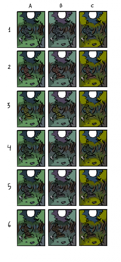
I like the most 1A, 3B, 4A, 5B, 6B and 6C. What do you think? (:
I got a request of making a druid in the woods summoning some roots to aid him attacking the viewer (at the thumbnail isn't visible ofc, but a wolf, a crow and him would be looking at the viewer with angry intentions), and will be using it for an upcoming fanzine project at my school (Deadline 28th March).
I made some thumbnails and decided on this one, but when colours came to mind I had a mix of options I like for the background. Also I'll be dressing the druid with drapes and some crow feathers in the shoulders, but I don't know which color would fit better depending on what colour scheme would I choose on the background.
So here is the scheme chart:
I like the most 1A, 3B, 4A, 5B, 6B and 6C. What do you think? (:
Replies
I would choose some of those where the character contrasts the most with the background.
Personally, I would have pick the 2B because the warm brown attracts the eye on the character and it stands out from the cold green of the forest. And the purple sky add a really nice mood to the overall piece in my opinion.
Yep, some of them were excluded practically before asking due to disappearing xD
I do like brown in his clothes, so maybe it'll be between 2B, 6A or 6B. I was in love with 6C but I think it's very saturated for a dark mood scene.
Well, I'll try to update today with the final sketch (:
Also I'm considering moving the moon to the right to help the composition.
(Will change the stars too, didn't see them zoomed and they're awful xD)
I'd push the overall values before refining areas further though.
I think your composition is too centered, the skyline is right in the middle of the image so it lacks of dynamism. But maybe it's on purpose to have a quiet mood ? Otherwise there is a good atmosphere, I like the light on the leaves, it's really soft and sweet but the roots seems to float a bit !
You maybe find me a little obsesive but I think that the characters doesn't come out the background. I did a quick paint over (that's an example to just show how you can push up the druid) :
I'm not sure about the moon too, even in your thumbnail, it becomes the focal point (high contrast, geometric silhouette). And with the crow, the contrast is very high (black and white even in the form : sphere and sharp) so that's what I look at first. Anyway, it seems that your deadline is quite short so do what you think is best^^
About the moon, maybe if I blur it a bit or put some clouds before it so it becomes less interesting to the eye? I'm having too that sensation of it being the focal point and I don't want that
The deadline was extended to the 30th since the girl that collects the images for the fanzine is my flatmate and gave me the weekend to improve the image the most I can
So, what else could I improve about the background elements?