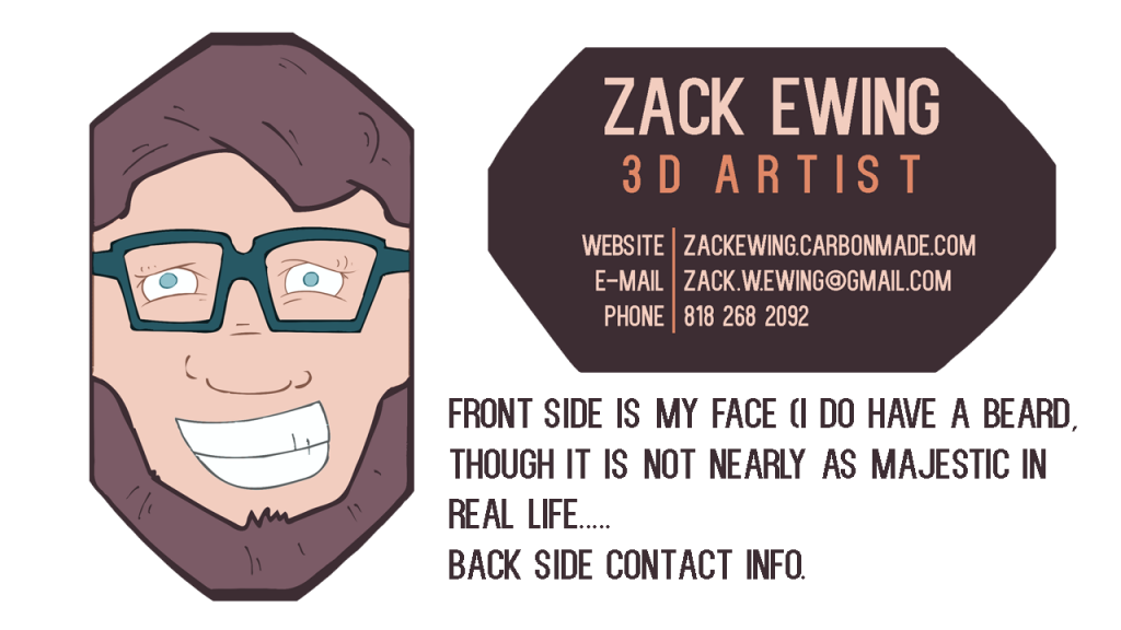
Business Card crit before GDC!
Hey all,
So I am attending GDC for the first time this year (see everyone @ the bar on Wednesday!)
I know that the business card is not half as important as the portfolio, or my ability to talk to people, but after getting stacks of cards from people, I would love it if mine sticks out a bit in the minds of potential employers. I have a polycount contest win and a lot of learning under my belt, but no real world experience yet, so I am REALLY trying to capitalize on this trip, especially since my mini golf level will be @ the Havok Play booth this year.
I read through the other "firt time @ GDC" threads and found the info really helpful, so I wont ask anyone to rehash the same info again here.
At any rate, I would love some feedback from everyone on this weird business card idea before I get it printed and cut.

Replies
Another option would be to put together a little simple scene with some of your mini-golf props.
I'd also remove the speed sculpts and concept art from your portfolio, you're only as strong as your weakest piece.
Thanks for the feedback, it all feels totally fair!
So I went ahead and removed the speed sculpts and illustration from my portfolio site. I guess since I am just starting out I was concerned about having a large enough volume of work, but I agree that the whole picture my portfolio paints is stronger now that I have dumped the 2D stuff and the scuplting (which I am just starting to learn, so clearly not my strongest suite.)
I like the idea of putting a little scene together for the front of the card. I guess it seemed pretty clever to have my face on a card, but I do hear what Slosh is saying about branding myself as a 3D artist.
I have a pretty limited amount of time to send something off to the local print shop before I go down to SF, but I will play with some scenes tonight and see if I can get a good form that would serve well as the front of the card.
Thanks everyone for your thoughts, keep 'em coming!