Hand painted/sculpted texture
polycounter lvl 7
--EDIT--
New Project:
Final texture:
--ORIGINAL POST--
Testing out some hand painted textures.. I would love some feedback on this.
ps:
marmoset:
zbrush:
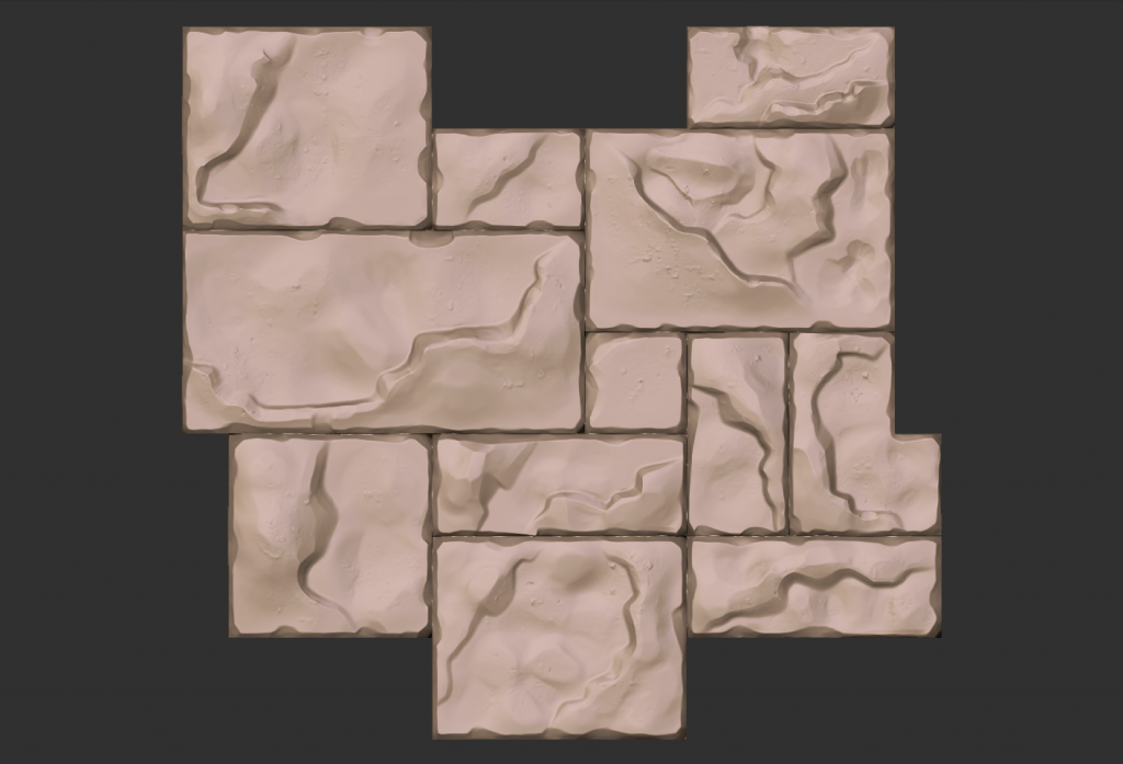
I feel like this would be the base that I would paint over, to give it more of a painterly feel, but I'm not sure where to take it from here.
New Project:
Final texture:
--ORIGINAL POST--
Testing out some hand painted textures.. I would love some feedback on this.
ps:
marmoset:
zbrush:
I feel like this would be the base that I would paint over, to give it more of a painterly feel, but I'm not sure where to take it from here.
Replies
Where do you want to go with this?
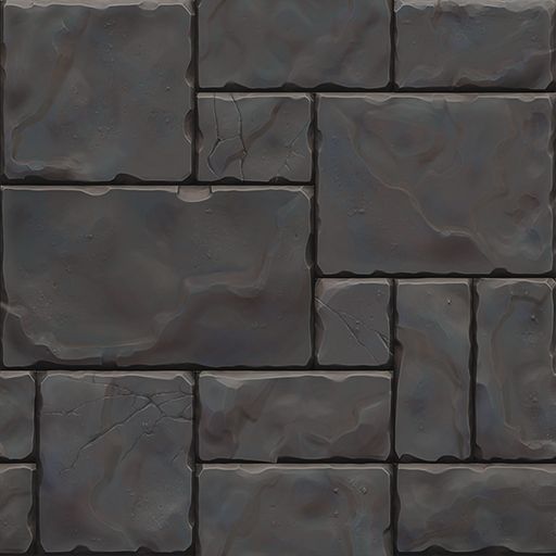
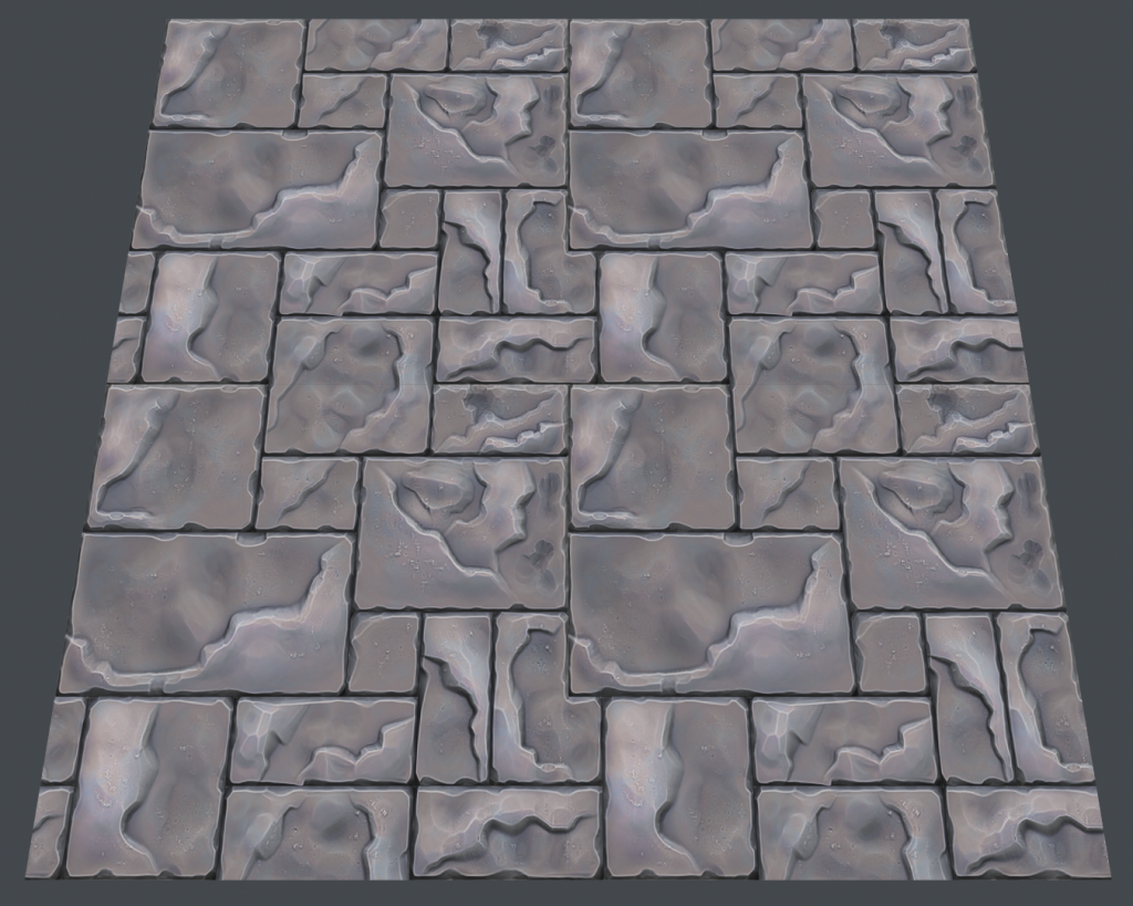
just a simple stone paver.
by the way, I'm not going for an exact color match, just trying to capture that style.
the style is defiantly on its way tho, lets see some real time renders?
Paintover:
You values are good. lets see what can be done about the color
But I really enjoy those little details you added.
EDIT: Should mention I meant in the Zbrush sculpt not the low poly.
Sort of like this:
The main thing I learned on this project was the interior cracks and height changes need to be secondary lighting info - so not as bold as the edge highlights and shadows. Also, subtle light changes make a big difference when there is not spec/gloss/roughness maps involved.
Thanks again for all the help spotting trouble areas for me!
Also threw Fanny's texture in the marmoset render to give myself a better idea of what I was shooting for:
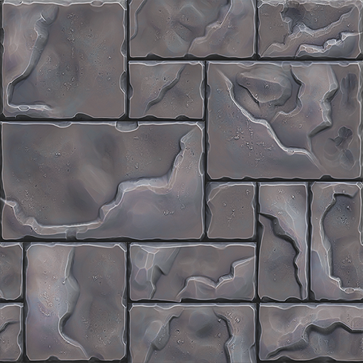
I do like the one on the right of the last Image more, looks more natural, less visual noise. I'm not sure if you used nDo 2 to bake your AO but It's giving that type of Colored AO effect nDo 2 gives makes it look a bit metal since it uses Blue and Red
I like the design more to
Keep it up!
concept: (not sure who did this, but I would love to find out)
block out:
I think what you have is a solid start. Excited to see where you take it.
Maybe chopping one of the big stones into two stones might help? Or you could replace two small stones with a big one.
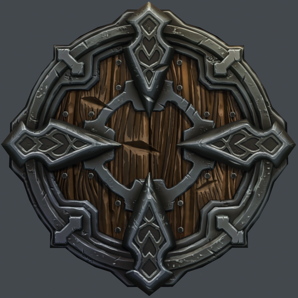
The shield is looking great so far, but it seems a lot more spaced out/bigger than the concept. What I mean is that, in the concept, the left and right arrows are thicker and covering both of the skeleton's eye sockets. Making the arrows thicker and less sharp around the edges might help.
The stones feel a bit wobbly in certain parts, like they have too much surface undulation. If you look at the reference you provide from Fanny's work there is little to no surface undulation, its subtle.
As well I would add more line variation to your steps on the stops, more thick to thin.
Look forward to seeing more!
ps file:
maya game res:
The game res is just under 1000 tri's. Not really sure what a good count is on something in this style, but it seems low in my opinion. Wouldn't be too hard to get that count down pretty quick and let the normal map take care of the inner detail.
I know you are sticking to that concept, but that's something that's coming along kinda weird in the concept itself.
And it's kinda sad that it ruins your great work, because the metal and wood parts really look great! In my opinions you did a fantastic job on those!
ps file:
Marmoset unlit shader:
Marmoset unlit shader: