Portfolio - Feedback Wanted
Hi lads and lassies,
I am a Junior 3D Artist currently in the midst of writing my Bachelor Thesis and working as 3D Artist - Intern at a game studio.
I realise the only way to grow is to get feedback, so I am asking you guys to critique my portfolio, tell me what you think I should strip, rework or keep.
I want to work as a 3D Generalist or Environment Artist, I haven't had much experience with Characters, though I am learning how to model them.
My main focus is organic or hard surface environment assets.
My portfolio:
www.robinpowellcg.com
Gallery:
http://robinpowellcg.com/portfolio/ (Hit load more at the bottom)
Samples:
Upgradeable Turret

Post-Apocalyptic Survivor

[ame="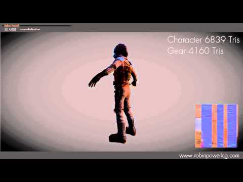 https://www.youtube.com/watch?v=Q_zBTWn3Dn8"]PowellAnimation - Post-Apocalyptic Survivor - YouTube[/ame]
Post-Apocalyptic City

Guard Tower

Medieval House

Thanks alot, fellow polycount members!
I am a Junior 3D Artist currently in the midst of writing my Bachelor Thesis and working as 3D Artist - Intern at a game studio.
I realise the only way to grow is to get feedback, so I am asking you guys to critique my portfolio, tell me what you think I should strip, rework or keep.
I want to work as a 3D Generalist or Environment Artist, I haven't had much experience with Characters, though I am learning how to model them.
My main focus is organic or hard surface environment assets.
My portfolio:
www.robinpowellcg.com
Gallery:
http://robinpowellcg.com/portfolio/ (Hit load more at the bottom)
Samples:
Upgradeable Turret
Post-Apocalyptic Survivor
[ame="
https://www.youtube.com/watch?v=Q_zBTWn3Dn8"]PowellAnimation - Post-Apocalyptic Survivor - YouTube[/ame]Post-Apocalyptic City
Guard Tower
Medieval House
Thanks alot, fellow polycount members!
Replies
It looks chaotic is what I'm saying. The turret is just an eyesore though. The shack feels bland and irritating...tiling irritating. To be honest, if you took the normal map off of the cabin, it doesn't look as bad.