The BRAWL² Tournament Challenge has been announced!
It starts May 12, and ends Oct 17. Let's see what you got!
https://polycount.com/discussion/237047/the-brawl²-tournament
It starts May 12, and ends Oct 17. Let's see what you got!
https://polycount.com/discussion/237047/the-brawl²-tournament
Blizzard Student Contest Entry (Environment)
Hey all
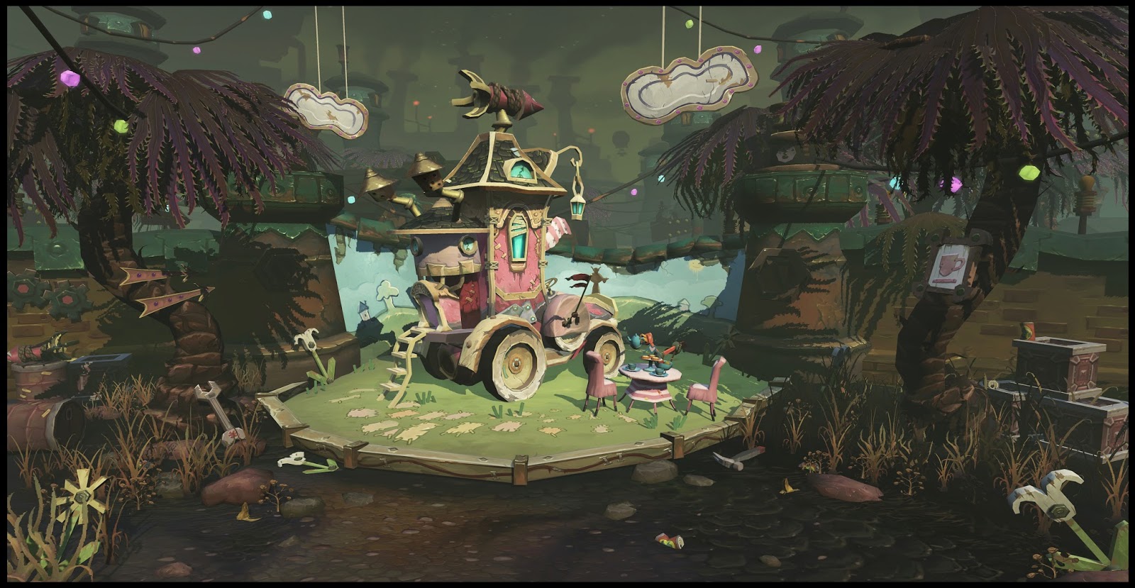
This is my Blizzard student contest entry, I would like to keep working on it as a portfolio piece, so all feedbacks are welcomed !

In WOW universe, Goblins are hot headed creatures who love money and mechanical things . Under the leadership of trading prince, they built an amazing tech city on the isle of Kezan and awfully polluted the environment over there.
Unlike other Goblins who only care about gold and engineering. little trading princess Abby Silverwrench does prefer a bit more "classy" type of lifestyle, so she ordered some of her troll slaves to build this secret garden
This is my Blizzard student contest entry, I would like to keep working on it as a portfolio piece, so all feedbacks are welcomed !

In WOW universe, Goblins are hot headed creatures who love money and mechanical things . Under the leadership of trading prince, they built an amazing tech city on the isle of Kezan and awfully polluted the environment over there.
Unlike other Goblins who only care about gold and engineering. little trading princess Abby Silverwrench does prefer a bit more "classy" type of lifestyle, so she ordered some of her troll slaves to build this secret garden

Replies
And I'd love to see some breakdowns.
Those clouds...! They made me smile.
It's really a great idea! The textures look also very good,
you also captured that WoW-feeling very well!
The only thing that's bothering me a little is that it feels a little chaotic, it took me a moment to recognize the blue painted wall. But I did.
Some gradients could improve your scene even more I guess!
But all in all very well done!
And here is a break down sheet
Also I have a zbrush sketch of Trading princess Abby Silverwrench, just a person project for some zbrush fun
Not sure what's going on with the ogre's lower jaw though. Also the ogre looks like a male with boobs lol.
Maybe its the face... the big flat nose/ strong cheek bones that gives it away? I feel a female ogre would have slightly thinner fingers/hands as well, Maybe some big nails to really push it. Just thinking out loud here.... ^_^
Since this is based on WoW I will commend your pushing of features,silhouettes and the like, nice work there. The colours and composition of the piece don't really say WoW to me at all. Everything is very desaturated and mostly everything outside of the car contraption is muddy and hard to read. I definitely get the feeling it's polluted and overcast probably because of it but you could still push some of the lighting a bit to try and define some of other the shapes in there.
Great work regardless though, you should be proud!
see in the image above she actually has some hair.. but I forgot to add that into the zbrush model..And btw that device on the ogre's jar is an air filter so that the princess does not have to suffer the terrible ogre breath all the time...XD
--Ducckz
Haha this is so funny, I didn't expect to have a man boob talk on polycount at all! And yes you are right I need to take out some details..
First of all, great job on the Mr Magic Caravan piece you did, it looks amazing. i like how you play with the shape and color to create visual interests and rest area. very inspiring!
While i was working on the Secret Garden, there was one point I actually had some bright and colorful elements on the two sides of the image, like this:
But then I started to worry that those things are overpowering the main focus area so I darkened them down.. But as you said I think I kinda of over did it.. also I made the textures a little too busy.. Well, part of the learning process I guess, thank you for the comments those are very helpful
-Stevston
Before I started this environment piece, I actually walked around in the goblin city for quite a few hours, the overall feel of that location is kinda of smokey and muddy.. So I decided to keep my piece desaturated to fit in this place:
But yes you are right, I think I need more color in this scene, especially the main area, I will go play with colors a bit more..
Also thanks to stevston for providing some visual guides as to what I was trying to explain, hopefully that helps you out. It's also good to see a bit of reference as to what you've been trying to fit your piece in to. Even still though, like you say there is more colour with it still being pretty filthy.
I look forward to seeing what you come up with!
The trees are off the chain and I want to run my fingers along the spiny edges, risking grave injury!
I actually like that early shot you posted for two things: it feels much easier to read, and I get a better sense of depth. I think what throws me off in your final image is the blue background behind your focal piece, likely because the values are very close.
Overall though, this has got some serious potential. Good luck!
-89roach Over the weekend I went back to UDK and revisited some stuff:
1 Deleting some unnecessary grass and lights to make the scene less busy.
2 increasing the density of fog to push the background further.
3.darken the bluewall...
...
Here is the new image.
Like I said, even through the Blizzard contest ended few weeks ago.
I still want to keep working on this piece for my portfolio
www.phillipzhangart.com
I feel like I should get started on a cool piece like this!