two_larsens Workshop
Hello Dota Item Makers,
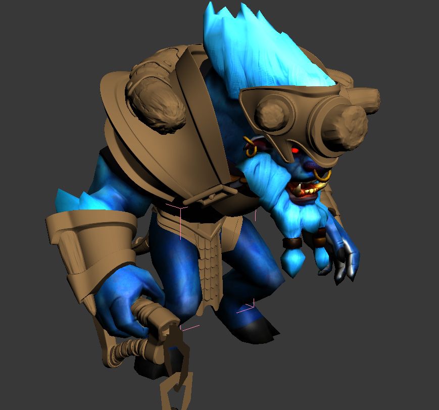
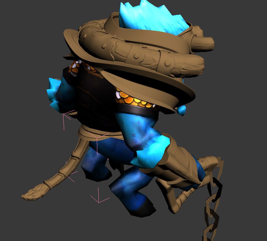
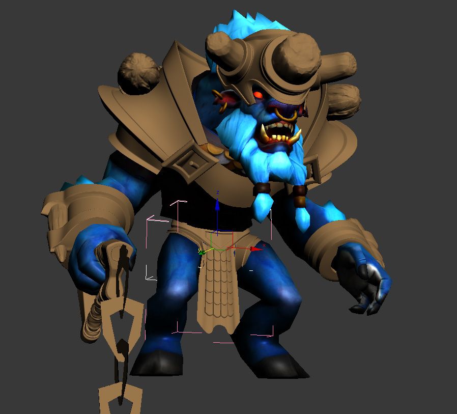
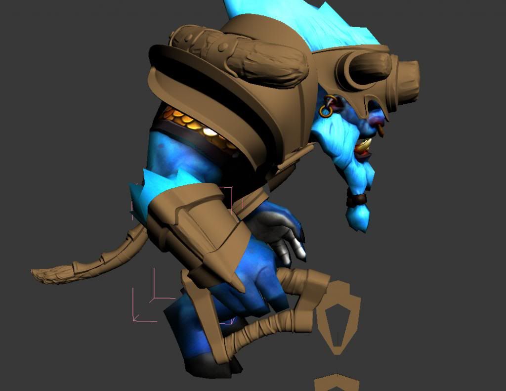
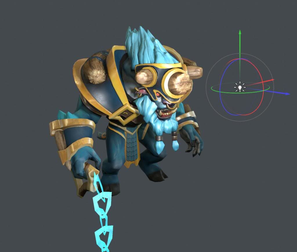
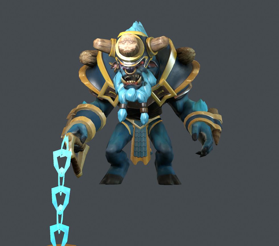
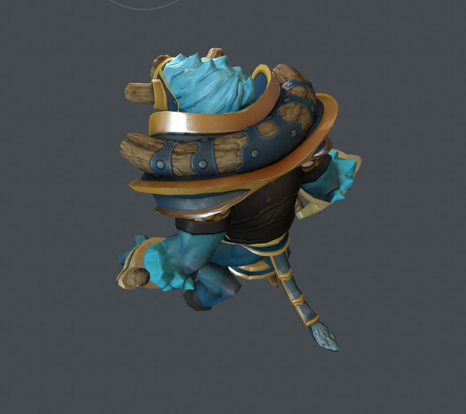
I've been busy trying to wrap up my first set - a set for Spirit Breaker. The theme I was going for was his charge. I wanted him to have a giant horn attached to a piece of protective shoulder/back armor shaped with a bit of forward motion.
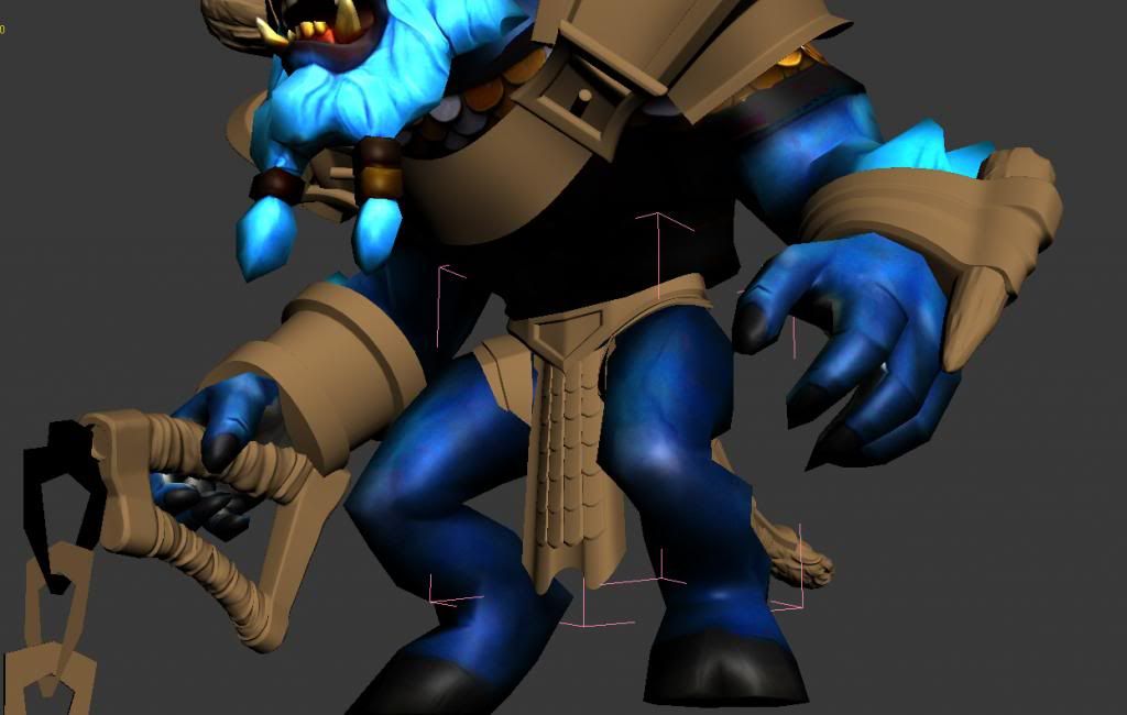
For the wrists, I used the horn idea, and went for two different pieces - for visual variety.
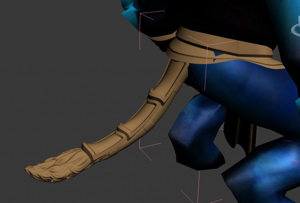
For his waist, I thought it would look interesting with some larger scales, combining into the tail armor, which is made of linked sections. The tail I remodeled with some larger hair swirls, and then have leather straps keeping all the pieces in place.
His head, I thought , would look interesting having three horns that all have broken to stubs - from him charging.
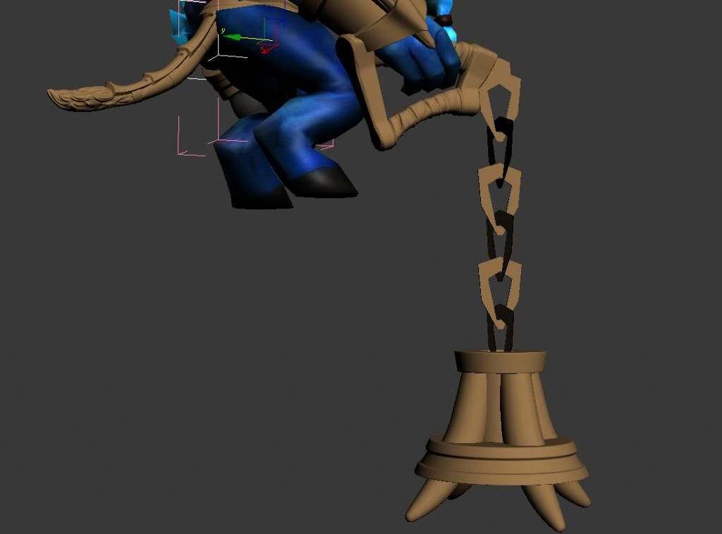
The weapon is not done - except for the handle. The shape is somewhat there, and the horns running through the mace part of it, are yet to be detailed - as well as the chain - but nothing too drastic.
My plan is for the chain to be glowing bright blue and for there to be an inner glow - also blue - in between the horns.
All the pieces (except for the weapon) are done - as such (LoD0 & LoD1), but nothing is cast in stone, since I do tend to change things to a fault.
Also, what also needs done is the rigging of the waist piece and the weapon, and to be honest, I have no idea of what I'm looking at there. I am an environment artist, but not an animator. Perhaps I will have to ask for some advice for how to proceed with that.
Anyway, suggestions are always welcome. Colors and color combinations are up for grabs as well. I have initially gone for colors already in his existing set (gold and blues).
Overall, I've gone for clean lines (as much as I can), and nothing too visually distracting from a distance - so simple shapes and lines, and something that looks like it belongs together. I could go in and make splits in the armor pieces, and I have thought about that, but for some reason, I personally liked the 'clean' look. That is up for grabs too, I imagine. I am still learning in regards to item-making, but it is a little tricky doing this since so many visual levels have to be considered.
Thanks.
website: http://www.henriks3dworld.com/


Replies
I understand the idea to let him have broken horns, but in the end he just doesn't look that dangerous. I'd like it more if he had some real killer spikes on his armor. Maybe you try breaking only one or two of the bones.
Also I like the weapon hand bracers better as it look more robust.
Another point that is odd to me: His loincloth has those small detailed scales whereas all the rest of his armor is simpler and larger. Maybe you try to simplify the loincloth.
And as a final statement: I love the metal clamps around the large shoulder bone!
Henrik
I, like with the Spirit Breaker set, didn't want too many ideas incorporated into an item - but rather one per thing, since it can become too busy - visually.
Thanks!
Henrik
Well as positive feedback it looks great a very good idea to combine it with a nice blade/dagger.
But for Qop I would use red colours maybe a bit of a goldish colour pool.
Any other feedback?
So, in essence, I remade it from scratch since there were a bunch of design I wanted in it, then.
Any thoughts?
Portfolio: http://www.henriks3dworld.com/