How do you Stylize art ?
polycounter lvl 10
Background:
I was trying to learn Project Anarchy so, though of making a simple mobile game(also maybe to enter a mobile game making company).
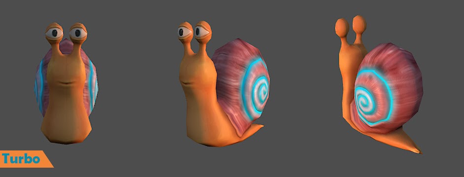
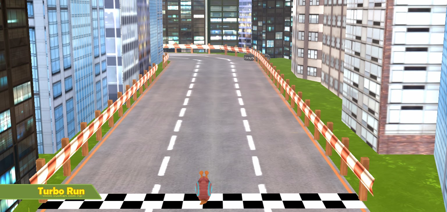
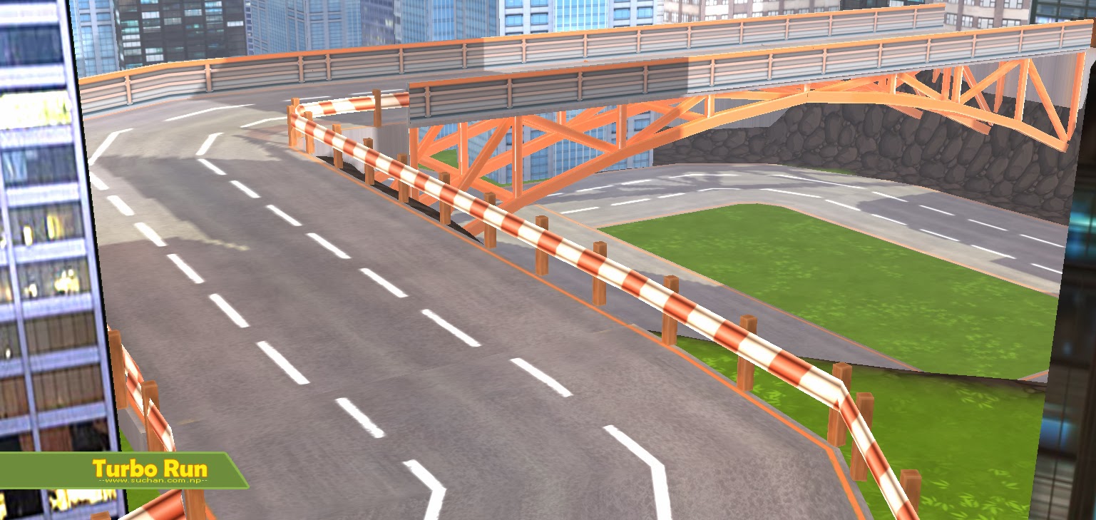
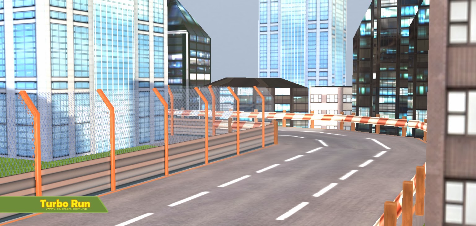
Inspired by movie Turbo, its a Turbo Run.
Few snaps here
To the Point:
Here is the thing, I made these without any concept art. Realized it not very nice or stylized as other usual mobile games be.
I see so many good looking game art and do I've reference from other stylized games but since mine has skyscraper, I almost hit a dead end.
If you've any suggestions or help regarding the same, I'd love to hear. Also if you know some resources that I should check for making stylized art, do let me know.
Thanks")
I was trying to learn Project Anarchy so, though of making a simple mobile game(also maybe to enter a mobile game making company).
Inspired by movie Turbo, its a Turbo Run.
Few snaps here
To the Point:
Here is the thing, I made these without any concept art. Realized it not very nice or stylized as other usual mobile games be.
I see so many good looking game art and do I've reference from other stylized games but since mine has skyscraper, I almost hit a dead end.
If you've any suggestions or help regarding the same, I'd love to hear. Also if you know some resources that I should check for making stylized art, do let me know.
Thanks
Replies
As for resources regarding stylized art deviantart is full of tutorials and so is youtube. Mostly for digital painting in general but the knowledge can be applied to doing textures and stylized models.
If you want a bright toon style, then dropping some detail in the environment textures is a good start.
Find some reference of something sorta like the style you want. Draw that. Forget about 3d for a minute and just figure out what it takes to make the look in terms of color, shapes, visual complexity, etc. Paint up a replica of an object that fits the style you want in photoshop. Then translate that knowledge onto your assets.
If you take a step back and look at something like a van Gogh painting, you can examine his style and determine how he does things so that you can then use what he does to make good decisions about what YOU should be doing.
Van Gogh did some very specific stylistic things that make his paintings easily identifiable. He used large strokes that imply motion, direction, and shape with their arrangement. He used colors to give the impression of what you're looking at, given his palette, rather than the objects' and scenes' actual colors. He didn't concern himself with very small details, instead preferring to give a general idea of what you're looking at -- as if you're looking at something from a few steps away rather than up close.
So how is this useful? You can do the same things van Gogh did. Simplify shapes; a skyscraper could be a large box with a solid color slapped on it instead of a collection of windows, walls, doors, etc. Use colors that give the impression of what you're looking at rather than using things like photos or detailed textures; concrete could be a flat gray instead of a gritty multicolored mass that looks gray from a distance. Small details that might exist in real life might be completely absent; instead of a window having a lock and lintel and beveled edges and a little crack in the corner, it could be a rectangle with a line through it.
On the other end of the spectrum of stylization is something you might see in Gears of War or the Transformers movies. They throw so much detail into every little nook and cranny that it's hard to focus on one thing at any given time. They don't throw detail away, they bring more detail in.
The key to all of this is consistency. Style is consistent, so choose a consistent way to represent things and run with it.
2) apply value/colour compositional theory to make your game more readable; the player needs to know where to look, so show them. Put together a broad palette for your level and use your saturated colours and accents in the important things - the track, the boundaries, your actual player! Use your secondary (less saturated) colours for the scenery, and take all that noise out of the buildings. Your viewer will always look straight at the area of highest contrast, which can also be considered the noisiest area of the scene. At the moment I like your neon orange track boundaries, but they're lost because of the noisy high-contrast areas in your buildings, which are pure scenery. Worse than this is that your actual player is really desaturated looking (for the style you're going for) and is easily the last thing you notice when you glance at the screen. As it is your eyes will dart around the buildings then rest on the track - you want the complete opposite of this
EDIT: I realise this is sod all to do with stylisation but it's late and I'm tired and it's still helpful so mnyerrrerrr
It was hard working on this one as it involved more skyscraper and on top of it without any reference..
So, after reading all the notes, I felt it's a good idea to make a reference by myself (Photoshop) whatever my skill allows and set the style first rather then jumping directly.
Color theory is the hardest thing: I watched Gnomen + Digital Lighting foundation/color theory but couldn't implement.. I think I should research more on it and try to find practical way of studying color theories.
Thanks alot again guys, I'll work on concept first and show you guys
Can I reverse engineer other's art ?
for eg.
This is a small but great piece of art from one of the Polycounter, the color is good and so appealing..
How can I study it ? (Can I ?) like why its looking nice, or why the artist used this color or color palette or saturation or whatever that I can learn for myself. Any ideas ?
Feature exaggeration(requaires solid observation skills / anatomy knowledge). When you know the rules of realism you also know how to break them.
Composition.
And above all, experience.