Now I've got a little free time back, I'm trying to get some more sets made up for Dota.
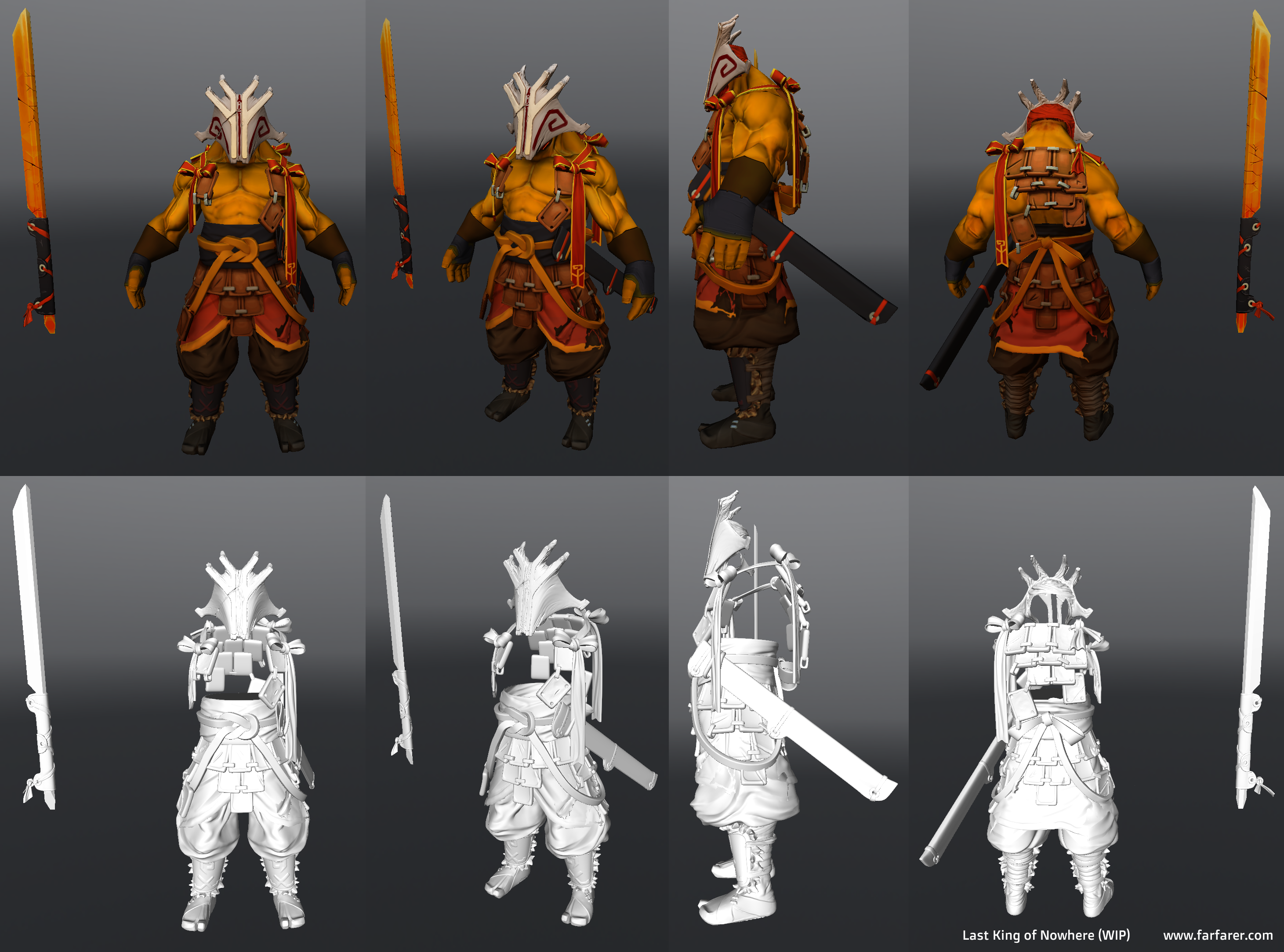
Here's the progress on my first set since my WD one for the Polycount contest; one for Juggernaut.
Textures are still WIP at this stage - just diffuse and normals for now, I'm still tweaking the colours as I'm not 100% happy with them. Trying to get them to be distinct but not too noisy.
Starting on a set for Tusk. Trying to get it as much done inside of MODO as possible.
So I wrote up an SMD importer (not ready for release yet - still a few niggles) to let MODO natively open/import SMD files.
I'm loosely basing this set around him being a bar fighter, with him having lost a tusk in a fight and had it replaced with a wooden one (like a pirate would with a leg). Not going for such a strictly contained set as I have done before. So far, just the tusks are done.
Just a quick update of texturing on the jacket. Added some slapdash stitches as I felt it was looking a bit too anachronistic; too much like a modern day puffer jacket, rather than something quilted. Not sure if it's making to too busy.
I had originally wanted to add some stuffing (either hay or fur) coming out of tears to show the same thing, but it was too indistinct on the game-res texture.
I've also re-coloured his remaining real tusk so that it fits in closer with the colour of his standard set. I'll need to do a spot of re-texturing at some point, too, as it's just a hasty hue-shift at the moment.
That jacket is adorable, and the tusks look really unique. Some aspects of the axe remind me of this axe though - you could try adding more ice on the blade to differentiate? It might be different enough already with the color swap, not sure
I love the jugg set. Most jugg sets accepted seem to only incorporate his "Samurai" style, your set gives the tribal and feudal swordsman-like style jugg really flows with.
Is there anyway to get the look you have in the icon on the in game model? The icon looks amazing so I was disappointed that the in game model doesn't share that convincing ice shine.
Been busy with some MODO scripting stuff, but I'm starting to tackle the Juggernaut ward.
Mostly playing with some animation tests to see if what I want to achieve is feasible.
The idea stems from a "tree of life" type thing. With the first of the race planting seeds from the tree of life. And then each child has a seed planted for them from their parents' tree upon their birth. When that child comes of age, their mask is carved from it and its seeds harvested. These seeds can then be planted and the resulting sapling will restore health to the warrior the tree belongs to, and one is planted for their own children when the time comes.
Tried to unify the colours a bit both with itself and with the rest of the juggernaut set.
Scrapped the baked vegetation as it looked shit and I've tried a more hand-painted approach that's a bit closer to Dota's own trees. Think I need to make it a less densely covered and perhaps add a few more in, as it's kinda clumpy at the moment.
No, it's intended as a juggernaut healing ward to go with this set.
I'm just a bit worried about it's suposed to move. Given how it moves around, it just levatates. It's hard to tell given the angle its currently screenshot at, but it looks like it's a flat ground, as if it's meant to be planted into the ground. I almost feel that with the base, adding some grass, to throw some greens in there, could be interesting. Then playing with the base looking as if someone just uprooted it from the ground. Something like these examples.
It's coming out great, can't wait to see it ingame!
Looking at other wards, I'd kinda figured that sliding-along-the-ground movement was just sort of accepted as a limitation of some designs. But I do like the floating chunk of soil idea... feels more polished than having it just magically glide along.
Got a good few polys left to play with (although less so UV space) so I'll give it a bash, see how it looks
Put in the floating island chunk and worked a little more on textures. Need to add in more and chunkier grass blades at the root as they're not very visible just now.
Seems to be some confusion with the petals and normals/tangents. I've randomised them a fair bit (randomly assigned each triangle of each bunch of petals to one of 3 tiles but I randomly flipped 50% of them to get more variation and that's confusing things). I'll see how it looks in-engine and revert that back if it's still screwing up.
Also updated the spawn animation a little - rubbishy preview capture from MODO's viewport.
Automedic, the shape is sort of defined now - and it's based on shapes found throughout the rest of the set, so I'm not sure I could do much with it at this point, other than rearrange the petals as they're not really attached to much, just seemed odd when they were floating too far off the main branches - but what is it about the colours that's bugging you?
Oh I'm just not a big fan of it since I just don't like the style of it (it's not very... massive? I think it just lacks a big, bulky shape where your eyes can rest - to avoid that the leaves craeete too much noise. And the sigil isn't really connected to the tree, so it looks a bit random. Plus I believe a lot of detail will get lost from top view). That's a purely subjective feeling however and the majority doesn't seem to share my opinion - so don't take my comment too personal or even as a reason to change anything .
As for the colour: I once worked on a juggernaut ward with Crowntail and since we wanted to adapt the ward to the radiant and dire building style we also didn't pick up the green of the healing effect which bugged a few people a lot. That aside - I'm just not a big fan of pink. I believe it won't compliment the green healing aura and the yellow/golden jug colour scheme very well.
Yet, as I said: I don't want to unsettle you, it's probably just my opinion. Tastes tend to differ. Leaving my personal preferences aside, your animations are amazing and I think with this kind of quality it will definitely be a success in the workshop.
Yeah, I get what you mean. Thanks for your honesty though - I tend to overlook a lot of stuff as I don't really play the game much (I'm awful at it). Just like making stuff for it.
The pink I'm still a bit unsure of myself. Cherry blossom fits the theme for Jugg and I just generally like 'em, but I'm open to pushing it more white, or even to leaf green if it needs it (and let the flowers carry the colour highlights, they're getting a bit lost in the petals at the moment). It's stuff I'm going to have to have to figure out when it's in-game.
So I got a chance to get it all in-game... and you're right on all counts. It's kinda weedy and doesn't stand out much.
That said, I'm pretty pleased with how the animations look for it and the general idea still works for me, so I'm gonna stick with it and get it into a submitable state.
I've gone back and beefed up the non-tree parts (the red wood surround/ribbons, the stone disc in the centre, and the ground/grass). I still need to tweak the rig/animation to account for that.
I've also switched the petals into a red-orange gradient rather than pink-white and it's looking a lot more bold now (the pink was a bit too easily lost in with the existing blossom trees of the map). I think I might need to go back and make the leaves in the texture larger, too, as they're kinda small and noisy.
I guess that's just one of the downfalls of how/when I get to work on this kind of stuff - it's very rare I get access to a PC that has both Steam access and the ability to run Dota... means I don't get to do much testing in-game
So thanks for your input, I should have listened sooner
I'm sorry to hear that. In case you consider changing a bit more, how about you go for a tree look somewhat closer to this:
In case you want to invest that much work I think this could really improve the ingame appearance of your item while retaining the amazing animations that made this item so outstanding.
I think you could largely maintain the bottom half of the rig (including most of the spawn animation) and replace the tree with a more crooked, thicker bonsai-themed tree. This would:
a) pick up the asian theme a bit better,
b) look less unnatural and perfect compared to the current tree,
c) allow you to create assymetrical branches and clouds/patches of leaves, which would render the floating patch of earth and the ring more visible from top-view
d) give you a nice opportunity to find a use for the sigil: maybe turn it into a gong that will hang down from a horizontal branch like the one in the left of the picture.
e) get me really excited about a new, less symmetric growth animation (patches of leaves shooting out of a growing branch!)
I was thinking about that, but the animation and rigging becomes much more complex the more crooked and irregular the tree is. The relatively straight and narrow shapes are a help there. Some of my earlier tests were pretty crooked and they end up needing quite a few bones just to get a decent looking growing animation, I was worried it would be overkill just for the item's "trick".
I'll do some quick tests and see how much work it would take to rework, then decide whether it's worth it or whether I should just get on with something new :P
Give it a shot! Animating it will get a bit tougher, true, but I'm sure the result will be downright amazing. You are way too far to throw the concept away now. This item has so much potential.
looks 100x better, I just wish it tied in a little better visually with the set. also I think the mask is a little plain. but the ward looks very nice!
Replies
Had to scale him up 15% to match the proper version. Now all of the bits are offset on X and Y axes by some amount. I have no idea why
http://steamcommunity.com/sharedfiles/filedetails/?id=193599457
So I wrote up an SMD importer (not ready for release yet - still a few niggles) to let MODO natively open/import SMD files.
I'm loosely basing this set around him being a bar fighter, with him having lost a tusk in a fight and had it replaced with a wooden one (like a pirate would with a leg). Not going for such a strictly contained set as I have done before. So far, just the tusks are done.
High res, LOD0 and bake are done.
Just a quick update of texturing on the jacket. Added some slapdash stitches as I felt it was looking a bit too anachronistic; too much like a modern day puffer jacket, rather than something quilted. Not sure if it's making to too busy.
I had originally wanted to add some stuffing (either hay or fur) coming out of tears to show the same thing, but it was too indistinct on the game-res texture.
I've also re-coloured his remaining real tusk so that it fits in closer with the colour of his standard set. I'll need to do a spot of re-texturing at some point, too, as it's just a hasty hue-shift at the moment.
And working on a new weapon for him;
I'll have a fiddle and see if I can differentiate it some more.
Some test bakes and really quick base textures;
Next up is a ward for that Juggernaut set, been meaning to get around to that for ages.
I'll look at updating it in future.
Mostly playing with some animation tests to see if what I want to achieve is feasible.
The idea stems from a "tree of life" type thing. With the first of the race planting seeds from the tree of life. And then each child has a seed planted for them from their parents' tree upon their birth. When that child comes of age, their mask is carved from it and its seeds harvested. These seeds can then be planted and the resulting sapling will restore health to the warrior the tree belongs to, and one is planted for their own children when the time comes.
[ame="http://www.youtube.com/watch?v=8d68ttZuKX8"]Juggernaut Ward Test - YouTube[/ame]
[ame="http://www.youtube.com/watch?v=KBJKp5O_iFI"]Juggernaut Ward Test 2 - YouTube[/ame]
Ignore the crappy alpha sorting if you can - modo's not very good with that.
Still all very WIP. I think I might have gone too far on the bark texture, might pull it back to be less noisy.
Scrapped the baked vegetation as it looked shit and I've tried a more hand-painted approach that's a bit closer to Dota's own trees. Think I need to make it a less densely covered and perhaps add a few more in, as it's kinda clumpy at the moment.
Also I think the stone on the top should rest at the base of the tree so the eye won't block it. This is an observer ward right?
I'm just a bit worried about it's suposed to move. Given how it moves around, it just levatates. It's hard to tell given the angle its currently screenshot at, but it looks like it's a flat ground, as if it's meant to be planted into the ground. I almost feel that with the base, adding some grass, to throw some greens in there, could be interesting. Then playing with the base looking as if someone just uprooted it from the ground. Something like these examples.
It's coming out great, can't wait to see it ingame!
Looking at other wards, I'd kinda figured that sliding-along-the-ground movement was just sort of accepted as a limitation of some designs. But I do like the floating chunk of soil idea... feels more polished than having it just magically glide along.
Got a good few polys left to play with (although less so UV space) so I'll give it a bash, see how it looks
I might just animate some simple polys.
Seems to be some confusion with the petals and normals/tangents. I've randomised them a fair bit (randomly assigned each triangle of each bunch of petals to one of 3 tiles but I randomly flipped 50% of them to get more variation and that's confusing things). I'll see how it looks in-engine and revert that back if it's still screwing up.
Also updated the spawn animation a little - rubbishy preview capture from MODO's viewport.
[ame="http://www.youtube.com/watch?v=S3_LLQejMns"]Juggernaut Ward Test 3 - YouTube[/ame]
Automedic, the shape is sort of defined now - and it's based on shapes found throughout the rest of the set, so I'm not sure I could do much with it at this point, other than rearrange the petals as they're not really attached to much, just seemed odd when they were floating too far off the main branches - but what is it about the colours that's bugging you?
Oh I'm just not a big fan of it since I just don't like the style of it (it's not very... massive? I think it just lacks a big, bulky shape where your eyes can rest - to avoid that the leaves craeete too much noise. And the sigil isn't really connected to the tree, so it looks a bit random. Plus I believe a lot of detail will get lost from top view). That's a purely subjective feeling however and the majority doesn't seem to share my opinion - so don't take my comment too personal or even as a reason to change anything .
As for the colour: I once worked on a juggernaut ward with Crowntail and since we wanted to adapt the ward to the radiant and dire building style we also didn't pick up the green of the healing effect which bugged a few people a lot. That aside - I'm just not a big fan of pink. I believe it won't compliment the green healing aura and the yellow/golden jug colour scheme very well.
Yet, as I said: I don't want to unsettle you, it's probably just my opinion. Tastes tend to differ. Leaving my personal preferences aside, your animations are amazing and I think with this kind of quality it will definitely be a success in the workshop.
Good luck with it!
The pink I'm still a bit unsure of myself. Cherry blossom fits the theme for Jugg and I just generally like 'em, but I'm open to pushing it more white, or even to leaf green if it needs it (and let the flowers carry the colour highlights, they're getting a bit lost in the petals at the moment). It's stuff I'm going to have to have to figure out when it's in-game.
Need to look into particles and all that, too.
That said, I'm pretty pleased with how the animations look for it and the general idea still works for me, so I'm gonna stick with it and get it into a submitable state.
I've gone back and beefed up the non-tree parts (the red wood surround/ribbons, the stone disc in the centre, and the ground/grass). I still need to tweak the rig/animation to account for that.
I've also switched the petals into a red-orange gradient rather than pink-white and it's looking a lot more bold now (the pink was a bit too easily lost in with the existing blossom trees of the map). I think I might need to go back and make the leaves in the texture larger, too, as they're kinda small and noisy.
I guess that's just one of the downfalls of how/when I get to work on this kind of stuff - it's very rare I get access to a PC that has both Steam access and the ability to run Dota... means I don't get to do much testing in-game
So thanks for your input, I should have listened sooner
In case you want to invest that much work I think this could really improve the ingame appearance of your item while retaining the amazing animations that made this item so outstanding.
I think you could largely maintain the bottom half of the rig (including most of the spawn animation) and replace the tree with a more crooked, thicker bonsai-themed tree. This would:
a) pick up the asian theme a bit better,
b) look less unnatural and perfect compared to the current tree,
c) allow you to create assymetrical branches and clouds/patches of leaves, which would render the floating patch of earth and the ring more visible from top-view
d) give you a nice opportunity to find a use for the sigil: maybe turn it into a gong that will hang down from a horizontal branch like the one in the left of the picture.
e) get me really excited about a new, less symmetric growth animation (patches of leaves shooting out of a growing branch!)
Just some ideas
I'll do some quick tests and see how much work it would take to rework, then decide whether it's worth it or whether I should just get on with something new :P
Give it a shot! Animating it will get a bit tougher, true, but I'm sure the result will be downright amazing. You are way too far to throw the concept away now. This item has so much potential.
Steam Workshop
Youtube:Dota 2 Workshop - Juggernaut Set - Last King of Nowhere
Ward looks cool allso , neat animation