Home Contests & Challenges Archives

VG Remix - Golden Sun

New to this site, made an account specifically for a class at school, but when I saw this particular contest's theme, I had to give it a shot! I may have higher priorities, but I shall try!

Well, Golden Sun is the whole reason I wanted to become a game designer, and what better scene to pick for this contest than the ending of the first game, where Sheba is about to fall off the lighthouse.
Reference image off of Google: 39-GS1426.png
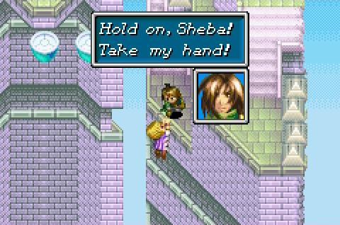
Gonna do a quick sketch of the scene before bed, and hopefully talk some people at school into also participating in this contest, as a motivator of sorts.

Replies

  • Alismuffin
    Offline / Send Message
    Alismuffin polycounter lvl 7
    YEEEEEEEEEEES
    Do it
    Golden sun is amazing
  • E2x7u
    Having a bit of trouble keeping up with this contest at the moment. A lot of tiny bad things happening all at once are depressing me, one of them being that the file I was working on crashed very early on. Clicking to fast or something like that I guess. But when I opened up the recovery file, I realized that I have no sense of scale what so ever, so I decided to start over. Watching some of the other entries, and one that helped me solve this issue was for FF Tactics. The person has a grid on their model, and I decided I should work with a grid too. I already did Mercury Lighthouse in Minecraft, so the process should be the same.

    Refrence used for today:tumblr_mhmht7wMj51s54raoo1_1359859315_cover.jpg

    Hopefully the work I did properly uploads (no idea how to), but if not, you're not missing much. Also, Saturdays or Sunday will be my update days, for now.
  • E2x7u
    Updating now, because I felt like working on it some more. I'm going to be posting all my WIP on deviant art, so I can just link the jpeg instead of putting attachments (unless I have to put them here, but I like the bigger image a linked image gives)

    d6fcb3t

    Plan on putting the current version on Sketchfab tomorrow, just to try out the uploading process of that site.
  • E2x7u
    [SKETCHFAB]ed6db62ab34a4baab066dbed47b7b842[/SKETCHFAB]
  • pikpiak
    Looking lowpolycious-ly promising!
  • E2x7u
    Well, this contest is the very first time I have ever modeled a human figure, and I am not good at it. Was working on the statues, and the first model was WAAAAAY to high poly, and I don't think it counts as an "important item", so I can't lump it into the ~500 tri category. But after looking more in-depth at several contestants character models and the TF2 examples, I redid the statues. 104 tris at the moment

    d6fwnj2
    http://fav.me/d6fwnj2

    for some reason, DA images don't work here...

    Next update should be a finalized version of the scene. Then will work on modeling the characters.
  • Urzaz
    Offline / Send Message
    Urzaz polycounter lvl 6
    Dude, awesome choice for a game, I think this is gonna look super cool, can't wait to see how it turns out! I'm trying to decide which game I should do currently.

    As for the statues, I would say don't try to model them with individualized arms, heads, breasts, etc. I'm not an expert, but there's probably not enough polys to do it that way. Try getting the main shape of the sprite (it's really just a kind of lump, when you think of it that way). You could then have the detail of the statue come from the texture. When you have the main shape you could extrude some lumps to represent the hands to hold the scepter thing.

    I can't wait.
  • E2x7u
    Got a base character made. Its 270 tris, so that gives me a lot of room to model in extra hair and other accessories. Just need to finalize some skin weights so I can start posing it in the main scene.

    And @Urzaz, I feel like the method you're advising is more based on how I make the textures, and I'm not that great at texturing, though correct me if I am misunderstanding what you were saying.
  • Urzaz
    Offline / Send Message
    Urzaz polycounter lvl 6
    zRtDqU6.png

    I just mean rather than trying to model the shapes of the statues arms and head as they actually are (2nd image), model the overall shape of the statue, just enough to get the shape and silhouette, which is what matters for the whole scene. There would be problems you'd have to solve, like how to make the hands hold the staff (I'd make little bevels come out of the center of the statue just enough to hold the staff). And yeah, texturing would hold most of the detail of the statue, so it would probably be another challenge, but hey, that's why it's called a challenge. I bet you could do it.

    Basically though I just wanted to call your attention to the idea of really simplifying and reducing a background object such that it does just what it needs to and no more. It needs to be that kind of "statue shape" to work in the scene, but not a whole lot more.

    Anyway, good work. I wish I'd seen this challenge earlier, I didn't realize it had been going on for a little while. Maybe I'll try to make something anyway, before school starts.
  • E2x7u
    Oh wow, you were even nice enough to draw out an explanation for me. It makes more sense what you were trying to say about the statue. However, I'm having some issues with unwrapping the characters, and working that out is going to be a higher priority at the moment. Also, I am falling behind in school work, and that is even a higher priority, so I'm not sure how much I can finish on this project. But I will definitely see about working in the statues time permitting.
  • E2x7u
    Had far fewer problems with fixing the UVs on the character base then I thought, so I have less to worry about in working on this challenge. Still have school stuff to work on, but I have all of Saturday to spend on this.

    Have character reference and a quick show of how bad I am at texturing/UVing
    golden-sun-the-lost-age-jpg-168721.jpg
  • E2x7u
    Got Isaac and Garet roughed out. Really don't like the middle triangle that forms the face of the character model, but I'm not sure of how to fix it. And then I would have to re unwrap it again (perverse UVs doesn't seem to work for me). The faces are derp because for the scene, the party is downed from the force of the lighthouse being lit, and the sprites kind of just have closed eyes, so hard to judge what the face is doing.


    076d30b0614a671beab4888da242a516-d6hg1ay.jpg

    Any advice on how I should approach adding more detail to the textures, like shading or more facial features, would be appreciated. I have all Saturday to finish this, and hopefully Sunday to figure out getting the finalized scene into Sketchfab.

    fun fact I learned from doing this: Isaac is a primary color scheme, and Garet is a secondary color scheme. :poly115:
  • RedRogueXIII
    Offline / Send Message
    RedRogueXIII polycounter lvl 16
    Focus on large scale detail (silhouette, important costume pieces) and enlarge important detail (eyes, face) in texture and UV space. Painting lighting also helps since relying on dynamic lighting usually make it look worse. Using saturated colours instead of white and black as the basis for painting shadows and highlights helps give a better effect and more natural light. For the UVs getting them to snap to pixel coordinates gives you the best control over your texture space and allows you to be more efficient in using a smaller map. Try blocking out the face with lighting instead of black contours and keep practicing until you find what you like.
  • E2x7u
    Think that I'm only going to be able to put 4 characters, instead of the full 6 that are in the scene. Got tired of working character textures, so tried getting the textures for the lighthouse to see how they should work.
  • E2x7u
    Got the 4 characters made. Also tested Sketchfabs texture setup, going to need to do some work to get the textures to tile properly.[SKETCHFAB]b6eab638977f42249cb8b9e0085e00ab[/SKETCHFAB]

    character_test_last_by_e2x7u-d6hpjfk.jpg
  • E2x7u
    Preparing for final submission. Please be patient as there a unexpected colliding polygon issues.
Sign In or Register to comment.